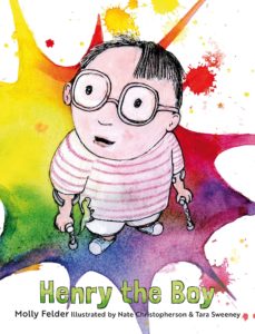
 Henry the Boy
Author: Molly Felder
Illustrator: Nate Christopherson & Tara Sweeney
Penny Candy Books
2 March 2019
36 pages
This month’s PB review is by Ryan G. Van Cleave (#1 Sticker Enthusiast at Only Picture Books) and Ringling College of Art and Design Illustration Professor (and OPB superfan) John Herzog.
–Ryan’s Review of the Writing–
The back cover text clues us in:“This is a story not about a heron or a robot or a chicken, but about me: Henry the boy.” Henry the Boy is indeed about Henry, told from his own perspective of being a kid who click-click-clicks around using forearm crutches decorated with animal stickers.
The sense of frustration Henry feels thanks to his physical challenge is apparent when he heads into the bathroom.
I looked into the mirror and
tried to stand straighter.
But I stood like me.
One of my crutches
slipped away.
And
Smack!
I fell.
But Henry has a friend–Joel–who accepts him for who he is and helps support him, whether it’s physically helping Henry up when he falls, or offering Henry a sponge dinosaur that Joel said was supposed to grow when submerged in water, but it didn’t. Henry loved the gift regardless of whether it did was it was supposed to do or not. Perhaps he loved it more for that fact.
Through all the challenges that one might expect the only kid at school with a mobility aid to face, Henry perseveres. And that’s what this book is about. It’s one kid’s story of perseverance, self-reliance, and the power of the imagination.
Henry the Boy is a compelling book about a type of character we don’t often see in picture books. It doesn’t surprise me in the least to learn that author Molly Felder has cerebral palsy, and has a physical assistance dog, Patterson, that helps her by opening doors, turning lights on and off, “and much more.” It’s no wonder that this book resonates with an authenticity that gives the emotional texture readers want, but it also offers some welcome optimism, too, and not just because the pictures in the final few pages pop with brightness.
4.5 out of 5 pencils
–John’s Review of the Illustrations–
The term I would use to best describe the illustrations in Henry the Boy is an oxymoronic one: Precise sloppiness. Or, if you prefer, sloppy precision. To be clear, in no way do I mean that as a negative. On the contrary, the illustrations in Henry the Boy complement the story and subject matter extraordinarily well.
From the beginning when we’re introduced to Henry, we get a very strong sense of the eclectic and endearing style of the book. Backgrounds are rendered in bright, unwieldy watercolors while the characters are outlined in ink and filled in with light pencil and even lighter watercolor wash. This stark contrast not only helps bring focus to the characters, but it also makes the neon colors surrounding the characters that much brighter. There’s such a tangible feeling to this book because of the use of traditional media, and it helps to connect us to Henry. It almost feels as if Henry himself is illustrating his story, helping us get a glimpse of how he views the world.
The illustrations here are messy but they’re not a mess. Everything that’s happening visually feels deliberate, in spite of the random stains and splotches that adorn most pages. This book is very much a commentary on what it can be like to have a disability, and how it feels to have no control over the world around you. It certainly makes Henry more sympathetic to the reader because of all the colorful chaos around him that he is unable to control.
My only criticism of the book–and it’s a minor issue–is the design of the characters/animals. While they do provide contrast to the watercolor backgrounds, I think the execution could have been a little more precise. Henry is charming with his cowlick and the wave of thin hair draped over his forehead, but I feel all of the characters could have been cleaner and more appealing from a design standpoint.
But that’s a minor criticism of an otherwise wonderful marriage of words and images that is Henry the Boy. I’m excited to see what mother-and-son illustration team Tara Sweeney and Nate Christopherson do next.
4.5 out of 5 crayons
John is a member of the Society of Illustrators and SCBWI, and received the 2018 SCBWI Magazine Merit Award for his Highlights High Five cover illustration. He lives in Florida with his wife, two kids, a pair of tarantulas, a bearded dragon, and a fish.

