Picture Book Review: Along the Tapajos by Fernando Vilela

See the source image

Author: Fernando Vilela
Illustrator: Fernando Vilela
Translated by Daniel Hahn
1 October 2019
40 pages
This month’s PB review is by Ryan G. Van Cleave (Top Riverboating Fan at Only Picture Books) and and Florida-​based author/​illustrator Linda Shute.

–Ryan’s Review of the Writing–

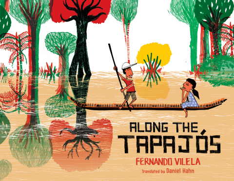
Author/​illustrator Fernando Vilela’s Along the Tapajós tells the story of Cauã and Inaê, a brother and sister who live in a small village along Brazil’s Tapajós River. (Here’s a map and more information about the river, in case you want a fuller geographical context for this story.) While all of their homes are up on stilts, the rainy season brings so much water that the entire community relocates to higher, drier ground. When they get to their new temporary home, the kids realize the problem straight away–they forgot their pet tortoise, Titi. A tortoise isn’t a turtle, so he can’t swim to safety on his own (turtles can swim whereas tortoises can’t). The pair hatch a daring plan to sneak back at night on a journey along the river to rescue him. Will they be able to save Titi in time before the waters get too high?

Foreign words won’t prove daunting here. Other than the names, there’s only one in the entire story, and it’s well-​glossed within the text. (Pa always finds a good spot, someplace sunny and close to an igarapé–that’s a kind of waterway.)

Readers will surely enjoy comparing the world of these kids to their own–the stilt houses, the school only reached by boat, the big critters (alligators and anacondas) lurking in the water, the idea of a two-​season year, a community-​wide annual migration, etc. All of that might lead to interesting discussions for sure.

The ending of this story, however, is potentially troublesome. Once the kids realize that Titi has been left behind, they disobey their parents who specifically tell them NOT to go back for the pet. And while on this unapproved rescue mission, they encounter an anaconda who’s about to gobble up the tortoise and both kids. But doesn’t. Why? It’s an unexplained deus ex machina moment. (“I don’t know how it happens, but when I jump back into the boat with Titi in my arms, the queen of the jungle gets all tangled up!”) Lucky for the kids and Titi, sure, but that’s the thing–they win via luck, not through their own efforts. Taken together, those two story moments might not sit well with readers.

Still, the book offers a lot of vivid details about this community that are interesting and extremely well-​depicted, visually speaking. And the backmatter, too, is quite fascinating and full of compelling facts, details, and images. The real selling point of this book, though, is the pictures. See what Linda has to rave about below!

3.75 out of 5 pencils


–Linda’s Review of the Illustrations–

The art in Fernando Vilela’s Along the Tapajós snags the eye and enlarges the interpretive experience of American children. It is a textured panorama reflecting the energy of its creation and the urgency of the story it tells. The marks are slashed, carved, and incised, the palette basic–mostly flat tones of greens, browns, red and yellow on an armature of black. The effect is of layered, hand-​printed folk art. The river is a gouged wood block printed edge to edge across the pages, over and under other elements. Palm fronds, lily pads, oxen, fish, birds, the snake’s pattern, and the catwalk supports are stamped on freely. The pages are filled with details authentic to the cultural setting and invite reexamination and discovery.

The figures, however, are drawn, and the sister and mother wear flowered collaged dresses. Their black outlines are angular and sometimes crude. The faces are appropriately simple but expressive cartoons. The only stylistic distraction for me was a capybara pair that seemed Photoshopped additives.

Although the viewpoint voice is the boy’s, the book’s visual main character is the tan river which dominates virtually every page. The double spread riverside landscape might backdrop two or three sequential actions of the boat and children, an ingenious design maneuver to avoid fracturing the flowing scene. The river carries the action forward, the villagers to their winter refuge, and finally transforms the world we first entered. When the children return to rescue their tortoise from their now-​submerged home, they find the land structure and water creatures dreamily melded. The closing endpaper, a rainy season redux of the opening dry season endpaper, brings us to a satisfying and thought-​provoking full circle.

5 out of 5 crayons


In 1996, Linda Shute traveled in a small boat up an Amazon tributary similar to the Tapajós River and visited a school like the one in this book. The Escola Bosque had a poster of Elizabeth Taylor on the classroom wall!

Linda is an author/​illustrator in Nokomis, Florida. She has taught at Ringling College of Art and Design, is a member of The Children’s Book Guild of Washington, D.C., and was Illustrator Coördinator of Florida SCBWI the past nine years.

Visit her at https://lindashute.com

Picture Book Review: Spiky by Ilaria Guarducci

Spiky by [Guarducci, Ilaria]
Author: Ilaria Guarducci (translated by Laura Watkinson)
Illustrator: Ilaria Guarducci
Amazon Crossing Kids
1 July 2019
36 pages

This month’s PB review is by Ryan G. Van Cleave (Top Spiked Friend at Only Picture Books) and Ringling College of Art and Design Illustration Professor (and OPB wunderkind) John Herzog.

–Ryan’s Review of the Writing–

Originally published in Italy, Spiky is now in offered in an English-​language edition thanks to the efforts of award-​winning translator Laura Watkinson. (I know Laura’s work. Her Dutch-​to-​English work on Tonke Dragt’s YA novel The Letter for the King is great–it’s going to be a Netflix series too, I hear!).

I have mixed feelings about this book. Let’s start with Spiky himself. There’s no two ways about it–he’s a jerk. He lives in the dark forest where he spends his days being a bully. He’s also a little too enamored with his own spikes, which he loves since they help keep everyone at a distance.

He was spiky, he was bad, and he didn’t need anyone at all.”

Thanks to being sent to bad school by his father, Mr. Spikington, Spiky grew even more nasty. He stole snacks. He raised a ruckus. He tormented the trees. And he “pulled the wings off butterflies. If he couldn’t fly, why should they?”

I’m all for showing how a PB creature isn’t doing good things, but Spiky doesn’t stop there. He captures robins and sticks them in jars. He plucks the petals off flowers. He pricks holes in snail shells. He laughs at toads for “being so ugly.” I worry that some readers will stop at this point because it’s all pretty one-​note, and it’s very, very dark, too.

The second potential hiccup I see is that one day, for no given reason, he starts to lose his spikes. I fully understand how this makes sense plotwise–it’s a way to turn the tables and disempower the nasty critter called Spiky by stripping the physical element of menace from him. But in terms of story logic, this seems random. That troubles me all the more so because it could’ve easily been connected to an action Spiky took in all of his wrongdoings–poetic justice of sorts.

When Spiky’s finally gone bald as a naked mole rat, he’s lost his power. Yet the bully now gets teased in return. The snails sneer. The toads titter. I’m not sure that’s the right lesson here for young readers, though admittedly, we all take some bit of joy in seeing a tormentor get their due.

From this point on, I like a lot about the book. Bernardo the bunny is a hip (hopping!) character with Yoda-​wise advice and a kumbaya mentality. Spiky, too, gets a personality makeover.

Then WHAM, Spiky suddenly–without a catalyst or reason again–grows back his spikes. And he’s tempted to return to his nasty ways. Yet he doesn’t because being good and letting friends get close to you, both physically and emotionally, is “very, very good.”

Sidenote: He never apologies or made friends with the critters he tormented. That part feels unresolved.

So for OPB, Spiky is a mixed bag. I admire how Guarducci takes on the narrative challenge of trying to make a villain into a hero. I also appreciate the novelty of such an odd protagonist.

Yet the images are odd at times (see John’s comments below), and the story feels long–mostly in terms of the extended “hey, he’s nasty!” opening with so many examples and the slow wind-​down at the end when Spiky eventually makes the final decision to eschew his old ways.

I wish I could read Italian so I could examine a copy of the original, called Spino, and see if the same things I’m encountering here are evident there. After all, it was shortlisted for the Soligatto Award for Best Italian Picture Book.

100+ Amazon reviews have Spiky averaging 4 stars. OPB can’t quite get behind it with the same level of enthusiasm.

3 out of 5 pencils

–John’s Review of the Illustrations–

From both a storytelling and illustration standpoint, I have some major issues with Ilaria Guarducci’s Spiky, which essentially tells the story of an antagonist who becomes a protagonist. It’s a valiant effort, and I recognize that. However, in both story and images, it’s a bit misguided and muddled.

First, the story: We’re introduced to the titular Spiky, a monster who was raised up to be bad. Not bad as in “putting the wrong items in the recycling bin” bad. No, I’m talking about “pulling wings off butterflies, trapping birds in glass jars” kind of bad. He’s proud of his spikes and uses them to terrorize the forest animals around him. He’s a completely unlovable main character, which is the point (no pun intended). However, as the story progresses, an event happens that completely changes Spiky’s attitude toward life, and this is where things go a bit sideways. First of all, this event is completely out of Spiky’s control, making his change of character involuntary and detracting from the overall message of the story. He’s forced to change, as opposed to changing because he wants to. Granted, this can work in certain circumstancestake the movie Groundhog Day, for example–but it needs to be done in a way where we’re ultimately charmed by the character we originally found repulsive. Spiky never really redeems himself in a believable way, and isn’t particularly charming by the end. I wanted to care, but I just didn’t.

I’m also not sure what I’m supposed to get out of this story. It feels like Guarducci is trying to tackle too many problems all at once. She tries to combine Spiky’s personal change with the importance of positive friends with the whole “don’t judge a book by its cover” message–and it ends up a mess in the process.

Now, the illustrations: There’s such a missed opportunity here to implement some contrast. Everything feels the same, incorporating a faux, digital gouache look and texture. There’s a fine line between interesting and boring, and this fell a bit on the boring side for me. I would love to have seen Spiky rendered with more of a streaky, old marker look so he stands out a bit more–see the example concept art from Monsters University below, which demonstrates this technique rather effectively:

© DISNEY/​PIXAR

As the story progresses and Spiky goes through his change, perhaps then he could’ve looked more like the characters and environment around him to give more of a feeling of unity. But as it is right now, he blends in with the backgrounds and overall texture the entire time, making his journey feel far less important than it really should. The character designs are adequate enough, with Spiky probably being the strongest. However, the bunnies really should’ve been rounder, fluffier, and just cuter overall.

The aspect of Spiky that I enjoyed most was all of the horrible things Spiky would do to the woodland creatures around him. The character’s actions don’t talk down to kids, which I absolutely love. Kids can handle hard things, and this book doesn’t pull any punches. Guarducci does a fantastic job setting up a loathsome character that I want to see redeemed at the end. Unfortunately, due to the muddled story and monotonous illustrations, his redemption ultimately feels dishonest and superficial.

2.5 out of 5 crayons


John Herzog is an illustrator and educator. His clients include Hasbro, Dreamworks TV, Houghton Mifflin Harcourt, and Highlights for Children. He also teaches illustration classes at Ringling College of Art and Design. John is a member of the Society of Illustrators and SCBWI, and received the 2018 SCBWI Magazine Merit Award for his Highlights High Five cover illustration. He lives in Florida with his wife, two kids, a tarantula, a bearded dragon, and a fish.

He is represented by Shannon Associates.

Picture Book Review: We Are (Not) Friends by Anna Kang


We Are (Not) Friends
Author: Anna Kang
Illustrator: Christopher Weyant
Two Lions
1 April 2019
40 pages

This month’s PB review is by Ryan G. Van Cleave (#1 Friend at Only Picture Books) and Ringling College of Art and Design Illustration Professor (and OPB superfriend) John Herzog.

–Ryan’s Review of the Writing–

We Are (Not) Friends is the fourth book in the You Are (Not) Small series, and the same fuzzy pals we’ve come to know from the other titles are here again with a new problem. The two of them are engaged in a terrific playdate with a cool trunk of fun stuff, and suddenly a new (blue) pal arrives, asking: “Can I play with you?”

Big brown fuzzy pal: “Yes!”

Little purple fuzzy pal: “Well…”

See where this is going? Welcome to the world of playdate–and friendship–politics. So many of the fun things this new trio of “friends” wants to try are best suited for two, such as a dancing duet. What’s the left-​out fellow to do when the other two are having fun without them? Whether it’s playing at being dinosaur hunters or pretending to build a car, someone is on the outs each time.

The sparse text doesn’t get in the way of telling an important, vital story that showcases how friends–old and new–can get along if the idea of what friendship means is re-​examined and re-​imagined. Part of the fun, as well, is the delightful sound effects such as WHUMP, ERGG, OOPH, and BONK that dovetail with Weyant’s comedic visuals.

While I’m still a bit more taken by You Are (Not) Small, this latest book is a worthy addition to the series and will likely please many readers, big AND small alike. Adult readers, in particular, will appreciate the lesson on friendship and inclusion.

4.25 out of 5 pencils


–John’s Review of the Illustrations–

Friendship and empathy are at the heart of Anna Kang and Christopher Weyant’s endearing We Are (Not) Friends, which tells the story of three friends who each feel left out at some point or another during their playdate.

The story is simple, and the illustrations complement that simplicity well. Like the previous books in the series, this is very much a character study with minimal backgrounds and as-​needed props. Instead of showing the characters against grand vistas and views, the illustrations are hyper-​focused on these “fuzzy friends” trying to navigate the perils that can come with new friends.

An aspect of the characters that really stands out to me is their expressions. As an illustrator who admires and strives for simplicity, Weyant has achieved moments of humor, sadness, and depth with a mere handful of brush strokes. For me, looking at the effectiveness of these expressions is like watching Usain Bolt run the 100-​meter dash or watching Gene Kelly dance while wearing roller skates. Weyant makes it look so darn easy when, in reality, nothing could be further from the truth. Simple is hard, and anyone who says differently is selling something.

My one nit-​pick with the illustrations might be viewed as charming to others, but not to me. It doesn’t detract from the overall experience of the book, but I have to say… It drives me nuts that I don’t exactly know the species of these “fuzzy friends.” One looks like a bear, another looks like a kangaroo, and another looks like a gopher. But it’s never exactly clear WHAT these animals are supposed to be. That’s something I appreciate about the Elephant and Piggie books by Mo Willems. He’s very clear about the characters’ species. I’m willing to admit that I might be wrong on this, though. Maybe it actually is cute and charming that it’s left up to us what exactly the characters are in We Are (Not) Friends. Right now, however, I find myself craving some clarity.

I’ve gotta be honest here: I have a deep admiration for the talents of Anna Kang and Christopher Weyant. From a superficial standpoint, their books are fairly simple and straightforward–great for children. But, if you dig deeper (or you’re a parent who ends up reading these books three or four million times to your children at night), you can find an incredible amount of subtext that speaks volumes about the human condition–which is both amazing and amusing since their books have yet to feature a human character.

4 out of 5 crayons


John Herzog is an illustrator and educator. His clients include Hasbro, Dreamworks TV, Houghton Mifflin Harcourt, and Highlights for Children. He also teaches illustration classes at Ringling College of Art and Design. John is a member of the Society of Illustrators and SCBWI, and received the 2018 SCBWI Magazine Merit Award for his Highlights High Five cover illustration. He lives in Florida with his wife, two kids, a tarantula, a bearded dragon, and a fish.

He is represented by Shannon Associates.

Picture Book Review: The Panda Problem by Deborah Underwood

See the source image

The Panda Problem
Author: Deborah Underwood
Illustrator: Hannah Marks
Dial Books
2 April 2019
48 pages

This month’s PB review is by Ryan G. Van Cleave (Biggest Panda Fan at Only Picture Books) and OPB review newcomer, Florida author-​illustrator Loreen Leedy.

–Ryan’s Review of the Writing–

One thing that we’ve come to expect from Underwood’s books is how stories themselves are often part of the story. In her latest picture book, The Panda Problem, that’s exactly what’s happening. A Narrator (yes, that’s with a capital N since this one’s quite the active character here) is trying to set up a story about Panda in a “beautiful bamboo grove,” but despite the Narrator’s insistence that a main character has to have a problem, Panda claims to not have one. “Looks like you’re the one with a problem, buddy,” Panda explains to the Narrator.

The story gets fairly chaotic from there in a fun way that will delight readers, especially once the setting moves far from the bamboo grove. Thankfully, the art clearly showcases the two distinct voices. Panda’s words are always in cartoon-​style speech bubbles, and those by the Narrator look like regular text on the page, which gives the words an adult, authorial seriousness to them. Together, they create a fast-​paced dialogue that roars along as Panda tries to help make the story, well, a story. Sort of.

A bonus is that Underwood includes plenty of kid-​pleasing sound effects, as well (witness a spider who says “BRAAAAP!” and the GLUG GLUG SLOSH of Panda’s paper boat wipeout).

While other picture book authors have had characters who wrest control of the story from a narrator/​author, Underwood’s adorable Panda does it in a fun, memorable way that doesn’t get overly meta and also introduces readers to storytelling techniques (such as dialogue and the escalation of stakes).

Even though I’m an admitted panda bear fan, this is a highly entertaining, witty read regardless.

4.25 out of 5 pencils

– Loreen’s Review of the Illustrations–

The premise of this cheeky picture book can be found on the book jacket as Panda disputes the title The Panda Problem right on the front cover by asking, “What problem?” Mysterious round purple characters hint at mysteries to unfold. On the back cover, Panda is smirking after drawing a line through the floating headline NO PROBLEM, NO STORY and rewriting it as NO STORY, NO PROBLEM!

Continuing the theme, the front flap copy originally stated that the author “…puts readers in control of this story.” However, our main character has revised it to read “…puts readers PANDA in control of this story.” The back flap copy has likewise been extensively revised by the irrepressible bear.

The color scheme is at first limited to black, white, olive greens, and purple only. The digitally painted illustrations include bamboo stalks with a subtle cloth texture and energetic dry brushed leaves, while Panda has loosely drawn line work enclosing the white parts of the body. Backgrounds are primarily white space in the beginning of the book, keeping the focus on Panda and the argument with the Narrator about whether or not Panda needs a story problem to be solved. The empty white space can also be an indication of the (seemingly) unfinished state the story is in.

As the debate continues, one spread is filled with possible problems proposed by the Narrator such as “Are you afraid of spiders?” or “Is your paw sore?” and Panda’s repeated answers, “Nope.” Once they’re mentioned, comical spiders appear in the artwork. The Narrator’s words are in a clean sans serif font while Panda speaks with lively handwritten words inside expressive speech balloons with oval, undulating, or spiky shapes. When the Narrator gets especially frustrated, her words are set in ALL CAPS.

Rich photographic textures add interest and additional colors to the illustrations, such as woven fibers in a hammock, wood grain in a banjo, and crumpled paper in a sailboat. As Panda induces a multi-​hued torrent of jelly beans by merely mentioning the possibility, the Narrator loses control of events. At this point the aliens arrive, portrayed as happy purple fuzzballs who accompany Panda to Antarctica.

The scenes become increasingly chaotic as spiders, penguins, aliens, and (suddenly) twin pandas sail across the icy waters then are shipwrecked. Panda’s worried face is seen in extreme close-​up while finally giving in and admitting there’s a problem. After wailing about their hunger and the complete lack of bamboo in Antarctica, the two pandas make a deal for the Narrator to take over again, sort of. The last page is blank except for the Narrator’s final, satisfying word.

Self-​taught illustrator and designer Hannah Marks lives and works in England; The Panda Problem is her first picture book released in the United States. The design of the type and illustrations perfectly complement and extend the concepts within about the power of words, creativity, writing, characters, illustration, and of course, story problems.

4 out of 5 crayons


See the source image

Loreen Leedy is the author-​illustrator of more than 40 popular picture books that have received many rave reviews and honors. Her titles such as Measuring Penny, Amazing Plant Powers, and Crazy Like a Fox: A Simile Story often include math, science, and language arts content. Her most recent book, Step by Step, features footprints made by baby animals including a puppy, duckling, and fawn in a page-​turning question and answer format. It makes an appealing nonfiction choice for preschool, kindergarten, and first grade age levels.

To see Loreen’s work and download free book activity printables, please visit www.LoreenLeedy.com.

Picture Book Review: Soar High, Dragonfly! by Sheri Mabry Bestor

Soar High, Dragonfly!
Author: Sheri Mabry Bestor
Illustrator: Jonny Lambert
Sleeping Bear Press
14 March 2019
32 pages

This month’s PB review is by Ryan G. Van Cleave (Top Science Buff at Only Picture Books) and OPB review newcomer, freelance artist Austin McKinley.

–Ryan’s Review of the Writing–

Soar High, Dragonfly!, the new picture book by Sheri Mabry Bestor (author of Good Trick Walking Stick), gives readers insight into the world of dragonflies with just enough science to work into STEM curricula.

The text works in two ways–the large-​font words at the top of each page make up the lyrical story of a dragonfly’s life cycle. That’s where we find techniques such as onomatopoeia where we hear the POP POP POP of a dragonfly laying eggs onto the water surface. It’s there that readers encounter strong words (squirts, thrusts, captures, gulp!) that make the moments come alive.

But the differently-​colored words–generally found at the bottom of many of the pages–work like a sidebar. The supplementary text there is informative and very straightforward, such as “Dragonfly eggs are very small and have no way to protect themselves. Many are eaten by fish, frogs, and other insects before they have a chance to hatch.” Science-​reluctant readers could potentially skip those parts and still find much to enjoy from this book, though without a doubt, this information adds to the overall experience.

While the sidebar-​style parts give this book depth, a robust backmatter section might’ve given this book a little extra oomph that so many nonfiction titles have today. Regardless, it’s a compelling title made even more so by the vibrant art that makes the “insect hero” of this story come alive.

4 out of 5 pencils

Austin’s Review of the Illustrations–

Prolific UK illustrator Jonny Lambert graces the book with lustrous, intricately cut and collage-​textured compositions. A comparison to Eric Carle’s 1969 classic The Very Hungry Caterpillar would be apt, because of the saturated palette and rich patterns, but also a disservice because Lambert brings his own expert and playful animator’s draftsmanship to bear, creating a warmly familiar but entirely distinct sensibility—and an order of magnitude more detail.

In a career spanning over 300 titles, Lambert has interpreted almost every member of the animal kingdom.  Although only the second collaboration with the author of Soar High Dragonfly, this is a rare example of Lambert’s insect renderings which he nevertheless approaches with adroit sensitivity. Even a brown, molting nymph seems friendly and endearing, while maintaining the book’s blend of elementary simplification and scientific accuracy.

Amazingly in the digital age, the technique is a traditional one, involving—as the artist says—layers of gouache “tickled” through individual stencils derived from hand-​drawn designs, and finished with colored pencil. His artistic attention seems to be lavished on every aspect of the process, from playful character creation to painstaking execution.

The book’s broad cast of predators and prey play out their primal drama amid a sumptuous environment of swirling shallow water and lush aquatic plant life, and Lambert’s spacious layouts and text interactions underscore the joy of flight embraced by a jewel-​toned master of his medium.

4 out of 5 crayons


Austin McKinley’s work crosses many different forms of media, from comic books and cartooning to short film directing, video production, video games, screenplays, novels and novellas. Most recently he produced, shot and appeared in the award-​winning feature documentary “The New 8‑Bit Heroes” alongside director Joe Granato, and created “By The Numbers,” a feature-​length abstract animation representing cinematic structure. He is the author of several works and collections through his company, Flying Car. His comic illustrations have also been published by Image Shadowline, Devil’s Due/​1st Comics, Alias/​Blue Water Press, Avatar, Boom!, Blue King Studios, and FC9. He wrote and illustrated “Squareasota,” a weekly cartoon in the Sarasota Herald-​Tribune for seven years. He lives and works in Sarasota.
Learn more about Austin and his work:

Picture Book Review: It’s Not Hansel and Gretel by Josh Funk

It’s Not Hansel and Gretel (It’s Not a Fairy Tale)
Author: Josh Funk
Illustrator: Edwardian Taylor
Two Lions
1 March 2019
40 pages

This month’s PB review is by Ryan G. Van Cleave (#1 fairy tale fan at Only Picture Books) and Ringling College of Art and Design Illustration Professor (and OPB mega-​fan) David C. Gardner.

–Ryan’s Review of the Writing–

It’s Not Hansel and Gretel is the newest Josh Funk book, and if you’ve read any of his picture books before (such as Lady Pancake & Sir French Toast, How to Code a Sandcastle, and Lost the Library: A Story of Patience & Fortitude), you know to expect:

  • an unexpected take on subject matter
  • a kid-​friendly sense of whimsy
  • witty wordplay

It’s official–It’s Not Hansel and Gretel delivers on all counts.

There’s a narrator here trying their best to keep this story under control, but the rapscallion duo of Hansel and Gretel keep yanking this fairy tale in different directions. The art clues us in when this happens by using speech bubbles that work against the words the narrator uses, which are in cast in a fancy, Old Timey font that seems straight out of the days of illuminated manuscripts written by monks beneath candlelight.

To offer just one example of how these kids push the story off the rails, the poor narrator tells the reader how the pair “left a trail of bread crumbs leading back home” to which the kids respond with:

Gretel: What type of person SAVES bread crumbs?

Hansel: It’s a time of great famine. If there are bread crumbs left, we eat them!

Gretel: Now I’m hungry! Why’d you have to bring up bread crumbs?

Things get worse from there for the narrator who wants to stick with the traditional story, with my favorite moment being when Gretel asks, “Why isn’t it ever Gretel and Hansel?” She even points out that alphabetically speaking, G comes before H, and while a giggling kid reader likely doesn’t stop to think about the problem of legacy thinking–doing something because it’s always been done that way, or perhaps subconsciously privileging males more than females–those topics are there for adults who want to dive into that end of the pool.

One clear instance of Funk’s wordplay happens when the witch begins to cast a spell, intoning “Double, double toil and trouble.” And Gretel says, “I can’t hear you over that noisy oven. Did you say TOILET trouble?”

That’s a burst-​out-​loud kid pleasing moment, to be sure. It’s entirely possible a member of the OPB staff had chocolate milk come out of their nose thanks to laughter here, as well. 

I’m also quite taken with how the kids are practical and have a positivity about them that helps save the day. Those are two good lessons beyond the legacy thinking idea and issues of gender and power that are lightly touched upon during the course of this story.

The ending, too, is full of cameos from other fairy tale friends, and it’s a surprising yet satisfying conclusion to this irreverent take on an old, old tale. Highly recommended. For those who get a real kick out of this kind of fun, check out the first book in Funk’s It’s Not a Fairy Tale series–It’s Not Jack and the Beanstalk.

4.75 out of 5 pencils

David’s Review of the Illustrations–

In the 1800s, children’s books were meant for moral education. But in the last century, some argued that it was enough to aim to entertain a child.

There’s no deep message in It’s Not Hansel and Gretel, but it’s a heap of entertaining fun.

Flipping through the illustrations by Edwardian Taylor is like watching a cartoon on TV, one of those vintage Fractured Fairytales, or Powerpuff Girls. This no accident; Taylor also designs for animation. I’ll confess, I’m not a big fan of the trend of children’s books mimicking slick Cartoon Network shows, but Taylor knows his stuff, and he takes full advantage of the picture book form, packing each spread with funny visual asides for kids (and adults). Look closely and you’ll discover treats on every page: Thumbelina in a corner chatting with a bird twice her size, the Seven Dwarves marching to work in the forest background, cute recurring elves in just about every spread. The clever, ebullient pictures establish from the start that we are in a world populated by fairy tale characters (a device that pays off wittily in the end–but I won’t give anything away.…)

Another note on the visuals: The great art direction makes it a breeze to tell who is talking on each page; every voice has its own font, a trick Walt Kelly pioneered in his classic comic strip Pogo.

Taylor’s character designs are fluid and manic in a way that perfectly fits the story’s tone, and his color palette is fabulous, too–muted greens and browns in the opening pages make way for the explosion of candy colors when the kids discover the gingerbread house. Close-​ups pull us into the center of the action, sometimes making an image hard to read at first glance. But in a picture book, where the child has plenty of time to peruse a picture, that’s not a problem. Add the bright, but controlled, colors–as sweet as the witch’s house–and you’ve got a book that’s an immersive experience, a cool hybrid of children’s book and animated cartoon, a perfect confection for our time.

5 out of 5 crayons


David C. Gardner is an award-​winning illustrator and visual development artist. A former artist for Walt Disney Animation Studios, he has illustrated numerous picture books, including his latest from Sleeping Bear Press, Write On, Irving Berlin! by Leslie Kimmelman (which appeared on OPB not so long ago). It tells the true story of little Izzy Baline, who immigrated to New York City in 1893 and grew up to become Irving Berlin, one of the most well-​known composers of popular music in America. David teaches illustration at Ringling College of Art and Design.
 
To learn more about David’s own work, please visit FlyingDogStudio.com.