Picture Book Review: Hedy & Her Amazing Invention by Jan Wahl

Author: Jan Wahl
Illustrator: Morgana Wallace
5 February 2019
36 pages
This month’s PB review is by Ryan G. Van Cleave (#1 Invention User at Only Picture Books) and and Florida-​based author/​illustrator Linda Shute.

–Ryan’s Review of the Writing–

This grade school level picture book biography tells the story of Hollywood actress and inventor, Hedy Keisler, who later became Hedy Lamarr.

While this book is longer than most picture books I run across at OPB–not just the 36 vs. 32 pages, but also because it has chapters!–it never feels like it’s too much. Partially that’s due to the simple sentence structure and a straightforward style.

But almost everybody could go to the movies. A ticket only cost a few coins.

The story flows chronologically, beginning in Hedy’s childhood years of poverty in Austria, then moving ahead to her work as an actress, her initial attempts at creating inventions, and then her failed marriage to an older man that led to her decision to help the Allies in World War II. And all of this happened while growing her career as a Hollywood star.

Though most didn’t know that Hedy harbored a deep interest in inventions, she continued to research and create new things throughout her life. A new Kleenex box. A dog collar that lights up in the dark (so lost pets can be found more easily). A better traffic light.

But her most famous invention emerged after she learned how Nazi submarines were sinking British ships in World War II, and then jamming the radio signals so the British couldn’t return fire with their radio-​controlled torpedoes. In response, Hedy came up with the idea for frequency-​hopping (also called “spectrum spread”), a technique that’s still used widely today in a variety of items, including fax machines, cell phones, and wireless technologies. It’s no surprise that her birthday–November 9th–is now known as Inventor’s Day!

While there’s a sense that the challenges in Hedy’s personal and professional life stemmed from society’s now-​antiquated views on women, that avenue isn’t explored in as much depth as some of today’s readers might choose. Yet without a doubt, Hedy is an intriguing character with spunk, wit, and a profound commitment to helping others.

A brief Author’s Note in the back of the book shares the author’s three memorable personal anecdotes about Hedy.

4 out of 5 pencils

OPB Sidenote: Readers who want a picture book biography on Hedy that’s targeted at a younger audience might try Hedy Lamarr’s Double Life: Hollywood Legend and Brilliant Inventor, which is releasing on the same day as this Penny Candy Books title.


–Linda’s Review of the Illustrations–

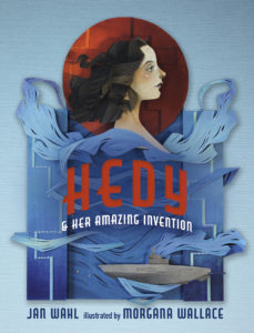
When the reader cracks open the pages of Hedy, she will discover sophisticated, rich, secondary colors–notes that fall between the bright primary tones of books for younger audiences. The content is clearly defined, yet couched in the mystery of deep hues set against dark backdrops.

Illustrator Morgana Wallace’s medium is cut paper. She paints the pieces engagingly, modeling faces, costumes, and other details. The paper elements cast a soft drop shadow, giving a subtle 3‑D vibe.

An Art Deco san serif font is used for titles and chapter heads. Pages of text face single spread pictures. Occasionally, humorous vignettes break the type page.

Starting with Lamarr’s Viennese childhood, clothing reflects the times. Just so they grasp the glamour and glitter of her primary career, readers are given one full-​length image of Hedy in a lavish Hollywood costume. Her figure is reminiscent of 1940s and 50s fashion drawings–clean edged and dramatically posed with pensive expressions. Hedy’s profile is all 1940s starlet–pouty lips, arched brow, disengaged gaze.

The young reader should close the book with a feeling of having visited an exciting past era, yet one that is relatable and connects with ours.

5 out of 5 crayons


Linda Shute is an author/​illustrator who earned a degree in art and art history at Florida State University and taught children’s book illustration at Ringling College of Art and Design.
She loves peanuts and beach sunsets.

Picture Book Review: Small Walt and Mo the Tow

Small Walt and Mo the Tow
Author: Elizabeth Verdick
Illustrator: Marc Rosenthal
Simon & Schuster/​Paula Wiseman Books
30 October 2018
40 pages

This month’s PB review is by Ryan G. Van Cleave (#1 snowplow aficionado at Only Picture Books) and Ringling College of Art and Design Illustration Professor (and frequent OPB helper-​outter) David C. Gardner.

–Ryan’s Review of the Writing–

Small Walt and Mo the Tow is the sequel to the 2017 book Small Walt, which was a delight. This new title has a simple plot–a “bitter blizzard” has come so Gus (the driver) and Walt are off to clear the roads with “a big load of ice-​melting salt.” When a little green car slides off a forest road and FWUMPs into a ditch, Walt wants to use his scoop to save the day, but Gus says, “Now, now. Plows only scoop snow.”

It’s Mo the Tow to the rescue, along with Mo’s driver Sue, who wears a bright blue coat. Only Mo’s tires can’t get a grip of the slick ice, so Walt does his part to plow the snow and use his spreader to drop salt with a “switch-​twist, switch-​twist.” And from that moment on, new friendships are made, and the little green car is rescued at last.

The vehicles have a good deal of personality, which is certainly part of the fun. Yet what young readers might respond best to is the attention to sound, both in the alliteration (“swish the slush” etc.) as well as the many instances of onomatopoeia (“Whumpa-​thumpa-​bumpa-​bump!” and “Rugga-​brum-​brum, HUMMAROOOM!”).

This is a sweet story of friendship and kindness. If you liked Small Walt, then this sequel likely won’t disappoint you.

4 out of 5 pencils

David’s Review of the Illustrations–

This sequel starts with a long view of the town, like a child’s eye view of a toy village, then the pictures swoop in to immerse us in the action. And it is all action, essentially a narrative of pulling a stuck car out of the snow. 

Rosenthal’s pictures border on crude, done in what looks to be heavy-​colored pencil or thick crayon. (I will confess I have always been skeptical of the notion that children want to look at pictures that look like something they might create themselves.) Rosenthal’s simple illustrations for the Small Walt books have been rightly compared to Virginia Lee Burton’s classic books like The Little House (1942), Mike Mulligan and His Steam Shovel (1939), and especially Katy and the Big Snow (1943), and they do share that childlike quality and charm. Burton worked in this medium too, but her work was more refined, like fine miniatures, starting with soft watercolor washes, then layering in colored pencil with attention to tiny details.

The looseness here is not necessarily a weakness, though; it gives the book a contemporary feel. Rosenthal has a wide-​ranging portfolio as an illustrator for magazines, advertising, and books, and his style consistently pays homage to illustration styles of the past, always with a clever twist so that we never forget his work is of-the-moment.

And this book is no different.

Rosenthal is, in a sense, playing jazz, not Beethoven. That freshness helps to convey the immediacy of the story for its very young audience. The illustrations also amp up the charm considerably, giving the book a hip coolness without being cynical, and never tipping over in the other direction into easy, sappy cuteness.

3 out of 5 crayons


David C. Gardner is an award-​winning illustrator and visual development artist. A former artist for Walt Disney Animation Studios, he has illustrated numerous picture books, including his latest from Sleeping Bear Press, Write On, Irving Berlin! by Leslie Kimmelman (which appeared on OPB not so long ago). It tells the true story of little Izzy Baline, who immigrated to New York City in 1893 and grew up to become Irving Berlin, one of the most well-​known composers of popular music in America. David teaches illustration at Ringling College of Art and Design.

To learn more about his work, please visit FlyingDogStudio.com.

Picture Book Review: Gittel’s Journey: An Ellis Island Story by Lesléa Newman

Gittel’s Journey: An Ellis Island Story
Author: Lesléa Newman
Illustrator: Amy June Bates
Abrams Books for Young Readers
5 February 2019
48 pages

This month’s PB review is by Ryan G. Van Cleave (Top journey-​taker at Only Picture Books) and Ringling College of Art and Design Illustration Professor (and OPB pal) John Herzog.

–Ryan’s Review of the Writing–

Gittel’s Journey tells the story–based on a pair of oral tales from the author’s family–of a nine-​year-​old girl being sent to America in the latter part of the 19th century while her mother has to stay behind because of an eye infection. Along the lengthy journey, the address on a piece of paper becomes smudged, so poor Gittel doesn’t know where to go when she arrives. I’ll hold off on revealing the ending but suffice to say, it’s both heartfelt and glorious.

Gittel’s Journey is one of those books that–even without the back matter–runs closer to 1,000 words than the 300 that so many literary agents and editors claim is the new norm. But the story necessitates it. And never did I have that somewhat common thought as I read: “Wow, this feels looooooong.”

That extra space allows for Newman to offer quiet moments of delicious sensory detail such as Gittel grabbing onto the ship’s “cold, wet railing” or how when she finally arrives at Ellis Island, the “ocean spray smacked Gittel in the face, and when she licked her lips, she tasted salt.” It also allows the the room for this story to unfold with the quiet tenderness it deserves. Nothing feels rushed.

Newman’s skill with language is also on full display with how she weaves in Yiddish words (always italicized) throughout the story. The context of those words give more than enough clues as to their meanings so not knowing Yiddish isn’t an issue.

The extensive Author’s Note, bibliography, and short glossary all add to the story and provide more interesting context to the immigrant experience as well.

This is a terrific book with spot-​on illustrations (see below for John’s glowing review on that aspect) that brings social issues into the realm of picture books in an effective, memorable way. It’s a fine, fine book worthy of your bookshelf space.

4.75 out of 5 pencils


–John’s Review of the Illustrations–

In today’s political and social climate in our great American experiment, we need a book like Gittel’s Journey. We need it to remind us of our past, where we come from, and why we’re here. We need it to remind us of the immense value of patience, kindness, and bravery. We need it to remind us of what made America truly great.

The story here is incredible, and based on the true events of a young girl who travels to America alone in search of a better life–without the use of a smart phone or GPS (terrifying). An amazing story like this requires amazing illustrations, and the work by Amy June Bates does not disappoint. In fact, it stands toe-​to-​toe with the story and–dare I say–elevates the book to a whole new level.

In a sea of muted browns and grays, little Gittel stands out with her red hood, pink apron, and bright green bag. We know this is her story. The progression of color throughout the book is breathtaking, helping guide is from that which is familiar to that which is not and back again. Gittel’s home country is depicted in very warm, inviting tones while her journey is very muted, cold and drab. Thankfully, the warm tones return at the end as Gittel’s cousin meets her for the first time, and into the final page when Gittel is reunited with her mother. It’s this mastery of color progression that makes us care about the safety of Gittel, and relieved when she is reunited with family.

The print quality of this book is exquisite. I love that tinted paper was used–a nod to a time long past. The whites used in the illustrations really pop against the colored paper, and helps create contrast and appealing movement in the images. The sketchy figures, the watercolor, the stamp-​like borders and filigree–all of it transports me back to what I would imagine this time period was like, yet fuzzied and faded by time.

This is an important book, both for children and adults. As Americans, we seem to have such a short memory when it comes to how important immigrants are to this country. It’s books like this that help us remember that, and what this country should stand for:

The Statue of Liberty,” said a man standing beside Gittel, as he
waved his cap in the air and wept. “She’s welcoming us to America.”

Gittel’s Journey is a masterpiece.

5 out of 5 crayons


John Herzog is an illustrator and educator. His clients include, Hasbro, James Patterson, Houghton Mifflin Harcourt, and Highlights for Children. He also teaches illustration classes at Ringling College of Art and Design. He lives in Florida with his wife, two kids, a pair of tarantulas, a bearded dragon, and a fish.
 

Picture Book Review: Nature’s Friend: The Gwen Frostic Story by Lindsey McDivitt

Nature’s Friend: The Gwen Frostic Story
Author: Lindsey McDivitt
Illustrator: Eileen Ryan Ewen
Sleeping Bear Press
4 August 2018
32 pages


This month’s PB review is by Ryan G. Van Cleave (#1 “Friend of the Trees” at Only Picture Books) and and Florida-​based author/​illustrator Linda Shute.

–Ryan’s Review of the Writing–

It’s always wonderful to read picture book texts where the author has a poetic sensibility about sound, as one can hear in “like a small fawn follows its herd,” which is how McDivitt describes Gwen’s relationship to her brothers and sisters. You hear it again with this line: “tiny town tucked into the thumb of Michigan.” While there are other instances of this type of attention to language, my favorite might well be “tiny ferns unfurled at her feet.” It’s clear early on that McDivitt is trying to create an image system from the natural world to prepare readers for Gwen’s later work as lover of nature.

Nature’s Friend shares Gwen’s entire life trajectory–all nine decades of it. She went from being a sickly child to a prominent businesswoman, successful artist, and environmental pioneer. She was so successful, in fact, that she left an estate of $13 million to Western Michigan University, which renamed its art school in her honor. While Gwen started off with clear physical challenges, she simply never saw herself as disabled. That’s an important message for young readers, to be sure.

Gwen’s life is so full of interesting things that trying to capture it all in a single book feels a bit like one of those Dagwood sandwiches–short of being a comic character with a jaw that can unhinge, there’s no way to quite get your mouth around all that deliciousness.

One of the nice touches in this book is how quotations by Gwen are occasionally included in soft blue letters at the bottom of the page. While some might include such quotations as back matter, these each seen specifically selected for the spread where they’re used. That’s a fine touch.

There’s even a craft project at the end of the book, along with additional back matter about Gwen’s life.

This is an empowering book about a truly noteworthy, admirable woman.

4.25 out of 5 pencils

–Linda’s Review of the Illustrations–

On the jacket of Nature’s Friend, dark tree trunks and limbs frame an alert turn-​of-​the century young Gwen sketching in a north woods glade. Artist Ewen draws us through the frame with a cast of half-​concealed wildlife friends in the greenery surrounding Gwen.

The watercolor color and line medium, warm colors, and intimate viewpoint lend a confident, cheerful mood to the mile marker scenes of Gwen’s life. A large page size, with widely line-​spaced blocks of text on generous white fields are inviting for the six to eight year old transitioning to independent reading. Many spreads feature Frostic quotes in a tall font that suggests hand lettering. Their sky blue tint prevents them from competing visually with the story text blocks, but beckons the reader to return and contemplate Gwen’s words. They soften and add interest to the generally airy page design.

We linger looking at Gwen’s early years long enough for the reader to identify with her, then sweep forward through her life watching her mature, her clothing and hair interestingly reflecting styles of the passing decades. The interior settings–her childhood classroom and home, Chicago trolley and print business, woodsy gift shop and sitting room–are well described, lending the story authenticity. For the outdoor scenes, the artist relies heavily on the less realistic and more decorative style used on the jacket.

Gwen’s physical handicaps are difficult to detect in the pictures. What is clearly shown is her spirit, determination, and resourcefulness, which leave an afterglow of optimism and peace.

4 out of 5 crayons


Linda Shute is an author/​illustrator who earned a degree in art and art history at Florida State University and taught children’s book illustration at Ringling College of Art and Design.
She loves peanuts and beach sunsets.

Picture Book Review: The Rabbit Listened by Cori Doerrfeld


The Rabbit Listened
Author: Cori Doerrfeld
Illustrator: Cori Doerrfeld
Bloomsbury Children’s Books
20 February 2018
40 pages


This month’s PB review is by Ryan G. Van Cleave (Top Rabbit at Only Picture Books) and Ringling College of Art and Design Illustration Professor (and OPB champion) John Herzog.

–Ryan’s Review of the Writing–

While this is a quiet book in many ways, the story starts with a disaster–birds knock down Taylor’s super-​tall, super-​cool block tower. In response, animal after animal arrives, with each acting in ways that match their animal nature. The chicken? It clucks away endlessly. The bear? It wants to roar and be mad. The snake? Revenge! But none of these interactions prove useful to Taylor, so each animal eventually wanders off. They all are more or less well-​intentioned, but they are more concerned with their solutions than thinking about what–if anything–Taylor needs.

It’s only the rabbit that doesn’t try to impose its natural response to the situation. It simply listens and is present, moving closer until “Taylor could feel its warm body.” This allows the child–half of the reviewers claim it’s a he, and half say Taylor is 100% gender neutral–to have their own range of reactions. Given the chance to respond as Taylor chooses, Taylor’s able to move past the many emotions (laughing, shouting, etc.) and can finally build once again.

Some readers will surely want to play up the animal voices to good effect when reading The Rabbit Listened to a child. The pacing of this story, too, lends itself well to reading aloud.

Will some readers find the message too straightforward or didactic? Perhaps. But it’s a sweet, simple story that teaches empathy, and that’s a lesson parents like myself wish were included in more picture books.

4 out of 5 pencils

–John’s Review of the Illustrations–

I’m really torn when it comes to The Rabbit Listened. No doubt Cori Doerrfeld has crafted an interesting take on what is essentially the five stages of grief. From an illustration standpoint, however, I feel there were a few missed opportunities.

For example, Taylor–our protagonist–is visited by all kinds of animals. We see them with Taylor in various spot illustrations that are organized just so on the page. On the far side of one spread, we see the animals walking away from Taylor, who’s on the opposite side. It’s adequate, I suppose, but we never truly get a sense of the crowd. We never get an image of all the animals overshadowing Taylor, enhancing and illustrating that overwhelming feeling of isolation. We get a great image of the bear doing that, but it would’ve felt much more powerful if all of the animals were there looking down at us.

Honestly, a little disorganization would’ve tremendously helped the first half of this book. Animals! Animals everywhere! Spouting advice and nonsense! It would’ve made the quieter scenes with the rabbit during the second half all the more endearing, providing some much-​needed contrast from the animal madness. Instead, the illustrations just feel a bit flat and somewhat sparse.

The strongest aspect of this book is the design of the main character. It’s very clear that Taylor is who we should be rooting for with their fun, messy hair and rounded features. The rabbit is fluffy and cute, of course, but feels a bit stock. The rest of the animals are designed somewhat grotesquely to emphasize Taylor’s ambivalence and aversion to their advice, I imagine. Yet from my perspective, these animals were only trying to help. Yes, they went about it in a bombastic way, but that doesn’t make them monsters. I wish they were softened up a bit, if anything to reinforce the idea that loved ones who suggest action in times of turmoil are only trying to help.

Perhaps I’m reading a bit too much into it.

I definitely like that we don’t have much of a sense of place and time, and I absolutely love the final image where we see Taylor’s vision of their next big building venture. And please don’t get me wrong–it’s important to listen in a situation like this. And Taylor eventually accepts what happened and moves on, which is nice and quite appropriate. For me, however, The Rabbit Listened perhaps aspires to be greater and deeper than it actually is.

3 out of 5 crayons


John Herzog is an illustrator and educator. His clients include Hasbro, James Patterson, Houghton Mifflin Harcourt, and Highlights for Children. He also teaches illustration classes at Ringling College of Art and Design. He lives in Florida with his wife, two kids, a pair of tarantulas, a bearded dragon, and a fish.
 

Picture Book Review: A Dog Named Doug by Karma Wilson and Matt Myers


A Dog Named Doug
Author: Karma Wilson
Illustrator: Matt Myers
Margaret K. McElderry Books
26 June 2018
40 pages


This month’s PB review is by Ryan G. Van Cleave (“Best of Show” winner at Only Picture Books) and Ringling College of Art and Design Illustration Professor David C. Gardner.

–Ryan’s Review of the Writing–

Choosing what to run with for this month’s review proved easier than usual–I’m a Karma Wilson fan (Bear Snores On got worn out in the Van Cleave household), and I’m a dog lover (rumor has it that I’ve twice chased a mailman). So when A Dog Named Doug arrived, it barked dug its way to the top of the list where it stayed. Like a good dog book should.

So here’s the story: A dog (named Doug) digs. He digs more. And more. And more. And then he goes to bed where he (1% spoiler here) dreams of digging in a (decidedly strange, and possibly too weird for some kids) dreamworld.

To be fair, a dog who digs because dogs like to dig isn’t much of a plot. But the book has three things really going for it that quite likely overcome any real or perceived weakness in the basic premise.

  1. The art is both compelling AND clever. See David’s review about that aspect of the book below.
  2. I have to mention the art again. Sorry to step on your toes so much, David. But the terrific art by illustrator Matt Myers frequently works as typography, such as a dirt mound becoming an A in “I can dig better than you!” or many dirt mounds becoming Ms in “Many miles of dirt Doug dug, leaving heaps and piles and mounds of mud.”
  3. The refrain of “Oh boy, did Doug dig!” is sure to encourage readers to shout it out during storytime. Plus the loose, easy rhymes that Karma’s known for are present here as well.

Part of the fun here is that Doug’s digging takes him to a whimsical range of destinations. The Old West. The White House (note the female POC/​President of Color). The ocean floor. Stonehenge. Some kind of Egyptian tomb. And even a bowling alley. He even digs to the other side of the earth where the perspective is, quite reasonably, upside down.

It’s a fun, rollicking book, to be sure. But some readers could get tripped up with the tongue-​twister start, and others might find the entire tail (yep–a pun!) a bit one note (Doug/​dog/​dug).

In sum, this is a playful book that could be–for the right child and adult reader–an enjoyable bedtime story with serious read-​aloud potential.

4 out of 5 pencils paws

–David’s Review of the Illustrations–

The cover starts us off on just the right note, with a vignette placing Doug digging in the text against a stark white background–a lovely, graphic design–and painted with such vigor that you can feel the dog digging furiously, happy, if a bit manic, capturing perfectly in one image what the book is about.

The palette is bright, saturated, and lighthearted without ever tipping into garishness. The whole book has the feel of an animated Looney Tunes short–madcap and raucous. The layouts are cinematic, utilizing a variety of close-​ups and long shots, and the brushwork is loose and energetic, with dabs of acrylic and oil paint so juicy and playful that you can almost feel them popping off the page.

What I appreciate most about Matt Myers’ illustrations are that they veer alongside and, at times, away from, the minimal text, often taking the lead and keeping us guessing: Where will Doug pop up next? The pictures, not the text, make this book a page turner.

This is exactly what Maurice Sendak suggested the pictures should do in a picture book–depict not just what the words are telling us, but take the story even further.

When Doug decides to head home, the text only tells us Doug is digging. But Mr. Myers turns the vignettes depicting Doug’s journey into a cartoony delight, with no rhyme or reason except to entertain a young reader (and their adult companion).

Near the end, the text tells us only that Doug was in his bed. But the illustration shows Doug in his owners’ bed, dreaming away. It’s an inspired choice–another gentle gag as the book is winding down.

A final example–and my favorite moment in the entire book–is when Doug digs all the way to China. The text only reads “Oh boy, did Doug dig, and dig, and dig.” In this fantastic spread, and with the help of some inspired handling of text, Mr. Myers shows that he can still see the world through a kid’s eyes.

Sharing the storytelling duties with the author to this extent is an illustrator’s dream. Matt Myers rises to the occasion splendidly.

4 out of 5 crayons dirt mounds


David C. Gardner is an award-​winning illustrator and visual development artist. A former artist for Walt Disney Animation Studios, he has illustrated numerous picture books, including his latest from Sleeping Bear Press, Write On, Irving Berlin! by Leslie Kimmelman (which appeared on OPB not so long ago). It tells the true story of little Izzy Baline, who immigrated to New York City in 1893 and grew up to become Irving Berlin, one of the most well-​known composers of popular music in America. David teaches illustration at Ringling College of Art and Design.

To learn more about his work, please visit FlyingDogStudio.com.

(Ryan’s note: With a website name like that, you can see why I asked him to pitch in for this month’s review!)