Picture Book Reviews: Just Snow Already; Don’t Mean to 13: Molly’s Tuxedo; Remind Me; What Goes on Inside a Beaver Pond?

I ran into an issue with securing a professional illustrator to partner with me this month on a picture book review. This just means we’re going with the much-​ballyhooed 5‑word review format once again here at OPB. Enjoy!


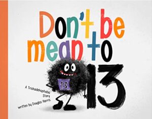
Don’t Be Mean to 13
Author: Douglas Harris
Illustrator: YipJar
Label Free Publishing
13 October 2023
24 pages

Five-​word review: Charming take on “unlucky” 13.

4 out of 5 Lucky Charms


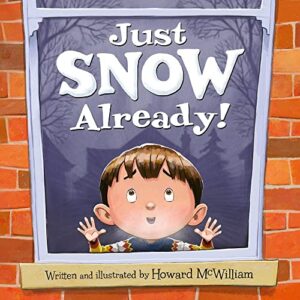
Just Snow Already!
Author: Howard McWilliam
Illustrator: Howard McWilliam
Flashlight Press
1 September 2023
32 pages

Five-​word review: Snow finally falls. Chaos missed.

4.25 out of 5 Snowballs


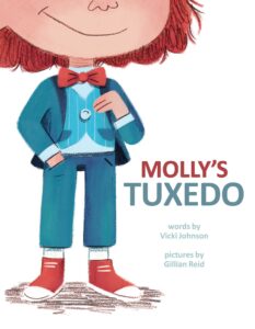
Molly’s Tuxedo
Author: Vicki Johnson
Illustrator: Gillian Reid
Little Bee Books
27 June 2023
40 pages

Five-​word review: Molly shines in true colors.

4.5 out of 5 Bow Ties


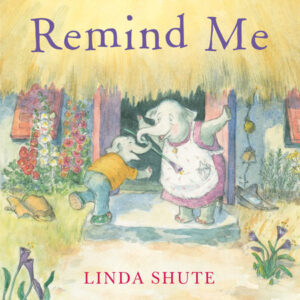
Remind Me
Author: Linda Shute
Illustrator: Linda Shute
Neal Porter Books
4 July 2023
32 pages

Five-​word review: Poignant look at memory loss.

4.5 out of 5 Elephants


What Goes on Inside a Beaver Pond?
Author: Becky Cushing Gop
Illustrator: Carrie Shryock
Storey Publishing
5 September 2023
48 pages

Five-​word review: Beaver tale marries science, art.

4.25 out of 5 Beaver Dams

Picture Book Review: Giants Are Very Brave People by Florence Parry Heide (illustrated by Merrill Rainey)

Holiday House
1 August 2023
32 pages

This month’s PB review is by Ryan G. Van Cleave (Owner/​Operator of Only Picture Books) and freelance illustrator Edna Cabcabin Moran.

–Ryan’s Review of the Writing–

While I was familiar with Florence Parry Heide (1919–2011), the author of over 100 children’s books, I initially didn’t realize that this was a new edition of a 50-​year-​old work. Realizing that situation now actually answers some of my questions about the book, which are likely a result of audiences being so different a half century ago.

Back to the book, though.…

This is the story of a blue-​skinned child named Bigelow. To put it plainly, he’s absolutely a total scaredy-catkid. The clouds could fall on him, after all. And alphabet soup could spell out a magic word that kapoofs him into a mushroom. And rain? Well, of course he’s afraid of rain. Because he might melt.

One day, he goes out for a walk and encounters a very small woman (Mrs. Pimberly) who’s afraid of him because to her, he’s huge. She suggests that he might be less afraid if he acted a bit more fierce–perhaps by giving “a giant short of shout” such as FEE FI FO FUM. While it seems as if Bigelow is the first giant she’s encountered, she says that all giants know that phrase.

Bigelow practices the shout repeatedly while Mrs. Pimberly brews some tea. When she comes out with the tea, Bigelow is LOUD, to which she says, “You certainly scared me. That’s a very good shout. I’m sure it will make you feel much, much braver.”

All that shouting made him hungry, so Mrs. Pimberly makes him a mountain of pancakes (large to her, small to him). After he’s had the tiny snack, he offers to take her home with him, but she declines, saying that she has never traveled or had many experiences. “I’ve never even been on a train,” she says.

Back at home, Bigelow uses FEE FI FO FUM to deal with two of his fears–alphabet soup and bathtime. Maybe acting brave does help someone feel a little braver after all! The kid giant returns the favor to Mrs. Pimberly by bringing her his toy train, which allows her to ride “round and round and round the track.” While it’s unclear how riding a toy train equates to exploring the world, Mrs. Pimberly appears genuinely thrilled with the experience.

Ultimately, I have questions about the story. While children are likely to love shouting FEE FI FO FUM with Bigelow, will they feel less excited that an adult solved/​helped solve Bigelow’s problem (being afraid)? Most contemporary picture books give far more agency to kids in stories. I also wonder how a child who is afraid of everything manages to summon courage to go on long walks away from the safety from home.

Yet Rainey’s graphite pencil and digital illustrations are quite charming, as Edna will explain below. I’ve already mentioned the read-​aloud-​ability of parts of this book, and I’m also charmed by how some readers might not realize how Bigelow is a kid giant until he does himself (which is when he meets Mrs. Pimberly). There’s also a sincerity to the text that still comes through even after 50 years.

All things considered, it’s worthy of a read and an after-​book discussion about courage and fear. Great job, Merrill Rainey!

4 out of 5 pencils


–Edna’s Review of the Illustrations–

Merrill Rainey’s digital illustrations in Giants Are Very Brave People bring a freshness and verve to a bygone storytelling style by late bestselling author, Florence Parry Heide. In contrast with the story’s ambling quality, the art is direct and charming as metrical compositions of richly layered pages. Colors and textures sing. Shape and line work dance. Negative space places the main character, Bigelow, center stage in coping with his exhaustive list of fears.

Bigelow ventures (accidentally) into a place outside his fears as Rainey’s colorful artwork starts to fill the pages. Full and half-​page compositions take Bigelow and readers onto different vantage points [see pages 5 and 7] where he literally and metaphorically  gets a new perspective on things.

He meets Mrs. Pimberly who, in spite of her fear (of giants) begins to befriend Bigelow. She breaks the news to Bigelow that he is a giant and gives advice on how to behave like one. Rainey presents a visual metaphor of Bigelow finding his own voice as a giant. As Bigelow practices his Fee Fi Fo Fum chant [pages 10–11], spot illustrations move across the page spread like musical notes building up to a gigantic crescendo.

A turn to page 12 features a blue person hiding behind a door. It’s not clear right away that this is Mrs. Pimberly as she is painted in flesh tone in the rest of the book. On closer inspection of the text and visuals such as glasses, hairstyle and polka-​dot blouse, we realize this blue character is Mrs. Pimberly after all. Whether or not this is an intentional color change is unclear. Taking small pause, however, in a book that tackles the big theme of fear does not detract from the exuberance of Rainey’s tight but loosely rendered, playful yet rigorous artwork.

The scene on pages 30–31, featuring Mrs. Pimberly riding the train that Bigelow set up, is sure to be a favorite among readers. Rainey’s composition of color, shape, line, texture, and expressive animate and inanimate things, result in a tour de force for this picture book. We are not only treated to a visual symphony that resonates with an old-​timey tale of Bigelow and Mrs. Pimberly, but we are shown how to be brave in the new millennia.

4.75 out of 5 crayons


Edna Cabcabin Moran is an author/​illustrator, multi-​disciplined artist, educator, and advocate for youth voices and diversity in publishing. A Filipina-​American born to immigrants and raised in a military family, Edna grew up in the USA’s east and west coasts, Iceland, and Hawai’i. She is also a dancer with acclaimed hālau hula and dance company, Nā Lei Hulu I Ka Wēkiu, and a teaching artist specializing in STEAM and integrative arts. Her latest picture book, Honu and Moa (BeachHouse Publishing), received a 2019 Aesop Accolade from the American Folklore Society.

https://kidlitedna.com

IG & Twitter: @kidlitedna

Picture Book Reviews: Here I Can Be Mindful (Ally Condie); Oh No, the Aunts Are Here (Adam Rex); Stinkbird Has a Superpower (Jill Esbaum); Weather Together (Jessie Sima); When You Can Swim (Jack Wong)

Things went sideways at OPB this month, so instead of offering a normal picture book review where I write about the story and a pro illustrator writes about the art, we’re going a different route this time. We’re doing five-​word reviews for five picture books.

If you like this zippy new format, maybe we’ll try it again from time to time.


Here I Can Be Mindful
Author: Ally Condie
Illustrator: Jamie Kim
Viking Books for Young Readers
2 May 2023
32 pages

Five-​word review: Peaceful voyage through mindful awareness.

4.25 out of 5 Zen koans


Oh No, the Aunts Are Here
Author: Adam Rex
Illustrator: Lian Cho
Chronicle Books
23 May 2023
40 pages

Five-​word review: Boisterous, loving family reunion tale.
4.25 out of 5 family photos

Stinkbird Has a Superpower
Author: Jill Esbaum
Illustrator: Bob Shea
G.P. Putnam’s Sons Books for Young Readers
16 May 2023
32 pages

Five-​word review: Unique charm amid stinky adventures.

4.25 out of 5 stink waves


Weather Together (Not Quite Narwhal and Friends)
Author: Jessie Sima
Illustrator: Jessie Sima
Simon & Schuster Books for Young Readers
2 May 2023
56 pages

Five-​word review: Unicorns explore emotional weather together.

4.75 out of 5 rainbow swirls


When You Can Swim
Author: Jack Wong
Illustrator: Jack Wong
Orchard Books
2 May 2023
48 pages

Five-​word review: Diverse, empowering, aquatic joy ride.

4.5 out of 5 diving boards

Picture Book Review: Hooked On Books by Margaret Chiu Greanias (illustrations by Kristyna Litten)

Peachtree
27 June 2023
32 pages

This month’s PB review is by Ryan G. Van Cleave (Owner/​Operator of Only Picture Books) and Connecticut-​based author/​illustrator Abi Cushman.

–Ryan’s Review of the Writing–

Hooked on Books dives deep into the heart of a bookworm named Pearl, an anglerfish who resides in the far reaches of the ocean’s twilight zone. With her glowing lure/​reading light, Pearl embarks on a journey that many readers will find relatable–she wrestles with finding the oh-​so-​perfect reading spot undisturbed by her sea creature buddies.

Pearl’s story begins with her anticipation to dive into a long-​awaited book about a kraken’s quest for happiness. However, her excitement is soon dampened by the constant interruptions from the underwater community (including eels, jellyfish, and mollusks), all eager to peek at her book. In her desperation for peace and quiet, Pearl explores the darkest corners of the sea, even braving the midnight zone where yeti crabs mistake her lure for a disco ball.

Finally, she finds solitude in the tranquil darkness of the abyss, a place untouched by the relentless interruptions. However, Pearl soon discovers that blissful silence can become a lonely place, leading to an unexpected realization: sharing her love for books might not be so bad after all.

In sum, Hooked on Books is a charming story that captures the frustration and the eventual compromise that comes with the territory of being an avid reader. Litten’s charming, whimsical illustrations breathe life into the narrative, illuminating the deep-​sea setting with captivating contrasts of light and dark–I’ll let Abi explain that a bit more. At the same time, Greanias’ adept storytelling provides a gentle reminder about the importance of setting healthy, appropriate boundaries while also appreciating the company of others.

This eye-​catching 32-​page picture book is likely to resonate with young readers, whether they live on land or fancy a life far under the sea.

4.25 out of 5 pencils


–Abi’s Review of the Illustrations–

In Hooked on Books, Kristyna Litten has created not only engaging and expressive characters, but also visually stunning scenes. This is quite a feat for a story that takes place deep down in the dark ocean with a main character that, in real life, let’s just say does not look very approachable.

But Litten accomplishes this by using a limited color palette of varying shades of blue for most of the sea creatures and scenery, and reserving a bright orange hue for the main character, an anglerfish named Pearl, paired with a burst of bright yellow to depict her lure/​reading light. In doing so, Litten skillfully evokes a deep sea atmosphere, but is still able to show details of other sea creatures, plant life, and scenery. The eye naturally follows the brightly-​colored Pearl on each spread, with her funny pouty face as she tries to get a moment alone to read her book.

One thing that I thought would be imperative in this book was the effective use of light and shadow because a lot of the magic of deep sea anglerfish is just how dark it is way deep down in the ocean, and just how bright the anglerfish’s lure is. Fortunately, Litten rose to this challenge, and depicts light and shadow beautifully. I especially enjoyed the spread where Pearl is swimming away from all the sea creatures leaving behind a trail of light. It is such a fun scene, and the light trail really boosts the humor of the situation.

Another challenge Litten had to solve was how to show what Pearl was reading. Litten chose to make the book look like a shell, and then the characters from the book emerge from it as simple outlined forms as opposed to fully-​rendered characters. This was a really clever way to distinguish the characters and action in Pearl’s book from what was really happening around Pearl.

I also really appreciated how Litten used creative layouts to effectively show Pearl’s vertical travel. For example, as Pearl journeys deeper, one spread has the reader flip the book on its side to make use of the full vertical double page orientation. As Pearl journeys up, Litten employs vertical panels to emphasize her ascent.

My favorite spread zooms out and shows a myriad of sea creatures fanned out from Pearl in a semicircle as she tries to hide in a shipwreck to get a moment of peace. Of course she’s illuminated by her burst of light at the bottom of the page. Kids will enjoy looking at the different fish and other creatures surrounding her.

In conclusion, it’s clear that Litten and the design team at Peachtree were very thoughtful in their choices about color, light and shadow, and design. The result is a book that flows wonderfully and will capture readers’ attention with every spread all the way through to the end.

5 out of 5 crayons


Abi Cushman is the author-​illustrator of funny picture books, including Animals Go Vroom! (Viking), Soaked! (Viking), and her nonfiction debut, Wombats Are Pretty Weird: A [Not So] Serious Guide (Greenwillow, 2023). She has also worked as a web designer for over 15 years, and runs two popular websites of her own: MyHouseRabbit.com and AnimalFactGuide.com, which was named a Great Website for Kids by the American Library Association. In her spare time, Abi enjoys running, playing tennis, and eating nachos. (Yes, at the same time.) She lives on the Connecticut shoreline with her husband and two kids.

For exclusive sneak peeks, wombats, and special giveaways, subscribe to Abi’s newsletter.

Picture Book Review: The Night Tent by Landis Blair

Margaret Ferguson Books
18 April 2023
40 pages

This month’s PB review is by Ryan G. Van Cleave (Owner/​Operator of Only Picture Books) and OPB friend, Rebecca Zomchek.

–Ryan’s Review of the Writing–

From the first page of Landis Blair’s debut picture book, readers encounter a scenario we all know–a child in bed is uncomfortable when considering all the worrisome things that MIGHT be lurking in the dark. The more he tries not to think about it, the more he does.

Then the child (his name is Watson) notices an odd light coming from beneath the covers, so what else can he do but check it out? Once he ducks beneath the covers, he finds himself under a giant tent where the roof is covered with stars (thus the title, one assumes).

It’s more than a tent, though–there on the ground before Watson is a magical pathway weaving its way to a strange forest. Yes, there are unmistakable Where the Wild Things Are vibes here as Watson encounters creatures among the trees. We already know he’s scared of creatures in the night, so it’s no shocker that he hides at first, but after giving us the ongoing refrain (“and since Watson wasn’t sleepy”), which justifies his decision to proceed each time in the face of potential peril, he joins them as “he ran and played with them along the forest path.”

Despite Watson’s insistence that he’s not tired, he looks sleepier by the page as he gets on a trolley and “traveled through an ancient city, along treacherous cliffs, and over the sea to a tiny island with a very tall tower.” Up he climbs as his eyes droop and his shoulders slump, and then he crawls out from under the cover and is zonked–way too tired to worry about monsters or darkness or anything except sleep.

I’ll let Rebecca explain how the art steals the show here, but I can see where parents might be pleased how this story demonstrates how a child can find their way to sleep on their own. Yeah, it’s Maurice Sendak with kid gloves, but the dreamlike art, gentle mood, and quiet, comforting language will be welcome fare for many families.

4 out of 5 pencils


–Rebecca’s Review of the Illustrations–

I first became aware of Landis Blair’s work from his illustrations for From Here to Eternity by Caitlin Doughy. His pen and ink work interested me then as I am a fan of both his style and influences, and I was very excited for the opportunity to see and review his debut picture book.

In a layered style full of strong ink values and hatch marks, reminiscent of both Edward Gorey and Tove Jannson, Blair takes on a night-​time adventure with young boy Watson and how his imagination takes him from being afraid of the darkness in his room into a sprawling Where the Wild Things Are type of adventure through a magical landscape.

Watson tries and fails to sleep while being afraid of his dark bedroom. After discovering a light coming from under his covers we and Watson go on a starlit journey through deep forests, meeting friendly monsters, and traveling down a winding path to a high tower. These are all depicted in cool blues, greens and purples, with pops of muted yellow and black crosshatching applied to add depth and texture. This helps with both the nighttime feeling and both the idea of being outside and inside a dream.

We and Watson discover just how far our imaginations can take us and how the power of creativity and thinking of positive things can help us overcome our fears and find peace and rest.

Blair balances his many armed and mix and match animal/​monsters and darker color palette with whimsy, and inviting smiles, managing to side-​step being scary and creating a world that feels very dream-​like. The story itself is simple and straightforward but is warm and gentle which helps balance the surreal world he creates. Watson also being one of the warmest elements in the books helps draw our eye to him and the many long paths create fun eye movement as you move through the story.

I hope this book lulls many children to sleep while following Watson’s journey, just as it did for him. I also hope anyone enjoying the book is able to twinkle with their own stars when faced with worries and fears, remembering that our thoughts and dreams can be there for us when things are dark.

4.75 out of 5 crayons


Rebecca Zomchek is a children’s book illustrator who has worked as a concept artist and cartoonist. She earned her BFA from Syracuse University and her MFA from The School of Visual Arts; she is now the Associate Dean of Entertainment Design at the Columbus College of Art and Design. Rebecca loves watching the stars and going on adventures through the woods.

Visit her at www.rzillustration.com.

Picture Book Review: Busy Feet by Marcia Berneger

Starry Forest Books
14 February 2023
24 pages

This month’s PB review is by Ryan G. Van Cleave (Owner/​Operator of Only Picture Books) and longtime OPB friend (and Ringling College of Art and Design Illustration Professor) John Herzog.

–Ryan’s Review of the Writing–

It’s always a bit challenging to review a book with minimal text and eye-​catching art. That’s the situation here with Busy Feet, where a pair of kids go throughout their day with the emphasis being on the range of activities they experience in a kind of Energizer-​bunny fashion. You almost never see their faces to the point that the feet themselves are essentially the main characters. I’ll let John explain the ifs, hows, and whys of the art’s effectiveness below, but I suggest it’s likely due to vibrant colors and a strong sense of motion.

Let’s circle back to the text. The rhymes are purposefully basic and appear to be chosen with a goal of showcasing opposites (hot/​cold, go/​stop, high/​low) to help very young readers learn important words and concepts. To ensure readers notice these common antonyms, they’re always in UPPER CASE lettering in the text.

The book is especially short for a picture book (24 pages versus the standard 32). Was it originally intended to be a board book? I wouldn’t be surprised to learn that, considering the level of text. This feels like a book intended for 2- to 4‑year olds, though kids in the images seem older than that mid- to late-​toddler age. I’m pleased to see that the main two kids/​pairs of feet showcase a biracial friendship, and in the cameos of other kids/​feet, there’s a child in a wheelchair zooming along. For a pretty small cast of characters/​feet, that’s a lot of range.

In the absence of a more defined storyline and with rhyming text this minimal, I prefer to find true rhymes (high/​sky) versus near rhymes (done/​come). Leaning into the accents in addition to being attentive to syllable counts and rhymes often gives subtle oomph to the text, as well.

Still, Busy Feet this has a pleasing read-​aloud quality. And, as John will explain in a moment, the art is sure to appeal. That’s a nice combination. But I wonder–since toddlers buzz through their days in a whirlwind of activity, might we see sequels that showcase other busy toddler body parts? I’m imagining hands and mouths, but surely other options might prove equally intriguing.

4 out of 5 pencils


–John’s Review of the Illustrations–

Reading Busy Feet reminded me of this quote from Douglas Horton:

The art of simplicity is a puzzle of complexity.”

Susanna Chapman’s illustrations for Busy Feet exemplifies this beautifully. The colors, patterns, design of the characters and peripheral elements – it all feels so simple, yet there’s a heart of complexity beating here.

Even simpler is the story, written by Marcia Berneger. Typeset in Futura (a Wes Anderson staple) and coupled with the simply complex illustrations, this feels more like a visual tone poem than a picture book. The design choices and visual flourishes give this an almost hallucinogenic feeling, which is exactly what the book needs.

I personally found the story (if it can be called that) somewhat lacking, but perhaps I’m expecting too much. After all, if the story were to be more straightforward, perhaps the balance of the simple story with the complex illustrations would cause it to feel a bit uneven. Nevertheless, I think there were more opportunities for Berneger to explore, especially given that the book takes the point-​of-​view of a little dog following along with the exploits of his child compatriots.

That’s the only weak link, really. On the other hand, the illustrations are incredibly effective and, most importantly, fun. This book is chock-​full of abstraction, interesting perspectives, textures you can really sink your teeth into, and old school printing imperfections – such as misaligned print plates. The style is very retro, which helps to make Busy Feet feel at home in both 1963 and 2023.

I have no doubt that this will end up being one of my favorite books of the year thanks to Chapman’s outstanding illustrations.

4.5 out of 5 crayons


John Herzog is an illustrator and educator. He has created work for Scholastic, Houghton Mifflin Harcourt, Little, Brown and Company, Highlights for Children, DreamWorks TV, and Hasbro. He also teaches illustration at Ringling College of Art and Design.

John is a member of the National Cartoonists Society and the Society of Children’s Book Writers and Illustrators, where he received the 2018 SCBWI Magazine Merit Award. He lives in Florida with his family.

John is represented by Kayla Cichello at Upstart Crow Literary.