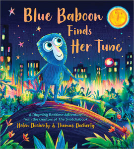
Picture Book Review: Blue Baboon Finds Her Tune by Helen Docherty

Author: Helen Docherty
Illustrator: Thomas Docherty
Sourcebooks Jabberwocky
6 September 2022
32 pages

This month’s PB review is by Ryan G. Van Cleave (Owner/​Operator of Only Picture Books) and Connecticut-​based author/​illustrator Abi Cushman.

–Ryan’s Review of the Writing–

In this simple rhyming book by Helen and Thomas Docherty, Blue Baboon shows up at a park where an animal music trio is jamming. Since Blue Baboon notices a bassoon just waiting there for someone to play it, she gives it a shot. Only she’s not musically talented, so Elephant yanks back the instrument.

A storm ends the scene, and leaves a drippy Blue Baboon wandering until she sees a hot-​air balloon. As the balloon goes up, up and away, Elephant hands her the bassoon as Blue Baboon sails off to a sand dune where she runs into Green Baboon–someone who appreciates her out-​of-​tune music at last. Why? Because Green Baboon croons out of tune.

The text is minimal–perhaps a few dozen words in total, with most of them rhyming with “Baboon.” As so often happens with such a strict adherence to rhyme, the story gets a bit illogical (like the sudden appearance of a monsoon, or how Elephant inexplicably gives away a bassoon), but overall, early educators and parents can use this book to introduce very young readers to colors, animals, musical instruments, and rhymes.

The selling point is the fine artwork and the cute animals, which I’ll let Abi discuss in full, though I’ll note that even I noticed the teensy red balloon with a heart in it on every spread. Charming.

All in all, it’s a fun, sweet book.

4.25 out of 5 pencils


–Abi’s Review of the Illustrations–

In Blue Baboon Finds Her Tune, Thomas Docherty’s playful illustrations are a real delight. They are bright, bold, and fun. I love the energy and vibrancy he instills in the nighttime city scenes and his expressive, endearing characters. With this sparse text, which is primarily driven by the sound of the words, Thomas does the heavy lifting when it comes to storytelling. Kids will not only enjoy watching Blue Baboon on her adventure, they will also have fun following the red balloon that drifts into the sky and makes its way into all the subsequent scenes.

With music being a major part of the story, Thomas was tasked with finding a creative way to SHOW music, and he does a wonderful job of this, portraying sounds–both harmonious and out of tune–with whimsical stars and colored lightning bolts. The expressions on the surrounding characters’ faces when Blue Baboon doesn’t quite hit the right note really amps up the humor in the story as well.

Thomas includes several hints in the illustrations of what’s to come. For example in the initial scene, we see a sign advertising Nighttime Balloon Rides. In the scene where Blue Baboon is playing the bassoon, we see part of a cloud rolling in. But I think he could have pushed this even further and included even more of these hints and Easter eggs in the illustrations. Perhaps we could have seen a peek of the umbrellas that were apparently behind the bear in earlier scenes or a peek of Green Baboon’s tail behind the dune.

One illustration that might get a lot of attention is actually located on the back endpapers. Thomas brings all the characters back in a hot-​air balloon scene, like the cat family who lost the red balloon and the ducks from the park. Kids will enjoy flipping back through the book to follow those characters’ storylines more carefully.

All in all, I found Thomas’s illustrations to be chock full of kid appeal, and I think young readers will enjoy poring over these pictures again and again.

4.5 out of 5 crayons


Abi Cushman is the author-​illustrator of Animals Go Vroom! (Viking), Soaked! (Viking), and Wombats Are Pretty Weird (Greenwillow), which hits shelves in summer 2023. She has also worked as a web designer for over 15 years, and runs two popular websites of her own: MyHouseRabbit.com and AnimalFactGuide.com, which was named a Great Website for Kids by the American Library Association. In her spare time, Abi enjoys running, playing tennis, and eating nachos. (Yes, at the same time.) She lives on the Connecticut shoreline with her husband and two kids.

For exclusive sneak peeks, wombats, and special giveaways, subscribe to Abi’s newsletter.

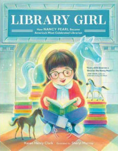
Picture Book Review: Library Girl: How Nancy Pearl Became America’s Most Celebrated Librarian, by Karen Henry Clark

This month’s PB review is by Ryan G. Van Cleave (Owner/​Operator of Only Picture Books) and longtime OPB friend, Austin McKinley.

—Ryan’s Review of the Writing—

Karen Henry Clark’s new picture book, Library Girl, shares the story of how Detroit native Nancy Pearl transformed her childhood love for books into a lifelong mission. From the start, Nancy was able to ignore how her peers teased her because her best friends were in books (“all those characters tucked into pages”). Clark cleverly uses bookish language throughout the text, such as how when the school librarian told Pearl about a nearby public library that was open on Saturdays, “Hope fluttered like pages turning in Nancy’s heart.”

Two sweet librarians at the public library encouraged Nancy’s imagination and her love for horses (Nancy had toy horses in her bedroom and she even imagined her bicycle was a horse named Charger). Though she hid her new library books to avoid more teasing, Nancy “read through rows of fantasies, trilogies, diaries, anthologies, dictionaries, histories, biographies, and mysteries.” And as so often happens to voracious young readers, all those stories led to this powerful realization–“I can be anything when I grow up.”

Nancy didn’t remain a solitary bookworm. When her librarian friends asked her to give a talk about horse books to the other kids, she couldn’t say no. Their belief in her was that strong, though she was understandably nervous. Even a spill on her bike en route to the library to give the talk didn’t spoil things. The other kids were “spellbound,” and when she was done, they clapped and the librarians “glowed.” I’ll let Austin talk about the art but I’ll add that many of the spreads have a magical glow to them, even when Nancy’s imagination isn’t being depicted in action.

After Nancy’s successful talk, the book fast-​forwards to where she has found her future as an adult librarian who helps other kids discover their own magic in books. An Author’s Note explains some of Nancy’s successes as a champion for books, reading, and libraries, though one of the most memorable moments is Nancy’s response to being challenged to write a six-​word memoir: “Girl discovers books, then discovers life.” The back matter also briefly lists awards Nancy won, books she wrote, and recognition she received.

While Nancy Pearl isn’t a household name, her sweet, empowering story will resonate with many readers. Book lovers, teachers, and librarians in specific will surely see some part of themselves in Library Girl.

4.5 out of 5 pencils


—Austin’s Review of the Illustrations—

It may seem obvious to say the work of an illustrator is to supply the “show” in “show and tell;” to provide tone and context beyond the reach of words alone. That’s exactly what Sheryl Murray’s depictions of the world of librarian Nancy Pearl’s childhood in the early 1950s accomplish.

Of the five books Murray has illustrated to date, Library Girl is the only one with a non-​fiction, biographical subject, but Murray’s fanciful sensibilities serve her well here, infusing Nancy’s experience with constant companions in sparkling azure shades, especially horses. Each scene is suffused with a magical pastel glow, a consistent palette perfectly suited to the romanticism of Nancy’s imagination. We would be remiss, however, if we failed to appreciate the subtle clues that set the mise en scene firmly in its historical context–the rolled-​up jeans, the milkman, and who could fail to be inspired by the palatial renderings of Detroit’s Parkman Branch Library?

An author herself as well as an illustrator, Murray’s firm grasp of visual storytelling are on dramatic display here. Beyond the warmth and approachability of Murray’s style, her framing and inclusion of evocative elements of the narrative add a textural richness to the reading experience: the dotted line of the map to the library, the bird landing nearby when the text mentions fluttering pages. The pulled back pictures that underscore Nancy’s emotional state when she feels small and insecure, the shots over her shoulder that put us in her black and white saddle shoes, which is especially appropriate in the story of a librarian who famously encouraged everyone in Seattle to read the same book at the same time. Murray’s illustrations allow us to see through Nancy’s eyes without telling us exactly how to feel. They give us permission to ask ourselves–as Nancy’s librarian mentors do–what helps us feel brave?

Nancy Pearl’s accomplished career as a librarian focused on outreach has been about understanding through shared experiences in books, and Murray’s charming compositions help enrich just such an experience for us–the readers of Nancy’s story.

4.5 out of 5 crayons


Austin McKinley makes comic books, cartoons, movies, video games, screenplays, novels and novellas through his company, Flying Car. He shot and appeared in the award-​winning feature documentary The New 8‑Bit Heroes alongside director Joe Granato. His comic illustrations have also been published by Image Shadowline, Devil’s Due/​1st Comics, Alias/​Blue Water Press, Avatar, Boom!, Blue King Studios, and FC9. He wrote and illustrated Squareasota, a weekly cartoon in the Sarasota Herald-​Tribune for seven years.
Most recently, he illustrated Tales of Mr. Rhee vol. 5: Rockstar Paranoia, a graphic novel for Source Point Press.

Picture Book Review: Life in Hot Water by Mary Batten

Life in Hot Water: Wildlife at the Bottom of the Ocean
Author: Mary Batten
Illustrator: Thomas Gonzalez
Peachtree
21 June 2022
40 pages

This month’s PB review is by Ryan G. Van Cleave (Owner/​Operator of Only Picture Books) and author-​illustrator Bonnie Kelso, a very good friend of the OPB family.

Ryan’s Review of the Writing

Mary Batten’s new picture book, Life in Hot Water: Wildlife at the Bottom of the Ocean, takes readers on a deep dive into one of the most extreme environments on Earth–hydrothermal vents. While a nonfiction look into an environment could easily be bland, Batten works to find beauty both in the subject matter and the language she uses to describe it. For example, phrases like “gushing plumes of superhot fluids” help nature come alive in ways kids might enjoy almost as much as Gonzalez’s evocative illustrations.

Batten also makes use of text placement such as how she describes the descent of a 1997 HOV (human-​operated vehicle) called Alvin:

Life in Hot Water helps readers understand that prior to the deep-​sea dives where these vent ecosystems were found, people believed that complex ecosystems could only thrive with sunlight and green plants. The basis for all food chains HAD to be photosynthesis. But after seeing life thrive in such a harsh environment without sunlight or green plants, scientists realized how wrong they were. In fact, this AHA moment–finding underwater vent ecosystem that were powered by chemicals inside the Earth–is “one of the most important discoveries of the twentieth century.”

In addition to offering lots of specific scientific facts (the temperatures that vent bacteria could live in, the difference between black smokers and white smokers, how there are 650 vents around the world, etc.), Batten also includes quotations both short and long from a range of scientists to help give voice and character to the discoveries that otherwise might feel didactic.

Kids who like icky or weird things will be drawn to facts such as: “Sharing the snail’s environment are crustaceans called Hoff crabs that have no eyes. They get their food from bacteria living in their chest hairs.” There’s also interesting medicine-​focused information such as how an antibiotic has already been made from the Pompeii worm’s bacteria or how the study of a specific enzyme led to the creation of a coronavirus test.

One thing I particularly appreciate is how Batten uses back matter. A book with this much science behind it could easily wax scientific in great length and detail after the main story, but it doesn’t. Readers instead get a readable two-​page, 10-​point “Learn More About the Deep Open” list along with a lively one-​page Author’s Note and a brief Glossary.

This will be a good addition for any school, library, or science lover.

4.5 out of 5 pencils


Bonnie’s Review of the Illustrations

Thomas Gonzalez’s atmospheric illustrations in Life in Hot Water: Wildlife at the Bottom of the Ocean capture a bizarre and seldom seen ecosystem that thrives at extreme depths. Using pastels, colored pencils, and an airbrush, Gonzalez masterfully portrays a craggy sea floor bursting open from rising geothermal steam. A sense of unworldly chaos is expressed through highly textured plumes of gray silt rising like geysers into an inky abyss. Mysterious eyeless alien-​like creatures cling to the crusty vents, feeding on nutrients or perhaps each other! Feathery tube worms, blind crabs, and iron-​clad gastropods cluster about in one intriguing spread where light shines into the distance, highlighting the blurred ripples of a rising thermocline.

Gonzalez does a great job of handling Mary Batten’s lengthy but fascinating text. He manages to achieve spaciousness even when illustrating hundreds of tube worms piled on top of each other. Each worm moves with the current, directing the viewer’s eye through the spread’s dynamic landscape. In another favorite spread, a lone amphipod floats on a spacious black background, stretching its body toward the life-​giving warmth of a nearby hydrothermal vent.

Even when depicting humans inside a submersible or on the deck of a research vessel, Gonzalez stays within his limited color palette and finds ways to continue his use of rich textures and dramatic lighting. Overall, this is a fabulous follow up to Life in a Frozen World: Wildlife of Antarctica and I can’t wait to see the next book in this series. I was the kind of child who would pore over books like these for hours. I know there are many children out there who will also enjoy dipping into this mysterious “hot water” world.

5 out of 5 crayons


Bonnie Kelso is a huge fan of everything ocean. She once dived off the coast of an active volcano and witnessed the awesomeness of CO2 vents up close and personal.

Bonnie’s debut informational fiction picture book Nudi Gill, about a feisty sea slug, releases March 2023 by Gnome Road Publishing. She is currently completing the final illustrations for In a Cave by Heather Kinser, also to be published by Gnome Road Publishing in 2023.

A graduate of the Rhode Island School of Design, Bonnie’s past experience in art spans a spectrum, from abstract painting on canvas to museum-​quality exhibit design. She has worked with clients such as the Smithsonian, National Geographic, and NASA.

She lives in Las Vegas with her partner, two sons, and an unruly cat. To learn more about Bonnie’s work, please visit www.BonnieKelso.com.

Picture Book Review: Growing An Artist by John Parra

Growing an Artist: The Story of a Landscaper and His Son
Author: John Parra
Illustrator: John Parra
Simon & Schuster/​Paula Wiseman Books
10 May 2022
40 pages

This month’s PB review is by Ryan G. Van Cleave (Owner/​Operator of Only Picture Books) and Florida author-​illustrator Loreen Leedy, a friend of the OPB family.

Ryan’s Review of the Writing

In Growing an Artist, author/​illustrator John Parra shares the first time he finally got to go to work with his dad, a landscape contractor. After picking up Dad’s helper, Javier, the three headed to a house that had a wild yard. From his dad, John (“Juanito”) learned some of the tricks of the trade, such as shaping and trimming bushes, and mowing perfect lines.

This fun, proud moment for young John was darkened when he noticed a schoolmate (Alex) in a nearby house purposefully ignoring him. It didn’t make sense because at school, the two boys always talked. It’s not said in the text, but it’s easy for adults to infer that the boy was literally and metaphorically looking down on the yard workers–the art communicates that clearly. Yet John couldn’t quite figure that out at the time, though something about it really bothered him.

Already an artist, though, John noticed a nest of baby birds and sketched what he saw. But he still fretted about Alex ignoring him. As John ate Mami’s famous burrito (chorizo, avocado, and egg) while on a lunch break, he asked his dad if he’s proud of his job, almost as if voicing the disapproval Alex must feel.

Dad responded with: “You have to work hard and sometimes you are treated like you are invisible, but when you do something you love and get to be creative, you feel proud.” Dad might as well be talking about being an artist instead of being a landscape contractor.

The other stops in the day were rewarding and pleasant, and the people they met were the opposite of Alex–happy to see the team. Mr. and Mrs. Carroll in particular were quite excited. “Together [with John’s dad] they discuss how to transform the overgrown yard into a special place.” With his artist’s way of thinking, John realized, “I look around and start to see its potential too.” Later that night at home, John used his budding artistic skills to create his own landscape design, which his father loved and planned to use for the Carroll’s yard because the Carrolls loved it, too.

The conclusion of the book might as well serve as John’s artist manifesto: “I will use my art to tell the stories of hardworking, passionate people who make the world more beautiful.” The recurring memory of a disapproving Alex is lost to the passion of this final statement and his commitment to a life of creativity, beauty, and purpose.

An Author’s Note details how John’s father launched the landscape business after serving in the United States Army, and how John worked alongside him for twelve years before taking illustration and fine art classes in college and embarking on a career as an artist.

There’s a lot of room for discussion here beyond the scope of what many picture books offer. Being proud of your parents and what they do for a living. Not making snap judgments or being overly worried about what your peers think. How encouragement can grow a passion into one’s life’s work.

Ultimately, Growing an Artist is an intriguing book that would be a nice addition to libraries and private collections.

4 out of 5 pencils


Loreen’s Review of the Illustrations

Blueprints of a landscaping design serve as endpapers for Growing an Artist, foreshadowing a big project to come. Young John narrates the action when he accompanies his father on the job for the first time. The crisp, hand-​painted illustrations have plenty of details for readers to enjoy, including a variety of plants, animals, and people as well as the tools and machines of the trade.

After picking up Javier, the three drive to several houses to mow, trim, and spruce up the yards. They buy a special rose at the nursery and drop off the yard waste at the city dump to be recycled into mulch. John draws several pictures in his sketchbook along the way. When a new plan is needed for a couple’s overgrown yard, he assists in creating the new design as well as helping to put the plants into the ground.

Every 2‑page spread depicts one scene (with one exception where a left and right page show different scenes.) This allows for expansive views of the nursery, the city, and the yards where the work takes place. The well-​chosen color scheme enhances the lively paintings.

One critique is that the text is long winded at times, including unnecessary information that slows down the narrative and sometimes does not sound like a child narrator (e.g. “Papa demonstrates how to shape and trim bushes.”) Some particulars could have been shown in the illustrations or just left out. For example, the sentence about the “registration booth” at the dump is not needed.

In the end, the charming sketches by the young boy revisit the various events and support his conclusion that making the world a more beautiful place is important work worth celebrating.

4 out of 5 crayons


See the source image

Loreen Leedy is the author-​illustrator of more than 40 popular picture books that have received many rave reviews and honors. Her titles such as Measuring Penny, Amazing Plant Powers, and Crazy Like a Fox: A Simile Story often include math, science, and language arts content. Her most recent book, Step by Step, features footprints made by baby animals including a puppy, duckling, and fawn in a page-​turning question and answer format. It makes an appealing nonfiction choice for preschool, kindergarten, and first grade age levels.

To see Loreen’s work and download free book activity printables, please visit www.LoreenLeedy.com.

Picture Book Review: Sunflower Sisters by Monika Singh Gangotra

Author: Monika Singh Gangotra
Illustrator: Michaela Dias-​Hayes
Owlet Press
6 July 2021
28 pages

This month’s PB review is by Ryan G. Van Cleave (Owner/​Operator of Only Picture Books) and freelance illustrator Edna Cabcabin Moran.


–Ryan’s Review of the Writing–

Right from the start, Monika Singh Gangotra’s picture book Sunflower Sisters leans into its primary topic–colorism (favoring light skin over dark skin). It’s not something often addressed in picture books, which is why I was so interested in reviewing this book.

Skin color comes up in the first scene because a pair of friends, Amrita and Kiki, each have older siblings who are getting married (not to each other). They’re playing outside, but as soon as the guests arrive, Amrita’s Aunty tells them to go inside because it’d be a bad idea to get a tan right before the weddings. It’s subtle, but that’s the first nod toward lighter being better than dark (from her perspective).

Once the children are in the house, Jas–Amrita’s sister and soon-​to-​be-​bride of Shahid–is wearing cream to “make my skin look fair and bright.” Mom isn’t having that. She wipes it off and assure her daughter that she’s beautiful as is.

During bathtime, Amrita’s mom talks with her about a number of old wives tales, such as avoiding tea because it might make her skin lighter. “That’s ridiculous,” Amrita says with the wisdom of a child. And her mom agrees, assuring her–and the reader–that everyone’s skin is perfect regardless of its color. Light, dark, or any shade at all, it’s “EXACTLY as it is meant to be.”

Amrita’s Aunty clearly has outdated beliefs and customs. In addition to having given Jas the skin-​lightening cream, she’s urging Amrita not to wear yellow because its brightness will only make her skin look darker. With the support of her mother–who doesn’t share the same beliefs as Aunty–Amrita wears yellow to her sister’s wedding.

As chance would have it, Kiki’s family is celebrating their own wedding on the other side of the street at the exact same time. Amrita notices Kiki is wearing bright colors, too. “Sunflower sisters!” they shout, promising to make each other feel like sunflowers every day. The final wordless images show a flash forward to the two kids owning their own clothing store and making runway-​worthy sunflowery clothes.

A single page of back matter addresses the idea of colorism in a clear, helpful manner that’s suitable for young readers.

The best lines in the entire book happen when Amrita gets ready for for some before-​bed tea after her bath, and Dondi says, “Yes you really are beautiful like the leaves in autumn. Do you know people travel from miles around to see the browns and golds of the changing leaves? It’s a marvel, just like you.” That’s lovely and empowering. Clearly not all adults are as locked into old ideas and traditions as is Aunty.

For those wanting more of a plot, they might find the book wanting since both children don’t have a lot of agency. The conflict here is ideological, but not one Amrita really faces firsthand since she is fully supported by Mom in every instance. While that’s a terrific thing in life, it’s less useful to include always-​there, always-​supportive adults in picture books since most readers want to see kids solve (or at least try to solve) their own problems. Also, there are a lot of characters here–two named neighbors, two kids, parents, other adults, wedding guests, etc., plus Amrita is also called “Beta,” so it’s possible independent readers might get confused, though the pictures might help them through those moments.

But make no mistake–the topic of colorism is book-​worthy. In an interview about Sunflower Sisters, the author explained her motivation behind the book and how she grew up with the underlying fear that if she became darker skinned, she’d be unworthy of love and unable to obtain success. “I was advised when attending social South Asian events that certain colours, such as yellow, would make my skin look darker and that I should probably choose another colour, no matter how much joy wearing it would bring me. These comments made by loved ones and strangers alike were not malicious. The comments and guidance were always well meaning and not intended to hurt us. They were done so because they thought they were protecting us and helping us live a life full of opportunity – ones that we would simply not be offered if our skin was darker.” To see the rest of the interview, check it out at My Book Corner.

In sum, the book has two weddings (fun!), two cool kids (fun!), and lots of terrific artwork (fun!). Plus, the story deals with a little-​talked-​about topic in an appropriate, empowering way. Those things alone merit consideration for this book being added to your To-​Read list.

3.75 out of 5 pencils


–Edna’s Review of the Illustrations–

The picture book, Sunflower Sisters, is bedecked in vibrant colors emanating from collage-​infused, stylized illustrations. Artist Michaela Dias-​Hayes creates charming characters set in stage-​like scenes in a tale of beauty standards and friendship told by Monika Singh Gangotra. But there is more to Dias-​Hayes’ use of buoyant, fun colors. Before color is even mentioned in the story, Dias-​Hayes suggests yellow as something beyond artistic element or device. I’d venture to say that Dias-​Hayes uses yellow as a character itself in the story.

In the opening scene, we see clusters of yellow sunflowers along the sides of the house and near the front entrance–an homage to the title of the book. Subtle yellow paint textures the house that serves as a backdrop for strings of yellow and white lights. The house’s triangular features on the upper level is painted golden yellow. It occupies the center of the page like an arrow pointing up to the sky, perhaps alluding toward higher ideals.

We are brought in a bit closer to characters on the opposite page which depicts Amrita, the main character, hugging her visiting aunt who advises that Amrita come in “out of the sun.” They are framed by splashes of yellow from sunflowers, Kiki’s dress, and a multitude of stringed bulbs dangling down from the house and along Amrita’s dad’s shoulders.

Then yellow is used sparingly–quieted down–in subsequent page spreads as Amrita receives both direct and subtle messages regarding dark skin tone versus whiteness–misleading, negative notions from older female relatives. On a shopping excursion, Amrita expresses her preference for dressing in yellow “like the sunflowers” and several aunties are depicted gasping with disapproval on a page devoid of the color yellow. “YELLOW?” they say, “With YOUR complexion?”

The story switches to a positive direction when Amrita’s Mom brings out a yellow “lehenga” outfit from her girlhood and gives it to Amrita to wear. Dias-​Hayes takes the color yellow into high gear transporting Amrita and her mom to a field of sunflowers–a jubilant page filled with golden yellows.

In contrast with its earlier single page scenes, the remainder of the book is comprised of scenes spanning the length of each spread–from Amrita’s sister’s wedding and the neighbors’ wedding scenes to the final fashion catwalk scene. All are resplendent in subtle touches of yellow glowing in the background while foreground colors host bright, bold yellow markers directing our eyes around the spread.

My only critique of Dias-​Haye’s illustrations is the uneven anatomical features and character proportions. There is a look and feel of characters being created separately and pasted into place like paper dolls. But these are minor details in the scheme of things. Dias-​Hayes has a strong design sensibility with a charming style. Through her expert use of color we are treated to a world that is bright and fun, bouncing with energy, while also grounded in a compelling color story filled with hope and gravitas.

4.5 out of 5 crayons


Edna Cabcabin Moran is an author/​illustrator, multi-​disciplined artist, educator, and advocate for youth voices and diversity in publishing. She is also a dancer with acclaimed hālau hula and dance company, Nā Lei Hulu I Ka Wēkiu, and a teaching artist specializing in STEAM and integrative arts. She has served on several nonprofit committees including We Need Diverse Books and Alternative in Action’s Project Youthview: The Power of Youth in Film.

A Filipina-​American born to immigrants and raised in a military family, Edna grew up in the USA’s east and west coasts, Iceland, and Hawai’i. She resides in the SF Bay Area where she’s written and/​or illustrated for children’s literature and poetry anthologies. Her latest picture book title, Honu and Moa (BeachHouse Publishing), received an 2019 Aesop Accolade from the American Folklore Society.

https://kidlitedna.com

IG & Twitter: @kidlitedna


Picture Book Review: Miguel’s Community Garden

Author: JaNay Brown-​Wood
Illustrator: Samara Hardy
Peachtree Publishing
1 March 2022
32 pages

This month’s PB review is by Ryan G. Van Cleave (Owner/​Operator of Only Picture Books) and longtime OPB friend (and Ringling College of Art and Design Illustration Professor) John Herzog.

–Ryan’s Review of the Writing–

I got interested in this book via the cover and story concept even before I realized it was the second book in a series (Where in the Garden?). Regardless, the book works fine on its own, though I have to say that it’s best suited for a very young audience due to its straightforward, simple plot and use of basic language and concepts. I say this in the most positive way–there’s a decidedly Mr. Rogers feel to lines such as: “Today, Miguel must find his sunflowers for his garden party. What do we know about sunflowers?”

The reader is invited to join Miguel and his pet tortoise on their journey to find a sunflower to decorate the Community Garden Party. That’s not as easy as it sounds because the garden is full of plants, so Miguel needs a hand with identifying them. He carefully examines eight types of plants before his criteria for what makes a sunflower a sunflower finally matches what he sees before him. The STEM focus of paying close attention to the attributes of a living thing might generate interesting discussions during or after the reading.

I’m also charmed by how Miguel isn’t daunted in his task when a quick rainshower arrives. He just tugs up his yellow rain slicker and keeps examining the characteristics of the plants before him. It’s hard not to smile, too, at how the tortoise sneaks off to take a happy chomp out of the spinach. Somehow, Samara Hardy has found the visual secret to making fruits and veggies look scrumptious, as that tortoise is proving right there on the page. He’s having a total blast with those leaves!

One of the clear strengths of this book is the repetition of key words that allow young readers to gain lots of useful read-​aloud practice. While some of the plants might be a bit exotic for some kids–I’m looking at you, artichokes and mulberries!–their names won’t be overly challenging. The art provides helpful visual context, as well.

For those who want an adult-​guided extension activity, the book includes the recipe for Sunflower Seed Salad. Normally, I ignore recipes in kid books, but something about this one makes me seriously want to give it a try. Perhaps it’s the luscious art throughout, or the delicious visuals on the end papers?

Quite simply, the book is charming and the which-​plant-​is-​it? plot is compelling enough for this age range. Add in the art that’s just teeming with life on nearly every page, and this is a worthwhile, lively book.

4.25 out of 5 pencils


–John’s Review of the Illustrations–

Miguel’s Community Garden is a pleasant surprise for me. I must admit that when I looked at the cover, I had my own preconceived notions regarding what the book would be about and what the main conflict would be. It’s easy for me to let that cynical, “Oh, I know what this is going to be because I know everything” side of me emerge just by looking at the cover. However, after reading it, that attitude took a back seat and was replaced with a very gratifying sense of discovery and joy, and the old adage really hit home:

Don’t judge a book by its cover.

While Miguel’s Community Garden does skew towards a younger audience (two- and three-​year-​olds will be in rapture) it doesn’t ever pander to them–in both the writing and the illustrations. I’ve ranted about this in a previous review here on Only Picture Books. We’re on this journey of discovery and learning with Miguel, a pleasant little boy who is simply trying to find some sunflowers for a garden party at his local community garden. We learn, along with him, about various fruits and vegetables and how they grow. And we even get a recipe for a sunflower seed salad at the end, connecting nicely with the main conflict of the book.

While the illustrations were created digitally, they implement a wonderful, Eric Carle-​like sensibility with rich, tangible textures and vibrant colors. There is beauty in the simplicity here, and Samara Hardy’s lovely illustrations complement that notion well.

The whole book is meditation on the beauty of simplicity, really. Simple ingredients, simple situations, simple storytelling… But don’t let that fool you. It’s incredibly difficult to distill something down to its simplest form while keeping it relatable and understandable. It’s easy to clutter up deficiencies with detail, and Hardy and author Janay Brown-​Wood avoid that completely here.

My only critique is that parents and older children may not find the book as engaging due to the subject matter. No doubt this is territory they’ve trod before. However, younger kids–and parents who are kids at heart–will thoroughly enjoy learning about various fruits and vegetables with Miguel. Personally, I found it a lovely change of pace to read a picture book that isn’t trying to tackle big, existential themes. It’s also incredibly fun to look at thanks to Hardy’s wonderful illustrations.

4.5 out of 5 crayons


John Herzog is an illustrator and educator. He has created work for Scholastic, Houghton Mifflin Harcourt, Little, Brown and Company, Highlights for Children, DreamWorks TV, and Hasbro. He also teaches illustration at Ringling College of Art and Design.

John is a member of the National Cartoonists Society and the Society of Children’s Book Writers and Illustrators, where he received the 2018 SCBWI Magazine Merit Award. He lives in Florida with his family.

John is represented by Kayla Cichello at Upstart Crow Literary.