Picture Book Review: Mommy’s Hometown by Hope Lim

Author: Hope Lim
Illustrator: Jaime Kim
Candlewick
12 April 2022
32 pages

This month’s PB review is by Joshua Walls (an OPB newcomer!) and longtime OPB friend, Austin McKinley.


—Joshua’s Review of the Writing—

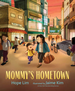
Hope Lim’s third picture book, Mommy’s Hometown, shares a timeless story about a young child who travels overseas with his mother to visit her childhood hometown in South Korea. Despite his surprise at discovering how much her town has changed since she left, he can still relive his mother’s memories while creating new ones with her.

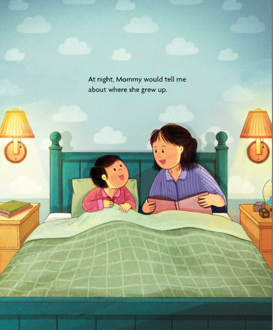
Every night at home, as part of their bedtime routine, the mother paints vivid pictures of her memories for her son. “She and her friends would walk to the river and play there all day. They caught fish, unearthed treasures beneath rocks, splashed each other, and dried themselves on the pebbled riverbank.” As a boy, I dreamed about where my family members grew up, and even today, I still do this with my friends living abroad, creating colorful images in my mind. When a story tugs at your memories, you know you’re in for a treat.

After listening to all his mother’s stories, the day finally comes for the boy to visit the town he has only imagined. Upon arriving, however, he discovers that it’s different. The little town he pictured has become a bustling city. “The new replaced the old,” his mother explains. The son doubts it’s the same place his mother grew up, but with help from his family, he overcomes uncertainties and discovers the town he envisioned in the present.

I adore how the story ends. The son and his mother visit the river where they play together, and the son discovers his mother’s younger side. Then, hearing Grandma call to them, the boy and his mother “run home together,” allowing the reader to reflect on the joy of shared moments. I’ll let Austin go into detail about the art, but I love the final illustrations of the mother and son, both as kids running home through the town the boy always imagined. The last page slowly resets back to reality, with both characters clearly having the time of their lives. These three pages make an already compelling story even more impactful.

Lim uses simple language that’ll make the reader finds themselves wanting to share their childhood tales as they tell her story. The son’s character arc is delightful. While it never hurts to get help, the boy shakes off his doubts and accepts the town’s changes, allowing him to build his own childhood memories. His experiences provide wonderful discussion opportunities. The reader can reassure a child that changes may happen, but change is okay. While things may not always be as we imagine, we may discover they’re even better.

Lim narrates a gentle, heartfelt story that I absolutely loved reading. It reminds me a lot of my hometown, Duluth, Georgia, and how it continues to evolve from a small Atlanta suburb into a prosperous, diverse community, rich in its own history. Mommy’s Hometown captures how places may appear different than described. It’s wonderful when a picture book taps into a timeless theme. I look forward to one day reading this story with my own curious child.

4.75 out of 5 unearthed treasures


—Austin’s Review of the Illustrations—

It’s the trip of a lifetime for the child narrator, as he discovers the world of his mother’s bedtime stories is neither as he imagined nor as she described them, because time has moved on. As Hope Lim crafts this tale of a child first confronted with the four-​dimensional shape of the world, illustrator Jaime Kim brings the experience to life in a series of lush two-​page spreads and sequential vignettes which give a subtle glow to both natural and urban landscapes.

Kim is a #1 New York Times bestselling illustrator, and it’s easy to see why. Her figures are universal, simplistic, yet evocative–all that’s necessary to imagine ourselves in their place. The characters are, in a sense, background to the lovingly rendered environment. And yet, when she depicts the child and mother at the same age, running through the laneway hand in hand, its emotional impact is devastating.

By contrast, the landscapes are very specific, but with masterful depth of field, they create just enough detail and texture to make them visceral and sentimental without being saccharine. It’s a genuine experience to which we can easily relate as a child first learns to contemplate the impermanence of life–those things that are timeless, and those that are not.

The pairing of Kim’s paintbrush with this weighty, poignant subject matter is pitch perfect. Perhaps the most so of any of her fifteen books to date. Her eye for creating a toy-​like world and playing with perspective without tilt-​shifting into miniaturization, is on glorious display here. Having seen her realize Lim’s narrative, one can hardly imagine anyone else doing it so well. Readers are so deftly embedded in the world of the artwork that they can almost feel the winds of change blowing through the characters’ hair. Exquisite.

**For an idea of what that looks like, you can check out Kim’s deliciously charming illustrations in animated GIFs on her website.**

5 out of 5 crayons


Joshua Walls is a children’s author and travel writer who isn’t afraid to fuse, challenge, or deconstruct genres in the pursuit of creating compelling stories. Currently, he lives in Sarasota, FL where he’s pursuing a BFA in Creative Writing at Ringling College of Art and Design. He’s also the co-​founder and co-​host of the Fluff It podcast.


Austin McKinley makes comic books, cartoons, movies, video games, screenplays, novels and novellas through his company, Flying Car. He shot and appeared in the award-​winning feature documentary The New 8‑Bit Heroes alongside director Joe Granato. His comic illustrations have also been published by Image Shadowline, Devil’s Due/​1st Comics, Alias/​Blue Water Press, Avatar, Boom!, Blue King Studios, and FC9. He wrote and illustrated Squareasota, a weekly cartoon in the Sarasota Herald-​Tribune for seven years.
Most recently, he illustrated Tales of Mr. Rhee vol. 5: Rockstar Paranoia, a graphic novel for Source Point Press.

Picture Book Review: Overground Railroad by Lesa Cline-Ransome

Author: Lesa Cline-​Ransome
Illustrator: James E. Ransome
Holiday House
11 January 2022
32 pages

This month’s PB review is by Ryan G. Van Cleave (Owner/​Operator of Only Picture Book) and freelance author/​illustrator Kelly Light.

–Ryan’s Review of the Writing–

Whenever I see a husband-​wife team do the authoring and illustrating on the same picture book, I’m kind of in awe because it just wouldn’t work for most couples. But for Cline-​Ransome and Ransome, it’s a terrific pairing, as we’ve seen with their collaborations on such fine books as The Power of Her Pen: The Story of Groundbreaking Journalist Ethel L. Payne, Game Changers: The Story of Venus and Serena Williams, and Before She Was Harriet.

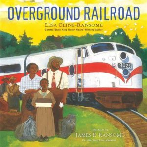
With this latest collaboration, Overground Railroad, they’re revealing another vital story from African American history. In this story, a young narrator (Ruth Ellen) is taking the Silver Meteor train north with Mama and Daddy to find a new home, a new life, and a new future.

The story is essentially Ruth Ellen recounting her own journey in the Great Migration–the post-​Civil War time when millions of African Americans left the South–through prose that’s poem-​like at times which allows Cline-​Ransome to highlight key words and ideas through lineation choices, as you can see here:

I watch the track
in front of me
and behind me

just as far as the eye can see.
Mama and Daddy say
job
education
freedom
are waiting in New York for us.

Before she left, Ruth Ellen’s teacher gave her a copy of Narrative of the Life of Frederick Douglass, which she reads along the way. As she journeys from a life of oppression to the shining promise of the North, Ruth reads and learns about the social reformer and abolitionist Frederick Douglass. Despite her age, Ruth Ellen finds connections between her life and his all on her own, noting that it’s “the story of a boy /​ leaving behind what he knew /​ and heading to what he don’t /​ just like me.” She also reads aloud from the book, and the changing scenery outside often links up in powerful, symbolic ways.

The various stages of the journey are also effectively punctuated by the conductor calling out the stops (“Next Stop Baltimore, Maryland!” etc.). Though from the start, we’re rooting for Ruth Ellen’s family to finally reach that last stop, which might just be The Promised Land, or so Ruth Ellen hopes.

Upon reaching New York City at last, we see imagery payoff, as Ruth Ellen notices stars the way that Douglass had the North Star guiding him in his own travels. But Ruth Ellen doesn’t just encounter one star. Instead, the last spread shows her “stretch my neck to see /​ bright lights /​ tall buildings /​ shimmering against a sky /​ bright as a hundred North Stars.” What a lovely, satisfying moment.

In this book, Cline-​Ransome doesn’t shy from presenting that challenges Black people faced during this moment in history. It might get emotional for some readers to witness how white people in the white train cars frown upon those who come from the Colored section. But Cline-​Ransome gives us–and Ruth Ellen–hope with phrases such as “we keep walking /​ until we find /​ smiles /​ from new neighbors.”

This is a visually lovely book (I’ll let Kelly explain why the illustrations are so apt) whose story has impact and importance. And, if you’re like me (or even Cline-​Ransome, who admits in the Author’s Note that she didn’t know about the Overground Railroad until doing her own research), you can learn all about the Overground Railroad itself and get a sense of its place in history.

4.5 out of 5 pencils


–Kelly’s Review of the Illustrations–

In Overground Railroad, James Ransome takes our eyes on a journey with his spellbinding illustrations. Let me explain.

I encourage everyone to use watercolors. The pigments absorb into the paper differently depending on how much water you use or what kind of brush you use: round, flat, wet, dry, or even frizzled. The results change with how much paint has been soaked in the pan with water before you dip into the color. If your paper is dry, the color takes differently than if the paper was wet. Watercolor carries with it an element of unpredictability that can ruin an image, or, in the right hands, what watercolor does can be magic.

Washes, which are larger areas of the paper where a good amount of water was used to move the pigment around, are the wild card when painting in translucent media.

And Ransome’s washes are MAGIC.

Overground Railroad has so many moments of this watercolor magic. I am looking closely at the illustrations and seeing a bit of mixed media. There is collage. There is drawing underneath the paint that is popping through. There is also drawing into and on top of the watercolor. Some of the color is intense, which leads me to believe there is a mix of watercolor and either inks or dyes. Layering these translucent media can give the intensity of color seen in the book’s trees and skies and buildings. The blues and greens ooze out cool tones in contrast to the warmest, loveliest golds, ochres, browns, and my favorite, the pink skies.

I could go on about the media, but I want to talk about the characters and the drawing and the design of this beautifully visualized picture book of a family’s brave journey to a better life. The first design element that made my eyes happy was the white cotton depicted on the endpapers that we are looking through. The un-​outlined shapes are bold and pure solid white, and its right in our faces as we peer over the stalks to see images of people leaving. Turn the page and there is a field of pure white shapes leading the eye back to a speeding train in the distance. Before we start to read, we have a feeling that a journey is about to begin.

The very first spread of the book begins, “Some walked. /​ Some drove. /​ But we took the train North” and it’s paired with a gorgeous pink sky. It also has the faces of eight expectant Black people waiting for a train to take them from the cotton fields and to a place where they never have to pick it again. The father’s shirt, just slightly yellow in the early dawn light, and the box in Ruth Ellen’s hands simply glow off the page. Here is color composition to allow your eyes to wash over. That sliver of acid yellow on the left, the yellow on the ticket booth, and the glow in the front on the clothing of the family is the sun coming up. Perhaps the dawning of hope?

What moves the eye around the page are the patterns used on the clothing and the bags. Florals, ginghams, stripes, and plaids are used in bold and flat ways. These elements help the washes do that magic but exist in stark contrast of flat color. The detail that Ransome puts into his illustrations is where it needs to be in the faces, which perfectly express mixtures of hope, worry, determination, and wondering what will be next. Every drawn line is as much and as little as it needs to be. Restraint is the word I am searching for. That is when an artist is well seasoned, when an artist knows when to stop and let the image have space to breathe and the viewer’s eye to have spots to rest.

In Art School, we learn to squint at an image to blur out the detail and get the large shapes and values in the composition. While Ransome teaches illustration at my own alma mater, Syracuse University, I was not young enough to have had him as an instructor, though he must be a brilliant teacher of the squinting method. His pink sky in front of the house at dawn, when squinted at, is so vividly real to anyone who ever woke up that early, when the light is so low and all you can perceive is temperature and shape. The abstraction on this spread as well as the spread that is a distant view over the cotton field teases our eyes to see that pattern is everywhere. Turn the page and there are patterns galore!

Patterned trees and birds outside connect back to Ruth Ellen. Check, floral, gingham, homespun–the very fabric of Ruth’s life goes by outside the train as she wonders what her life will look like in the city. Ransome finds ways to weave in the brightest yellow and bold white shapes with the coolness of the blues that take us through a train that has crossed the line that divides South from North. The cool blue inside page turns into the cool river being crossed and into the night sky over Frederick Douglass and into the window surrounding Ruth Ellen’s smiling face as she arrives at New York City. Daddy and Mama share a relaxed moment before twinkling windows and stars and all of the blue paint envelops Ruth Ellen in what lies ahead as she steps out onto the streets of her future.

As an illustrator, one never stops learning. Learning from fellow artists, especially artists who work differently in style and media, is a never-​ending joy. This book took me on several journeys of learning, and I am grateful to the Ransomes for the chance.

4.5 out of 5 colored pencils


Kelly Light lives in Amherst, MA but grew up down the shore in New Jersey surrounded by giant pink dinosaurs, cotton candy colors, and Skee-​Ball sounds. She was schooled on Saturday-​morning cartoons and Sunday funny pages. She picked up a pencil, started drawing, and never stopped.

Kelly is the author/​Illustrator of the Louise series. Louise Loves Art and Louise and Andie, The Art of Friendship are the first two picture books in the series. Louise Loves Bake Sales and Louise and The Class Pet are the first readers in HarperCollins’ I Can Read program.

Kelly has also illustrated Elvis and the Underdogs and Elvis and the Underdogs: Secrets, Secret Service, and Room Service by Jenny Lee, and The Quirks series by Erin Soderberg.

Website: www.kellylight.com

Picture Book Review: Hamsters Make Terrible Roommates by Cheryl B. Klein

Author: Cheryl B. Klein
Illustrator: Abhi Alwar
Dial Books for Young Readers
2 November 2021
32 pages

This month’s PB review is by Ryan G. Van Cleave (Owner/​Operator of Only Picture Books) and longtime OPB friend Austin McKinley.


—Ryan’s Review of the Writing—

I can’t help but think of The Odd Couple as I read Cheryl Klein’s new picture book where we find an introverted hamster and an extroverted one trying to co-​exist. Or perhaps a more season-​appropriate comparison is the movie Elf, where an over-​exuberant elf character, Buddy (brilliantly played by Will Ferrell), can’t easily win over his grumpy father (played by James Caan) who has more “important” stuff to do and just wants to be left alone.

In Hamsters Make Terrible Roommates, Hamster Henry is downright unhappy at having to share the cage with Hamster Marvin, who’s just endless joy and enthusiasm and talk-​talk-​talk (“Seeds! Seeds are my favorite!!!”). Poor Henry hasn’t had a day of peace in two hundred and five days–he’s sure about that, because he’s keeping track. Marvin simply loves to do everything Henry does not. Talk in the tunnel. Talk when they’re munching hamster kibble. Talk when they’re running on the wheel.

Henry finally has had it up to his hamster neck. On day two hundred and six, he blows up. “Just don’t talk! Go away! And leave me alone!” he screams. And Marvin does.

Neither is happy with the new situation, but they soon discover there’s a way to co-​exist. The exact ending–which I won’t spoil here–is spot-​on perfect. Klein nails it. But, to be fair, she has control of this story from the start with minimalist text that gets at the heart of each scene. She wrote the book on kidlit writing, after all, with The Magic Words: Writing Great Books for Children and Young Adults.

The art here is absolutely adorable, though I’ll leave it to Austin to explain why. The text is equally powerful–the driving plot really comes together in a way that hits home in a (little) sad but (mostly) sweet way. Seeing how Henry and Marvin work through their differences with honesty, grace, and compassion is a lesson that’s easy to digest here, given as it is with a double helping of hamster humor and good kid fun.

If your classroom has a pet hamster, this book is sure to be a scream. But even if your life is currently hamster-​less, Hamsters Make Terrible Roommates still has enough oomph to please and entertain. While I have no insider knowledge about plans for a sequel, these characters are rich enough to easily carry another story–I hope to see that someday!

4.75 out of 5 pencils

—Austin’s Review of the Illustrations—

Cartooning is deceptively simple. It has to iconify, to strip away needless detail and zero in on exactly the broad strokes that will convey the energy, emotion, and humor of the scene. It has to be charming, evocative, consistent, and clear. Abhi Alwar accomplishes all this with each masterful stroke.

Although the rest of her body of work covers a range of textural scales, Hamsters Make Terrible Roommates brings us right up close, seemingly putting the linework under a magnifying glass to reinforce the diminutive story environment. It’s a brave choice that leaves the illustrator nowhere to hide. The gestures and expressions of the characters have to carry each layout with the rest of the mise-​en-​scène fading away into a soft blur. Alwar pulls it off wonderfully.

All of which is even more impressive considering Hamsters is Alwar’s first picture book. The consistency required across the series of images in a picture book is in some ways even more demanding than other mediums. For her one-​off illustrations and comics, Alwar often employs a sketchy, primitive, childlike quality in her linework and color choices. Hamsters preserves that energy, but delivers it in a crisp, polished, fully realized visual syntax with a sophisticated palette and rich, sumptuous textures.

All of this helps to accomplish that most important element of cartooning—the audience’s ability to relate to the characters and their situation. By leaving out irrelevant details, by letting our imagination linger only on the impression of an experience, we’re able to imagine ourselves in the place of these hamsters. We’ve all been these hamsters, known these hamsters. For the children reading or listening to the story, they’re able to have a legitimate and useful narrative experience that helps them practice empathy and theory of mind.

It’s no surprise that writer and artist developed the idea together from a synergy of favorite subject matter and mutual interest in the dramatic premise. That’s when cartooning is at its best, when it’s more than a simple illustration, but provides the narrative underpinnings of the story whether or not there are any words. That overlap of intent is what makes Hamsters feel like what it is: an outpouring of the natural interplay between words and pictures in a naturally harmonious, unified whole.

4 out of 5 crayons


Austin McKinley makes comic books, cartoons, movies, video games, screenplays, novels and novellas through his company, Flying Car. He shot and appeared in the award-​winning feature documentary The New 8‑Bit Heroes alongside director Joe Granato. His comic illustrations have also been published by Image Shadowline, Devil’s Due/​1st Comics, Alias/​Blue Water Press, Avatar, Boom!, Blue King Studios, and FC9. He wrote and illustrated Squareasota, a weekly cartoon in the Sarasota Herald-​Tribune for seven years.
Most recently, he illustrated Tales of Mr. Rhee vol. 5: Rockstar Paranoia, a graphic novel for Source Point Press.

Picture Book Review: Stretchy and Beanie by Judy Schachner

Author: Judy Schachner
Illustrator: Judy Schachner
Dial Books for Young Readers
2 November 2021
40 pages

This month’s PB review is by Ryan G. Van Cleave (Owner/​Operator of Only Picture Books) and longtime OPB friend (and Ringling College of Art and Design Illustration Professor) John Herzog.

–Ryan’s Review of the Writing–

We all know Judy Schachner as the author/​illustrator of the terrific Skippyjon Jones series, so the expectations for her work are quite reasonably pretty high. Does this sequel to the picture book Stretchy McHandsome hit that mark? Let’s see!

At the beginning of Stretchy and Beanie, the McHandsome cat clan met the McBright human clan, so every McBright kid suddenly had the opportunity to become a pet owner. Beanie felt a deep connection with Stretchy the cat, and not just because they shared the same eye color (one green and one blue). In rhyming quatrains, readers learn how the new pair explored ways of getting along with each other. Things were “glorious.” At first.

Then Beanie “got the bright idea /​ to raise a perfect pet. /​ Even read a big best seller /​ on how she could, and yet…” Anyone who’s ever had a cat knows what’s coming next.  You can’t make a cat do things that the cat doesn’t want to do. And Stretchy isn’t into Beanie’s silly math, music, and dance lessons. Wearing a harness? No, thank you! So, Stretchy fought back by climbing the drapes and peeing on the carpet.

Still, Beanie kept over-​snuggling and kissing him! Ugh! Stretchy did his best to avoid her, but he finally had had enough. The door was left ajar, so off he fled. The point-​of-​view then shifts to a feline perspective, with Stretchy worrying about who’d bring him dinner, brush his fur, or listen to him purr. Those concerns are what finally get the runaway cat to come down from his hiding spot up in a tree. That, plus a fire truck and two bags of snacks.

The introduction of a first-​person narrator in the final few pages was quite a surprise. Another thing in the surprising category is some of the word choices, such as “caused our lad to hiss,” where the “our lad” feels at odds with the kid-​appropriate language found in much of the rest of the story (“squeezy squishes” and how Stretchy thought of birds as “little flying snacks”).  The “’twas” and “Ol’ Binney” also seems overly poetic and a bit old-fashioned.

The lesson for Beanie–and readers–is to have “patience, love, and kindness” for others, feline or not. And no one likes bossy people, period. Yet Beanie doesn’t learn this lesson because when Stretchy finally comes down, she gives him a “smushy hug and kiss” which is exactly what the cat hates most. The text alleviates this concern a little by saying that she hasn’t yet learned to be gentle with pets, so one might assume she will learn it eventually, but do parents and teachers want characters to change for the better by the end of a story? Do they need clearer evidence of the positive change that so many picture books promise? One might argue that Beanie remains the same, which explains the final spread, where Stretchy is once again tearing up the curtains.

The McBrights are as diverse as the cats they embrace, and one of the children even uses a wheelchair. Those are definite positives. And the art is quite interesting throughout. It really matches the text quite well. There’s much to like in this new book.

In sum, Stretchy and Beanie is lighthearted enough to undercut much of the serious material here, and Shachner’s incredibly bendy cat images are loads of fun. Cat lovers and fans of Shachner’s other titles will likely find this book to be adorable.

4.25 out of 5 pencils


–John’s Review of the Illustrations–

There’s an interesting trend that I’ve noticed in the kidlit world over the last few years that I have very strong feelings about. For obvious reasons, I will not name names here, but I’ve noticed that there is a group of illustrators out there who try to draw the way that kids draw–or at least the way they think kids draw.

These illustrators purposefully get anatomy wrong, simplifying in a way that feels kid-​like on the surface, but really isn’t because it lacks any kind of heart or soul. As a result, there is a cynical, condescending feeling to the work. Oftentimes, these illustrators are drawing well below their ability. But because they’re illustrating for kids, they feel that they have to extract any kind of sophistication and “dumb it down” for the audience. And sometimes, an illustrator lacking in observational and drawing skills hides behind this “style” to cover for the fact that they can’t draw very well.

I won’t lie to you: I hate this trend. It diminishes the entire medium. It underestimates the audience. And, more egregiously, it talks down to and belittles them. Kids are often smarter than we give them credit for.

Now, you may be asking, what does this have to do with Judy Schachner’s lovely Stretchy and Beanie? Well, after reading this book with my little boy and seeing his delighted reaction to both the rhythmic words and engaging pictures, I found myself genuinely contemplating why the illustrations in this book work so well for both a five-​year-​old and a forty-year-old.

I eventually came to this conclusion: Schachner’s love for the medium and the audience shines through in a way that is both accessible and enjoyable. While the illustrations don’t exactly look like a kid drew them, they embody the spirit of how a kid would illustrate a book like this. The little details coupled with swathes of bright, vibrant color reminded me of how I would draw as a kid, and the little things I would pick up on and include.

And speaking of color, this book? This book is an absolute masterclass when it comes to color. Bright oranges mixed with teals, reds, and purples… This is a book I will be referring to for years just so I can soak in the color palette.

Regarding the story, it’s interesting how Stretchy serves as a kind of mirror reflection of Beanie. With Beanie’s insistence on Stretchy being the perfect pet, it made me wonder if Beanie had someone in her life who was insisting on her being the perfect kid. It felt like a bit of a missed opportunity to explore that aspect more, but that is a minor criticism.

Reflected beautifully here is the way that kids tend to draw, without all of the pandering and cynicism. There is heart and soul aplenty here, and with Stretchy and Beanie, Schachner continues to prove that she is one of the best illustrators working today.

4.75 out of 5 crayons


John Herzog is an award-​winning illustrator and educator. 

His clients include Hasbro, Dreamworks TV, Houghton Mifflin Harcourt, Scholastic, and Highlights for Children. He also teaches illustration classes at Ringling College of Art and Design.

John is a member of the National Cartoonists Society and Society of Children’s Book Writers and Illustrators, where he received the 2018 SCBWI Magazine Merit Award for his Highlights High Five cover illustration. He lives in Florida with his wife, two kids, a pair of geckos, a bearded dragon, and a tarantula.

Picture Book Review: Song for Jimi by Charles R. Smith Jr.

Neal Porter Books
16 November 2021
56 pages

This month’s PB review is by Ryan G. Van Cleave (Owner/​Operator of Only Picture Books) and Connecticut-​based author/​illustrator Abi Cushman.

–Ryan’s Review of the Writing–

Author Charles R. Smith Jr. makes a clever choice with this biography of guitar legend Jimi Hendrix’s life (1942–1970) by structuring the book as an album, with five verses (full of poems that mirror song lyrics), and both an interlude and outro. Pretty cool! And it’s quite a fitting choice for a book about the man that the Rock and Roll Hall of Fame called “arguably the greatest instrumentalist in the history of rock music.”

Like so many gifted creatives, Jimi came from a home life that wasn’t ideal. Witness the powerful black-​and blue art in verse 1 which mirrors the language: “So Jimmy would hide, /​ hide in the closet, /​ scared and alone, /​ trying to keep quiet.” Yeah, his childhood gave him firsthand experience with living the blues.

Some readers will be surprised to learn that Jimi had “roots made strong /​ by the blood of Cherokee” or that he taught himself to draw as a way to deal with his sadness and pain. I can easily see and believe, though, that he played air guitar on a broom as he imagined his musical heroes, like Elvis, BB King, and John Lee Hooker, well before he turned sixteen and finally got his first real instrument–a white Supro Ozark electric guitar.

We even learn that while Jimi was born a lefty–we all recall him playing that way as an adult in the 60s–he faked playing righty as a kid because his dad said “the left hand was of the devil.” But along the way,  Jimi learned to actually play both ways. That’s how gifted he was in taking the hurt and pain inside him and letting it flow out “like rain” to explode into the air.

Yet in ninth grade, Jimi got an F in music because “school wasn’t his thing.” Worse, the music teacher said he should give up any dream of playing music. He responded by learning a new song every single day, and creating a raw (“VRENNNNNNNN”) and wild (“RENN ROWNNN RREEEE”) sound because he wanted his own style.

Song for Jimi is a big book (56 pages vs. the normal 32), so it covers a lot of ground. We see Jimi through all of his schooling, then his brief time in the military, and his tumultuous times in big cities like Nashville, New York, and London before he became the iconic Jimi Hendrix we all know and admire.

I’m always interested in how picture book authors push language in fresh ways, and we see that here where the author tries to mimic the bizarre sounds Jimi urged from his guitar, such as in Verse 1 where we encounter: “WRRRRRIIIINNNNN.” Or how we get poetry-​fun moments like “Tangerine SCREAMS /​ screeched through loud, /​ yellow sunBURSTS, /​ electrifying the crowd.” Lovely. And perfectly appropriate for a book comprised of poems.

I’m less enthusiastic at how readers repeatedly encounter the phrase “git-​tar” throughout the book. Is it ever a good idea to have incorrectly spelled words when the intended audience is those who are learning to read, write, and spell themselves? I fully understand that the voice in these poems/​verses is very conversational, as we see in these playful lines that depict a far less playful scene: “But Jimmy could hear, /​ oh yeah, that’s right, /​ he could hear Mama and Daddy /​ drink and fight.” Ultimately, some of the creative language choices might give readers pause.

The art by former TIME art director Edel Rodriguez is on-​point throughout, however, with an appropriate psychedelic feel and mood that reminds me of rock band posters of the 60s and 70s. I’ll let Abi explain that all more clearly because that’s more her thing than mine. But I can sure admire it. Well done, Edel!

The outro section of this book offers a nice take on an iconic moment in Jimi’s life–the Monterey Pop Festival where Jimi delivered his “groovy git-​tar voo-​doo.” The author also provides a detailed Author’s Note, as well as an extensive timeline, a personal playlist, discography, and references.

Ultimately, this is a rhymey, fast-​paced storybook that covers a ton of biographical ground and offers insight into the man who became a legend despite dying at 27. It might be a bit much in terms of sheer size for some readers, but it’s family friendly and more of a celebration of a life than a lament over a genius being lost far too soon (as we see so often with many geniuses). But as the author said, “Jimi, /​ no one /​ before you /​ could play the style /​ that you do.” And this visually appealing book has some of those same aspirations that make it different than other picture book biographies.

4.25 out of 5 pencils


–Abi’s Review of the Illustrations–

The cover for Song for Jimi immediately caught my eye. And how could it not? Featuring a portrait of Jimi Hendrix, made up of bright swaths of color and dynamic black linework, the cover is truly mesmerizing. Kids will get a sense of Jimi’s groundbreaking and otherworldly sound immediately through Edel Rodriguez’s artwork.

Rodriguez’s illustrations, created with woodblock prints and digital media, are reminiscent of the iconic psychedelic art of the late 1960s. This bold illustration style is surely a tip of the hat to psychedelic rock poster artists like David Byrd, as well as to Karl Ferris, the psychedelic photographer and designer who created many of Jimi’s album covers.

Psychedelic art often features bright, contrasting colors, distorted or surreal imagery, and kaleidoscopic patterns. We see examples of this throughout the book, starting with a very impactful image on the first spread, where bursts of colors and circles emanate out from Jimi’s guitar.

The use of flat, textured color and geometric shapes in the backgrounds of all the spreads succeed in eliciting various moods in the story, rather than depicting specific locations. This focuses the reader in on the emotion of Jimi’s music, personal triumphs, and heartbreaks.

One particularly emotional spread showcases the devastation Jimi feels when his mother leaves him. On the left side, we see Jimi as a boy crouching by himself, his face buried in his hands. The slope of Jimi’s back along with the diagonals in the background draw your eye from him to the image of his mother, who is shown with her back to us and suitcases in hand. Her figure is contrasted against a cream-​colored rectangle. Though the background isn’t drawn out in detail,
the reader can make the connection that his mother is walking out the door. The stark, limited palette of blues and blacks in the image evokes a mood of loneliness and sadness.

Similarly, the colors used by Rodriguez help amplify the happy moments of Jimi’s life, as well. For example, when Jimi finally catches a break and captures the attention of a big music producer, Rodriguez uses bright bursts of pinks, blues, and yellows overlaid with circles and flowers to showcase his triumph.

Overall, I found the illustrations in Song for Jimi to be breathtaking and powerful–a perfect testament to the book’s legendary subject matter. I also really enjoyed how all parts of the book work together to resemble an album. Not only is the author’s verse structured like parts of a song, the art and layout of the text work in tandem to echo the design of a record album.

5 out of 5 crayons


Abi Cushman is the author-​illustrator of Animals Go Vroom! and Soaked!, which was a Kids’ Indie Next To Ten Pick. She has also worked as a web designer for over 15 years, and runs two popular websites of her own: MyHouseRabbit.com and AnimalFactGuide.com, which was named a Great Website for Kids by the American Library Association. In her spare time, Abi enjoys running, playing tennis, and eating nachos. (Yes, at the same time.) She lives on the Connecticut shoreline with her husband and two kids.

For exclusive sneak peeks, wombats, and special giveaways, subscribe to Abi’s newsletter.

Picture Book Review: A Song of Frutas by Margarita Engle

Author: Margarita Engle
Illustrator: Sara Palacios
Atheneum Books for Young Readers
3 August 2021
40 pages

This month’s PB review is by Ryan G. Van Cleave (Owner/​Operator of Only Picture Books) and freelance illustrator Edna Cabcabin Moran.


–Ryan’s Review of the Writing–

Pura Belpré Award-​winning author Margarita Engle’s A Song of Frutas tells the story of a young child who visits “mi abuelo” (Spanish for “my grandfather”) in Cuba and helps him sell fruit in the streets.

What’s wonderful is how the child watches Abuelo and the other sellers hawking their wares in song, full of “melodies and rhythms.” As Abuelo and the child walk together, “our footsteps are drumbeats,” and “our hands are maracas.” But there’s all manner of music in the air, so Abuelo must sing louder than the rest in order to be heard. This musical theme is embedded all throughout these pages literally, lyrically, and visually.

I’m a fan of how the physical layout of the text tries to mirror the musical rhythms, such as “mangos, lemons, limes, coconuts, melons, oranges, grapefruits, bananas, and pineapples.” Written in vivid colors and staggered down the page, this list of fruits is echoes the multi-​vocal song of the street vendors.

The most tender moment of the story is how the child explains that their favorite visits to Cuba are “on the eve of el año nuevo,” where everyone wants to buy 12 grapes so they can have luck in each month of the coming year.  At midnight on New Year’s Eve, the child gobbles 12 grapes to “make one wish per month for the whole coming year.”

The author has a clear message in this book, as the child illustrates by admitting that their last wish is for friendship between the two countries (the US and Cuba). This message re-​appears in greater clarity in the Back Matter, citing the “unfair” travel restrictions that keep people from seeing loved ones as often as they’d like.

Let’s go back to the story text itself. Many of the Spanish job titles included in the story are easily explained in the context. That’s wonderfully done. And, at times, we see Spanglish in action, such as how Engle uses “Sabroso” followed by “Tasty.” Giving readers the same meaning from two words in two languages is a very strong technique, and from the Back Matter, this is intentional.

As I read, I wondered if there’d be a Spanish-​to-​English glossary in the back, or perhaps a pronunciation guide. There isn’t. Maybe there’s no need? I wonder, though, how many readers will, in those early pages, be saying “nah-​ran-​jah” and “pee-​na” for naranja and piña. Hopefully none!

It’s a sweet book with bright, memorable illustrations that offer a glimpse into a very specific part of the world of Cuba. Very nice indeed!

4.25 out of 5 pencils


–Edna’s Review of the Illustrations–

Sara Palacios’ delightful artwork in A Song of Frutas brilliantly underscores Margarita Engle’s heartwarming Spanglish poem and her story of a girl and her beloved Abuelo el frutero. Palacios’ mid-​century inspired illustrations are very compelling, but I find them equally potent as a sequential work, enhancing and elevating Engle’s words with a warm, visual narrative imbued with musicality and meaning.

Throughout the book, Palacios’ paintings croon with jewel-​tone hues, textured shapes and lines, and an energetic cast of characters. From an artistic standpoint, this dense combination of equally bold colors, patterns, and personalities is hard to pull off. Palacios confidently blends and amplifies these elements in a symphony of movement and white space (a.k.a. composition). What might come across as light and loose stylistically is actually tightly composed.

Palacios’ overall treatment of spreads move with rhythm and musicality–highly-angled collage and expressive lines coming together under Palacios’ deft orchestration. She plays the elements in service of story and tenor. In the opening spread, contrasting colors and values establish that the girl and her abuelo are the main characters overseeing a street that sits under a cerulean blue sky hosting the opening stanza. In the second spread, Palacios directs the readers’ eyes from light pastel words floating in the sky, down the handle of Abuelo’s fruit cart, and across the gutter to the right page, landing onto main characters joyfully singing.

In the third spread, Palacios employs golden browns and bursts of yellow on a building that fills the entire left page. This is balanced at the right by detailed vignettes of people and objects dancing atop a background gradation of soft purple to gray and then to white space with a stanza, at the top.

Palacios switches to a completely different treatment on the next spread where she leaves the left page empty of illustration–a field of white space that holds one long stanza with playful type–and on the opposite side, installs a charming scene of the girl with her abuelo delivering fruit in a basket to a customer high up in a balcony. Palacios’ varied and generous use of white space continues into the middle of the book as other “los pregoneros,” or singing vendors, are mentioned.

Then come the final spreads, beginning with Palacios articulating the poignancy of grapes on New Year’s Eve. After a dramatic sweep of painterly scenes, one after another, Palacios changes from the jewel-​tones of Havana to an earth-​tone scene in San Francisco. A blue mailbox and a set of blue doors at the US Post Office foreshadow what’s next: A scene accompanying “hopeful poems flying like songbirds” followed by a scene of the girl and Abuelo embraced in a hug–all happening beneath cerulean blue skies.

Flat, collage-​style artwork has the potential for visual tangents which create ambiguity and confusion between objects. I found a few instances in Palacios’ artwork such as the open market scene where, at first glance, a basket of fruit appears to be on the same plane as a woman’s head, jutting out like a headdress. But such tangents are minor and do not detract from the story. I feel satiated after reading this picture book, thanks in great part to Palacios’ gorgeously detailed and stylized illustrations—each spread hanging together with all the rest and giving voice to what matters in the story like the soft glowing festival lights in Palacios’ nighttime scenes.

4.75 out of 5 crayons


Edna Cabcabin Moran is an author/​illustrator, multi-​disciplined artist, educator, and advocate for youth voices and diversity in publishing. She is also a dancer with acclaimed hālau hula and dance company, Nā Lei Hulu I Ka Wēkiu, and a teaching artist specializing in STEAM and integrative arts. She has served on several nonprofit committees including We Need Diverse Books and Alternative in Action’s Project Youthview: The Power of Youth in Film.
A Filipina-​American born to immigrants and raised in a military family, Edna grew up in the USA’s east and west coasts, Iceland, and Hawai’i. She resides in the SF Bay Area where she’s written and/​or illustrated for children’s literature and poetry anthologies. Her latest picture book title, Honu and Moa (BeachHouse Publishing), received an 2019 Aesop Accolade from the American Folklore Society.

https://kidlitedna.com

IG & Twitter: @kidlitedna