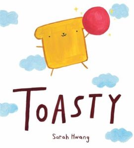
Picture Book Review: Toasty by Sarah Hwang

Author: Sarah Hwang
Illustrator: Sarah Hwang
Margaret Ferguson Books
4 May 2021
32 pages

This month’s PB review is by Ryan G. Van Cleave (Owner/​Operator of Only Picture Books) and Florida-​based freelance illustrator Gladys Jose.


–Ryan’s Review of the Writing–

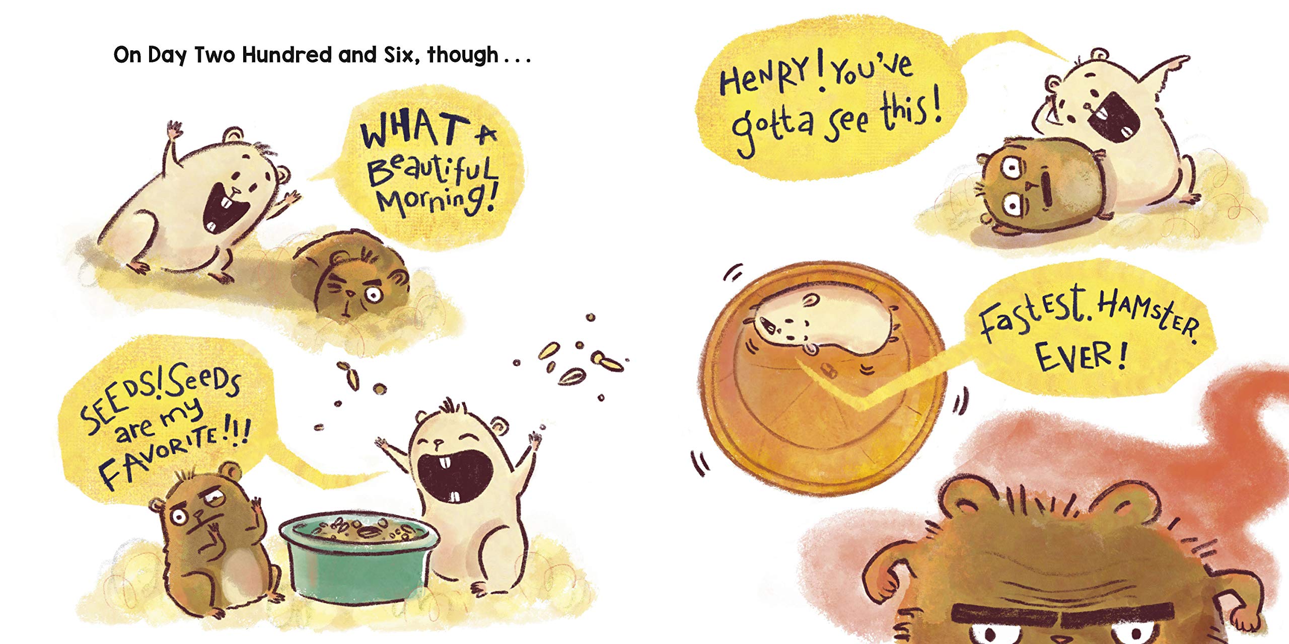
There’s no doubt about it–the main character in Sarah Hwang’s Toasty is pretty darn cute. He’s a piece of toast, after all, with arms, legs, and a little face. I’ll resist sharing too much of my non-​expert opinion on the art because I have the terrific Gladys Jose to do that, but I must note this. Toasty’s problem–a wish, really–is to be a dog. Once we realize that, it’s just so easy to see his face as a doggy face in a way that wasn’t evident at the start. That’s a clever bit of art making there!

The story is all about Toasty trying to be a dog. He can bark and he has a collar, but he stinks at rolling and chasing cats. He keeps trying canine things with a determination that might be called “dogged.” In the park, Toasty goes from trying to play with dogs to being the thing they want to play with. He hides in a sandwich and just as the dogs seem ready to gobble him up…a girl rescues him. He woofs in response, and she more or less adopts him as a pet. Not just as any pet, but a dog!

I’m charmed by the art, the dilemma this anthropomorphic piece of toast faces, and the ending (finding a way to be a dog-​like companion for someone despite his non-​dog characteristics). Yet I have questions.

Question 1–The book is super-​lean on text. That’s fine, but it requires what’s there to have to really sing at the same level of goodness as the fun imagery. Given that level of attention, the first line doesn’t really hold up. In fact, most editors strongly recommend against beginning picture books with “Hi, I’m_​_​_​_​” or “This is _​_​_​_​.” The reason why is easy to see–readers want story. An introduction can happen in the course of story or action versus a static narrative beginning. Why not just start with “Toasty loved to watch the dogs outside this window play”?

Question 2–If Toasty is just discovering his desire to be a dog, why does he already have a collar and leash (and not just one but several collars because he has a “best collar”)?

Question 3–Isn’t the girl swooping in to save him stealing Toasty’s agency for solving his own problems?

Ultimately, I have mixed feelings about Toasty. Am I being too crusty? Maybe. But no matter what, that little toast character is terrific. I can’t help but feel that an industry gatekeeper was so charmed by the image and idea of Toasty–that spread where he hides atop a sandwich is darling!–that the story didn’t matter as much.

Some reviewers and readers will counter my questions by saying it’s just quirky or strange in the same way an imaginative child might tell a story. Maybe. If that’s the argument, I’m not persuaded. And yet I’m so taken by the character and his strange desire that I find myself liking a lot about this book. From the response of other readers and reviewers, I’m not along in that appreciation. I just wish the story would’ve given us one just-​believe-​it thing (this piece of toast operates like a person), because the rest could easily have worked with real-​world logic.

Regardless, I look forward to seeing more of Sarah Hwang’s work. She’s clearly a talented picture book creator.

3.75 out of 5 pencils


–Gladys’ Review of the Illustrations–

Toasty was a visually tasty treat. Not that I’d ever dare feast on Toasty!

I absolutely adored Sarah Hwang’s picture book. There’s an innocence and tenderness that just left me smiling and feeling satisfied at the end.

Art comes in so many styles, rendering techniques, and media. Sarah is very proficient in her art style. I absolutely love that this isn’t super rendered with layers and layers of color and details. Sarah added exactly what is needed in each illustration and nothing is unintentional. From things happening in the foreground to every minor detail in the background–like the silhouettes in the window of the last page that she uses to re-​enforce the difference between toasty and the others.

I love how you can see the layers of color underneath some of the paint strokes. It makes Sarah’s art seem more genuine and honest which works so perfectly with the story and the intended audience.

Her character designs are great and I’m especially in love with Toasty as a character. It’s a challenge to bring life to non-​living things–especially a square toast of bread!–without having it look lifeless and stiff. Or there’s the other problem of adding “too much life” and losing the original form of the character. But Sarah beautifully avoids that with just a few simple details and with the looseness of her paint strokes. Toasty seems very much like a piece of toast, but simultaneously it’s presented as toast that’s somehow alive! Plus, I mean, just look at him–he’s so darn cute!

In conclusion, I thoroughly enjoyed this picture book. Both the words and art were superb! It will definitely be a re-​read for my daughter and me.

5 out of 5 crayons


Gladys Jose is an illustrator and storyteller. She graduated from the University of Central Florida in 2012, where she earned a Bachelor of Fine Arts degree, specializing in graphic design. She’s the illustrator of the Fresh Princess series (HarperCollins), The Elephants’ Guide to Hide-​and-​Seek (Sourcebooks), and Clayton Parker Really Really REALLY Has to Pee (Abrams), as well as other upcoming books.
She lives in the sunny state of Florida with her supportive loving husband, energetic brilliant daughter, and a very sweet pup named Miles.

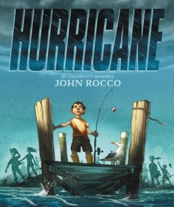
Picture Book Review: Hurricane by John Rocco

Author: John Rocco
Illustrator: John Rocco
Little, Brown Books for Young Readers
7 September 2021
48 pages

This month’s PB review is by Ryan G. Van Cleave (Owner/​Operator of Only Picture Books) and Ringling College of Art and Design Illustration Professor (and OPB pal) David C. Gardner.


–Ryan’s Review of the Writing–

I chose this book to review because John Rocco’s art is consistently luscious and delightful (I enlisted David Gardner to explain the hows and whys below!), and Rocco’s new picture book, Hurricane, is no exception. What grabbed me on the first page of text is how the boy walking to the end of a decrepit dock remarks “It’s very old and splintery.” Wow, that last word is spot-​on. It’s the sort of exactitude of language I don’t encounter often enough in picture books by author-illustrators.

The boy we’re following in the story returns home after a lovely day of fishing and swimming off that dock to find his dad boarding up the house in preparation for a hurricane. Does the father seem a bit too calm (both in his visual appearance and not using an exclamation point in telling the boy to go inside)? Maybe. Being in Florida for more than a decade now, I know all about hurricanes–intimately so. I’m not a fan of seeing the boy with his face pressed up against a top-​story window during the actual storm. That’s dangerous stuff, I’m afraid, since windows are very susceptible to blowing out in hurricanes. Plus, we just saw the dad boarding up the downstairs window for safety reasons. In a hurricane, EVERY window is a source of danger. Rocks and debris get kicked up and fly around like bullets–any one of them could shatter any window at any time.

But again, in this very same moment where the boy looks out at the storm from the upstairs window, the language is once more quite evocative: “The rain doesn’t fall in drops–it slashes sideways as if shot from a fire hose.”

I don’t want to harp on bad parenting in a picture book, BUT letting the boy outside in the post-​storm wreckage of the neighborhood the next morning (witness flooding, felled trees, and damaged houses!)? That’s hard to swallow in this age of helicopter parenting or just general common sense. I fully appreciate that it’s a story about a child, so getting adults out of the way is helpful in terms of keeping it the child’s story, but this stops me. There’s not a single adult anywhere when he first goes outside. Yes, he could’ve sneaked out before anyone noticed, though adults tend to go outside to assess damage the moment it’s safe to do so.

I often think about the obligations of authors and illustrators in picture books. While we don’t want to make our stories too didactic, can we err too much on the other side by having kids so completely in their own kid-​world bubble that they miss growth opportunities or seem to exist in a world that’s not quite our own? Maybe I’ve seen too many big Florida storms to easily buy into the casual response here in an otherwise real-​world setting with realistic characters. Maybe picture books should be more aspirational and inspirational than realistic? Or maybe we can do all three at once? It’s an interesting conundrum for sure for which there’s no easy answer.

The boy is quite concerned with how the “monster”–meaning the storm–gobbled up the dock he loved so much. Since no one else ever used that dock, it easily explains why everyone has more pressing things to do than deal with that ruined dock. So, the boy decides he’ll try to fix it. That’s a lovely moment since the dock is so special to him and him alone. It’s almost like a friend who needs help.

I won’t spoil the ending, but there’s a strong sense of community in play through both words and visuals–it’s quite compelling. I’m also charmed by the back matter, which includes an image of a note the author wrote at six years old.

To Mom and Dad–

I have gone fishing. I will come back with a fish. John

P.S. I hope I will come back with a fis!

In quality STEAM fashion, readers are also given double-​page spreads that reveal how both a dock and a hurricane work. Like the rest of the illustrations in this story, these schematic-​like images are impressive and memorable.

This is a gorgeous picture book that feels visually on par with Rocco’s other fine titles (including an OPB favorite, Blackout). The story feels somewhat less potent in comparison, however. Overall, this is a fine book that can spark useful discussions about dangerous weather, community, and fear, as well as kids who have “secret” places. And do I need to mention yet again how fine the images are? Rocco is a supremely talented visual storyteller.

4.25 out of 5 pencils


–David’s Review of the Illustrations–

John Rocco is perhaps best well-​known for his beloved, iconic illustrations for the Percy Jackson book series, so it’s no surprise that his cover for Hurricane is a knockout.

The cover promises a dramatic story: the low camera angle, the slash of lighting across the boy on the pier, the monochromatic background and characters in near silhouette in poses suggesting urgent anticipation of something terrible. The hurricane is referred to as a “monster” in the text, and the kids on the cover could easily be witnessing the arrival of Godzilla.

The story unfolds cinematically, shifting from wide shots to close-​ups. Small panels, like storyboards, show progression. The depiction of the river creeping up the street is clear and exciting––we see the boy’s point-​of-​view looking through his window. Like a fixed camera shot, the first picture shows a red car in the rain, the second shows the same car, flood water rising fast all around it.

Plenty of generous double spreads are put to good use. I found two layouts especially effective: The hurricane devastating the boy’s street, full-​bore, and the boy dreaming of the ocean creatures stirred up and sailing beneath his pier. It’s a moment filled with wonder.

Rocco is at the forefront of the visual storytellers who currently work in children’s books and in visual development for animation. His extensive work as a concept artist for studios like Dreamworks is evident. Mood and emotions are essential elements in concept art, and they are conveyed masterfully in Hurricane, from the sunny beginning to the turbulent storm to a sparkling, hopeful resolution.

Much of this is in his depiction of light––the changes from blue skies and French vanilla clouds to the shadowy, dimly lit, desaturated palette of the storm. For the aftermath, light sparkles on the calm water in a lovely, well-​observed play of light.

The painted effects, done in watercolor, line and digital painting, are delightful. Wind and rain, tumbling leaves, waves and splashes––there’s is dynamic movement on every page. Rocco’s loving and carefully studied rendering of water, clouds, the swirl of debris, and the details of the smallest props, such as the boys rod-​and-​reel, all ground the story in a realistic setting, which heightens the impact of the storm.

A recurring seagull character adds a funny (but believable) lighthearted touch. Technical illustrations describing hurricane formation and pier construction serve as bookends. They’re not essential to the story, but they round the book out into a perfect study guide for classrooms.

4.5 out of 5 crayons


David C. Gardner is an award-​winning illustrator and visual development artist. A former artist for Walt Disney Animation Studios, he has illustrated numerous picture books, including his latest from Sleeping Bear Press, Write On, Irving Berlin! by Leslie Kimmelman (which appeared on OPB in May 2018). It tells the true story of little Izzy Baline, who immigrated to New York City in 1893 and grew up to become Irving Berlin, one of the most well-​known composers of popular music in America. David teaches illustration at Ringling College of Art and Design.
To learn more about David’s own work, please visit FlyingDogStudio.com.

Picture Book Review: King of Ragtime by Stephen Costanza

Author: Stephen Costanza
Illustrator: Stephen Costanza
Atheneum Books for Young Readers
24 August 2021
56 pages

This month’s PB review is by Ryan G. Van Cleave (Owner/​Operator of Only Picture Books) and longtime OPB pal (and Ringling College of Art and Design Illustration Professor) John Herzog.

–Ryan’s Review of the Writing–

King of Ragtime, the new picture-​book biography by author/​illustrator Stephen Costanza, drives home the point that Joplin created his music by using his own creativity as well as the sounds and music of the world around him. From the start, Scott Joplin was a quiet boy who “hardly spoke above a whisper” because he preferred to listen instead. And listen he did, to the “Buzzz-​zuzzz!” of a wasp’s nest to the “Chhh-​chhhipp!” of a cicada or the “Rrrrrrummm-​bum-​bum!” of a thundercloud that could just as easily be an unseen train in the distance.

Because sound is so vital to this story, Costanza employs subtle rhymes and onomatopoeia to emphasize the rhythms and music of life that Joplin took as source material. It’s clear that the King of Ragtime heard things in a way no one else quite did.

It’s a little surprising that Joplin’s parents were so supportive of his musical interest despite facing profound poverty. Yet his father didn’t insist his son join him for the dependable work on the railroad, and his mother traded cleaning services for piano lessons. They even “scrimped and saved” enough to buy a dusty, old second-​hand piano so that Joplin could make his own music versus asking to use pianos in the homes of wealthy white families where his mother cleaned.

Who knew a piano could roar like a train or sing like a nightingale?”

Joplin did, of course. And he soon went from being a local sensation playing for church socials, dances, and Juneteenth celebrations, to living in St. Louis and working as a pianist in saloons and dance halls. He even played outside the 1893 World’s Fair–“Black pianists weren’t allowed to play at the fair, but in the nearby cafés a red-​hot piano sound filled the air”–and that seemed to help introduce the music known as ragtime to the world. Later, Joplin studied music in college and published “Maple Leaf Rag,” the first of his many popular songs.

The book’s Back Matter includes a Recommended Listening list of Joplin’s music and a short Bibliography, as well as 2+ pages of historical information that includes the story of how the author became interested in Joplin and his life. This material provides welcome context for how Joplin and his music was received in his own time, too.

Throughout King of Ragtime, Costanza doesn’t shy from issues concerning race. In both images and words, he shows many of the challenges that newly free Black people faced. Through it all, they returned to music “for solace and celebration,” which is something Joplin’s own beautiful music offered them, too.

This book is visually stunning from start to finish–so much so that I find myself imagining a wordless version, especially in those moments where the text and image line up perhaps a bit too linearly. I’ll let John say more about the art, but wow, it’s really evocative and memorable.

With King of Ragtime, Costanza has created a lively book that does justice to Joplin, the King of Ragtime, whose work inspired generations of jazz musicians. Libraries and teachers, in particular, should have a copy on their shelves. (I can also imagine amazing read-​alouds of this book with music introduction and accompaniment to help young readers appreciate just how different ragtime is from so many other types of music.)

4.25 out of 5 pencils


–John’s Review of the Illustrations–

Stephen Costanza’s King of Ragtime is an absolutely beautiful picture book and–dare I say it–an instant classic.

There. That’s my review.

What? You need more? All right…

From an illustration perspective, this book is an incredibly enjoyable combination of the surreal and the traditional. It’s a fever dream of bright colors, captivating perspective, and appealing characters. I suspect that Costanza’s mixing of popular art styles from the time of Joplin (Fauvism, Expressionism, and American Modernism) is not a coincidence. Instead of using a more classical illustrative approach for this reverential story–which, let’s be honest, would’ve been a bit hokey–Costanza’s illustrations reflect the style and methods of the time, trading in digital illustration for wax pastels, collage, and gouache. It not only feels true to the time, but also to Joplin and his music.

Each illustration is a feast–so much so that I often forgot there were words to read. The written story is perfectly fine, but the reality is that I was consumed by the art. And honestly, the illustrations do such a good job of telling the story that I feel this could’ve easily been a wordless picture book. There is so much story to mine from the visuals that the text almost feels a bit redundant.

Now, to acknowledge my bias: I am a massive fan of Mary Blair. Her use of color, design and composition–all of it is perfect in my opinion, and right up my alley. If you’re unfamiliar with Mary Blair, click here to learn more. While reading King of Ragtime, I couldn’t help but be reminded of Blair’s wonderful work. And while I don’t know if Costanza overtly referenced her art while making this book, he’s done an amazing job of capturing all of the qualities that makes Blair’s work so amazing and fun.

In conclusion, and I know I’m going to sound like a broken record here, but Stephen Costanza’s King of Ragtime is an absolutely beautiful picture book and–dare I say it–an instant classic.

5 out of 5 crayons


John Herzog is an award-​winning illustrator and educator. 

His clients include Hasbro, Dreamworks TV, Houghton Mifflin Harcourt, Scholastic, and Highlights for Children. He also teaches illustration classes at Ringling College of Art and Design.

John is a member of the National Cartoonists Society and Society of Children’s Book Writers and Illustrators, where he received the 2018 SCBWI Magazine Merit Award for his Highlights High Five cover illustration. He lives in Florida with his wife, two kids, a pair of geckos, a bearded dragon, and a tarantula.

Picture Book Review: Keeping the City Going by Brian Floca

27 April 2021
40 pages

This month’s PB review is by Ryan G. Van Cleave (#1 city-​goer at Only Picture Books) and freelance author/​illustrator Kelly Light.

–Ryan’s Review of the Writing–

Brian Floca’s new picture book, Keeping the City Going, tells a familiar story since it’s one we all lived some version of since early 2020. Our narrator is a young child who immediately turns the story’s focus outward into the “almost, but not entirely” empty streets where a few people are “there because we need them.” What Floca is directing our attention to are those who continued to work to keep the city going when COVID-​19 threatened to shut everything down.

Bus drivers, train engineers, food delivery people, police officers, taxi drivers, trash collectors, postal carriers, package couriers, construction crews, EMTs, doctors, nurses, aides, and more–they’re all here in these pages, each nobly doing what has to be done so that we can “not feel so alone” and that we can “stay connected.”

While the art is on par with Floca’s award-​winning work in his other books–I’ll let Kelly explain why below–his attention to sound is truly interesting. It starts with the awareness that “the voice of the city is low,” but as the story continues and we witness the work of so many brave souls, the noise–the life–of the city increases. “A clap, a whistle, a call.” Then “pots BANG! Drums BOOM! Bells RING! Horns BLOW!–a racket, a din, and a row!”

The end of the book follows through on this metaphor of the city having a voice. Ultimately, this voice says what we all want it to–a well-​earned THANK YOU to the people still out on the streets, working hard to keep our city going, whether it’s NYC, Chicago, Scranton, or Sarasota.

Those who didn’t experience COVID-​19 in NYC might find it odd for Floca to be so specific about the 7pm celebrations. An Author’s Note explains that: “I took additional inspiration from neighbors I could hear cheering every evening at seven o’clock, through the spring. Home from school and home from work, isolated and with stresses and struggles of their own, they were sounding from their windows and stoops a daily expression of gratitude toward healthcare and other workers still on the job—cheers we cannot imagine to be all we owe those workers, but that helped lift morale in the early, overwhelming days of the pandemic, when the lift was badly needed.”

What’s lovely is that the children at the start of the book are here, too, showing their appreciation and happiness along with the rest. They’re part of the “we” that includes us–the readers, too.

Like LeUyen Pham’s Outside, Inside (which we reviewed here at OPB), this is an important book to help young readers make sense of the pandemic. And it’s a welcome Thank You! to a group of people–and a city–that deserves it.

This heartfelt, earnest book is both delightful and appropriate.

4.5 out of 5 pencils


–Kelly’s Review of the Illustrations–

I moved from Brooklyn to Western, MA in the summer of 2019. Neither you nor I could have any clue that just a year later, we would be in an unprecedented, global lockdown. I was glued to the footage on the TV of NYC. I found it hard to fathom the rush, the hum, the cacophony of NYC, hushed. I was so moved by scenes of the exuberant 7PM pot clanging and cheering to honor the essential workers.

In his book Keeping the City Going, Brian Floca captures first-​hand the experience of living in NYC in 2020 as well as capturing the fighting NYC spirit as it endures an unimaginable pandemic. Floca must have been a wartime illustrator in a past life. Ernest Shepherd, illustrator of Winnie the Pooh and master draftsman, was himself a WWI illustrator. He might look at Floca’s work here and see a kindred pencil. Managing to merge a journalistic drawing approach with visual storytelling for an audience of young readers, Keeping the City Going is a time capsule of an awful time that chooses to hold on to and depict the best of what took place in the midst of the worst year in modern history. There is an intimacy in Floca’s art where there could have been a detached voyeuristic view in the streetscapes. There is a love, simply drawn into every line, for the city he calls home.

I found myself recognizing so much in Floca’s drawings. I saw the “Thank You, Thank You, Thank You” plastic bags found in every bodega used to deliver food all over the five boroughs. I recognized the brownstones, the skyline and the corner of Smith Street in Brooklyn. “The City” has specific shapes and colors–the repetitive rectangles of bricks and buildings and doors and stoops and skyscrapers and trucks and windows. The windows are the frames, the visual device Floca uses to help us focus in and recognize one other thing: the humanity. Keeping The City Going is truly a book about humanity. New York City’s greatness is its people. The faces seen through the windows, the children, the essential workers, the families and the cats are all giving us the feeling that we, too, are peering in to the city, appreciating everyone keeping it moving.

The palette is warm and golden, as if it is summer in the city, except that there are long sleeves and pants on everyone. Perhaps his choice of palette is intentional–to warm our feelings as we heal from our collective trauma. There are down jackets and scarves on the workers and bike delivery guys, letting us know that though there is a chill in the air, there is protection.

Floca begins the book with two children tentatively pulling back a curtain to look out of a window. The children appear on several more pages and we see them join in with the joyous 7PM tribute to the service workers of the city. Watching the children find ways to acclimate to this strange way of life is reassuring and affirms that life goes on. Floca draws humans in a simplified realistic style in contrast to his obvious enjoyment of mechanical detail. The figures are drawn expertly and not “over drawn.” He could have created visual noise with never-​ending detail. Instead, he treats the people with sensitivity and restraint and good gesture drawing.

The boldest illustration in the book is of the ambulance. The EMT is looking directly out at the reader, her two dot eyes making eye contact with us. The vehicle is drawn with the technical accuracy that has garnered Floca many awards including a Caldecott for 2013’s Locomotive.

His ability to draw is unquestionable. His ability to NOT over-​draw, is his greatest gift. Using watercolor and ink, Floca lifts his pen off of the paper in all of the right places. He allows the color to do some of the work to outline form. In some places, like on the side of a sanitation truck, every lever and button and reflector and decal is drawn, but the tires? They are loose with lines wrapping around to describe the tire more than define it. The faces with masks adorned are only given a touch of ink to maintain their softness. This skill comes from observational drawing–drawing from live models and sitting with a sketchbook on a lap. Floca has the uncanny ability to show you a lot, to teach you how things are made in his drawings and in this book, and to make you feel something with his art.

Keeping the City Going is more than another historical nonfiction feat of draftsmanship that marvels at the mechanics of man-​made wonders. Floca can draw those. This time out, he applied his skills to capture the greatest act of mankind–kindness.

4.5 out of 5 colored pencils


Kelly Light lives in Amherst, MA but grew up down the shore in New Jersey surrounded by giant pink dinosaurs, cotton candy colors, and Skee-​Ball sounds. She was schooled on Saturday-​morning cartoons and Sunday funny pages. She picked up a pencil, started drawing, and never stopped.

Kelly is the author/​Illustrator of the Louise series. Louise Loves Art and Louise and Andie, The Art of Friendship are the first two picture books in the series. Louise Loves Bake Sales and Louise and The Class Pet are the first readers in HarperCollins’ I Can Read program.

Kelly has also illustrated Elvis and the Underdogs and Elvis and the Underdogs: Secrets, Secret Service, and Room Service by Jenny Lee, and The Quirks series by Erin Soderberg.

Website: www.kellylight.com

Picture Book Review: June Almeida, Virus Detective! by Suzanne Slade

June Almeida, Virus Detective!  The Woman Who Discovered the First Human Coronavirus
Author: Suzanne Slade
Illustrator: Elisa Paganelli
Sleeping Bear Press
15 March 2021
40 pages

This month’s PB review is by Ryan G. Van Cleave (#1 Biography Lover at Only Picture Books) and UK-​based artist (and new OPB friend) Lucy Barnard.

**Yes, Lucy being from the UK means we’re all just going to roll with the British spellings (“colour,” etc.) this month. Embrace it!**

–Ryan’s Review of the Writing–

I’m always leery of cradle-​to-​grave picture book biographies about someone who isn’t name-​brand famous along the lines of Stephen Hawking, Kobe Bryant, or Georgia O’Keefe. But the throughline of June’s life–a deep interest in science that sharpened into a goal to help sick people in general, and children in specific–began at a very early age. So, we quite reasonably start with her childhood and soon learn how she lost a brother to diphtheria when she was ten. While this book moves past that event relatively quickly, the trauma clearly informed June’s life and guided her to her life’s work–becoming a brilliant virologist.

It’s hard to imagine how June “left school at age 16 to help pay family bills” and still managed to pursue her own interest in science. But she did. In her role as a scientist, June flourished.

While it’s less clear why no one else seemed to realize how to make such good use of an electron microscope, it’s quite clear that June–“a photographer at heart,” Slade writes–had the creativity and interest in picture-​making to figure it out.

June snapped away photos of “tiny blobs,” and was able to determine which were viruses and which were antibodies. This was a game changer for scientists who were essentially working blind with viruses–they were desperate for the answers she found. Not only was June the first to discover coronavirus, but she studied other viruses, too, such as rubella, hepatitis B, and HIV. Her work helped others create ways to battle viruses and make the world a healthier place.

Beyond the amazing timeliness of this book, what makes it memorable is that author Suzanne Slade is once again able to make science sound interesting. And her ability to take a complicated scientific process like negative staining and explain it in two pages is impressive. Couple that with Elisa Paganelli’s fine artwork, and this book is a worthy take on a worthy role model.

A thorough timeline, high-​level bibliography, and two pages of context-​providing back matter about June and electron microscopes will be of help to readers who want a deeper look into June’s world. Slade also includes a scientific spoof of William Blake’s “The Tyger” poem which June wrote, though the humor evident there isn’t showcased in June’s life in this book.

Ultimately, this book is focused on June’s scientific accomplishments versus some larger personal narrative arc, and that’s just fine. So is the cradle-​to-​grave coverage of June’s life (she died in 2007 at age 77). Bringing light to underappreciated or forgotten women in STEM is always worthwhile, even without the book’s clear pandemic connection that’s likely moving this to the must-​get category for libraries and schools.

4.25 out of 5 pencils


Lucy’s Review of the Illustrations–

Before being asked to review this book, I have to confess that I had not heard of the virologist June Almeida. Her story is a fascinating and timely one, brought to life beautifully by the illustrations of Elisa Paganelli. The cover sets the scientific tone immediately and shows June as a grown woman, but the first spread takes us right back to her childhood. The figure of June as a little girl cuts across both pages as she races breathlessly towards school; this cleverly indicates where her passions lie whilst also drawing us into the rest of the book.

The mix of single pages, spreads, and vignettes keep the design of this book fresh and interesting. It really feels like we are accompanying June on her journey. Indeed, the character development is skillfully done as we see June progress from a little girl right the way through to old age. I also love the muted colour palette used throughout the book; no garish, bright colours here, the tones are more likely to be earthy ochres, blue-​greys and mustard yellows.

Spreads five and eight are particular favourites of mine, not only for their fabulous compositions and beautiful illustrations of figures and architecture, but also because both cleverly juxtapose June’s home and work life (plainly showing us that she was a working wife and mother in an era when this was undoubtedly uncommon).

The illustrations also manage to bring to life some complex scientific ideas and imagery in a very accessible way. We are shown June thinking whilst a microscope and photos swirl around her, a clear illustrative explanation of a particular procedure and the moment June discovered confirmation of a new virus.

June Almeida was a truly inspirational woman and, in these times of a coronavirus pandemic, her story deserves to be more widely known. Elisa Paganelli’s illustrations are a perfect accompaniment to this rich and fascinating life story and strike just the right note for a children’s picture book.

4.5 out of 5 crayons


Lucy Barnard has been a freelance illustrator for more years than she cares to remember and, after illustrating for many other authors, decided to begin writing her own picture books. She is represented as an illustrator by

www.advocate-art.com

and as an author by

www.carolinewakeman.com

Lucy lives in Manchester, UK, and loves reading, eating cake, and going on long walks with her family and dog.

Picture Book Review: Ten Beautiful Things by Molly Beth Griffin

Ten Beautiful Things
Author: Molly Beth Griffin
Illustrator: Maribel Lechuga
Charlesbridge
12 January 2021
32 pages

This month’s PB review is by Ryan G. Van Cleave (Picture Book Reader Aficionado at Only Picture Books) and Ringling College of Art and Design Illustration Professor (and OPB friend) Rebecca Zomchek.

–Ryan’s Review of the Writing–

Moving to a new home is on the short list of Most Stressful Things a child can go through, and that’s what’s happening with our main character, Lily. The story begins with Gram driving Lily to a far-​off Iowa farmhouse–the child’s new home.

We quickly realize that Lily is going through yet another Most Stressful Thing. Her parents are MIA. It’s never explained why they’re not in the book, but the reasons surely don’t matter. The mere fact of their absence exponentially adds to Lily’s sadness and anxiety.

To pass the time–and take Lily’s mind off her worries–Gram suggests, “Let’s try to find ten beautiful things along the way.”

Lily is understandably reluctant. But, soon, she notices how beautiful things start to appear once you begin to look for them.

A gorgeous sunset.

A wind farm whose “spinning windmill blades gleamed in the morning sun.”

A red-​winged blackbird perched on a swaying stalk of last year’s corn.”

What makes things interesting and situationally honest is that between these moments where Lily witnesses beautiful things–all wonderfully depicted by the skilled hands of Maribel Lechuga–she slips back to feeling sad and “hollow” inside. The contrast of Lily being gently urged out of her funk by these beautiful moments is well handled, and the more beautiful moments she finds, the less fully and frequently Lily slips back into that place of sadness.

Beauty seems to resurrect her dampened spirits and fortify her. What a lovely idea.

At one point, Gram suggests that a falling-​apart barn counts as a beautiful thing, yet Lily disagrees because it’s not pretty. Gram responds: “We’re not looking for pretty. We want beautiful.” What a great distinction–pretty versus beautiful. I can see how adult readers might have a conversation with a child over what those words mean and why considering their differences is worthwhile.

Without giving spoilers, the resolution to the hollow feeling inside Lily’s chest and the arrival of beautiful thing #10 are emotionally rewarding and earned by the story.  I’m also pleased that the author avoided naming most of the emotions, choosing instead to let art, action, and nuanced dialogue bring those to life for readers. Trust me–they’ll get it.

In Ten Beautiful Things, Molly Beth Griffin has created a touching, quiet book that’s both a nod to the wonders of the natural world and a positive life-​changing journey for a child who has brighter days ahead.

4.75 out of 5 pencils


Rebecca’s Review of the Illustrations–

This book is a visual pleasure and really is full of many beautiful things.

We are presented with a wonderful diversity of times of day, landscapes, and weather, and through these different vistas, the book does a brilliant job of taking us on this journey of not only passing from city into country, but finding our way home.

As someone who grew up in the Midwest and has gone on many meditative car trips, this book was wonderfully nostalgic and felt like such a real time and space come to life on the page. From the rolling fields, to hay bales, to the wind turbines and glowing treetops at sunrise, the land springs to life for us as the day unfolds and invites us along on the visual and emotional journey Lily and Gram are experiencing.

Illustrator Maribel Lechuga has really taken advantage of digital painting’s capacity for texture and has included wonderful movement and light. The clouds swirl and undulate, grass and water flow, and both leaves and birds float in the breeze. Along with our vibrant landscapes, we get wonderful 360° views around the car, both inside and outside, which help to capture the feeling of movement and the inner and outer worlds of a person.

One of my favorite scenes is the rainstorm as Gram and Lily get close to their final destination. The storm is palpable and generates a sense of drama, energy, and cleansing. This moment also creates closeness between the characters, and I found myself drawn into every page, looking at all of the small details and finding beauty in the pebbles and fences and treetops as I remembered so clearly and fondly the places where I grew up.

Lechuga captures emotion even with a relatively simplified character design style. We can feel loss, longing, questioning, and even grief on the characters’ faces (especially Lily’s), but also toward the end of the book we can feel the peace, growth, and love between the two characters as they find beauty together through hard times.

For a book that covers a lot of intense emotions that are not necessarily given names in the text, the illustrations do a fantastic job of drawing us all in and connecting us to the journey–both physical and emotional–that the characters are taking. At the end of the book I, too, was pleased with all the beautiful things I found and felt as I enjoyed this story.

5 out of 5 crayons


Rebecca Zomchek is a children’s book illustrator who has worked as a concept artist and cartoonist. She earned her BFA from Syracuse University and her MFA from The School of Visual Arts; she teaches Illustration at Ringling College of Art and Design. Rebecca likes distinguished things like classical music and museums, but also loves being outside and getting paint everywhere.