Picture Book Review: Bear Outside by Jane Yolen

Author: Jane Yolen
Illustrator: Jen Corace
Neal Porter Books
2 March 2021
32 pages

For the first time ever, the review of the story-​side of a picture book isn’t being done by Ryan G. Van Cleave (owner/​operator of Only Picture Books).

Don’t worry, though. We’ve brought in ringers to handle things at the same high level we all expect of OPB picture book reviews.

So, without further ado, here’s this month’s picture book review that features insight from Brooklyn-​based editor Octavia Saenz and Florida-​based freelance artist (& OPB superfriend) Austin McKinley.


—Octavia’s Review of the Writing—

Bears are quiet, solitary things, but sometimes, if you look closely enough, you might find profound wisdom. Like the narrator of Bear Outside, the book itself is a quietly wise thing with a simple exterior that hides a deeper truth about what we owe ourselves.

The story is simple—and, like any good picture book, is half told in the details of the art—as the narrator explains how she wears her bear on the outside, as a form of protection, as a companion, as a talisman of courage. Beyond the narrator’s simple words, we see how the bear is a shield against mocking classmates as well as a a collaborator for the narrator having fun on their own. She says, too, that the bear is hers to take care of, and in the artwork we see her taking care of herself. She engages in brave and kind acts, fighting back bees to eat honey, and giving flowers to a neighbor, all with the help of the bear.

Bear Outside, celebrated author Jane Yolen’s 400th book, is an ode to kids who march to their own bear, and a guide for the imaginative ones in touch with their needs and boundaries.

It’s wonderful.

5 out of 5 pencils

—Austin’s Review of the Illustrations—

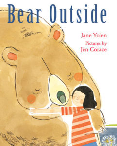
The central conceit of Bear Outside—that of a child imagining wearing their inner spirit as a kind of protective and companionable aura—is delightfully rich visual territory which the book’s artist, Jen Corace, explores with palpable joy. The sumptuous textural watercolor world she creates, which ranges from soft pastels to vibrant jewel-​toned hues (the red leaves on that giant, two-​page tree spread are chef’s kiss material!) is punctuated by Bear, the only cartoon element in each illustration described with a calligraphic line. As the book jacket explains, it was this conceptual image Corace created—of a girl surrounded by a bear—that formed the impetus for the book proper.

Corace has so much fun depicting Bear reading a book in a blanket fort (more great textures!) riding a bicycle, and jumping on a trampoline, that one can’t help but grin in appreciation. Her character and stage design have that quality of all the best children’s book illustrations: they are warm, inviting, approachable, and deceptively simple. Almost as if a child had done them, but a child with a master’s hand. It reminds us of the way we felt as children, and it makes it look easy.

Little touches–like the girl and Bear riding on the front of the shopping cart, clambering into a tree fort, flailing in water wings, or going to sleep with a night light–are all rendered in flattened perspectives. Overlapping watercolor elements and simplified backgrounds bring the childhood of our mind’s eye into a soft, sensitive focus.

A stroll through the artist’s website reveals there are many things about the imagery for this book that are motifs throughout her work. The little girl with the black bob haircut, the semi-​translucent textures, and the fanciful combinations of people and animals all make regular appearances. Corace’s work here is moodier than her children’s illustration, more akin to what might appear on an indie record’s album art.

What makes Bear Outside unique is not just the more whimsical palette–it’s how charmingly relatable the scenes are, and the humor that arises when the core personality of the narrator and the alter ego of Bear seem to vie for dominance. It makes you want to have such a bear in your life, and the beauty of the book’s message is that you can!

It’s a powerful, inspiring piece of children’s literature, simple to understand, but taking a complex topic like healthy self-​confidence, and making it impossible to forget.

5 out of 5 crayons


Octavia Saenz is an editor and cartoonist based in Brooklyn, NY who creates visual narratives about queer, Puerto Rican diaspora. Octavia grew up in Puerto Rico and has a BFA in Creative Writing and Illustration from Ringling College of Art and Design, as well as a Lambda Fellowship.

Find her on Twitter and Instagram: @shrimpwonder.


Austin McKinley makes comic books, cartoons, movies, video games, screenplays, novels and novellas through his company, Flying Car. He shot and appeared in the award-​winning feature documentary The New 8‑Bit Heroes alongside director Joe Granato. His comic illustrations have also been published by Image Shadowline, Devil’s Due/​1st Comics, Alias/​Blue Water Press, Avatar, Boom!, Blue King Studios, and FC9. He wrote and illustrated Squareasota, a weekly cartoon in the Sarasota Herald-​Tribune for seven years.
Most recently, he illustrated Tales of Mr. Rhee vol. 5: Rockstar Paranoia, a graphic novel for Source Point Press slated for spring 2021.

Picture Book Review: Outside, Inside by LeUyen Pham

Author: LeUyen Pham
Illustrator: LeUyen Pham
Roaring Brook Press
5 January 2021
48 pages

This month’s PB review is by Ryan G. Van Cleave (Semi-​Professional Insider at Only Picture Books) and Ringling College of Art and Design Illustration Professor (and OPB pal) David C. Gardner.


–Ryan’s Review of the Writing–

The story is quiet, calm, and simple. People who were once outside are now inside. And it’s not just people in one or two places who go inside–it’s “Everyone. Everywhere. All over the world.” But she adds, “Well, almost everyone. Some people needed to be…where they needed to be.”

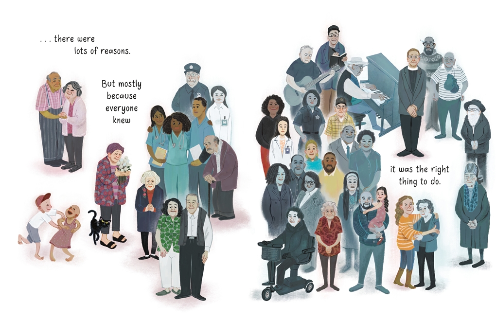
Who are these people who are exempt from heading indoors? The art that tells us–it’s people from hospitals, police stations, and fire departments. And they’re all wearing face masks.

While the words “virus,” “pandemic,” and “COVID” aren’t included anywhere, that’s clearly what this book is addressing–it’s a fine example of an “of the moment” book. Pham captures the worldwide scope of the coronavirus situation via artwork showing people of all types, and the constant use of “We.” She does an admirable job of presenting both the private and public experiences of a world facing the challenges of a pandemic.

The art style seems to create some of the tension many of us have felt over the past year. I think it has to do with the textures and colors, but I’ll leave it to David to dig deeper into that aspect of things. Since Pham admits that she never thinks of the words first, I suspect there’s a rich trove of details to examine in the art that launched this book.

Regardless, it’s very hard to create a picture book that deals with such a topical issue, but Pham dodges both sentimentality and didacticism with the only attempt at nudging people toward specific action being in this spread below, near the end of the book.

Outside, Inside ends on an appropriate, uplifting note: “And we remembered that soon spring would come. Inside…and outside.” Utilizing the metaphorical versus the literal here is a wise choice that helps open up the book and make it feel bigger than other “of the moment” texts.

This book is a welcome, timely response to a crisis that has dominated our world for a year and requires vital, careful conversations with the children in our lives going forward. Well done, LeUyen Pham.

4.75 out of 5 pencils


–David’s Review of the Illustrations–

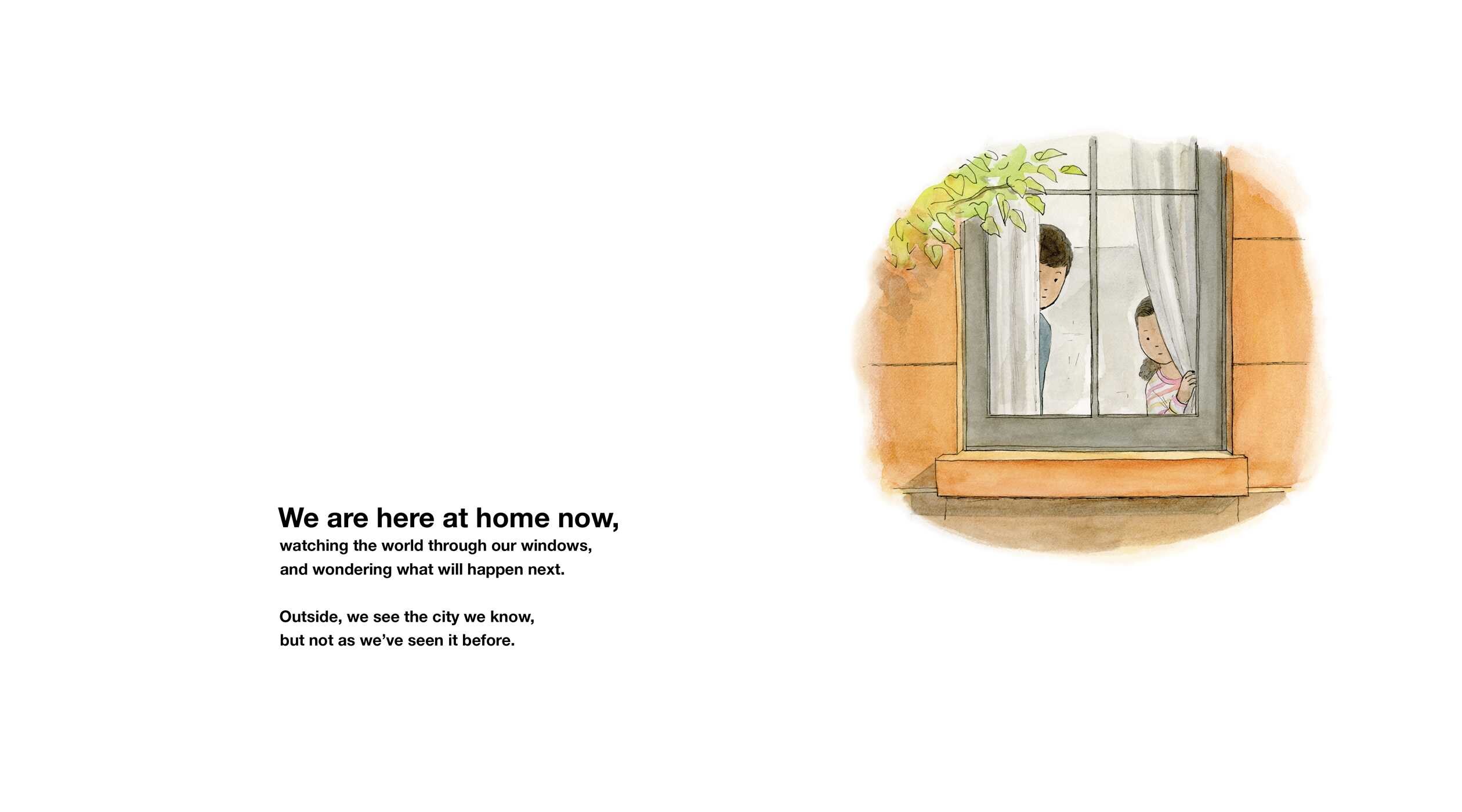
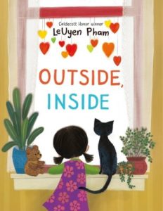
LeUyen Pham’s evocative cover sets the tone: a girl and her pet black cat, seen from behind, looking through a window. Outside, only white. It’s a playful and mysterious image – I couldn’t help wondering what was out there.

The book starts with a bustling neighborhood street, full of people. In the next spread, the same street is empty.

Something strange is going on.

Even without the words, we can see that. When the people disappear inside, they seem to take the bright colors with them. The palette becomes muted.


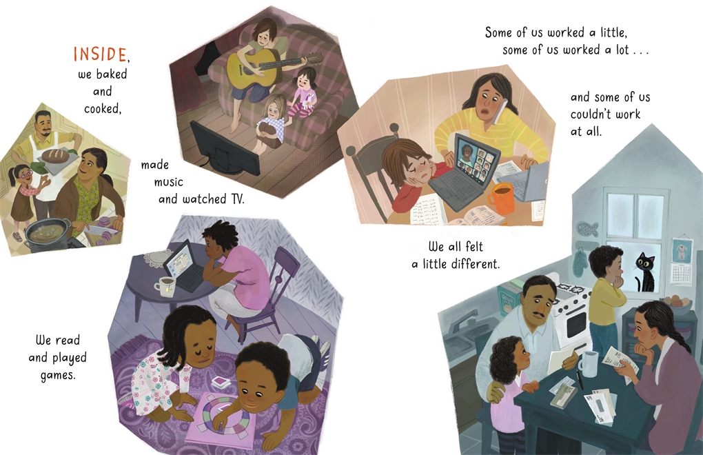
The book, we realize, is a visual journal, showing empty shops and everyday people grounded in everyday details: laptops, masks, indoor activities. And hopeful moments, too: a teddy bear in a window, a family happily baking bread, a drive-​by birthday party.

Double spreads are interspersed with vignettes, illustrated scenes like snapshots, images that are common to us all now: Kids playing board games, attending online classes, parents worrying over bills to pay.

The artist has said that she based the pictures on daily drawings she made, recording the pandemic for herself, sketching moments from each day.

An especially effective spread is a mosaic of these vignettes centered around a hospital. In one image, an exhausted health care worker naps on a breakroom couch while another calls home.

We see other cartoon photos of exhausted nurses and doctors, patients on gurneys, and families, all types, huddled in concern and support.

At some point, the artist opens the story up to include the world. Early in her career, Ms. Pham worked as a layout artist for Dreamworks Animation, and her attention to environment and regional architectural details is quite effective. She tells us in pictures: This situation is global.

Still, she uses a light touch. The world never seems too big or overwhelming. In a brilliant, subtle bit of visual storytelling, the girl and her cat act as our tour guides. The bold, simple shapes reminded me of the lighthearted, gouache-​painted Golden Book illustrations of Disney great Mary Blair. There are plenty of vibrant colors to appeal to a child, but she balances them with grayed tones that keep the story grounded in our shared, often challenging, reality.

In the end, the artist’s overall tone is one of hopefulness.

She visualizes this with plants, outside and inside. Growing things: A potted plant leafing out as the book progresses, trees that bud and bloom.

One especially effective passage near the book’s end suggests that we are all the same inside. Reaching a colorful crescendo, the flood of hearts could seem cliché as a visual symbol, but in this artist’s hands, the valentines become a lovely, moving design, a powerful extension of the text.

Ms. Pham captures the pandemic and the lockdown with a reporter’s eye and an artist’s big spirit. Whimsical and heart-​tugging, the illustrations strike the perfect tone for a children’s book. This is a much-​needed report from the trenches, and each page-​turn offers a perspective that is sure to comfort children – and their grown-ups.

It certainly comforted me.

5 out of 5 crayons


David C. Gardner is an award-​winning illustrator and visual development artist. A former artist for Walt Disney Animation Studios, he has illustrated numerous picture books, including his latest from Sleeping Bear Press, Write On, Irving Berlin! by Leslie Kimmelman (which appeared on OPB in May 2018). It tells the true story of little Izzy Baline, who immigrated to New York City in 1893 and grew up to become Irving Berlin, one of the most well-​known composers of popular music in America. David teaches illustration at Ringling College of Art and Design.
To learn more about David’s own work, please visit FlyingDogStudio.com.


Picture Book Review: Opening the Road: Victor Hugo Green and His Green Book by Keila V. Dawson

Author: Keila V. Dawson
Illustrator: Alleana Harris
Beaming Books
26 January 2021
40 pages

This month’s PB review is by Ryan G. Van Cleave (Amateur Travel Aficionado at Only Picture Books) and OPB newcomer Edna Cabcabin Moran.

–Ryan’s Review of the Writing–

In 1930s America, segregation was legal, and that meant Black Americans couldn’t do many of the things others could simply because they were Black. When New York mail carrier Victor Hugo Green found a guide for Jewish people that listed stores that sold kosher food, he got an idea. What if he put together his own guide that shared information about where Black Americans were safe and welcome?

Opening the Road tells the story of how Green got the idea, created the first guide, expanded it because of increasingly popular demand, and ultimately changed the lives of countless people because it offered Black people a list of safe places they could trust. He sold a lot of copies of his guide even before a national gas station chain started stocking it. Before long, the US government dubbed “The Green Book” an “official Negro travel guide.”

Green’s dream was that his guide would one day become obsolete, and in 1964, the US Congress “passed a law that made separating people by race illegal.” As a result, notes author Dawson, the 1966–67 Green Book was the very last edition ever published.

Dawson’s prose throughout the book is understated, which is an interesting choice considering the emotionally charged subject matter. Since the flip side is potential melodrama, it’s a tough balance to negotiate–no doubt about it. Another challenge nonfiction picture book authors face with subject matter like this is finding ways to engage children in a story that doesn’t feature children. Right on page one–as well as the cover–Victor Hugo Green is an adult. Perhaps what draws child readers are phrases like “a make-​do toilet” and “sold like hotcakes!” or Alleana Harris’ potent illustrations which show conflict via contrast in many pages.

I’ll let Edna explain what’s going on with the art, since that’s her expertise.

A two-​page Author’s Note supported by a two-​page timeline helps contextualize Victor Hugo Green’s life and historical contribution. It also connects this story to Black Lives Matter and includes a clear call to action to fight injustice.

Opening the Road is fundamentally about the power within all of us to make a difference and change the world. It’s a clear must-​have for public and school libraries. Adults who want another avenue to discuss the power of the human spirit to resist might find this an apt conversation starter, too.

4.25 out of 5 pencils


–Edna’s Review of the Illustrations–

The visual story of Victor Hugo Green and his Negro Motorist Green Book springs off the page in Keila V. Dawson’s Opening the Road thanks to illustrator Alleanna Harris’ intriguing combination of painterly and minimalist renderings. Harris’ keen digitally-​created melding of artistic expression and socio-​political references offers a frank, unsentimental, and impactful view of Black peoples’ experience in mid-​century America.

Harris’ illustrations open on a strong note. In the first double-​page spread, the bold shape of a two-​lane highway shown in one-​point perspective juts out from behind a minimally rendered car. Harris cleverly frames the faces of a frustrated Victor Hugo Green and his worried wife, Alma, with the simple form of a windshield. Through textural brushwork and thoughtful design, Harris sets a compelling stage for the Green Book’s inception and journey.

In subsequent pages, Harris composes painterly settings and deceivingly simple layouts that indicate a deeper narrative around Jim Crow rules: Long-​distance travelers, unable to stop at a highway café, continue down a lonely stretch of highway; a white girl and a Black girl, with their backs to one another, walk away from segregated water fountains stationed at the center of the double-​page spread; and in the first set of one-​page illustrations, an image of a Black driver being told to leave a “sundown town” is juxtaposed with an illustration of Black children being kept out of a playground. Each of these scenes is powerful on their own but in succession they form a gripping visual tale.

Harris’ work is reminiscent of the architectural and scenic treatments of mid-​century painter, Edward Hopper, as well as illustrative styles from the Little Golden Books of the same era. The first two-​thirds of illustrations for Opening the Road are marvelously executed, setting up an expectation of continued dynamic page design, engaging sequential narrative, and fully-​rendered paintings. Yet, the final double-​page spreads fall a bit short. The bottom sections repeat the pattern of images in the lower half of the page and text at the top, and there are no textural treatments or background elements to draw one’s eyes up and around the pages.

The scene depicting protestors in the bottom foreground of the spread is interesting but the digital technique of repeating the crowd and blurring them out is a departure from Harris’ painterly handling of background elements. Plus, the blurring calls attention to itself. In the page spread that follows, a gray-​haired woman sitting at a desk with Victor is placed in the bottom foreground, while the background is rendered with blue lines and light blue shading. The blue lines remind me of non-​photo blue pens and pencils used in sketching and art production. This treatment and style is yet another departure from Harris’ painterly renderings such as that shown in the kitchen table scene of Victor and Alma writing letters.

Overall, I enjoy Harris’ illustrations and narrative voice and would’ve appreciated the same consistency and dynamics of the early pages in the final spreads. For me, the layout and style choices are a missed opportunity at bringing the visual narrative full circle. Yet, I had a change of perspective on the last double-​page spread with its layout split in half by the illustration at the bottom and the text on top, against a paper-​white background. I wondered if the visual “questions” of the first spread were answered by the last spread. (This is based on a writing tip offered by acclaimed author, Jane Yolen—that good endings “answer” the questions in a story’s opening).

I came to appreciate that Harris does answer the opening spread with her depiction of a present-​day Black family (on the bottom half of the page) traveling in a car that “drives” to the right, into the future. The characters’ expressions are happy and hopeful, conveying Victor’s dream of “no Green Book for Black people.”

Lastly, nonfiction picture book backmatter often includes spot illustrations that add interest and round out the feeling of the book. The author notes pages are text-​heavy and devoid of images, so I am glad to see Harris’ charming illustrations in the fun timeline of the Negro Motorist Green Book.

4.25 out of 5 crayons


Edna Cabcabin Moran is an author/​illustrator, poet, arts educator, and hula dancer. Having been raised in the continental US east and west coasts, Iceland, and Hawai’i, Edna’s approach to storytelling and teaching is informed by her multicultural experiences and rooted in her arts-​integrative practices.

Edna’s latest picture book is Honu and Moa (BeachHouse Publishing), a Hawaiiana mash-​up of the Tortoise and The Hare and recipient of a 2019 Aesop Accolade.

https://kidlitedna.com


Picture Book Review: Joey: The Story of Joe Biden, by Jill Biden

Author: Jill Biden (with Kathleen Krull)
Illustrator: Amy June Bates
Paula Wiseman Books
22 September 2020
48 pages

This month’s PB review is by Ryan G. Van Cleave (Chief Political Analyst at Only Picture Books) and OPB superfriend (and Ringling College of Art and Design Illustration Professor) John Herzog.

–Ryan’s Review of the Writing–

Joey: The Story of Joe Biden is a picture book biography about the 46th President of the United States, written by his wife, bestselling author Jill Biden (with the help of award-​winning writer Kathleen Krull). The book begins with Joe’s early years in the quaint world of the 1950s, with terrific Norman Rockwell-​esque illustrations that effectively create a pleasurable nostalgic mood. I could wax on about the art alone, but I’ll let John handle that below.

Though Joe knew the challenge of poverty early on, he enjoyed a rich, supportive family life. Mrs. Biden–little Joey’s mom–even told him, “Bravery resides in ever heart, and yours is fierce and clear.” Through a series of anecdotes like that, the book reveals an admirable sense of responsibility and honor the entire Biden clan seems to hold dear.

Many reviewers seem untroubled by the potentially problematic role model that Joe presents in those early years, though, such as how Joe was “unable to refuse a dare, even when it was dangerous,” and how he dealt with school bullies by fighting. The accompanying image for that latter situation even shows him with a clenched jaw and clenched fists. These facts might undercut the role-​model purity some readers hope a book like this will bring. Certainly, having young people fight their way out of problems or undertake unnecessary risk behaviors aren’t things many adults condone.

Yet the book gets back on track fairly quickly, with Joe’s competitiveness, sense of justice, and ability to overcome a pervasive stutter preparing readers for the metamorphosis Joe undergoes in high school. He grows a foot taller, develops boundless charisma, and works hard to be a peacemaker. The fact that he spent summers in a work-​study program so he could afford to attend the expensive “Catholic high school overlooking the Delaware River” helps present him as a sympathetic, hard-​working figure. Here’s the role model parents are looking for in this book.

While the book acknowledges that Joe became “one of the youngest people ever elected to the United State Senate,” and that Obama found him to be “the best vice president America’s ever had,” Joe’s political career isn’t really a large part of the book. This is more the nostalgic story of how a leader is made through the crucible of life’s challenges told through unadorned, plain English–as opposed to the poetic depiction Nikki Grimes used to present the life of Kamala Harris in her recent biography.

Author Jill Biden understandably tries hard to present Joe in a very positive manner that mostly rings true. But there’s this moment early on: “maybe he was just a regular guy, not rich, not privileged, but he dreamed big and saw himself a leader.” Will some readers be bothered by the “not privileged” note? Perhaps.

The book went to press prior to Biden winning the election, so it simply ends with his 2019 announcement that he’s running for President of the United States, which he considers “a battle for the soul of America.” The book ends with “Give me the ball!” which connects to a throughline regarding his past as a successful athlete.

The backmatter is sizable but the highlights are a quirky list of Bidenisms and a comprehensive timeline that fills in many of the blanks of Joe’s life and career. Whether you’re a Biden fan or not, this book offers insight into our 46th President and will be a welcome addition to the shelves of school and public libraries.

4.25 out of 5 pencils


–John’s Review of the Illustrations–

With his successful campaign for President of the United States, interest in all things Joe Biden was bound to be inevitable. So it’s no surprise that we now have Joey: The Joe Biden Story for children (and their parents) to learn a little more about Biden’s upbringing and why he got into politics in the first place.

Written by Jill Biden with Kathleen Krull, and illustrated by Amy June Bates, Joey spends a lot of its time with Biden as a young man playing football, interacting with his siblings, going to school, etc. We have a chance to see the values instilled in him when he was a kid, how he exemplified them as a young boy, and how he continues to exemplify them today. While the book does seem overly idyllic at times, it understands its audience and does a good job of showing the relevant parts of Biden’s life.

I know that, in the past, I have been very effusive about the work of Amy June Bates (see my review for Gittel’s Journey). With her work in Joey, that effusion has not diminished in any way. The reality is this: Amy June Bates is one of the best picture book illustrators working today, and is probably one of the best picture book illustrators of all time. Her sense of design and color, the natural flow of her illustrations coupled with the story, her impeccable sense of detail balanced out with blocks of color–what can I say? It’s all fantastic and perfect and wonderful. Her use of traditional media–in this case watercolor, gouache, and pencil–elevates the storytelling, giving us rich, nuanced images that help us connect to Biden–first as a kid, and now as President-elect.

The nitpicks I have with the illustrations in this book–and they’re very minor–are as follows. Sometimes it’s hard to pick out Biden from the crowd. Overall, Bates does a fine job of separating him from the pack, but there were a few times where I just wasn’t sure which character was supposed to be Biden. In many of the illustrations, Bates gives Biden’s clothes a slight teal color, but I think it would’ve been helpful to make that more consistent throughout the book. I also wish that Biden’s character design had a consistent trademark attribute that followed him from childhood to adulthood. His design felt slightly erratic, and adding a staple of his look would’ve also been helpful.

These are minor criticisms, of course. And while I thoroughly enjoyed Joey: The Story of Joe Biden, it often felt like the picture book equivalent of rose-​colored glasses. But perhaps that’s the point. It brims with nostalgia, of course, but thankfully it’s infused with elements of reality that help keep it grounded. That’s probably the best compliment I could give the book, really. Biden himself feels like a dreamer, a go-​getter who also understands the plight of the average person. That attitude comes across loud and clear in the book and, after dealing with the last four years, it’s a very welcome change.

4.5 out of 5 crayons


John Herzog is an award-​winning illustrator and educator. 

His clients include Hasbro, Dreamworks TV, Houghton Mifflin Harcourt, Scholastic, and Highlights for Children. He also teaches illustration classes at Ringling College of Art and Design.

John is a member of the National Cartoonists Society and Society of Children’s Book Writers and Illustrators, where he received the 2018 SCBWI Magazine Merit Award for his Highlights High Five cover illustration. He lives in Florida with his wife, two kids, a pair of geckos, a South American horned frog, a bearded dragon, and a fish.


Picture Book Review: Kamala Harris: Rooted in Justice by Nikki Grimes

Atheneum Books for Young Readers
25 August 2020
40 pages

This month’s PB review is by OPB regular Ryan G. Van Cleave, and OPB newcomer, freelance writer and illustrator Bonnie Kelso.

–Ryan’s Review of the Writing–

With this timely book, poet Nikki Grimes uses lyrical language to tackle the challenge of presenting a rich, well-​lived life. She also frames the story of Kamala Harris’ life in the ongoing conversation between a young Black girl and her mother and the motif of the lotus flower (which the word Kamala just so happens to mean).

We quickly learn the history of Kamala’s parents as well as how they marched for civil rights and went to see Dr. Martin Luther King, Jr. “Kamala was there, too,” Grimes writes, “bouncing along in her stroller, chewing on her pacifier and words like ‘peace’ and ‘justice.’ ” We move from those early years to seeing Kamala battling for the use of a soccer field in middle school to her time at Howard and her initial foray into politics.

The text might require a good bit of adult glossing and intersection, both because the lines are set as verse (which makes sense, considering Grimes’ penchant for poetry), and the terminology/​references are somewhat wide-​ranging. Those who want the fullest version of Harris’ story would be well-​served by examining her book The Truths We Hold: An American Journey, which came out earlier this year.

Some readers might resist the italicized mother/​daughter conversation frame because it could be seen as getting in the way of the deep dive into Kamala’s life. Others might not want the story to end with Kamala ending her presidential bid because she “realized running for President/​cost more money than she thought,/and Kamala’s campaign team/​didn’t have enough.” Some might also see this as an opportunity for a sequel!

I’ll let Bonnie get into the vibrant digital illustrators by Laura Freeman, but my layman’s two cents on the art is this–it’s bright, textured, and inviting. Seeing the cover alone made me want to seriously consider this book for a review, regardless of any other factors. A great cover really draws my eye.

Without a doubt, Kamala Harris–the first Black woman and first Asian American woman named to a major party presidential ticket (more firsts might happen the day after this review is out!)–is worthy of being the subject of a picture book biography.

The timeline in the back matter is welcome and helps give context to the events in the book. Kamala Harris: Rooted in Justice is a worthy addition to any library or personal collection, and can serve as an introduction to the world of politics.

4 out of 5 pencils


–Bonnie’s Review of the Illustrations–

Laura Freeman’s illustrations in Kamala Harris: Rooted In Justice give an abundance of emotional depth to the life story of this widely beloved public servant who has been breaking boundaries in the name of justice her entire life. From my first glance at the gorgeous cover, I was struck by the perfect balance of compassion and strength it conveys. Kamala’s family influences emerge from the cool inkiness of her hair and contrast against the warm tones in her skin, the lotus, and the red stripes of the American flag.

This play with warm and cool tones continues throughout the book, showing Laura Freeman’s immense skill as a visual storyteller. Bold pops of magenta and saffron against pools of blue, urge the characters off the page and into life. Patterns are used with intention and precision, blending the traditional textiles of Africa, India, and America, emphasizing Kamala’s unique perspective and family history. The layered and sometimes angular compositions add drama to Laura Freeman’s trademark flat, digitally collaged style. She reserves the use of shading and detail to emphasize faces and bring vibrancy to the characters.

It was a pleasure to review this important and relevant biographical picture book and I can’t wait to read the sequel.

5 out of 5 crayons


Bonnie Kelso is a writer and illustrator of picture books who tends to shy away from political discussions. However, she believes strongly that Kamala Harris would make an excellent president.

A graduate of the Rhode Island School of Design, Bonnie’s past experience in art spans a spectrum, from abstract painting on canvas to museum-​quality exhibit design. She has worked with clients such as the Smithsonian, National Geographic, and NASA. Currently, Bonnie is pursuing the challenging path of becoming a published children’s book author and illustrator. She lives in Las Vegas with her partner, two sons, cat, and Japanese cleaner shrimp.

To learn more about Bonnie’s work, please visit www.BonnieKelso.com.

Picture Book Review: Your House, My House by Marianne Dubuc

22 September 2020
32 pages

This month’s PB review is by Ryan G. Van Cleave (chief rabbit aficionado at Only Picture Books) and OPB newcomer, freelance author/​illustrator Kelly Light.

–Ryan’s Review of the Writing–

Marianne Dubuc’s new picture book, Your House, My House, almost seems like one of those seek-​and-​find books my kids loved so much in their k‑1 years. On every page of this book, a little block of text is tucked into the leaves of a tree at the top left while the rest of the page–the bulk of it–offers a look inside a multi-​level house full of animals engaged in a variety of actions. Yes, it’s a very special day at 3 Maple Street since it’s Little Rabbit’s birthday. But there’s so much more going on at the same time.

I confess that I find it a bit challenging to connect the text to the characters being referenced since the art is disproportionately large on the page. I’m almost more inclined to just peruse the pictures and imagine my own stories to pair up with the interesting characters versus try to bring the existing text into some kind of connection with the art. Is that a good thing? I’m not sure what to think about it.

Since my responsibility in these reviews is to focus on the story, though, I’ll leave it to Kelly to dive deep into the compelling artwork. While I have lots of appreciation for this book as a whole, I’m giving this a slightly lower ranking than I’d give were I reviewing the entire book as a single thing. With it being such a clearly art-​centric book, there’s almost no other option.

It’s worth checking out, though. Let’s not lose track of that fact.

4 out of 5 pencils


–Kelly’s Review of the Illustrations–

I’d like to ask Marianne Dubuc if she’s a fan of the book What Do People Do All Day? after pouring over her new book Your House, My House. Before I even received the book to review, the cover of her book struck a chord deep inside of me. I ripped tape off of boxes from my recent move, to find my own tattered copy of Richard Scarry’s book.

Was it the cross-​sectioned home revealing the inside of the building and goings-​on of what appears to be an early twentieth century, very large old apartment building? The viewer never sees the house with its front wall. That invisible wall allows us to take in all that happens on a very, very busy day at 3 Maple Street.

The SUPREMELY detailed drawings in Marianne’s book appear to be done in great, old-​fashioned pencil and watercolor. Simply–the best. Some touches of colored pencil, here and there. The palette emits a sunny day in soft washes with just the right amount of puddling. My inner art geek is dying to know. Did she work to size? (which means the size of the printed book.) I wonder if that’s the case because there is so much detail. I would imagine working larger to fit it all in, but if Marianne did that, perhaps all of this lovely graphite would close up and darken and lose its silvery tone.

These are the thoughts that fill my head when inspecting another illustrator’s work.

The details are ABUNDANT and the art tells most of the story. The writing here is mostly visual but WHOOO BOY, what kinds of lists Marianne must have made to keep this all straight as she drew! The day of the tiny Bunny’s birthday is filled with four floors of activity, one tree, two sides of the house, and the street out front. The inhabitants are all drawn with charm and deceptive simplicity. Marianne manages to convey all kinds of mood and emotion in her characters. An annoyed Owl, a sick Bear, Terrible Two Mice Triplets, Expectant Fox Family, Hedgehogs waiting for Dad, Cats moving in, Rabbits burning baked goods, Birds in the branches, a Post-​Cat, a Goldilocks breaking and entering, a Wolf chasing down some pigs and a Little Red Riding Hood walking on by. The tiniest of the characters, the ghost, the ladybug, the bee, the mice children, and a very odd Gnome are the only ones that are hardest to read.

Some of their drawings got tight. It was the Gnome that made me put this book onto my Cintiq and blow it up. I stared. ”IS THAT A…GNOME? A GNOME, TOO??” I started to question my own eyes and rubbed them and wondered if Marianne had eye strain, too, after creating the art. It is quite a feat to draw what is the visual equivalent to a silent movie. I had to go back through all of the pages and see where and when this crazy Gnome came into 3 Maple Street! By making me do that, I knew, Marianne had hooked me into this book experience.

I imagine a child POURING over this book, over and over and over to see all of the details, just as I did with my own Scarry book. This feels very classic, looks very classic, and is illustrated with a lot of class. It feels very real in these times that we stay so close to home and perhaps feel so much more together than we have for a long time.

My ONLY wish? That the book was BIG. 11x15 BIG , like my old Richard Scarry book.

Pure pencil, pure watercolors, pure picture book perfection.

4 out of 5 colored pencils


Kelly Light lives in Amherst, MA but grew up down the shore in New Jersey surrounded by giant pink dinosaurs, cotton candy colors, and Skee-​Ball sounds. She was schooled on Saturday-​morning cartoons and Sunday funny pages. She picked up a pencil, started drawing, and never stopped.

Kelly is the author/​Illustrator of the Louise series. Louise Loves Art and Louise and Andie, The Art of Friendship are the first two picture books in the series. Louise Loves Bake Sales and Louise and The Class Pet are the first readers in HarperCollins’ I Can Read program.

Kelly has also illustrated Elvis and the Underdogs and Elvis and the Underdogs: Secrets, Secret Service, and Room Service by Jenny Lee, and The Quirks series by Erin Soderberg.

Website: www.kellylight.com