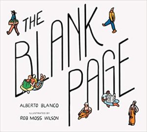
Picture Book Review: The Blank Page by Alberto Blanco

Author: Alberto Blanco
Illustrator: Rob Moss Wilson
Parallax Press
22 September 2020
32 pages

This month’s PB review is by Ryan G. Van Cleave (#1 Paper Fan at Only Picture Books) and OPB newcomer, freelance artist Sharon Holm.

–Ryan’s Review of the Writing–

It’s fitting that a book like this is published by Parallax Press, a publisher founded by Zen Master Thich Nhat Hanh, and one that’s committed to producing books on mindfulness. Why? Because the book’s first line is very Zen.

There is nothing here.”

And just as Zen can plunge one past the surface of life, so, too, does this picture book by acclaimed Mexican poet Alberto Blanco seek to send the reader into an unexpected journey into the profound interconnectedness of all things. To look at a single page of paper is to sense the tree it was made from, as well as the rain and sunlight that helped it grow, and so on.

Eventually, “we can see the trees, the rivers, the clouds, and the mountains…and we can see people, like you and me.” That’s a pretty deep concept for picture book readers. But if we’re fine with board books like Nietzsche 4 Babies or Metaphysics for Babies, why not this, right?

Still…is the idea that the book in your hands is something that connects you to the whole universe too big of idea for little ones to grasp? Is it too abstract? I’m not certain. It’s ambitious, to be sure. And there’s a clear sense of community and connection here, which I applaud.

The best line is the last one: “Where nothing happens, there is a miracle that we are not seeing.” A note on the copyright page attributes that to someone other than the author, though it certainly feels like a line that a poet as accomplished as Blanco might have created.

Ultimately, the book might be more about prompting discussions and thought than providing answers or entertaining readers. For the right adult companion reader, that might be a great fit for what they want to share with a child.

3.75 out of 5 pencils


–Sharon’s Review of the Illustrations–

The Blank Page has a clever introduction, especially for a children’s picture book–a blank page that says “There’s nothing on this page.”  But is there really nothing there? There’s the page, after all. And the book goes on to examine the process of making the paper that makes up that page, as Ryan noted above.

One might suggest that the story is rather simplistic. But is it really? Can a child see that this is more than just another life cycle of a tree book?  The words created a depth I wanted to read into.

Let’s see if the art helps readers explore those depths.

I found the design of the cover to be simple yet effective. I’m also pleased by how that design simplicity is carried throughout the interior spreads. The composition of the interior pages–with the use of sparse text and brightly colored vignettes–pop on a solid white background.

Overall, the illustration style of bold black outlines with bright digital color come across well.

But I wanted more of a connection between the actual artwork and the words of the story. Instead, the heavy lines and flat digital color caused the illustrations to lack the same emotion and depth of the words. It seemed like a missed opportunity.

The art and text didn’t quite work as well as I hoped to support a picture book that isn’t nonfiction, but doesn’t have a main character or narrative throughline.

The book’s message seems to be that everything has a connection, and that we’re all working together in conjunction with our universe. And that we must ALL work together as one, with the universe, to succeed. That’s a great message for any child.

3.25 out of 5 crayons


Sharon Holm is an artist, mother, sister, daughter, wife, friend, black belt kick boxer, and animal rescuer.

She’s also a professional children’s book illustrator/​work-​in-​progress writer. She graduated with honors from the Art Institute of Fort Lauderdale with a degree in Visual Communications, and was an award-​winning art director for various advertising agencies in South Florida before turning her attention to children’s illustrating.

Since then, she’s built an art career through illustrating trade books, fiction, nonfiction, activity books, educational products, and bath books, as well as greeting cards, puzzles, and calendars.

Picture Book Review: Hans Christian Andersen: The Journey of His Life by Heinz Janisch

Author: Heinz Janisch
Illustrator: Maja Kastelic
NorthSouth Books
1 September 2020
56 pages

This month’s PB review is by Ryan G. Van Cleave (Frequent Fairytail Fan at Only Picture Books) and Ringling College of Art and Design Illustration Professor John Herzog.

–Ryan’s Review of the Writing–

I’m always a bit leery of picture books that run past the traditional 32 pages. And with this one at 56 pages? This might be the most telling comment of the entire review–it doesn’t feel long. Had I not known in advance that it was 2x as long as most, I wouldn’t have even thought about that fact.

Partially, it’s due to the captivating artwork. Witness how mesmerizingly bright things get when the story leaps into flights of the imagination. But I’ll let John handle that aspect of things, though I’ll simply add that this reader really appreciates the sense of wonder, innocence, and magic the illustrations create at times. Well done, Maja Kastelic!

Austrian author Heinz Janisch’s fresh take on the life of Hans Christian Andersen (translated by David Henry Wilson) is clever in that it allows Hans himself to tell his own story fairy-​tale-​style to a young girl named Elsa as they share a coach ride. That’s so appropriate in that it connects to the oral component of his tales–we likely first heard them read aloud to us, and here’s Hans doing that same thing for yet another young story lover. Like I said–so clever and apt.

Elsa also serves as a stand-​in for the reader, asking the questions we want asked, primarily “What happens next?” But she also asks if he’s the Hans in his many stories, to which he replies:  “I don’t think my stories are all about me. With fairy tales you can sometimes hold a mirror out in front of other people without them realizing it.”

Another way in which this book is clever is how Hans showcases qualities and experiences from his own life through the lens of his stories, such as how his own early years were like “The Ugly Duckling,” which is about a duckling who is teased for being different until one day when it turns into a beautiful swan. “Anyone can turn into something special–that’s what the story tells us. Like a poor cobbler’s son becoming a famous writer,” he says to Elsa and her mom.

Some might argue that the book presents too cheery a take on a life that most realize was fairly grim, lonely, and eccentric (I hesitate to call him weird, but yeah, that’s probably more accurate since he went bonkers over bad reviews, was terrified of being buried alive, and was likely celibate his entire life), but without a doubt, he’s one of the most influential writers of his century and this book captures a bit of that magic in a pleasant mix of biography and a well-​fabricated story frame.

This is a must-​read for any reader, with appropriate Back Matter that likely will offer one or two tidbits adult readers didn’t know about this beloved literary giant.

4.75 out of 5 pencils


–John’s Review of the Illustrations–

There’s something truly magical happening in Hans Christian Andersen: The Journey of His Life. It’s not just the context, although there’s plenty of magic to be found there. It’s in everything, really: the story, the illustrations, the colors, the compositions. If there’s a perfect picture book, in my opinion, I’d say this gets damn close to being it.

First, I must point out how much I love the length of this book. It’s much, much longer than your typical picture book today, but I appreciate that here. It’s long, but at no point was I bored and, personally, I don’t think kids will be bored reading this either. Heinz Janisch has made this popular, prominent figure of the establishment feel fresh again with an interesting take on their life story. I found it incredibly clever to couch Andersen’s history in a journey where he talks about his life with Elsa, a child–his main audience then and now. I was pleasantly reminded of how Andersen’s stories don’t talk down to children (and neither does this book), which I feel is something of a problem in the children’s publishing world today.

In terms of the illustrations, this is probably one of the most cinematic picture books I’ve ever read. The compositions, character designs, and expert use of color and mood harken to the work of Wes Anderson and Quentin Tarantino. As someone who has dabbled in filmmaking, it’s fantastic to see the crossover here. Color especially is used in incredibly effective ways that help tell the story. We’re taken through the highs and lows of Andersen’s life through color, and the way illustrator Maja Kastelic has approached it is pitch perfect. The contrast is such that, if you were to remove the words, I dare say that the images would still tell the story. They’re that good.

The character designs are also brimming with watercolorey appeal. I instantly like Andersen as he’s depicted here with his top hat and blue bow tie, his cheeks slightly flushed. The other characters involved are also charming and full of life. Even the environments are full of appeal and character thanks to the watercolor approach here.

The way the compositions are laid out almost resemble a comic book, and also reminded me of how Wes Anderson loves playing around with aspect ratio in his films (see The Grand Budapest Hotel and The French Dispatch). There’s one page in particular that I absolutely love: Andersen is discussing the dark times he endured as a child, and the illustrations are very desaturated and dour. And at the very bottom right-​side of the page, underneath this mountain of black & white images, we see a small Elsa looking sad at what Andersen had to endure. We know exactly how Elsa is feeling because of the way the page is laid out and the way color (or lack of it) is used. This page, in and of itself, is a masterclass of visual storytelling.

I completely and willingly admit that I’m coming at this book with my own personal biases. However, I’m planning to purchase The Journey of His Life when it’s released in September, so that right there should tell you how much I love it. I think you’ll love it, too.

5 out of 5 crayons


John Herzog is an award-​winning illustrator and educator. 

His clients include Hasbro, Dreamworks TV, Houghton Mifflin Harcourt, Scholastic, and Highlights for Children. He also teaches illustration classes at Ringling College of Art and Design.

John is a member of the National Cartoonists Society and Society of Children’s Book Writers and Illustrators, where he received the 2018 SCBWI Magazine Merit Award for his Highlights High Five cover illustration. He lives in Florida with his wife, two kids, a pair of geckos, a South American horned frog, a bearded dragon, and a fish.

He is represented by Shannon Associates.

Picture Book Review: Hello, Neighbor!: The Kind and Caring World of Mister Rogers, by Matthew Cordell

Hello, Neighbor!: The Kind and Caring World of Mister Rogers
Author: Matthew Cordell
Illustrator: Matthew Cordell
Neal Porter Books
6 April 2020
40 pages

This month’s PB review is by Ryan G. Van Cleave (Biggest Mister Rogers Fan at Only Picture Books) and Florida author-​illustrator Loreen Leedy, a friend of the OPB family.

–Ryan’s Review of the Writing–

Hello, Neighbor, an authorized biography, takes a direct chronological approach to the life of Fred McFeely Rogers (1928–2003). A lot of care is given to establishing the motivation for Fred’s later commitment to creating quality educational TV programming, starting from being bullied as a child to his growing faith to his sincere interest in becoming a minister.

Then came this: In those days, television was new and just beginning to become popular. And Fred didn’t like what he saw.

Fred decided he could do better. So, what he did was learn the industry from the inside out, then he brought his love for puppetry and music to bear with the première of Mister Roger’s Neighborhood in February 1968. Fred’s interest in welcoming and accepting others was key to all he did–it’s why “Police Office Clemmons was the first African American character to appear in a recurring role on a children’s television series.” Through the many guests to The Neighborhood, viewers also encountered artists, musicians, and people from all walks of life.

One noteworthy linguistic technique is the shift to first-​person plural–we–once Fred’s own show is underway. That might be a choice that represents Fred’s inclusivity or the lasting impact of his work, though many young readers of today won’t be as familiar with The Neighborhood as their adult reading companions will surely be, so they’re not exactly part of the aforementioned “we.” But no doubt, they’d like to be after reading/​hearing so many good things about Fred.

The nonfiction element of Fred’s story doesn’t quite allow for the richness of language and the poetry of sound to emerge within the lines themselves, though perhaps that sense of beauty instead is found in the accompanying artwork done in Cordell’s sketchy-​scratchy style. Cordell is a skilled artist and his soft imagery has a leisurely sensibility that fits the mood of Fred’s life.

The back matter–archival images, a robust About page, visual glossary, and more–is necessary to give a deeper sense of all that Fred did to earn his lasting legacy. And inspirational quotes that get to the heart of who he was and what he believed in are prominently displayed on endpapers.

There are few adults I can think of who are more universally beloved and respected than Fred Rogers. This book serves as a welcome tribute to this admirable, kind-​hearted man.

4 out of 5 pencils

– Loreen’s Review of the Illustrations–

Scrapbook pages from Fred’s childhood reveal his early interests in music, puppetry, and storytelling. As a young man, he questions the frivolous content of children’s television programming. Instead of endless pies in the face and rude behavior, he is inspired to create something gentle, empathetic, and educational. On his show, Mr. Rogers would speak directly to young viewers, engaging with their questions, joys, and fears as well as their imaginations. Author-​illustrator Matthew Cordell takes readers behind the scenes to visit the set with its familiar front door, bench, trolley to the Neighborhood of Make Believe, plus the lights, cameras, and crew.

The illustrations recall a variety of moments from the over 900+ episodes. Fred sings the show’s Won’t You Be My Neighbor theme song in a sequence of TV-​shaped spots, accompanied by delightfully wonky, rainbow-​hued hand lettering. Framed portraits of recurring cast members, scenes from field trips, and famous visitors like Margaret Hamilton as the Wicked Witch of the West enliven the pages. The back matter showcases several photographs of Mr. Rogers in action. The familiar fish tank is one of the notable elements included in a handy visual glossary.

Both young and old will enjoy a tour of Mr. Rogers’ friendly neighborhood with the help of this picture book biography.

Disclosure: Many of Loreen’s picture books have been published by Holiday House.

4 out of 5 crayons


See the source image

Loreen Leedy is the author-​illustrator of more than 40 popular picture books that have received many rave reviews and honors. Her titles such as Measuring Penny, Amazing Plant Powers, and Crazy Like a Fox: A Simile Story often include math, science, and language arts content. Her most recent book, Step by Step, features footprints made by baby animals including a puppy, duckling, and fawn in a page-​turning question and answer format. It makes an appealing nonfiction choice for preschool, kindergarten, and first grade age levels.

To see Loreen’s work and download free book activity printables, please visit www.LoreenLeedy.com.

Picture Book Review: A Little Called Pauline by Gertrude Stein

A Little Called Pauline
Author: Gertrude Stein
Illustrator: Bianca Stone
Penny Candy Books
14 April 2020
64 pages

This month’s PB review is by Ryan G. Van Cleave (Big-​time Gertrude Stein fan at Only Picture Books) and Florida-​based author/​illustrator Fred Koehler.

–Ryan’s Review of the Writing–

Let me preface this review by saying that dozens of picture book hardcovers, softcovers, e‑versions, ARCs, and F&Gs arrive at OPB each month, and it’s hard to deny that more than a few have a sense of sameness to them. That’s not to say quality stories don’t land on my desk each month–some are quite strong! A few are even great. But it’s accurate to note that much of what I see follows traditional paths in how they story creators convey story. I say all this by way of explaining that when a picture book comes along that avoids well-​trod paths, it stands out.

Enter A Little Called Pauline by the late-​great Gertrude Stein, who first published this as a poem in her amazing 1914 book Tender Buttons. The poem isn’t some candy-​coated version of poetry for kids with June-​moon-​spoon rhymes and surface-​only clarity. And this new book is a vibrant, fresh take on a poem that might seem a bit disjointed in both logic and language.

Witness: “Bidding a wedding, widening received treading, little leading mention nothing.”

Or the lines that immediately follow the above: “Cough out cough out in the leather and really feather it is not for.”

Yet there IS a story here, thanks to the work of illustrator Bianca Stone, whose ink and wash sketches pair with Stein’s words to create a story about a girl who dearly wants a fancy, expensive crown for her birthday that’s more than the family can afford. The girl throws a tantrum, and has a Where the Wild Things Are imaginative trip out to sea in a little boat where she then has strange experiences that end up not quite being all she hoped for. In both stories, it’s Mom who provides an apt, tender moment to bring these tumultuous excursions to a satisfying close.

I applaud the inclusion of the Illustrator’s Afterword which discusses the storyness of this poem, and the poemness of this story, as well as Stone’s personal connection to the original “A Little Called Pauline.” The Afterword also invites readers to join in the visual interpretative fun via what Stone calls “Poetry Comics.”

Leave it to Stone–a poet-artist–to trust the power of poetry for its ability to reach young readers. Stone explains: “Poetry is not a mysterious riddle you must figure out. It is a continuous adventure with your own mind, and there are no wrong answers in how you interact with it. All it asks is that you do.”

And that’s what this welcome adaptation of a century-​old poem does. It asks–insists, really–for interaction and response that few readers can deny.

4.5 out of 5 pencils

–Fred’s Review of the Illustration–

Anytime an artist successfully pushes boundaries within a genre, they’re creating new spaces for other artists to experiment and play. In A Little Called Pauline, two bodies of art are separated by over a hundred years and yet somehow they sing in a weird and satisfying harmony.

Yes, I credit this book with having two artists. Gertrude Stein wrote the words in her 1914 poetry collection Tender Buttons. At first blush, they’re so strange that you wonder if it’s a bad translation. But the more you look at lines and say them out loud, the more sense they make. The words make art all by themselves, almost as if they’re a magic spell and by reading them you’re falling under its influence.

Then along comes Bianca Stone, who addresses the text as if she understood exactly what Stein was meaning to say all along. Around the nonsense, she wraps a parent/​child narrative that’s equally intriguing. I love the ink and watercolor style that draws the eye to important details. It’s fun to go back through and see what you missed the first time.

If you skip the words all together, you’ll understand the story. But when you add in the poem, you end up with something oddly wonderful that seems perfectly appropriate, and potentially a healing force, for the strange world we live in today.

I can’t wait to see what Bianca Stone comes up with next.

4 out of 5 crayons


Fred Koehler is an artist and storyteller whose real-​life misadventures include sunken boats, covert border crossings, and fighting off robbers in the dead of night. Whether free diving in the Gulf of Mexico or backpacking across Africa, Fred’s sense of adventure and awe of nature overflow into his characters’ stories.

Fred is passionate about encouraging young artists, promoting social justice, and conserving our environment. He lives in Florida with his wife, kids, and a rescue dog named Cheerio Mutt-​Face McChubbybutt.

Picture Book Review: Fly, Firefly! by Shana Keller

Fly, Firefly!
Author: Shana Keller
Illustrator: Ramona Kaulitzki
Sleeping Bear Press
1 March 2020
32 pages

This month’s PB review is by Ryan G. Van Cleave (#1 Firefly Fan at Only Picture Books) and Florida-​based freelance artist Austin McKinley.

–Ryan’s Review of the Writing–

Fly, Firefly! tells the story of what happens to a single firefly when “a wind current carried him out to see the sea.” While out there, he sees winking lights beneath the water–other fireflies, perhaps? So he dives into the water and can’t get out. He’s rescued by “my niece and I” who explain that the underwater fireflies were in fact the glow of marine plankton–“bioluminescence swirling and twirling through the great sea!” The eponymous firefly is then released on land where he finds his fellow fireflies, and all is well again.

The smoothness and sense of most of the rhymes make lines such as “He dove and splashed through the wet glass, but under the surface, air did not last” stand out. Another line that gives this reviewer pause is “The sea pushed and tugged while I scooped up our bug.” While the second part of the Back Matter does an effective job of offering STEM-​style information on fireflies (a.k.a. lightning bugs)–including pointing out that they’re beetles, not flies–it doesn’t say that they aren’t bugs either (a fact, despite what this line claims). Considering that this book does have a science fact focus–and given the popularity of the term “lightning bugs”–this distinction seems useful to make at some point. Ultimately, the reason the word “bug” is there seems clear–to fit the rhyme, not the science.

Taken as a whole, the text works, though the overall story isn’t a story so much as an anecdote since it’s unclear whether the main character could/​should be the firefly (witness the title, and how it’s the first character we see on page one and in the last spread), the first-​person speaker (who’s an older character), or the niece, Marjie (who rescues the firefly and explains bioluminescence to it in Dr. Doolittle fashion that belies her very young age).

What gives away the real goal of the book is the first page of the Back Matter–the author read a letter that Silent Spring author and environmentalist Rachel Carson wrote to a friend about her own memorable encounter with a firefly half a century ago. An excerpt of that letter shows that Rachel herself considered writing a children’s book about the experience, though she clearly never did such a thing. Some readers might find it gratifying that Shana Keller helped fulfill Rachel’s impulse here with Fly, Firefly!.

The other selling points of this book are the really fine art (see what Austin says below!) and the second half of the Back Matter that gets into the science and biology of fireflies. It’s a plus that the author has so much information on Rachel , too, because kids need to know about her impactful life and work, without a doubt. If Shana Keller opts to write a nonfiction book about Rachel Carson (or the worldwide impact of Silent Spring) with the quality she used in her picture book biography, Ticktock Banneker’s Clock, OPB will be eager to see it.

If you’re a firefly fan or you just love good picture book art, Fly, Firefly! is likely to brighten up your nights.

3.5 out of 5 pencils

Austin’s Review of the Illustrations–

German Illustrator Ramona Kaulitzki’s sumptuous illustrations are so kinetic you can practically hear them, but nevertheless remain calming and peaceful. Here she explores the entire spectrum from the warm glow of the firefly’s body, through a masterful rendering of magic-​hour twilight, to the swirling blues and greens of glowing plankton churning in the waves, all in tints pure and moody without being brooding.

The forest at dusk comes alive. The panoply of sea life she depicts with exquisite sensitivity, whereas the human and titular firefly characters she handles with appealing whimsy.

Her choice of perspectives is also fascinating. We soar through the air, plunge into the waves, and plod along the beach as the sparkling stars hang over the day’s last glow. She skillfully captures mood and emotion—it’s a truly magical, evocative experience that perfectly portrays the parallels of life-​generated lights that created such an impression on biologist Rachel Carlson, and subsequently author Shana Keller.

A look through Ramona’s portfolio will reveal a flair for stylizing the natural world in a sophisticated but approachable way both dynamic and heartwarming without ever becoming saccharine. Her work is digital, but has a very organic, textural, handmade quality that reminds one of mid-​century children’s illustration, like a next-​generation Alain Grée or J.P. Miller. Her staging, however, is far more clever and interesting, her cartooning more fine-​tuned, her palette more refined.

It’s a fine line to walk, but she dances along it expertly in Fly, Firefly!

5 out of 5 crayons


Austin McKinley makes comic books, cartoons, movies, video games, screenplays, novels and novellas through his company, Flying Car. He shot and appeared in the award-​winning feature documentary The New 8‑Bit Heroes alongside director Joe Granato. His comic illustrations have also been published by Image Shadowline, Devil’s Due/​1st Comics, Alias/​Blue Water Press, Avatar, Boom!, Blue King Studios, and FC9. He wrote and illustrated Squareasota, a weekly cartoon in the Sarasota Herald-​Tribune for seven years.
He is currently illustrating Tales of Mr. Rhee vol. 5: Rockstar Paranoia, a graphic novel for Source Point Press.

Picture Book Review: Paper Planes by Jim Helmore

Author: Jim Helmore
Illustrator: Richard Jones
Simon & Schuster Children’s
1 March 2020
32 pages

This month’s PB review is by Ryan G. Van Cleave (Chief Paper Plane Designer at Only Picture Books) and Ringling College of Art and Design Illustration Professor (and OPB lizard-​loving wunderkind) John Herzog.


–Ryan’s Review of the Writing–

Anytime you’ve got a story about friends separating, it seems like we tend to follow the one who goes to the new place. It makes sense. Stories are fundamentally about challenges and changes, and, of course, the person moving away will have those things aplenty.

But in Paper Planes, author Jim Helmore wisely shows us that the ones left behind are encountering their own brand of challenge and change, as we see with Mia, the child left behind when her bestie, Ben, moves far, far away.

One of the things both children share is a love for making paper planes. In fact, they had a Big Plan to create a paper plane so large that it could fly across a “great, wide lake” where they live next to in side-​by-​side houses at the start of the story. What are they going to do now that Ben and his family have moved so, so far from Mia?

Helmore doesn’t pull emotional punches as you can see here: “Hot tears fell from her eyes.” And we see Mia’s loneliness darken into resentment, shown in action by her taking a plane Ben gave her and smashing it. That kind of direct access to a character’s feelings will surely spark discussions in parents and readers about acceptable behavior and the power of emotions.

I’m quite taken by the art here–there’s an interesting contrast in play between the relatively lean prose and the dreamy aspects to the illustrations. I’ll let John explain that better below, since that’s solidly in his domain.

In sum, Paper Planes is an emotionally textured book about friendship and belonging that’s especially welcome in these challenging times.

4.5 out of 5 pencils


–John’s Review of the Illustrations–

I’m prefacing my review of Paper Planes with some historical context:

Right now, it’s April 2020 and the planet is engulfed in the coronavirus pandemic. The majority of businesses are closed, grocery stores can’t keep toilet paper and hand sanitizer in stock, and everyone has been tasked with the responsibility of practicing self-​quarantine and social distancing. Little to no air travel is happening as airlines have suspended service, and hubs of humanity from Times Square to St. Peter’s Square are empty. Friends, family, educators, and entertainers now largely communicate via video conference from their homes.

It is a very, very strange time — and it makes me appreciate Paper Planes all the more.

A lovely story of the triumph of long-​distance friendship, Paper Planes is timeless yet relevant. Mia and Ben are two friends who enjoy spending time with each other, and they especially love making paper airplanes together. One day, Ben tells Mia that he and his family are moving far away, and we see how Mia copes with the situation. Jim Helmore’s story is incredibly sweet and sensitive, yet believable. Mia’s frustration, sadness, and longing for her friend endears us to her, and I kept hoping that she and Ben would somehow be brought back together. Can their friendship endure despite being far away from each other? I’ll avoid spoilers here, but I will say that the result is realistic yet satisfying.

Richard Jones’ illustrations elegantly combine both the simple and complex. Mia and Ben, as well as their cute little dogs, are simply designed yet they’re surrounded by geese, seaside towns, and grassy fields that are full of complexity. The world is nicely balanced, and everything here feels effortlessly deliberate–a quality most illustrators (myself included) struggle to achieve. With Paper Planes, Jones makes it look like a cakewalk.

There’s also a very tactile feel to the illustrations, which is of course inherent in their execution, but also helped quite a bit by the presentation offered by Peachtree Publishing. The dust jacket, for instance, uses a very textured substrate that adds a sophistication and warmth to the overall feeling of the book. Likewise, the interior pages use a matte finish that allows the reader to soak in all of the sumptuous earth tones and vibrant colors used by Jones. This is a high-​quality book — probably one of the best I’ve seen–that rightly deserves to be on everyone’s shelf.

Paper Planes provides a message of hope for all who are far away from friends and loved ones. Granted, given our current situation with the coronavirus pandemic, that message resonates even more. However, I can’t help but feel that I would love this book regardless of what’s happening right now. Its message of friendship transcending distance is timeless.

4.5 out of 5 crayons


John Herzog is an award-​winning illustrator and educator. His clients include Hasbro, Dreamworks TV, Houghton Mifflin Harcourt, Scholastic, and Highlights for Children. He also teaches illustration classes at Ringling College of Art and Design.

John is a member of the Society of Illustrators and SCBWI, and received the 2018 SCBWI Magazine Merit Award for his Highlights High Five cover illustration. He lives in Florida with his wife, two kids, a pair of geckos, a South American horned frog, a bearded dragon, and a fish.

He is represented by Shannon Associates.