Picture Book Review: Socks: A Kid’s Christmas Lament by J.D. McPherson (illustrated by Anika Orrock)

Socks: A Kid’s Christmas Lament
Author: J.D. McPherson
Illustrator: Anika Orrock
Walker Books US
10 September 2024
40 pages

This month’s PB review is by Ryan G. Van Cleave (Owner/​Operator of Only Picture Books) and freelance illustrator Edna Cabcabin Moran.

Ryan’s Review of the Writing

***Note: I’ve been creating picture book reviews at OPB since 2018, and this is the first one I’ve covered which is linked to a song! Witness the QR code at the front of the book which leads to the song and animations. Fun!***

JD McPherson’s picture book, Socks, adapts his song of the same name, transforming a catchy tune into a heartwarming and humorous Christmas story. The book retains the song’s core concept—a child’s comical outrage at receiving socks for Christmas—but expands upon it with a richer narrative, deeper character development, and a more nuanced exploration of holiday themes.

The rhyming text, a hallmark of the original song, remains a driving force in the book. The rhymes are playful and varied, capturing the child’s frenetic energy as they search for hidden presents. The repetition of key phrases, particularly the lament over the “lousy pair of socks,” creates a humorous rhythm that young readers will delight in.

***Want to see the lyrics of the song for yourself? Here you go!***

McPherson’s vivid language and imagery elevate the story beyond the song’s lyrics. The child’s actions are described with dynamic verbs like “creep,” “peek,” and “rifle,” painting a picture of their frantic quest. The socks themselves are imbued with personality, described as something to “insulate” the child’s boots or their failure to “beep or buzz or bop.” These details add depth and humor, making the story a joy to read aloud.

While the song ends on a lighthearted note of defiance, the book offers a more quiet resolution. The child’s anger subsides as they witness their family’s joy and realize the importance of togetherness. This shift in perspective adds emotional depth and reinforces the book’s heartwarming message.

The book’s execution occasionally stumbles in its pursuit of rhyme and rhythm. While the majority of the rhymes are charming and effective, some lines feel forced. This is particularly noticeable in phrases like “impassioned declarations” and “I ruined no vacations,” where the multisyllabic words and unusual phrasing create an uneven cadence that (to some ears/​tongues) might disrupt the natural flow of the language.

Ultimately, Socks is a testament to the power of adaptation. McPherson successfully reimagines his song, creating a picture book that stands on its own merits. The story’s humor, relatable characters, and endearing message will resonate with young readers, making it a festive addition to any holiday collection.

4.25 out of 5 pencils


Edna’s Review of the Illustrations

The minimalistic cartoon style of Socks is befitting of this song-​inspired picture book. Chock full of energy and whimsy, the pages draw you in through a playful composition of line, shape and muted color blocks deftly rendered by illustrator, Anika Orrock.

The story is centered on a nameless boy who complains of getting socks for Christmas. Readers follow along as the boy searches in vain for gifts (other than socks) as his musings lead up to a sock protest in this jazzy-​blues stylized world.

Orrock depicts the boy frantically conducting a dimly lit, early morning search and winding up in a bright, joyful reveal of family festivities and coveted gifts. The story ends with Santa and Mrs. Claus cozying up with socked feet, on a bright North Pole morning. The sophisticated yet subtle transitions and treatment of light in the illustrations are one of my favorite things about this book.

Of special note are pages 28–29 which help to usher in the story’s climax in a side-​by-​side comparison of limited-​color cityscape featuring multilingual balloons versus a stark, colorless crowd of sock-​protesters carrying signs. Kudos to Orrock’s clever typographic treatment of “SOCKS” which is incorporated into a page turn.

Kids will enjoy discovering the sub-​stories and the clever hints on the boy’s personality and interests–see the Jolly Roger skull and crossbones on different objects and the “swear jar” among other things.

Readers can check out the book’s origin by clicking on the QR Code in the book’s front matter. This will take you to the YouTube page which hosts the original song performed by author/​songwriter JD McPherson. The album’s original art show the boy and a Christmas tree–obvious inspiration for the book’s main character and illustrative style.

Overall, I found the illustrations to be a delightful throwback to mid-​century cartoons, keenly drawn and composed and loads of fun to explore–key aspects to the success of this holiday story.

5 out of 5 candy canes


Edna Cabcabin Moran is an author/​illustrator, multi-​disciplined artist, educator, and advocate for youth voices and diversity in publishing. A Filipina-​American born to immigrants and raised in a military family, Edna grew up in the USA’s east and west coasts, Iceland, and Hawai’i. She is also a dancer with acclaimed hālau hula and dance company, Nā Lei Hulu I Ka Wēkiu, and a teaching artist specializing in STEAM and integrative arts. Her latest picture book, Honu and Moa (BeachHouse Publishing), received a 2019 Aesop Accolade from the American Folklore Society.

https://kidlitedna.com

IG: @kidlitedna

Picture Book Review: Giants Are Very Brave People by Florence Parry Heide (illustrated by Merrill Rainey)

Holiday House
1 August 2023
32 pages

This month’s PB review is by Ryan G. Van Cleave (Owner/​Operator of Only Picture Books) and freelance illustrator Edna Cabcabin Moran.

–Ryan’s Review of the Writing–

While I was familiar with Florence Parry Heide (1919–2011), the author of over 100 children’s books, I initially didn’t realize that this was a new edition of a 50-​year-​old work. Realizing that situation now actually answers some of my questions about the book, which are likely a result of audiences being so different a half century ago.

Back to the book, though.…

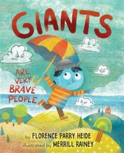
This is the story of a blue-​skinned child named Bigelow. To put it plainly, he’s absolutely a total scaredy-catkid. The clouds could fall on him, after all. And alphabet soup could spell out a magic word that kapoofs him into a mushroom. And rain? Well, of course he’s afraid of rain. Because he might melt.

One day, he goes out for a walk and encounters a very small woman (Mrs. Pimberly) who’s afraid of him because to her, he’s huge. She suggests that he might be less afraid if he acted a bit more fierce–perhaps by giving “a giant short of shout” such as FEE FI FO FUM. While it seems as if Bigelow is the first giant she’s encountered, she says that all giants know that phrase.

Bigelow practices the shout repeatedly while Mrs. Pimberly brews some tea. When she comes out with the tea, Bigelow is LOUD, to which she says, “You certainly scared me. That’s a very good shout. I’m sure it will make you feel much, much braver.”

All that shouting made him hungry, so Mrs. Pimberly makes him a mountain of pancakes (large to her, small to him). After he’s had the tiny snack, he offers to take her home with him, but she declines, saying that she has never traveled or had many experiences. “I’ve never even been on a train,” she says.

Back at home, Bigelow uses FEE FI FO FUM to deal with two of his fears–alphabet soup and bathtime. Maybe acting brave does help someone feel a little braver after all! The kid giant returns the favor to Mrs. Pimberly by bringing her his toy train, which allows her to ride “round and round and round the track.” While it’s unclear how riding a toy train equates to exploring the world, Mrs. Pimberly appears genuinely thrilled with the experience.

Ultimately, I have questions about the story. While children are likely to love shouting FEE FI FO FUM with Bigelow, will they feel less excited that an adult solved/​helped solve Bigelow’s problem (being afraid)? Most contemporary picture books give far more agency to kids in stories. I also wonder how a child who is afraid of everything manages to summon courage to go on long walks away from the safety from home.

Yet Rainey’s graphite pencil and digital illustrations are quite charming, as Edna will explain below. I’ve already mentioned the read-​aloud-​ability of parts of this book, and I’m also charmed by how some readers might not realize how Bigelow is a kid giant until he does himself (which is when he meets Mrs. Pimberly). There’s also a sincerity to the text that still comes through even after 50 years.

All things considered, it’s worthy of a read and an after-​book discussion about courage and fear. Great job, Merrill Rainey!

4 out of 5 pencils


–Edna’s Review of the Illustrations–

Merrill Rainey’s digital illustrations in Giants Are Very Brave People bring a freshness and verve to a bygone storytelling style by late bestselling author, Florence Parry Heide. In contrast with the story’s ambling quality, the art is direct and charming as metrical compositions of richly layered pages. Colors and textures sing. Shape and line work dance. Negative space places the main character, Bigelow, center stage in coping with his exhaustive list of fears.

Bigelow ventures (accidentally) into a place outside his fears as Rainey’s colorful artwork starts to fill the pages. Full and half-​page compositions take Bigelow and readers onto different vantage points [see pages 5 and 7] where he literally and metaphorically  gets a new perspective on things.

He meets Mrs. Pimberly who, in spite of her fear (of giants) begins to befriend Bigelow. She breaks the news to Bigelow that he is a giant and gives advice on how to behave like one. Rainey presents a visual metaphor of Bigelow finding his own voice as a giant. As Bigelow practices his Fee Fi Fo Fum chant [pages 10–11], spot illustrations move across the page spread like musical notes building up to a gigantic crescendo.

A turn to page 12 features a blue person hiding behind a door. It’s not clear right away that this is Mrs. Pimberly as she is painted in flesh tone in the rest of the book. On closer inspection of the text and visuals such as glasses, hairstyle and polka-​dot blouse, we realize this blue character is Mrs. Pimberly after all. Whether or not this is an intentional color change is unclear. Taking small pause, however, in a book that tackles the big theme of fear does not detract from the exuberance of Rainey’s tight but loosely rendered, playful yet rigorous artwork.

The scene on pages 30–31, featuring Mrs. Pimberly riding the train that Bigelow set up, is sure to be a favorite among readers. Rainey’s composition of color, shape, line, texture, and expressive animate and inanimate things, result in a tour de force for this picture book. We are not only treated to a visual symphony that resonates with an old-​timey tale of Bigelow and Mrs. Pimberly, but we are shown how to be brave in the new millennia.

4.75 out of 5 crayons


Edna Cabcabin Moran is an author/​illustrator, multi-​disciplined artist, educator, and advocate for youth voices and diversity in publishing. A Filipina-​American born to immigrants and raised in a military family, Edna grew up in the USA’s east and west coasts, Iceland, and Hawai’i. She is also a dancer with acclaimed hālau hula and dance company, Nā Lei Hulu I Ka Wēkiu, and a teaching artist specializing in STEAM and integrative arts. Her latest picture book, Honu and Moa (BeachHouse Publishing), received a 2019 Aesop Accolade from the American Folklore Society.

https://kidlitedna.com

IG & Twitter: @kidlitedna

Picture Book Review: Sunflower Sisters by Monika Singh Gangotra

Author: Monika Singh Gangotra
Illustrator: Michaela Dias-​Hayes
Owlet Press
6 July 2021
28 pages

This month’s PB review is by Ryan G. Van Cleave (Owner/​Operator of Only Picture Books) and freelance illustrator Edna Cabcabin Moran.


–Ryan’s Review of the Writing–

Right from the start, Monika Singh Gangotra’s picture book Sunflower Sisters leans into its primary topic–colorism (favoring light skin over dark skin). It’s not something often addressed in picture books, which is why I was so interested in reviewing this book.

Skin color comes up in the first scene because a pair of friends, Amrita and Kiki, each have older siblings who are getting married (not to each other). They’re playing outside, but as soon as the guests arrive, Amrita’s Aunty tells them to go inside because it’d be a bad idea to get a tan right before the weddings. It’s subtle, but that’s the first nod toward lighter being better than dark (from her perspective).

Once the children are in the house, Jas–Amrita’s sister and soon-​to-​be-​bride of Shahid–is wearing cream to “make my skin look fair and bright.” Mom isn’t having that. She wipes it off and assure her daughter that she’s beautiful as is.

During bathtime, Amrita’s mom talks with her about a number of old wives tales, such as avoiding tea because it might make her skin lighter. “That’s ridiculous,” Amrita says with the wisdom of a child. And her mom agrees, assuring her–and the reader–that everyone’s skin is perfect regardless of its color. Light, dark, or any shade at all, it’s “EXACTLY as it is meant to be.”

Amrita’s Aunty clearly has outdated beliefs and customs. In addition to having given Jas the skin-​lightening cream, she’s urging Amrita not to wear yellow because its brightness will only make her skin look darker. With the support of her mother–who doesn’t share the same beliefs as Aunty–Amrita wears yellow to her sister’s wedding.

As chance would have it, Kiki’s family is celebrating their own wedding on the other side of the street at the exact same time. Amrita notices Kiki is wearing bright colors, too. “Sunflower sisters!” they shout, promising to make each other feel like sunflowers every day. The final wordless images show a flash forward to the two kids owning their own clothing store and making runway-​worthy sunflowery clothes.

A single page of back matter addresses the idea of colorism in a clear, helpful manner that’s suitable for young readers.

The best lines in the entire book happen when Amrita gets ready for for some before-​bed tea after her bath, and Dondi says, “Yes you really are beautiful like the leaves in autumn. Do you know people travel from miles around to see the browns and golds of the changing leaves? It’s a marvel, just like you.” That’s lovely and empowering. Clearly not all adults are as locked into old ideas and traditions as is Aunty.

For those wanting more of a plot, they might find the book wanting since both children don’t have a lot of agency. The conflict here is ideological, but not one Amrita really faces firsthand since she is fully supported by Mom in every instance. While that’s a terrific thing in life, it’s less useful to include always-​there, always-​supportive adults in picture books since most readers want to see kids solve (or at least try to solve) their own problems. Also, there are a lot of characters here–two named neighbors, two kids, parents, other adults, wedding guests, etc., plus Amrita is also called “Beta,” so it’s possible independent readers might get confused, though the pictures might help them through those moments.

But make no mistake–the topic of colorism is book-​worthy. In an interview about Sunflower Sisters, the author explained her motivation behind the book and how she grew up with the underlying fear that if she became darker skinned, she’d be unworthy of love and unable to obtain success. “I was advised when attending social South Asian events that certain colours, such as yellow, would make my skin look darker and that I should probably choose another colour, no matter how much joy wearing it would bring me. These comments made by loved ones and strangers alike were not malicious. The comments and guidance were always well meaning and not intended to hurt us. They were done so because they thought they were protecting us and helping us live a life full of opportunity – ones that we would simply not be offered if our skin was darker.” To see the rest of the interview, check it out at My Book Corner.

In sum, the book has two weddings (fun!), two cool kids (fun!), and lots of terrific artwork (fun!). Plus, the story deals with a little-​talked-​about topic in an appropriate, empowering way. Those things alone merit consideration for this book being added to your To-​Read list.

3.75 out of 5 pencils


–Edna’s Review of the Illustrations–

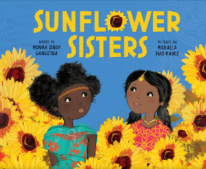
The picture book, Sunflower Sisters, is bedecked in vibrant colors emanating from collage-​infused, stylized illustrations. Artist Michaela Dias-​Hayes creates charming characters set in stage-​like scenes in a tale of beauty standards and friendship told by Monika Singh Gangotra. But there is more to Dias-​Hayes’ use of buoyant, fun colors. Before color is even mentioned in the story, Dias-​Hayes suggests yellow as something beyond artistic element or device. I’d venture to say that Dias-​Hayes uses yellow as a character itself in the story.

In the opening scene, we see clusters of yellow sunflowers along the sides of the house and near the front entrance–an homage to the title of the book. Subtle yellow paint textures the house that serves as a backdrop for strings of yellow and white lights. The house’s triangular features on the upper level is painted golden yellow. It occupies the center of the page like an arrow pointing up to the sky, perhaps alluding toward higher ideals.

We are brought in a bit closer to characters on the opposite page which depicts Amrita, the main character, hugging her visiting aunt who advises that Amrita come in “out of the sun.” They are framed by splashes of yellow from sunflowers, Kiki’s dress, and a multitude of stringed bulbs dangling down from the house and along Amrita’s dad’s shoulders.

Then yellow is used sparingly–quieted down–in subsequent page spreads as Amrita receives both direct and subtle messages regarding dark skin tone versus whiteness–misleading, negative notions from older female relatives. On a shopping excursion, Amrita expresses her preference for dressing in yellow “like the sunflowers” and several aunties are depicted gasping with disapproval on a page devoid of the color yellow. “YELLOW?” they say, “With YOUR complexion?”

The story switches to a positive direction when Amrita’s Mom brings out a yellow “lehenga” outfit from her girlhood and gives it to Amrita to wear. Dias-​Hayes takes the color yellow into high gear transporting Amrita and her mom to a field of sunflowers–a jubilant page filled with golden yellows.

In contrast with its earlier single page scenes, the remainder of the book is comprised of scenes spanning the length of each spread–from Amrita’s sister’s wedding and the neighbors’ wedding scenes to the final fashion catwalk scene. All are resplendent in subtle touches of yellow glowing in the background while foreground colors host bright, bold yellow markers directing our eyes around the spread.

My only critique of Dias-​Haye’s illustrations is the uneven anatomical features and character proportions. There is a look and feel of characters being created separately and pasted into place like paper dolls. But these are minor details in the scheme of things. Dias-​Hayes has a strong design sensibility with a charming style. Through her expert use of color we are treated to a world that is bright and fun, bouncing with energy, while also grounded in a compelling color story filled with hope and gravitas.

4.5 out of 5 crayons


Edna Cabcabin Moran is an author/​illustrator, multi-​disciplined artist, educator, and advocate for youth voices and diversity in publishing. She is also a dancer with acclaimed hālau hula and dance company, Nā Lei Hulu I Ka Wēkiu, and a teaching artist specializing in STEAM and integrative arts. She has served on several nonprofit committees including We Need Diverse Books and Alternative in Action’s Project Youthview: The Power of Youth in Film.

A Filipina-​American born to immigrants and raised in a military family, Edna grew up in the USA’s east and west coasts, Iceland, and Hawai’i. She resides in the SF Bay Area where she’s written and/​or illustrated for children’s literature and poetry anthologies. Her latest picture book title, Honu and Moa (BeachHouse Publishing), received an 2019 Aesop Accolade from the American Folklore Society.

https://kidlitedna.com

IG & Twitter: @kidlitedna


Picture Book Review: A Song of Frutas by Margarita Engle

Author: Margarita Engle
Illustrator: Sara Palacios
Atheneum Books for Young Readers
3 August 2021
40 pages

This month’s PB review is by Ryan G. Van Cleave (Owner/​Operator of Only Picture Books) and freelance illustrator Edna Cabcabin Moran.


–Ryan’s Review of the Writing–

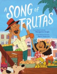
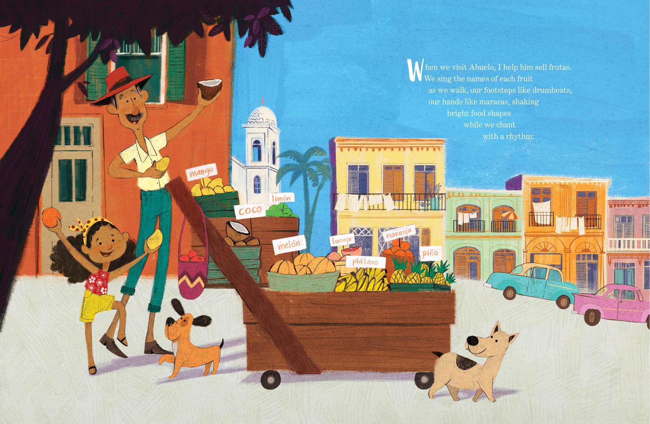
Pura Belpré Award-​winning author Margarita Engle’s A Song of Frutas tells the story of a young child who visits “mi abuelo” (Spanish for “my grandfather”) in Cuba and helps him sell fruit in the streets.

What’s wonderful is how the child watches Abuelo and the other sellers hawking their wares in song, full of “melodies and rhythms.” As Abuelo and the child walk together, “our footsteps are drumbeats,” and “our hands are maracas.” But there’s all manner of music in the air, so Abuelo must sing louder than the rest in order to be heard. This musical theme is embedded all throughout these pages literally, lyrically, and visually.

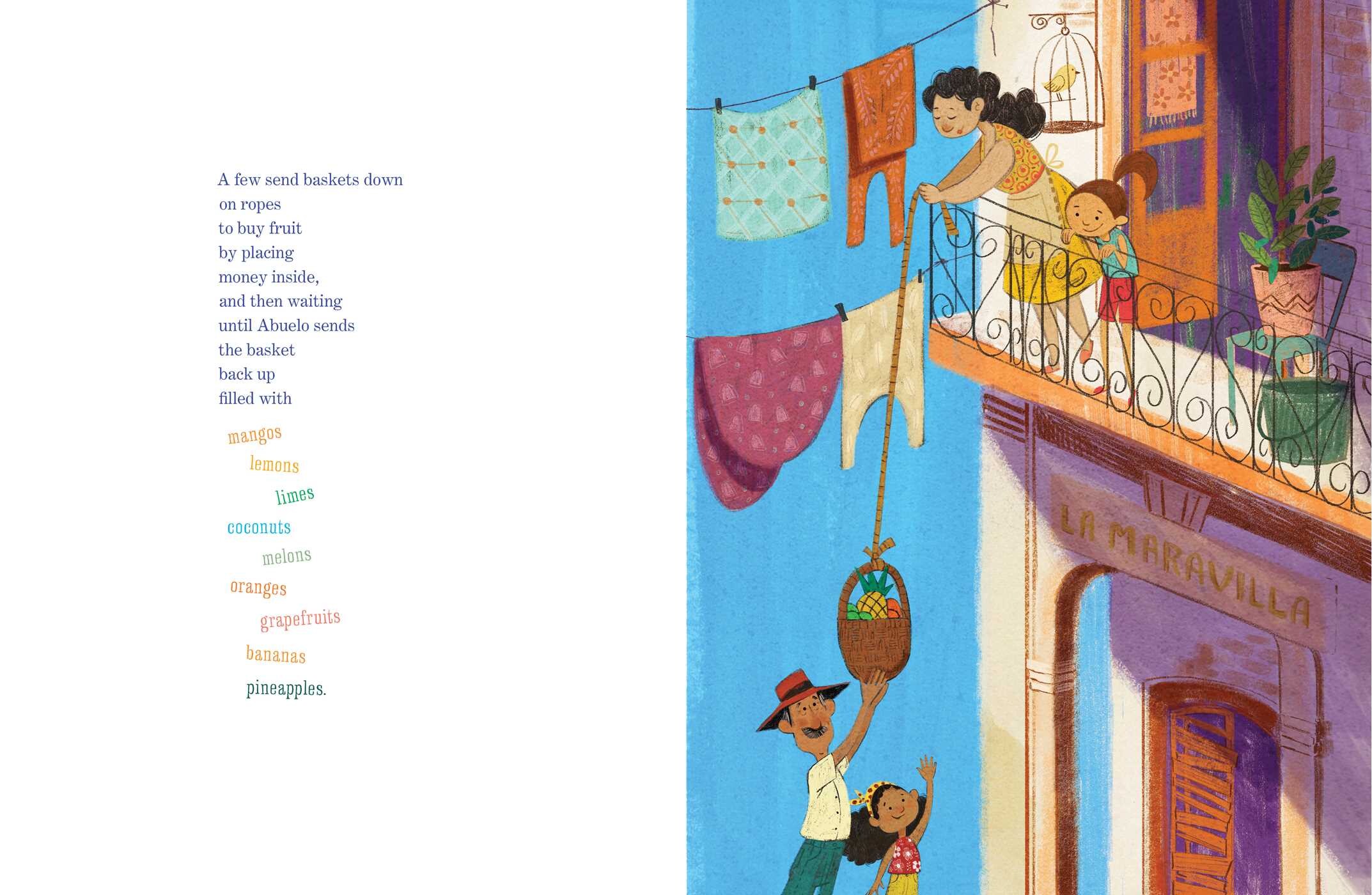
I’m a fan of how the physical layout of the text tries to mirror the musical rhythms, such as “mangos, lemons, limes, coconuts, melons, oranges, grapefruits, bananas, and pineapples.” Written in vivid colors and staggered down the page, this list of fruits is echoes the multi-​vocal song of the street vendors.

The most tender moment of the story is how the child explains that their favorite visits to Cuba are “on the eve of el año nuevo,” where everyone wants to buy 12 grapes so they can have luck in each month of the coming year.  At midnight on New Year’s Eve, the child gobbles 12 grapes to “make one wish per month for the whole coming year.”

The author has a clear message in this book, as the child illustrates by admitting that their last wish is for friendship between the two countries (the US and Cuba). This message re-​appears in greater clarity in the Back Matter, citing the “unfair” travel restrictions that keep people from seeing loved ones as often as they’d like.

Let’s go back to the story text itself. Many of the Spanish job titles included in the story are easily explained in the context. That’s wonderfully done. And, at times, we see Spanglish in action, such as how Engle uses “Sabroso” followed by “Tasty.” Giving readers the same meaning from two words in two languages is a very strong technique, and from the Back Matter, this is intentional.

As I read, I wondered if there’d be a Spanish-​to-​English glossary in the back, or perhaps a pronunciation guide. There isn’t. Maybe there’s no need? I wonder, though, how many readers will, in those early pages, be saying “nah-​ran-​jah” and “pee-​na” for naranja and piña. Hopefully none!

It’s a sweet book with bright, memorable illustrations that offer a glimpse into a very specific part of the world of Cuba. Very nice indeed!

4.25 out of 5 pencils


–Edna’s Review of the Illustrations–

Sara Palacios’ delightful artwork in A Song of Frutas brilliantly underscores Margarita Engle’s heartwarming Spanglish poem and her story of a girl and her beloved Abuelo el frutero. Palacios’ mid-​century inspired illustrations are very compelling, but I find them equally potent as a sequential work, enhancing and elevating Engle’s words with a warm, visual narrative imbued with musicality and meaning.

Throughout the book, Palacios’ paintings croon with jewel-​tone hues, textured shapes and lines, and an energetic cast of characters. From an artistic standpoint, this dense combination of equally bold colors, patterns, and personalities is hard to pull off. Palacios confidently blends and amplifies these elements in a symphony of movement and white space (a.k.a. composition). What might come across as light and loose stylistically is actually tightly composed.

Palacios’ overall treatment of spreads move with rhythm and musicality–highly-angled collage and expressive lines coming together under Palacios’ deft orchestration. She plays the elements in service of story and tenor. In the opening spread, contrasting colors and values establish that the girl and her abuelo are the main characters overseeing a street that sits under a cerulean blue sky hosting the opening stanza. In the second spread, Palacios directs the readers’ eyes from light pastel words floating in the sky, down the handle of Abuelo’s fruit cart, and across the gutter to the right page, landing onto main characters joyfully singing.

In the third spread, Palacios employs golden browns and bursts of yellow on a building that fills the entire left page. This is balanced at the right by detailed vignettes of people and objects dancing atop a background gradation of soft purple to gray and then to white space with a stanza, at the top.

Palacios switches to a completely different treatment on the next spread where she leaves the left page empty of illustration–a field of white space that holds one long stanza with playful type–and on the opposite side, installs a charming scene of the girl with her abuelo delivering fruit in a basket to a customer high up in a balcony. Palacios’ varied and generous use of white space continues into the middle of the book as other “los pregoneros,” or singing vendors, are mentioned.

Then come the final spreads, beginning with Palacios articulating the poignancy of grapes on New Year’s Eve. After a dramatic sweep of painterly scenes, one after another, Palacios changes from the jewel-​tones of Havana to an earth-​tone scene in San Francisco. A blue mailbox and a set of blue doors at the US Post Office foreshadow what’s next: A scene accompanying “hopeful poems flying like songbirds” followed by a scene of the girl and Abuelo embraced in a hug–all happening beneath cerulean blue skies.

Flat, collage-​style artwork has the potential for visual tangents which create ambiguity and confusion between objects. I found a few instances in Palacios’ artwork such as the open market scene where, at first glance, a basket of fruit appears to be on the same plane as a woman’s head, jutting out like a headdress. But such tangents are minor and do not detract from the story. I feel satiated after reading this picture book, thanks in great part to Palacios’ gorgeously detailed and stylized illustrations—each spread hanging together with all the rest and giving voice to what matters in the story like the soft glowing festival lights in Palacios’ nighttime scenes.

4.75 out of 5 crayons


Edna Cabcabin Moran is an author/​illustrator, multi-​disciplined artist, educator, and advocate for youth voices and diversity in publishing. She is also a dancer with acclaimed hālau hula and dance company, Nā Lei Hulu I Ka Wēkiu, and a teaching artist specializing in STEAM and integrative arts. She has served on several nonprofit committees including We Need Diverse Books and Alternative in Action’s Project Youthview: The Power of Youth in Film.

A Filipina-​American born to immigrants and raised in a military family, Edna grew up in the USA’s east and west coasts, Iceland, and Hawai’i. She resides in the SF Bay Area where she’s written and/​or illustrated for children’s literature and poetry anthologies. Her latest picture book title, Honu and Moa (BeachHouse Publishing), received an 2019 Aesop Accolade from the American Folklore Society.

https://kidlitedna.com

IG & Twitter: @kidlitedna

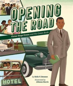
Picture Book Review: Opening the Road: Victor Hugo Green and His Green Book by Keila V. Dawson

Author: Keila V. Dawson
Illustrator: Alleana Harris
Beaming Books
26 January 2021
40 pages

This month’s PB review is by Ryan G. Van Cleave (Amateur Travel Aficionado at Only Picture Books) and OPB newcomer Edna Cabcabin Moran.

–Ryan’s Review of the Writing–

In 1930s America, segregation was legal, and that meant Black Americans couldn’t do many of the things others could simply because they were Black. When New York mail carrier Victor Hugo Green found a guide for Jewish people that listed stores that sold kosher food, he got an idea. What if he put together his own guide that shared information about where Black Americans were safe and welcome?

Opening the Road tells the story of how Green got the idea, created the first guide, expanded it because of increasingly popular demand, and ultimately changed the lives of countless people because it offered Black people a list of safe places they could trust. He sold a lot of copies of his guide even before a national gas station chain started stocking it. Before long, the US government dubbed “The Green Book” an “official Negro travel guide.”

Green’s dream was that his guide would one day become obsolete, and in 1964, the US Congress “passed a law that made separating people by race illegal.” As a result, notes author Dawson, the 1966–67 Green Book was the very last edition ever published.

Dawson’s prose throughout the book is understated, which is an interesting choice considering the emotionally charged subject matter. Since the flip side is potential melodrama, it’s a tough balance to negotiate–no doubt about it. Another challenge nonfiction picture book authors face with subject matter like this is finding ways to engage children in a story that doesn’t feature children. Right on page one–as well as the cover–Victor Hugo Green is an adult. Perhaps what draws child readers are phrases like “a make-​do toilet” and “sold like hotcakes!” or Alleana Harris’ potent illustrations which show conflict via contrast in many pages.

I’ll let Edna explain what’s going on with the art, since that’s her expertise.

A two-​page Author’s Note supported by a two-​page timeline helps contextualize Victor Hugo Green’s life and historical contribution. It also connects this story to Black Lives Matter and includes a clear call to action to fight injustice.

Opening the Road is fundamentally about the power within all of us to make a difference and change the world. It’s a clear must-​have for public and school libraries. Adults who want another avenue to discuss the power of the human spirit to resist might find this an apt conversation starter, too.

4.25 out of 5 pencils


–Edna’s Review of the Illustrations–

The visual story of Victor Hugo Green and his Negro Motorist Green Book springs off the page in Keila V. Dawson’s Opening the Road thanks to illustrator Alleanna Harris’ intriguing combination of painterly and minimalist renderings. Harris’ keen digitally-​created melding of artistic expression and socio-​political references offers a frank, unsentimental, and impactful view of Black peoples’ experience in mid-​century America.

Harris’ illustrations open on a strong note. In the first double-​page spread, the bold shape of a two-​lane highway shown in one-​point perspective juts out from behind a minimally rendered car. Harris cleverly frames the faces of a frustrated Victor Hugo Green and his worried wife, Alma, with the simple form of a windshield. Through textural brushwork and thoughtful design, Harris sets a compelling stage for the Green Book’s inception and journey.

In subsequent pages, Harris composes painterly settings and deceivingly simple layouts that indicate a deeper narrative around Jim Crow rules: Long-​distance travelers, unable to stop at a highway café, continue down a lonely stretch of highway; a white girl and a Black girl, with their backs to one another, walk away from segregated water fountains stationed at the center of the double-​page spread; and in the first set of one-​page illustrations, an image of a Black driver being told to leave a “sundown town” is juxtaposed with an illustration of Black children being kept out of a playground. Each of these scenes is powerful on their own but in succession they form a gripping visual tale.

Harris’ work is reminiscent of the architectural and scenic treatments of mid-​century painter, Edward Hopper, as well as illustrative styles from the Little Golden Books of the same era. The first two-​thirds of illustrations for Opening the Road are marvelously executed, setting up an expectation of continued dynamic page design, engaging sequential narrative, and fully-​rendered paintings. Yet, the final double-​page spreads fall a bit short. The bottom sections repeat the pattern of images in the lower half of the page and text at the top, and there are no textural treatments or background elements to draw one’s eyes up and around the pages.

The scene depicting protestors in the bottom foreground of the spread is interesting but the digital technique of repeating the crowd and blurring them out is a departure from Harris’ painterly handling of background elements. Plus, the blurring calls attention to itself. In the page spread that follows, a gray-​haired woman sitting at a desk with Victor is placed in the bottom foreground, while the background is rendered with blue lines and light blue shading. The blue lines remind me of non-​photo blue pens and pencils used in sketching and art production. This treatment and style is yet another departure from Harris’ painterly renderings such as that shown in the kitchen table scene of Victor and Alma writing letters.

Overall, I enjoy Harris’ illustrations and narrative voice and would’ve appreciated the same consistency and dynamics of the early pages in the final spreads. For me, the layout and style choices are a missed opportunity at bringing the visual narrative full circle. Yet, I had a change of perspective on the last double-​page spread with its layout split in half by the illustration at the bottom and the text on top, against a paper-​white background. I wondered if the visual “questions” of the first spread were answered by the last spread. (This is based on a writing tip offered by acclaimed author, Jane Yolen—that good endings “answer” the questions in a story’s opening).

I came to appreciate that Harris does answer the opening spread with her depiction of a present-​day Black family (on the bottom half of the page) traveling in a car that “drives” to the right, into the future. The characters’ expressions are happy and hopeful, conveying Victor’s dream of “no Green Book for Black people.”

Lastly, nonfiction picture book backmatter often includes spot illustrations that add interest and round out the feeling of the book. The author notes pages are text-​heavy and devoid of images, so I am glad to see Harris’ charming illustrations in the fun timeline of the Negro Motorist Green Book.

4.25 out of 5 crayons


Edna Cabcabin Moran is an author/​illustrator, poet, arts educator, and hula dancer. Having been raised in the continental US east and west coasts, Iceland, and Hawai’i, Edna’s approach to storytelling and teaching is informed by her multicultural experiences and rooted in her arts-​integrative practices.

Edna’s latest picture book is Honu and Moa (BeachHouse Publishing), a Hawaiiana mash-​up of the Tortoise and The Hare and recipient of a 2019 Aesop Accolade.

https://kidlitedna.com