Picture Book Review: Busy Feet by Marcia Berneger

Starry Forest Books
14 February 2023
24 pages

This month’s PB review is by Ryan G. Van Cleave (Owner/​Operator of Only Picture Books) and longtime OPB friend (and Ringling College of Art and Design Illustration Professor) John Herzog.

–Ryan’s Review of the Writing–

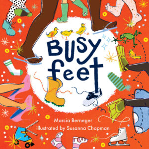
It’s always a bit challenging to review a book with minimal text and eye-​catching art. That’s the situation here with Busy Feet, where a pair of kids go throughout their day with the emphasis being on the range of activities they experience in a kind of Energizer-​bunny fashion. You almost never see their faces to the point that the feet themselves are essentially the main characters. I’ll let John explain the ifs, hows, and whys of the art’s effectiveness below, but I suggest it’s likely due to vibrant colors and a strong sense of motion.

Let’s circle back to the text. The rhymes are purposefully basic and appear to be chosen with a goal of showcasing opposites (hot/​cold, go/​stop, high/​low) to help very young readers learn important words and concepts. To ensure readers notice these common antonyms, they’re always in UPPER CASE lettering in the text.

The book is especially short for a picture book (24 pages versus the standard 32). Was it originally intended to be a board book? I wouldn’t be surprised to learn that, considering the level of text. This feels like a book intended for 2- to 4‑year olds, though kids in the images seem older than that mid- to late-​toddler age. I’m pleased to see that the main two kids/​pairs of feet showcase a biracial friendship, and in the cameos of other kids/​feet, there’s a child in a wheelchair zooming along. For a pretty small cast of characters/​feet, that’s a lot of range.

In the absence of a more defined storyline and with rhyming text this minimal, I prefer to find true rhymes (high/​sky) versus near rhymes (done/​come). Leaning into the accents in addition to being attentive to syllable counts and rhymes often gives subtle oomph to the text, as well.

Still, Busy Feet this has a pleasing read-​aloud quality. And, as John will explain in a moment, the art is sure to appeal. That’s a nice combination. But I wonder–since toddlers buzz through their days in a whirlwind of activity, might we see sequels that showcase other busy toddler body parts? I’m imagining hands and mouths, but surely other options might prove equally intriguing.

4 out of 5 pencils


–John’s Review of the Illustrations–

Reading Busy Feet reminded me of this quote from Douglas Horton:

The art of simplicity is a puzzle of complexity.”

Susanna Chapman’s illustrations for Busy Feet exemplifies this beautifully. The colors, patterns, design of the characters and peripheral elements – it all feels so simple, yet there’s a heart of complexity beating here.

Even simpler is the story, written by Marcia Berneger. Typeset in Futura (a Wes Anderson staple) and coupled with the simply complex illustrations, this feels more like a visual tone poem than a picture book. The design choices and visual flourishes give this an almost hallucinogenic feeling, which is exactly what the book needs.

I personally found the story (if it can be called that) somewhat lacking, but perhaps I’m expecting too much. After all, if the story were to be more straightforward, perhaps the balance of the simple story with the complex illustrations would cause it to feel a bit uneven. Nevertheless, I think there were more opportunities for Berneger to explore, especially given that the book takes the point-​of-​view of a little dog following along with the exploits of his child compatriots.

That’s the only weak link, really. On the other hand, the illustrations are incredibly effective and, most importantly, fun. This book is chock-​full of abstraction, interesting perspectives, textures you can really sink your teeth into, and old school printing imperfections – such as misaligned print plates. The style is very retro, which helps to make Busy Feet feel at home in both 1963 and 2023.

I have no doubt that this will end up being one of my favorite books of the year thanks to Chapman’s outstanding illustrations.

4.5 out of 5 crayons


John Herzog is an illustrator and educator. He has created work for Scholastic, Houghton Mifflin Harcourt, Little, Brown and Company, Highlights for Children, DreamWorks TV, and Hasbro. He also teaches illustration at Ringling College of Art and Design.

John is a member of the National Cartoonists Society and the Society of Children’s Book Writers and Illustrators, where he received the 2018 SCBWI Magazine Merit Award. He lives in Florida with his family.

John is represented by Kayla Cichello at Upstart Crow Literary.

Picture Book Review: Wally, the World’s Greatest Piano-​Playing Wombat by Ratha Tep

Princeton Architectural Press
18 October 2022
40 pages

This month’s PB review is by Ryan G. Van Cleave (Owner/​Operator of Only Picture Books) and longtime OPB friend (and Ringling College of Art and Design Illustration Professor) John Herzog.

–Ryan’s Review of the Writing–

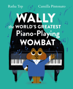
I’m a sucker for a picture book cover that screams READ ME and wow, this one does that. The title is silly and full of alliteration, and Wally himself just seems like the type of wombat I want to spend 32 pages with. And yes, it’s partially due to the blue tuxedo tailcoat.

This debut picture book by frequent The New York Times contributor Ratha Tep starts fast. By the third spread, we know that while Wally wants to be the world’s best piano-​playing wombat, he’s not–a wombat in a red tuxedo tailcoat does it better. Wally isn’t daunted by that realization, however. He adds more and more to his act until he’s tap dancing, ball twirling, AND playing the piano. Surely he’s the greatest at all of that?

He’s not. That same red-​dressed wombat can do all of that better.

At that realization,Wally quits. But like anyone with a dream, he finds it’s hard to give it up completely. He keeps thinking about that piano, and when the other wombat is “lurking around Wally’s piano,” Wally takes action.

The other wombat (Wylie), though, offers a cookie. Then he says that he missed Wally’s playing because it made playing the piano fun, and it made him try harder and play better. Wally realizes that Wylie’s playing made HIM play better, too. Over a chocolate chip cookies and milk snack, the two new wombat friends create a plan. Not just any plan, but the WORLD’S GREATEST plan.

The two perform on stage as the “World’s greatest blindfolded, unicycling, flamethrowing, hula-​hooping, piano-​playing wombats ever!” And it’s amazing. Until they realize someone else can do it better.

Even though Wally is discouraged at times, the book showcases the power of healthy competition and the delicious joy of doing what one loves. In an interview at Picture Book Builders, Tep discusses how, as a child, she had experiences similar to Wally’s but that “things also exponentially improved for me once I started accepting that there would always be someone better. I don’t mean this in a defeatist way; if anything I find it a liberating frame of thought. It frees you up to do what you really love.”

I think that affirmative, empowering focus comes through effectively in this story. Even when Wally has his minor eruption, he immediately comes around after the simple kind act of Wylie offering him a cookie.

Even though this is Tep’s debut picture book, I have to note that she did an admirable job keeping the text tight and focused. I think that’s partially why the artwork is so effective–she purposefully left a lot of room for Pintonato to play with, explore, and spotlight.

In sum, while this is a debut author at work and the publisher isn’t one I’ve encountered before, the product is memorable, amusing, and well worth reading again. Highly recommended.

4.75 out of 5 pencils


–John’s Review of the Illustrations–

Wait, what?”

These are the two words I repeated to myself at least three or four times while I read Wally the World’s Greatest Piano-​Playing Wombat. Not because I didn’t like the book–I absolutely love this book, and it will probably end up being my favorite picture book of 2022. I said those words because Wally genuinely surprised me with its sophisticated themes, and how universal yet specific it is. It’s a two-​person, high-​wire balancing act, with Ratha Tep’s snappy prose beautifully balanced by Camilla Pintonato’s charming, vintage-​style illustrations.

This is a book that speaks to anyone who aspires to anything, spending hours and hours honing and perfecting their craft only to realize that there’s someone out there who does it better than you. This conflict is at the core of our story, which involves a piano-​playing wombat named Wally who discovers that there’s another wombat named Wylie who can not only play the piano, but can tap-​dance and twirl a ball and play the piano at the same time. Naturally, Wally decides to take his ball and go home (a sentiment I very much relate to). But that doesn’t last for long, as he and Wylie discover that they both motivate each other to become better and strive for more.

This story resonated very deeply with me. It’s easy to get jealous and competitive when you’re around others who do what you do, but do it better. I’m surrounded by immense talent at Ringling College from both faculty and students alike, so I can definitely relate to Wally’s frustrations.

And if anyone were to get me thinking seriously about taking my ball and going home, it would be Camilla Pintonato. Her illustrations for this book are so vibrant, fun, and well-​designed that it makes me sick. This Italian talent is today’s equivalent of Mary Blair, in my opinion. And I despise her for it.

Only kidding. Or am I?

At the beginning of each semester at Ringling, I like to give a presentation to my students that sums up some of my philosophies when it comes to being a working artist. One of these philosophies is this:

You are not climbing a mountain. You are on a never-​ending road of discovering and learning.

Sometimes, the road is quick, smooth, and easy. Sometimes you’re in wall-​to-​wall traffic going two miles per hour. Sometimes the road has a lot of bumps and potholes. Sometimes you’re off-​roading in the jungle, unsure of what lies ahead. There will always be people behind you on this road, and there will always be people ahead of you on this road. The key is to stay on the road, to continue moving forward. And Wally the World’s Greatest Piano-​Playing Wombat sums that up beautifully.

Dammit.

5 out of 5 crayons


John Herzog is an illustrator and educator. He has created work for Scholastic, Houghton Mifflin Harcourt, Little, Brown and Company, Highlights for Children, DreamWorks TV, and Hasbro. He also teaches illustration at Ringling College of Art and Design.

John is a member of the National Cartoonists Society and the Society of Children’s Book Writers and Illustrators, where he received the 2018 SCBWI Magazine Merit Award. He lives in Florida with his family.

John is represented by Kayla Cichello at Upstart Crow Literary.

Picture Book Review: Miguel’s Community Garden

Author: JaNay Brown-​Wood
Illustrator: Samara Hardy
Peachtree Publishing
1 March 2022
32 pages

This month’s PB review is by Ryan G. Van Cleave (Owner/​Operator of Only Picture Books) and longtime OPB friend (and Ringling College of Art and Design Illustration Professor) John Herzog.

–Ryan’s Review of the Writing–

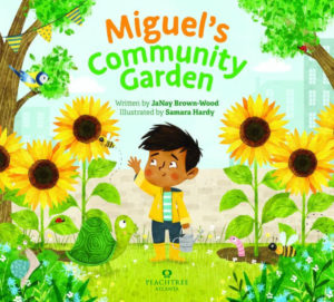
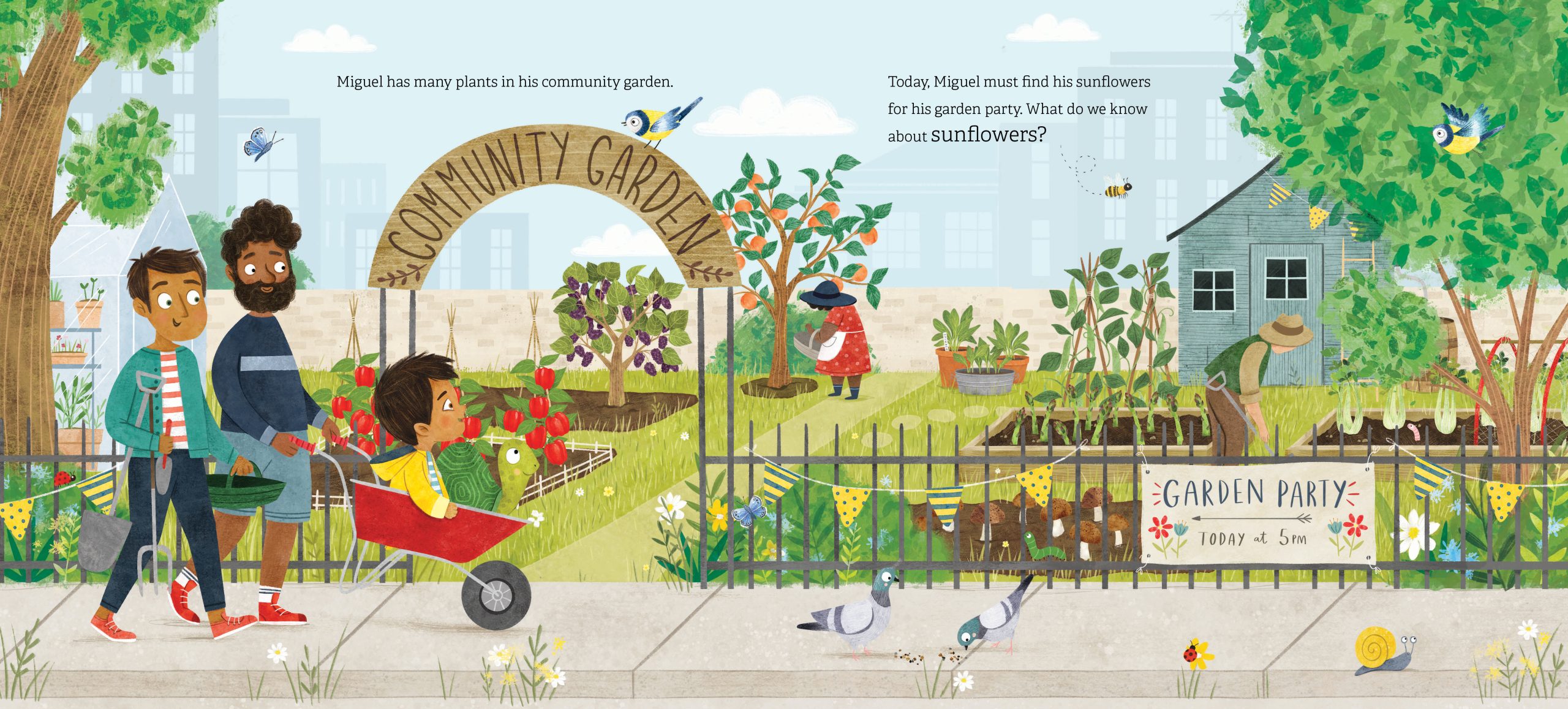
I got interested in this book via the cover and story concept even before I realized it was the second book in a series (Where in the Garden?). Regardless, the book works fine on its own, though I have to say that it’s best suited for a very young audience due to its straightforward, simple plot and use of basic language and concepts. I say this in the most positive way–there’s a decidedly Mr. Rogers feel to lines such as: “Today, Miguel must find his sunflowers for his garden party. What do we know about sunflowers?”

The reader is invited to join Miguel and his pet tortoise on their journey to find a sunflower to decorate the Community Garden Party. That’s not as easy as it sounds because the garden is full of plants, so Miguel needs a hand with identifying them. He carefully examines eight types of plants before his criteria for what makes a sunflower a sunflower finally matches what he sees before him. The STEM focus of paying close attention to the attributes of a living thing might generate interesting discussions during or after the reading.

I’m also charmed by how Miguel isn’t daunted in his task when a quick rainshower arrives. He just tugs up his yellow rain slicker and keeps examining the characteristics of the plants before him. It’s hard not to smile, too, at how the tortoise sneaks off to take a happy chomp out of the spinach. Somehow, Samara Hardy has found the visual secret to making fruits and veggies look scrumptious, as that tortoise is proving right there on the page. He’s having a total blast with those leaves!

One of the clear strengths of this book is the repetition of key words that allow young readers to gain lots of useful read-​aloud practice. While some of the plants might be a bit exotic for some kids–I’m looking at you, artichokes and mulberries!–their names won’t be overly challenging. The art provides helpful visual context, as well.

For those who want an adult-​guided extension activity, the book includes the recipe for Sunflower Seed Salad. Normally, I ignore recipes in kid books, but something about this one makes me seriously want to give it a try. Perhaps it’s the luscious art throughout, or the delicious visuals on the end papers?

Quite simply, the book is charming and the which-​plant-​is-​it? plot is compelling enough for this age range. Add in the art that’s just teeming with life on nearly every page, and this is a worthwhile, lively book.

4.25 out of 5 pencils


–John’s Review of the Illustrations–

Miguel’s Community Garden is a pleasant surprise for me. I must admit that when I looked at the cover, I had my own preconceived notions regarding what the book would be about and what the main conflict would be. It’s easy for me to let that cynical, “Oh, I know what this is going to be because I know everything” side of me emerge just by looking at the cover. However, after reading it, that attitude took a back seat and was replaced with a very gratifying sense of discovery and joy, and the old adage really hit home:

Don’t judge a book by its cover.

While Miguel’s Community Garden does skew towards a younger audience (two- and three-​year-​olds will be in rapture) it doesn’t ever pander to them–in both the writing and the illustrations. I’ve ranted about this in a previous review here on Only Picture Books. We’re on this journey of discovery and learning with Miguel, a pleasant little boy who is simply trying to find some sunflowers for a garden party at his local community garden. We learn, along with him, about various fruits and vegetables and how they grow. And we even get a recipe for a sunflower seed salad at the end, connecting nicely with the main conflict of the book.

While the illustrations were created digitally, they implement a wonderful, Eric Carle-​like sensibility with rich, tangible textures and vibrant colors. There is beauty in the simplicity here, and Samara Hardy’s lovely illustrations complement that notion well.

The whole book is meditation on the beauty of simplicity, really. Simple ingredients, simple situations, simple storytelling… But don’t let that fool you. It’s incredibly difficult to distill something down to its simplest form while keeping it relatable and understandable. It’s easy to clutter up deficiencies with detail, and Hardy and author Janay Brown-​Wood avoid that completely here.

My only critique is that parents and older children may not find the book as engaging due to the subject matter. No doubt this is territory they’ve trod before. However, younger kids–and parents who are kids at heart–will thoroughly enjoy learning about various fruits and vegetables with Miguel. Personally, I found it a lovely change of pace to read a picture book that isn’t trying to tackle big, existential themes. It’s also incredibly fun to look at thanks to Hardy’s wonderful illustrations.

4.5 out of 5 crayons


John Herzog is an illustrator and educator. He has created work for Scholastic, Houghton Mifflin Harcourt, Little, Brown and Company, Highlights for Children, DreamWorks TV, and Hasbro. He also teaches illustration at Ringling College of Art and Design.

John is a member of the National Cartoonists Society and the Society of Children’s Book Writers and Illustrators, where he received the 2018 SCBWI Magazine Merit Award. He lives in Florida with his family.

John is represented by Kayla Cichello at Upstart Crow Literary.
Picture Book Review: Stretchy and Beanie by Judy Schachner

Author: Judy Schachner
Illustrator: Judy Schachner
Dial Books for Young Readers
2 November 2021
40 pages

This month’s PB review is by Ryan G. Van Cleave (Owner/​Operator of Only Picture Books) and longtime OPB friend (and Ringling College of Art and Design Illustration Professor) John Herzog.

–Ryan’s Review of the Writing–

We all know Judy Schachner as the author/​illustrator of the terrific Skippyjon Jones series, so the expectations for her work are quite reasonably pretty high. Does this sequel to the picture book Stretchy McHandsome hit that mark? Let’s see!

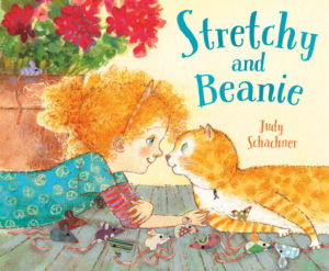
At the beginning of Stretchy and Beanie, the McHandsome cat clan met the McBright human clan, so every McBright kid suddenly had the opportunity to become a pet owner. Beanie felt a deep connection with Stretchy the cat, and not just because they shared the same eye color (one green and one blue). In rhyming quatrains, readers learn how the new pair explored ways of getting along with each other. Things were “glorious.” At first.

Then Beanie “got the bright idea /​ to raise a perfect pet. /​ Even read a big best seller /​ on how she could, and yet…” Anyone who’s ever had a cat knows what’s coming next.  You can’t make a cat do things that the cat doesn’t want to do. And Stretchy isn’t into Beanie’s silly math, music, and dance lessons. Wearing a harness? No, thank you! So, Stretchy fought back by climbing the drapes and peeing on the carpet.

Still, Beanie kept over-​snuggling and kissing him! Ugh! Stretchy did his best to avoid her, but he finally had had enough. The door was left ajar, so off he fled. The point-​of-​view then shifts to a feline perspective, with Stretchy worrying about who’d bring him dinner, brush his fur, or listen to him purr. Those concerns are what finally get the runaway cat to come down from his hiding spot up in a tree. That, plus a fire truck and two bags of snacks.

The introduction of a first-​person narrator in the final few pages was quite a surprise. Another thing in the surprising category is some of the word choices, such as “caused our lad to hiss,” where the “our lad” feels at odds with the kid-​appropriate language found in much of the rest of the story (“squeezy squishes” and how Stretchy thought of birds as “little flying snacks”).  The “’twas” and “Ol’ Binney” also seems overly poetic and a bit old-fashioned.

The lesson for Beanie–and readers–is to have “patience, love, and kindness” for others, feline or not. And no one likes bossy people, period. Yet Beanie doesn’t learn this lesson because when Stretchy finally comes down, she gives him a “smushy hug and kiss” which is exactly what the cat hates most. The text alleviates this concern a little by saying that she hasn’t yet learned to be gentle with pets, so one might assume she will learn it eventually, but do parents and teachers want characters to change for the better by the end of a story? Do they need clearer evidence of the positive change that so many picture books promise? One might argue that Beanie remains the same, which explains the final spread, where Stretchy is once again tearing up the curtains.

The McBrights are as diverse as the cats they embrace, and one of the children even uses a wheelchair. Those are definite positives. And the art is quite interesting throughout. It really matches the text quite well. There’s much to like in this new book.

In sum, Stretchy and Beanie is lighthearted enough to undercut much of the serious material here, and Shachner’s incredibly bendy cat images are loads of fun. Cat lovers and fans of Shachner’s other titles will likely find this book to be adorable.

4.25 out of 5 pencils


–John’s Review of the Illustrations–

There’s an interesting trend that I’ve noticed in the kidlit world over the last few years that I have very strong feelings about. For obvious reasons, I will not name names here, but I’ve noticed that there is a group of illustrators out there who try to draw the way that kids draw–or at least the way they think kids draw.

These illustrators purposefully get anatomy wrong, simplifying in a way that feels kid-​like on the surface, but really isn’t because it lacks any kind of heart or soul. As a result, there is a cynical, condescending feeling to the work. Oftentimes, these illustrators are drawing well below their ability. But because they’re illustrating for kids, they feel that they have to extract any kind of sophistication and “dumb it down” for the audience. And sometimes, an illustrator lacking in observational and drawing skills hides behind this “style” to cover for the fact that they can’t draw very well.

I won’t lie to you: I hate this trend. It diminishes the entire medium. It underestimates the audience. And, more egregiously, it talks down to and belittles them. Kids are often smarter than we give them credit for.

Now, you may be asking, what does this have to do with Judy Schachner’s lovely Stretchy and Beanie? Well, after reading this book with my little boy and seeing his delighted reaction to both the rhythmic words and engaging pictures, I found myself genuinely contemplating why the illustrations in this book work so well for both a five-​year-​old and a forty-year-old.

I eventually came to this conclusion: Schachner’s love for the medium and the audience shines through in a way that is both accessible and enjoyable. While the illustrations don’t exactly look like a kid drew them, they embody the spirit of how a kid would illustrate a book like this. The little details coupled with swathes of bright, vibrant color reminded me of how I would draw as a kid, and the little things I would pick up on and include.

And speaking of color, this book? This book is an absolute masterclass when it comes to color. Bright oranges mixed with teals, reds, and purples… This is a book I will be referring to for years just so I can soak in the color palette.

Regarding the story, it’s interesting how Stretchy serves as a kind of mirror reflection of Beanie. With Beanie’s insistence on Stretchy being the perfect pet, it made me wonder if Beanie had someone in her life who was insisting on her being the perfect kid. It felt like a bit of a missed opportunity to explore that aspect more, but that is a minor criticism.

Reflected beautifully here is the way that kids tend to draw, without all of the pandering and cynicism. There is heart and soul aplenty here, and with Stretchy and Beanie, Schachner continues to prove that she is one of the best illustrators working today.

4.75 out of 5 crayons


John Herzog is an award-​winning illustrator and educator. 

His clients include Hasbro, Dreamworks TV, Houghton Mifflin Harcourt, Scholastic, and Highlights for Children. He also teaches illustration classes at Ringling College of Art and Design.

John is a member of the National Cartoonists Society and Society of Children’s Book Writers and Illustrators, where he received the 2018 SCBWI Magazine Merit Award for his Highlights High Five cover illustration. He lives in Florida with his wife, two kids, a pair of geckos, a bearded dragon, and a tarantula.

Picture Book Review: King of Ragtime by Stephen Costanza

Author: Stephen Costanza
Illustrator: Stephen Costanza
Atheneum Books for Young Readers
24 August 2021
56 pages

This month’s PB review is by Ryan G. Van Cleave (Owner/​Operator of Only Picture Books) and longtime OPB pal (and Ringling College of Art and Design Illustration Professor) John Herzog.

–Ryan’s Review of the Writing–

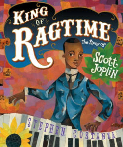
King of Ragtime, the new picture-​book biography by author/​illustrator Stephen Costanza, drives home the point that Joplin created his music by using his own creativity as well as the sounds and music of the world around him. From the start, Scott Joplin was a quiet boy who “hardly spoke above a whisper” because he preferred to listen instead. And listen he did, to the “Buzzz-​zuzzz!” of a wasp’s nest to the “Chhh-​chhhipp!” of a cicada or the “Rrrrrrummm-​bum-​bum!” of a thundercloud that could just as easily be an unseen train in the distance.

Because sound is so vital to this story, Costanza employs subtle rhymes and onomatopoeia to emphasize the rhythms and music of life that Joplin took as source material. It’s clear that the King of Ragtime heard things in a way no one else quite did.

It’s a little surprising that Joplin’s parents were so supportive of his musical interest despite facing profound poverty. Yet his father didn’t insist his son join him for the dependable work on the railroad, and his mother traded cleaning services for piano lessons. They even “scrimped and saved” enough to buy a dusty, old second-​hand piano so that Joplin could make his own music versus asking to use pianos in the homes of wealthy white families where his mother cleaned.

Who knew a piano could roar like a train or sing like a nightingale?”

Joplin did, of course. And he soon went from being a local sensation playing for church socials, dances, and Juneteenth celebrations, to living in St. Louis and working as a pianist in saloons and dance halls. He even played outside the 1893 World’s Fair–“Black pianists weren’t allowed to play at the fair, but in the nearby cafés a red-​hot piano sound filled the air”–and that seemed to help introduce the music known as ragtime to the world. Later, Joplin studied music in college and published “Maple Leaf Rag,” the first of his many popular songs.

The book’s Back Matter includes a Recommended Listening list of Joplin’s music and a short Bibliography, as well as 2+ pages of historical information that includes the story of how the author became interested in Joplin and his life. This material provides welcome context for how Joplin and his music was received in his own time, too.

Throughout King of Ragtime, Costanza doesn’t shy from issues concerning race. In both images and words, he shows many of the challenges that newly free Black people faced. Through it all, they returned to music “for solace and celebration,” which is something Joplin’s own beautiful music offered them, too.

This book is visually stunning from start to finish–so much so that I find myself imagining a wordless version, especially in those moments where the text and image line up perhaps a bit too linearly. I’ll let John say more about the art, but wow, it’s really evocative and memorable.

With King of Ragtime, Costanza has created a lively book that does justice to Joplin, the King of Ragtime, whose work inspired generations of jazz musicians. Libraries and teachers, in particular, should have a copy on their shelves. (I can also imagine amazing read-​alouds of this book with music introduction and accompaniment to help young readers appreciate just how different ragtime is from so many other types of music.)

4.25 out of 5 pencils


–John’s Review of the Illustrations–

Stephen Costanza’s King of Ragtime is an absolutely beautiful picture book and–dare I say it–an instant classic.

There. That’s my review.

What? You need more? All right…

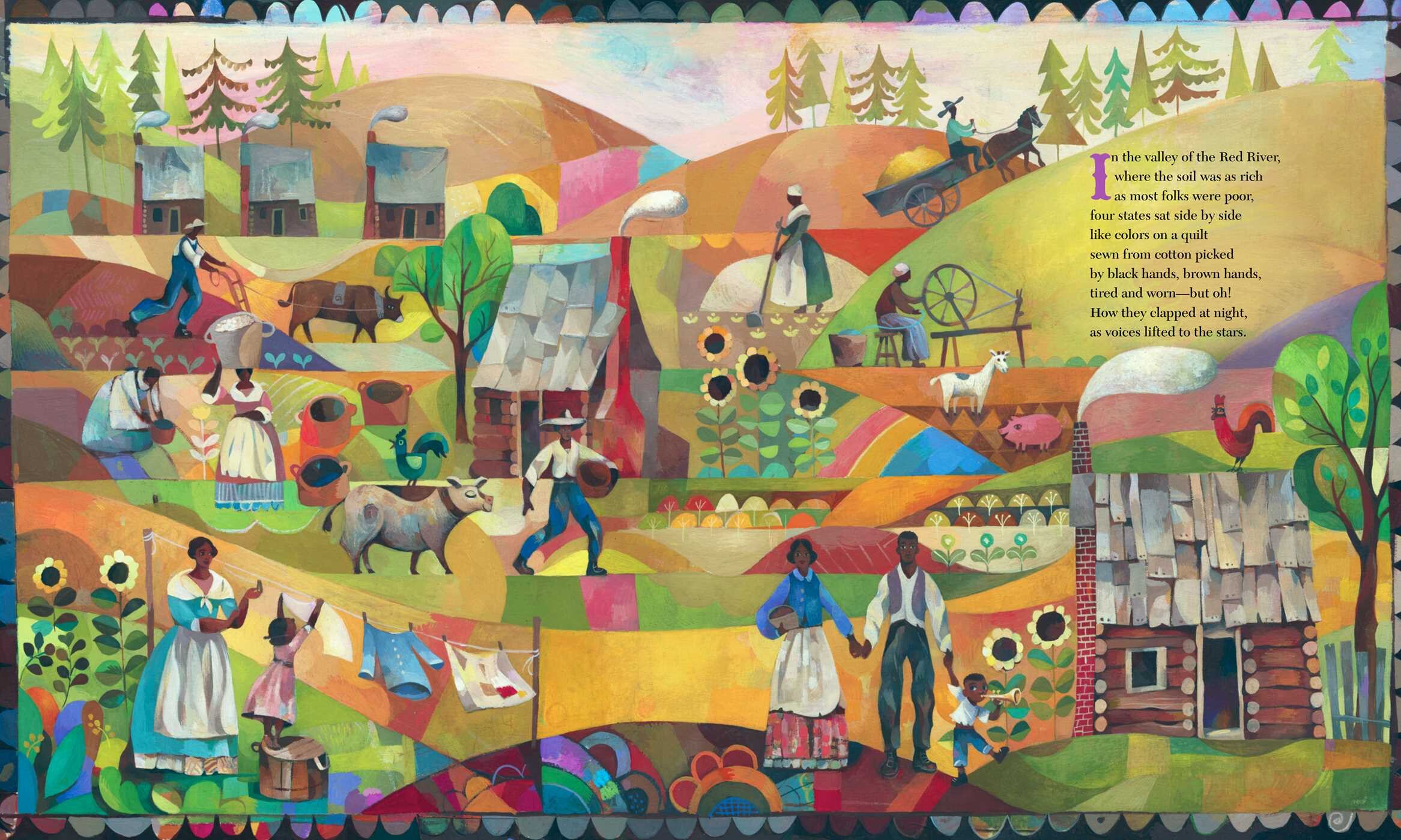
From an illustration perspective, this book is an incredibly enjoyable combination of the surreal and the traditional. It’s a fever dream of bright colors, captivating perspective, and appealing characters. I suspect that Costanza’s mixing of popular art styles from the time of Joplin (Fauvism, Expressionism, and American Modernism) is not a coincidence. Instead of using a more classical illustrative approach for this reverential story–which, let’s be honest, would’ve been a bit hokey–Costanza’s illustrations reflect the style and methods of the time, trading in digital illustration for wax pastels, collage, and gouache. It not only feels true to the time, but also to Joplin and his music.

Each illustration is a feast–so much so that I often forgot there were words to read. The written story is perfectly fine, but the reality is that I was consumed by the art. And honestly, the illustrations do such a good job of telling the story that I feel this could’ve easily been a wordless picture book. There is so much story to mine from the visuals that the text almost feels a bit redundant.

Now, to acknowledge my bias: I am a massive fan of Mary Blair. Her use of color, design and composition–all of it is perfect in my opinion, and right up my alley. If you’re unfamiliar with Mary Blair, click here to learn more. While reading King of Ragtime, I couldn’t help but be reminded of Blair’s wonderful work. And while I don’t know if Costanza overtly referenced her art while making this book, he’s done an amazing job of capturing all of the qualities that makes Blair’s work so amazing and fun.

In conclusion, and I know I’m going to sound like a broken record here, but Stephen Costanza’s King of Ragtime is an absolutely beautiful picture book and–dare I say it–an instant classic.

5 out of 5 crayons


John Herzog is an award-​winning illustrator and educator. 

His clients include Hasbro, Dreamworks TV, Houghton Mifflin Harcourt, Scholastic, and Highlights for Children. He also teaches illustration classes at Ringling College of Art and Design.

John is a member of the National Cartoonists Society and Society of Children’s Book Writers and Illustrators, where he received the 2018 SCBWI Magazine Merit Award for his Highlights High Five cover illustration. He lives in Florida with his wife, two kids, a pair of geckos, a bearded dragon, and a tarantula.

Book Giveaway: Clarinet & Trumpet (& Bonus Mini-Interviews)

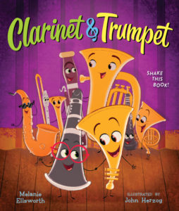
This is the first signed copy giveaway we’ve ever done at OPB! To learn a bit more about the picture book you might win, enjoy the mini-​interviews below with both the author and illustrator of Clarinet & Trumpet.

Also, feel free to read about the book at Goodreads or via its starred review at School Library Journal!

(The details for how to get your name in the running for a free copy will be at the very bottom!)


Questions for author Melanie Ellsworth

RVC: What’s something about Trumpet we wouldn’t guess from just reading the story?

ME: Trumpet has a unicorn collection at home–stickers, figurines, posters, t‑shirts, you name it! Trumpet believes in things that others dismiss.

RVC: What music puns didn’t quite make the final cut? (As we all know, music puns can lead to treble!)

ME: So many! Face the music, music to my ears, ring a bell, off key, off beat, jump on the bandwagon, composed (I thought of starting with, “Clarinet was quite composed,” but ended up going with, “Sure, Trumpet was rather brass, and Clarinet a bit long-winded.”)

RVC: What’s your own musical background?

ME: I started piano lessons when I was seven years old and kept at it until 10th grade, and I started playing the clarinet in 4th grade and continued through college. What I loved about clarinet was that I could play it with others–starting with band in elementary school and adding orchestra, pit band, and Northeast district bands in high school. I picked up the saxophone for a bit in high school, hoping to join the jazz band but never quite got there!

These days, I dream of playing the bagpipes…

RVC: Your favorite image from the book?

ME: That’s a tough question because John’s work is amazing. It might be the scene where Trumpet is desperately trying to get Clarinet’s attention–I love the various expressions and gestures as Trumpet works through his entire repertoire of friendship strategies. But that’s tied with the stage scene where Oboe lassos Trombone with her cleaning rag–the movement of the characters and the deep purple of the curtains just grab me.


Questions for illustrator John Herzog

RVC: Which instrument-​character was the most challenging to illustrate?

JH: All of them had their challenges, but Clarinet was surprisingly hard to get right. Her design changed significantly over the course of working on the book.

RVC: What’s something fun that only an eagle-​eyed reader might notice?

JH: There’s a little J+B in a heart on the chalkboard in the music room. J and B are my and my wife’s initials.

RVC: What’s your own musical background?

JH: My dad and my brother are musical–they both play piano. I greatly appreciate music, but I myself am not very musical.

RVC: Your favorite line from the story?

JH: “The woodwinds tweeted, tooted, and trilled. The brass blew, blasted, and blared.” Love the alliteration there.


How Do I Get a Chance at a Freebie Signed Copy?

Are you read to take your chance at winning a free signed copy of Clarinet & Trumpet? There are THREE ways to do this–each will earn you a single entry toward the signed copy drawing.

  1. Leave a comment right here on this blog post (the LEAVE A COMMENT button is at the top of the post) that answers the question: “What’s the best concert band instrument?”
  2. Leave a comment on FB that answers the question: “What’s your favorite song that includes a trumpet?” https://www.facebook.com/OnlyPictureBooks
  3. Like and retweet the giveaway post on Twitter. https://twitter.com/OPBblog

(It’s three entries max, and only one per source, so hit up all three options if you want to increase your chances at winning!)

**The drawing will be 11:59pm on Wednesday, May 19.**