Picture Book Review: Joey: The Story of Joe Biden, by Jill Biden

Author: Jill Biden (with Kathleen Krull)
Illustrator: Amy June Bates
Paula Wiseman Books
22 September 2020
48 pages

This month’s PB review is by Ryan G. Van Cleave (Chief Political Analyst at Only Picture Books) and OPB superfriend (and Ringling College of Art and Design Illustration Professor) John Herzog.

–Ryan’s Review of the Writing–

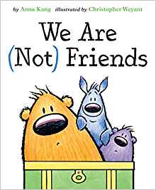
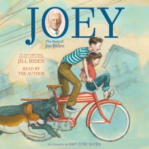
Joey: The Story of Joe Biden is a picture book biography about the 46th President of the United States, written by his wife, bestselling author Jill Biden (with the help of award-​winning writer Kathleen Krull). The book begins with Joe’s early years in the quaint world of the 1950s, with terrific Norman Rockwell-​esque illustrations that effectively create a pleasurable nostalgic mood. I could wax on about the art alone, but I’ll let John handle that below.

Though Joe knew the challenge of poverty early on, he enjoyed a rich, supportive family life. Mrs. Biden–little Joey’s mom–even told him, “Bravery resides in ever heart, and yours is fierce and clear.” Through a series of anecdotes like that, the book reveals an admirable sense of responsibility and honor the entire Biden clan seems to hold dear.

Many reviewers seem untroubled by the potentially problematic role model that Joe presents in those early years, though, such as how Joe was “unable to refuse a dare, even when it was dangerous,” and how he dealt with school bullies by fighting. The accompanying image for that latter situation even shows him with a clenched jaw and clenched fists. These facts might undercut the role-​model purity some readers hope a book like this will bring. Certainly, having young people fight their way out of problems or undertake unnecessary risk behaviors aren’t things many adults condone.

Yet the book gets back on track fairly quickly, with Joe’s competitiveness, sense of justice, and ability to overcome a pervasive stutter preparing readers for the metamorphosis Joe undergoes in high school. He grows a foot taller, develops boundless charisma, and works hard to be a peacemaker. The fact that he spent summers in a work-​study program so he could afford to attend the expensive “Catholic high school overlooking the Delaware River” helps present him as a sympathetic, hard-​working figure. Here’s the role model parents are looking for in this book.

While the book acknowledges that Joe became “one of the youngest people ever elected to the United State Senate,” and that Obama found him to be “the best vice president America’s ever had,” Joe’s political career isn’t really a large part of the book. This is more the nostalgic story of how a leader is made through the crucible of life’s challenges told through unadorned, plain English–as opposed to the poetic depiction Nikki Grimes used to present the life of Kamala Harris in her recent biography.

Author Jill Biden understandably tries hard to present Joe in a very positive manner that mostly rings true. But there’s this moment early on: “maybe he was just a regular guy, not rich, not privileged, but he dreamed big and saw himself a leader.” Will some readers be bothered by the “not privileged” note? Perhaps.

The book went to press prior to Biden winning the election, so it simply ends with his 2019 announcement that he’s running for President of the United States, which he considers “a battle for the soul of America.” The book ends with “Give me the ball!” which connects to a throughline regarding his past as a successful athlete.

The backmatter is sizable but the highlights are a quirky list of Bidenisms and a comprehensive timeline that fills in many of the blanks of Joe’s life and career. Whether you’re a Biden fan or not, this book offers insight into our 46th President and will be a welcome addition to the shelves of school and public libraries.

4.25 out of 5 pencils


–John’s Review of the Illustrations–

With his successful campaign for President of the United States, interest in all things Joe Biden was bound to be inevitable. So it’s no surprise that we now have Joey: The Joe Biden Story for children (and their parents) to learn a little more about Biden’s upbringing and why he got into politics in the first place.

Written by Jill Biden with Kathleen Krull, and illustrated by Amy June Bates, Joey spends a lot of its time with Biden as a young man playing football, interacting with his siblings, going to school, etc. We have a chance to see the values instilled in him when he was a kid, how he exemplified them as a young boy, and how he continues to exemplify them today. While the book does seem overly idyllic at times, it understands its audience and does a good job of showing the relevant parts of Biden’s life.

I know that, in the past, I have been very effusive about the work of Amy June Bates (see my review for Gittel’s Journey). With her work in Joey, that effusion has not diminished in any way. The reality is this: Amy June Bates is one of the best picture book illustrators working today, and is probably one of the best picture book illustrators of all time. Her sense of design and color, the natural flow of her illustrations coupled with the story, her impeccable sense of detail balanced out with blocks of color–what can I say? It’s all fantastic and perfect and wonderful. Her use of traditional media–in this case watercolor, gouache, and pencil–elevates the storytelling, giving us rich, nuanced images that help us connect to Biden–first as a kid, and now as President-elect.

The nitpicks I have with the illustrations in this book–and they’re very minor–are as follows. Sometimes it’s hard to pick out Biden from the crowd. Overall, Bates does a fine job of separating him from the pack, but there were a few times where I just wasn’t sure which character was supposed to be Biden. In many of the illustrations, Bates gives Biden’s clothes a slight teal color, but I think it would’ve been helpful to make that more consistent throughout the book. I also wish that Biden’s character design had a consistent trademark attribute that followed him from childhood to adulthood. His design felt slightly erratic, and adding a staple of his look would’ve also been helpful.

These are minor criticisms, of course. And while I thoroughly enjoyed Joey: The Story of Joe Biden, it often felt like the picture book equivalent of rose-​colored glasses. But perhaps that’s the point. It brims with nostalgia, of course, but thankfully it’s infused with elements of reality that help keep it grounded. That’s probably the best compliment I could give the book, really. Biden himself feels like a dreamer, a go-​getter who also understands the plight of the average person. That attitude comes across loud and clear in the book and, after dealing with the last four years, it’s a very welcome change.

4.5 out of 5 crayons


John Herzog is an award-​winning illustrator and educator. 

His clients include Hasbro, Dreamworks TV, Houghton Mifflin Harcourt, Scholastic, and Highlights for Children. He also teaches illustration classes at Ringling College of Art and Design.

John is a member of the National Cartoonists Society and Society of Children’s Book Writers and Illustrators, where he received the 2018 SCBWI Magazine Merit Award for his Highlights High Five cover illustration. He lives in Florida with his wife, two kids, a pair of geckos, a South American horned frog, a bearded dragon, and a fish.


Picture Book Review: Hans Christian Andersen: The Journey of His Life by Heinz Janisch

Author: Heinz Janisch
Illustrator: Maja Kastelic
NorthSouth Books
1 September 2020
56 pages

This month’s PB review is by Ryan G. Van Cleave (Frequent Fairytail Fan at Only Picture Books) and Ringling College of Art and Design Illustration Professor John Herzog.

–Ryan’s Review of the Writing–

I’m always a bit leery of picture books that run past the traditional 32 pages. And with this one at 56 pages? This might be the most telling comment of the entire review–it doesn’t feel long. Had I not known in advance that it was 2x as long as most, I wouldn’t have even thought about that fact.

Partially, it’s due to the captivating artwork. Witness how mesmerizingly bright things get when the story leaps into flights of the imagination. But I’ll let John handle that aspect of things, though I’ll simply add that this reader really appreciates the sense of wonder, innocence, and magic the illustrations create at times. Well done, Maja Kastelic!

Austrian author Heinz Janisch’s fresh take on the life of Hans Christian Andersen (translated by David Henry Wilson) is clever in that it allows Hans himself to tell his own story fairy-​tale-​style to a young girl named Elsa as they share a coach ride. That’s so appropriate in that it connects to the oral component of his tales–we likely first heard them read aloud to us, and here’s Hans doing that same thing for yet another young story lover. Like I said–so clever and apt.

Elsa also serves as a stand-​in for the reader, asking the questions we want asked, primarily “What happens next?” But she also asks if he’s the Hans in his many stories, to which he replies:  “I don’t think my stories are all about me. With fairy tales you can sometimes hold a mirror out in front of other people without them realizing it.”

Another way in which this book is clever is how Hans showcases qualities and experiences from his own life through the lens of his stories, such as how his own early years were like “The Ugly Duckling,” which is about a duckling who is teased for being different until one day when it turns into a beautiful swan. “Anyone can turn into something special–that’s what the story tells us. Like a poor cobbler’s son becoming a famous writer,” he says to Elsa and her mom.

Some might argue that the book presents too cheery a take on a life that most realize was fairly grim, lonely, and eccentric (I hesitate to call him weird, but yeah, that’s probably more accurate since he went bonkers over bad reviews, was terrified of being buried alive, and was likely celibate his entire life), but without a doubt, he’s one of the most influential writers of his century and this book captures a bit of that magic in a pleasant mix of biography and a well-​fabricated story frame.

This is a must-​read for any reader, with appropriate Back Matter that likely will offer one or two tidbits adult readers didn’t know about this beloved literary giant.

4.75 out of 5 pencils


–John’s Review of the Illustrations–

There’s something truly magical happening in Hans Christian Andersen: The Journey of His Life. It’s not just the context, although there’s plenty of magic to be found there. It’s in everything, really: the story, the illustrations, the colors, the compositions. If there’s a perfect picture book, in my opinion, I’d say this gets damn close to being it.

First, I must point out how much I love the length of this book. It’s much, much longer than your typical picture book today, but I appreciate that here. It’s long, but at no point was I bored and, personally, I don’t think kids will be bored reading this either. Heinz Janisch has made this popular, prominent figure of the establishment feel fresh again with an interesting take on their life story. I found it incredibly clever to couch Andersen’s history in a journey where he talks about his life with Elsa, a child–his main audience then and now. I was pleasantly reminded of how Andersen’s stories don’t talk down to children (and neither does this book), which I feel is something of a problem in the children’s publishing world today.

In terms of the illustrations, this is probably one of the most cinematic picture books I’ve ever read. The compositions, character designs, and expert use of color and mood harken to the work of Wes Anderson and Quentin Tarantino. As someone who has dabbled in filmmaking, it’s fantastic to see the crossover here. Color especially is used in incredibly effective ways that help tell the story. We’re taken through the highs and lows of Andersen’s life through color, and the way illustrator Maja Kastelic has approached it is pitch perfect. The contrast is such that, if you were to remove the words, I dare say that the images would still tell the story. They’re that good.

The character designs are also brimming with watercolorey appeal. I instantly like Andersen as he’s depicted here with his top hat and blue bow tie, his cheeks slightly flushed. The other characters involved are also charming and full of life. Even the environments are full of appeal and character thanks to the watercolor approach here.

The way the compositions are laid out almost resemble a comic book, and also reminded me of how Wes Anderson loves playing around with aspect ratio in his films (see The Grand Budapest Hotel and The French Dispatch). There’s one page in particular that I absolutely love: Andersen is discussing the dark times he endured as a child, and the illustrations are very desaturated and dour. And at the very bottom right-​side of the page, underneath this mountain of black & white images, we see a small Elsa looking sad at what Andersen had to endure. We know exactly how Elsa is feeling because of the way the page is laid out and the way color (or lack of it) is used. This page, in and of itself, is a masterclass of visual storytelling.

I completely and willingly admit that I’m coming at this book with my own personal biases. However, I’m planning to purchase The Journey of His Life when it’s released in September, so that right there should tell you how much I love it. I think you’ll love it, too.

5 out of 5 crayons


John Herzog is an award-​winning illustrator and educator. 

His clients include Hasbro, Dreamworks TV, Houghton Mifflin Harcourt, Scholastic, and Highlights for Children. He also teaches illustration classes at Ringling College of Art and Design.

John is a member of the National Cartoonists Society and Society of Children’s Book Writers and Illustrators, where he received the 2018 SCBWI Magazine Merit Award for his Highlights High Five cover illustration. He lives in Florida with his wife, two kids, a pair of geckos, a South American horned frog, a bearded dragon, and a fish.

He is represented by Shannon Associates.

Picture Book Review: Paper Planes by Jim Helmore

Author: Jim Helmore
Illustrator: Richard Jones
Simon & Schuster Children’s
1 March 2020
32 pages

This month’s PB review is by Ryan G. Van Cleave (Chief Paper Plane Designer at Only Picture Books) and Ringling College of Art and Design Illustration Professor (and OPB lizard-​loving wunderkind) John Herzog.


–Ryan’s Review of the Writing–

Anytime you’ve got a story about friends separating, it seems like we tend to follow the one who goes to the new place. It makes sense. Stories are fundamentally about challenges and changes, and, of course, the person moving away will have those things aplenty.

But in Paper Planes, author Jim Helmore wisely shows us that the ones left behind are encountering their own brand of challenge and change, as we see with Mia, the child left behind when her bestie, Ben, moves far, far away.

One of the things both children share is a love for making paper planes. In fact, they had a Big Plan to create a paper plane so large that it could fly across a “great, wide lake” where they live next to in side-​by-​side houses at the start of the story. What are they going to do now that Ben and his family have moved so, so far from Mia?

Helmore doesn’t pull emotional punches as you can see here: “Hot tears fell from her eyes.” And we see Mia’s loneliness darken into resentment, shown in action by her taking a plane Ben gave her and smashing it. That kind of direct access to a character’s feelings will surely spark discussions in parents and readers about acceptable behavior and the power of emotions.

I’m quite taken by the art here–there’s an interesting contrast in play between the relatively lean prose and the dreamy aspects to the illustrations. I’ll let John explain that better below, since that’s solidly in his domain.

In sum, Paper Planes is an emotionally textured book about friendship and belonging that’s especially welcome in these challenging times.

4.5 out of 5 pencils


–John’s Review of the Illustrations–

I’m prefacing my review of Paper Planes with some historical context:

Right now, it’s April 2020 and the planet is engulfed in the coronavirus pandemic. The majority of businesses are closed, grocery stores can’t keep toilet paper and hand sanitizer in stock, and everyone has been tasked with the responsibility of practicing self-​quarantine and social distancing. Little to no air travel is happening as airlines have suspended service, and hubs of humanity from Times Square to St. Peter’s Square are empty. Friends, family, educators, and entertainers now largely communicate via video conference from their homes.

It is a very, very strange time — and it makes me appreciate Paper Planes all the more.

A lovely story of the triumph of long-​distance friendship, Paper Planes is timeless yet relevant. Mia and Ben are two friends who enjoy spending time with each other, and they especially love making paper airplanes together. One day, Ben tells Mia that he and his family are moving far away, and we see how Mia copes with the situation. Jim Helmore’s story is incredibly sweet and sensitive, yet believable. Mia’s frustration, sadness, and longing for her friend endears us to her, and I kept hoping that she and Ben would somehow be brought back together. Can their friendship endure despite being far away from each other? I’ll avoid spoilers here, but I will say that the result is realistic yet satisfying.

Richard Jones’ illustrations elegantly combine both the simple and complex. Mia and Ben, as well as their cute little dogs, are simply designed yet they’re surrounded by geese, seaside towns, and grassy fields that are full of complexity. The world is nicely balanced, and everything here feels effortlessly deliberate–a quality most illustrators (myself included) struggle to achieve. With Paper Planes, Jones makes it look like a cakewalk.

There’s also a very tactile feel to the illustrations, which is of course inherent in their execution, but also helped quite a bit by the presentation offered by Peachtree Publishing. The dust jacket, for instance, uses a very textured substrate that adds a sophistication and warmth to the overall feeling of the book. Likewise, the interior pages use a matte finish that allows the reader to soak in all of the sumptuous earth tones and vibrant colors used by Jones. This is a high-​quality book — probably one of the best I’ve seen–that rightly deserves to be on everyone’s shelf.

Paper Planes provides a message of hope for all who are far away from friends and loved ones. Granted, given our current situation with the coronavirus pandemic, that message resonates even more. However, I can’t help but feel that I would love this book regardless of what’s happening right now. Its message of friendship transcending distance is timeless.

4.5 out of 5 crayons


John Herzog is an award-​winning illustrator and educator. His clients include Hasbro, Dreamworks TV, Houghton Mifflin Harcourt, Scholastic, and Highlights for Children. He also teaches illustration classes at Ringling College of Art and Design.

John is a member of the Society of Illustrators and SCBWI, and received the 2018 SCBWI Magazine Merit Award for his Highlights High Five cover illustration. He lives in Florida with his wife, two kids, a pair of geckos, a South American horned frog, a bearded dragon, and a fish.

He is represented by Shannon Associates.

Picture Book Review: A Crazy-​Much Love by Joy Jordan-Lake

Author: Joy Jordan-​Lake
Illustrator: Sonia Sánchez
Two Lions
17 Sept 2019
32 pages

This month’s PB review is by Ryan G. Van Cleave (Fan of All Things Crazy–especially Love–at Only Picture Books) and Ringling College of Art and Design Illustration Professor (and OPB superfriend) John Herzog.

–Ryan’s Review of the Writing–

I’ve got a soft spot in my picture-​book-​loving heart for stories that help children better understand what it is to be loved (like Sam McBratney’s Guess How Much I Love You, Robert Munsch’s Love You Forever, and Matt de la Peña’s Love, to name just a few of my favs), and A Crazy-​Much Love is in that same sweet spirit.

From the very first line–“You are the one, precious child–did you know?”–it’s clear that this story is from the point of view of eager, excited, and thankful parents who are telling their daughter exactly how she came to be part of their family. Not just any part, either, but a vital, important, and unique part, as seen in lines such as: “You were the one we hoped for, and prayed for, and piled up stuffed bears for.”

From first words to first steps to a first ride on a trike, the parents recount milestones with joy, compassion, and love. At times, though, the child asks questions that any child–adopted or not–might eventually wonder. “How much is the crazy-​much love?” and “How long does it last, the crazy-​much love?”

It’s a nice touch to have the child laugh when asking those tough questions because, as the story says and the parents know, “you already know.” Of course she does. There’s a sense of ritual to this family’s origin story that feels like the sort of thing they regularly tell, just as some kids love to flip through photo albums or request a favorite story over and over.

The answer to the child’s questions powerfully comes across via the smiling faces of the entire family in the art as well as in the powerful refrain “It was you” which, at the very end of the story, becomes “It is YOU.” It’s no surprise to learn that author Jordan-​Lake is drawing upon her own experience of adopting a child from China here because the emotions here feel honest and true.

This is a terrific addition to anyone’s bookshelves, whether they’re part of an adoptive family or not.

4.5 out of 5 pencils

–John’s Review of the Illustrations–

2019 has been a year marred by incessant bedlam. Every day, news organizations dish out an onslaught of stories that detail corrupt leadership, international conflict, wealth inequality, civil and equal rights violations, and so on and so on. Given all of this madness, how grateful I am to close out this year with a review of A Crazy-​Much Love, in which the only major conflict is a child sneaking their dog onto a school bus.

The story by Joy Jordan-​Lake is a simple yet effective one: Told from the perspective of an eager young couple, they adopt a child from another country and narrate the book, telling said child about their “crazy-​much love” for them. The book is a straightforward love letter from parent to child that most everyone can relate to, and (thankfully) strives to be nothing more.

Contrasting that simplicity are the wonderful illustrations by Sonia Sánchez. While they are on the messy side, they’re chock-​full of all-​too tangible expression and life. The compositions and colors start off fairly simple, then become more visually rich and complex after the child is brought home. I really enjoy how the “crazy-​much love” is first depicted as simple shapes and colors, then evolves into more complex shapes and colors as the child grows older. The character designs are also incredibly fun and relatable, with subtle nods to the likes of Quentin Blake and Mary Blair.

I must admit that A Crazy-​Much Love really struck a chord with me on a personal level, as I have some incredibly close friends who have adopted several children. It’s fantastic to see a book like this where their story, along with countless others, is represented. If anything, I’m thankful to end the year reviewing a book like this, which extols the virtues of love, patience, and compassion. We’re definitely going to need them as we head into a potentially turbulent 2020.

4.75 out of 5 crayons


John Herzog is an illustrator and educator. His clients include Hasbro, Dreamworks TV, Houghton Mifflin Harcourt, and Highlights for Children. He also teaches illustration classes at Ringling College of Art and Design. John is a member of the Society of Illustrators and SCBWI, and received the 2018 SCBWI Magazine Merit Award for his Highlights High Five cover illustration. He lives in Florida with his wife, two kids, a tarantula, a bearded dragon, and a fish.

He is represented by Shannon Associates.

Picture Book Review: Spiky by Ilaria Guarducci

Spiky by [Guarducci, Ilaria]
Author: Ilaria Guarducci (translated by Laura Watkinson)
Illustrator: Ilaria Guarducci
Amazon Crossing Kids
1 July 2019
36 pages

This month’s PB review is by Ryan G. Van Cleave (Top Spiked Friend at Only Picture Books) and Ringling College of Art and Design Illustration Professor (and OPB wunderkind) John Herzog.

–Ryan’s Review of the Writing–

Originally published in Italy, Spiky is now in offered in an English-​language edition thanks to the efforts of award-​winning translator Laura Watkinson. (I know Laura’s work. Her Dutch-​to-​English work on Tonke Dragt’s YA novel The Letter for the King is great–it’s going to be a Netflix series too, I hear!).

I have mixed feelings about this book. Let’s start with Spiky himself. There’s no two ways about it–he’s a jerk. He lives in the dark forest where he spends his days being a bully. He’s also a little too enamored with his own spikes, which he loves since they help keep everyone at a distance.

He was spiky, he was bad, and he didn’t need anyone at all.”

Thanks to being sent to bad school by his father, Mr. Spikington, Spiky grew even more nasty. He stole snacks. He raised a ruckus. He tormented the trees. And he “pulled the wings off butterflies. If he couldn’t fly, why should they?”

I’m all for showing how a PB creature isn’t doing good things, but Spiky doesn’t stop there. He captures robins and sticks them in jars. He plucks the petals off flowers. He pricks holes in snail shells. He laughs at toads for “being so ugly.” I worry that some readers will stop at this point because it’s all pretty one-​note, and it’s very, very dark, too.

The second potential hiccup I see is that one day, for no given reason, he starts to lose his spikes. I fully understand how this makes sense plotwise–it’s a way to turn the tables and disempower the nasty critter called Spiky by stripping the physical element of menace from him. But in terms of story logic, this seems random. That troubles me all the more so because it could’ve easily been connected to an action Spiky took in all of his wrongdoings–poetic justice of sorts.

When Spiky’s finally gone bald as a naked mole rat, he’s lost his power. Yet the bully now gets teased in return. The snails sneer. The toads titter. I’m not sure that’s the right lesson here for young readers, though admittedly, we all take some bit of joy in seeing a tormentor get their due.

From this point on, I like a lot about the book. Bernardo the bunny is a hip (hopping!) character with Yoda-​wise advice and a kumbaya mentality. Spiky, too, gets a personality makeover.

Then WHAM, Spiky suddenly–without a catalyst or reason again–grows back his spikes. And he’s tempted to return to his nasty ways. Yet he doesn’t because being good and letting friends get close to you, both physically and emotionally, is “very, very good.”

Sidenote: He never apologies or made friends with the critters he tormented. That part feels unresolved.

So for OPB, Spiky is a mixed bag. I admire how Guarducci takes on the narrative challenge of trying to make a villain into a hero. I also appreciate the novelty of such an odd protagonist.

Yet the images are odd at times (see John’s comments below), and the story feels long–mostly in terms of the extended “hey, he’s nasty!” opening with so many examples and the slow wind-​down at the end when Spiky eventually makes the final decision to eschew his old ways.

I wish I could read Italian so I could examine a copy of the original, called Spino, and see if the same things I’m encountering here are evident there. After all, it was shortlisted for the Soligatto Award for Best Italian Picture Book.

100+ Amazon reviews have Spiky averaging 4 stars. OPB can’t quite get behind it with the same level of enthusiasm.

3 out of 5 pencils

–John’s Review of the Illustrations–

From both a storytelling and illustration standpoint, I have some major issues with Ilaria Guarducci’s Spiky, which essentially tells the story of an antagonist who becomes a protagonist. It’s a valiant effort, and I recognize that. However, in both story and images, it’s a bit misguided and muddled.

First, the story: We’re introduced to the titular Spiky, a monster who was raised up to be bad. Not bad as in “putting the wrong items in the recycling bin” bad. No, I’m talking about “pulling wings off butterflies, trapping birds in glass jars” kind of bad. He’s proud of his spikes and uses them to terrorize the forest animals around him. He’s a completely unlovable main character, which is the point (no pun intended). However, as the story progresses, an event happens that completely changes Spiky’s attitude toward life, and this is where things go a bit sideways. First of all, this event is completely out of Spiky’s control, making his change of character involuntary and detracting from the overall message of the story. He’s forced to change, as opposed to changing because he wants to. Granted, this can work in certain circumstancestake the movie Groundhog Day, for example–but it needs to be done in a way where we’re ultimately charmed by the character we originally found repulsive. Spiky never really redeems himself in a believable way, and isn’t particularly charming by the end. I wanted to care, but I just didn’t.

I’m also not sure what I’m supposed to get out of this story. It feels like Guarducci is trying to tackle too many problems all at once. She tries to combine Spiky’s personal change with the importance of positive friends with the whole “don’t judge a book by its cover” message–and it ends up a mess in the process.

Now, the illustrations: There’s such a missed opportunity here to implement some contrast. Everything feels the same, incorporating a faux, digital gouache look and texture. There’s a fine line between interesting and boring, and this fell a bit on the boring side for me. I would love to have seen Spiky rendered with more of a streaky, old marker look so he stands out a bit more–see the example concept art from Monsters University below, which demonstrates this technique rather effectively:

© DISNEY/​PIXAR

As the story progresses and Spiky goes through his change, perhaps then he could’ve looked more like the characters and environment around him to give more of a feeling of unity. But as it is right now, he blends in with the backgrounds and overall texture the entire time, making his journey feel far less important than it really should. The character designs are adequate enough, with Spiky probably being the strongest. However, the bunnies really should’ve been rounder, fluffier, and just cuter overall.

The aspect of Spiky that I enjoyed most was all of the horrible things Spiky would do to the woodland creatures around him. The character’s actions don’t talk down to kids, which I absolutely love. Kids can handle hard things, and this book doesn’t pull any punches. Guarducci does a fantastic job setting up a loathsome character that I want to see redeemed at the end. Unfortunately, due to the muddled story and monotonous illustrations, his redemption ultimately feels dishonest and superficial.

2.5 out of 5 crayons


John Herzog is an illustrator and educator. His clients include Hasbro, Dreamworks TV, Houghton Mifflin Harcourt, and Highlights for Children. He also teaches illustration classes at Ringling College of Art and Design. John is a member of the Society of Illustrators and SCBWI, and received the 2018 SCBWI Magazine Merit Award for his Highlights High Five cover illustration. He lives in Florida with his wife, two kids, a tarantula, a bearded dragon, and a fish.

He is represented by Shannon Associates.

Picture Book Review: We Are (Not) Friends by Anna Kang


We Are (Not) Friends
Author: Anna Kang
Illustrator: Christopher Weyant
Two Lions
1 April 2019
40 pages

This month’s PB review is by Ryan G. Van Cleave (#1 Friend at Only Picture Books) and Ringling College of Art and Design Illustration Professor (and OPB superfriend) John Herzog.

–Ryan’s Review of the Writing–

We Are (Not) Friends is the fourth book in the You Are (Not) Small series, and the same fuzzy pals we’ve come to know from the other titles are here again with a new problem. The two of them are engaged in a terrific playdate with a cool trunk of fun stuff, and suddenly a new (blue) pal arrives, asking: “Can I play with you?”

Big brown fuzzy pal: “Yes!”

Little purple fuzzy pal: “Well…”

See where this is going? Welcome to the world of playdate–and friendship–politics. So many of the fun things this new trio of “friends” wants to try are best suited for two, such as a dancing duet. What’s the left-​out fellow to do when the other two are having fun without them? Whether it’s playing at being dinosaur hunters or pretending to build a car, someone is on the outs each time.

The sparse text doesn’t get in the way of telling an important, vital story that showcases how friends–old and new–can get along if the idea of what friendship means is re-​examined and re-​imagined. Part of the fun, as well, is the delightful sound effects such as WHUMP, ERGG, OOPH, and BONK that dovetail with Weyant’s comedic visuals.

While I’m still a bit more taken by You Are (Not) Small, this latest book is a worthy addition to the series and will likely please many readers, big AND small alike. Adult readers, in particular, will appreciate the lesson on friendship and inclusion.

4.25 out of 5 pencils


–John’s Review of the Illustrations–

Friendship and empathy are at the heart of Anna Kang and Christopher Weyant’s endearing We Are (Not) Friends, which tells the story of three friends who each feel left out at some point or another during their playdate.

The story is simple, and the illustrations complement that simplicity well. Like the previous books in the series, this is very much a character study with minimal backgrounds and as-​needed props. Instead of showing the characters against grand vistas and views, the illustrations are hyper-​focused on these “fuzzy friends” trying to navigate the perils that can come with new friends.

An aspect of the characters that really stands out to me is their expressions. As an illustrator who admires and strives for simplicity, Weyant has achieved moments of humor, sadness, and depth with a mere handful of brush strokes. For me, looking at the effectiveness of these expressions is like watching Usain Bolt run the 100-​meter dash or watching Gene Kelly dance while wearing roller skates. Weyant makes it look so darn easy when, in reality, nothing could be further from the truth. Simple is hard, and anyone who says differently is selling something.

My one nit-​pick with the illustrations might be viewed as charming to others, but not to me. It doesn’t detract from the overall experience of the book, but I have to say… It drives me nuts that I don’t exactly know the species of these “fuzzy friends.” One looks like a bear, another looks like a kangaroo, and another looks like a gopher. But it’s never exactly clear WHAT these animals are supposed to be. That’s something I appreciate about the Elephant and Piggie books by Mo Willems. He’s very clear about the characters’ species. I’m willing to admit that I might be wrong on this, though. Maybe it actually is cute and charming that it’s left up to us what exactly the characters are in We Are (Not) Friends. Right now, however, I find myself craving some clarity.

I’ve gotta be honest here: I have a deep admiration for the talents of Anna Kang and Christopher Weyant. From a superficial standpoint, their books are fairly simple and straightforward–great for children. But, if you dig deeper (or you’re a parent who ends up reading these books three or four million times to your children at night), you can find an incredible amount of subtext that speaks volumes about the human condition–which is both amazing and amusing since their books have yet to feature a human character.

4 out of 5 crayons


John Herzog is an illustrator and educator. His clients include Hasbro, Dreamworks TV, Houghton Mifflin Harcourt, and Highlights for Children. He also teaches illustration classes at Ringling College of Art and Design. John is a member of the Society of Illustrators and SCBWI, and received the 2018 SCBWI Magazine Merit Award for his Highlights High Five cover illustration. He lives in Florida with his wife, two kids, a tarantula, a bearded dragon, and a fish.

He is represented by Shannon Associates.