Picture Book Review: Henry the Boy by Molly Felder

Henry the Boy
Author: Molly Felder
Illustrator: Nate Christopherson & Tara Sweeney
Penny Candy Books
2 March 2019
36 pages

This month’s PB review is by Ryan G. Van Cleave (#1 Sticker Enthusiast at Only Picture Books) and Ringling College of Art and Design Illustration Professor (and OPB superfan) John Herzog.

–Ryan’s Review of the Writing–

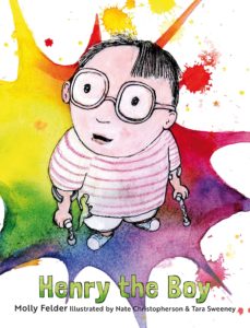
The back cover text clues us in:“This is a story not about a heron or a robot or a chicken, but about me: Henry the boy.” Henry the Boy is indeed about Henry, told from his own perspective of being a kid who click-​click-​clicks around using forearm crutches decorated with animal stickers.

The sense of frustration Henry feels thanks to his physical challenge is apparent when he heads into the bathroom.

I looked into the mirror and
tried to stand straighter.

But I stood like me.

One of my crutches
slipped away.

And
Smack!

I fell.

But Henry has a friend–Joel–who accepts him for who he is and helps support him, whether it’s physically helping Henry up when he falls, or offering Henry a sponge dinosaur that Joel said was supposed to grow when submerged in water, but it didn’t. Henry loved the gift regardless of whether it did was it was supposed to do or not. Perhaps he loved it more for that fact.

Through all the challenges that one might expect the only kid at school with a mobility aid to face, Henry perseveres. And that’s what this book is about. It’s one kid’s story of perseverance, self-​reliance, and the power of the imagination.

Henry the Boy is a compelling book about a type of character we don’t often see in picture books. It doesn’t surprise me in the least to learn that author Molly Felder has cerebral palsy, and has a physical assistance dog, Patterson, that helps her by opening doors, turning lights on and off, “and much more.” It’s no wonder that this book resonates with an authenticity that gives the emotional texture readers want, but it also offers some welcome optimism, too, and not just because the pictures in the final few pages pop with brightness.

4.5 out of 5 pencils


–John’s Review of the Illustrations–

The term I would use to best describe the illustrations in Henry the Boy is an oxymoronic one: Precise sloppiness. Or, if you prefer, sloppy precision. To be clear, in no way do I mean that as a negative. On the contrary, the illustrations in Henry the Boy complement the story and subject matter extraordinarily well.

From the beginning when we’re introduced to Henry, we get a very strong sense of the eclectic and endearing style of the book. Backgrounds are rendered in bright, unwieldy watercolors while the characters are outlined in ink and filled in with light pencil and even lighter watercolor wash. This stark contrast not only helps bring focus to the characters, but it also makes the neon colors surrounding the characters that much brighter. There’s such a tangible feeling to this book because of the use of traditional media, and it helps to connect us to Henry. It almost feels as if Henry himself is illustrating his story, helping us get a glimpse of how he views the world.

The illustrations here are messy but they’re not a mess. Everything that’s happening visually feels deliberate, in spite of the random stains and splotches that adorn most pages. This book is very much a commentary on what it can be like to have a disability, and how it feels to have no control over the world around you. It certainly makes Henry more sympathetic to the reader because of all the colorful chaos around him that he is unable to control.

My only criticism of the book–and it’s a minor issue–is the design of the characters/​animals. While they do provide contrast to the watercolor backgrounds, I think the execution could have been a little more precise. Henry is charming with his cowlick and the wave of thin hair draped over his forehead, but I feel all of the characters could have been cleaner and more appealing from a design standpoint.

But that’s a minor criticism of an otherwise wonderful marriage of words and images that is Henry the Boy. I’m excited to see what mother-​and-​son illustration team Tara Sweeney and Nate Christopherson do next.

4.5 out of 5 crayons


John Herzog is an illustrator and educator. His clients include Hasbro, Dreamworks TV, Houghton Mifflin Harcourt, and Highlights for Children. He also teaches illustration classes at Ringling College of Art and Design.

 John is a member of the Society of Illustrators and SCBWI, and received the 2018 SCBWI Magazine Merit Award for his Highlights High Five cover illustration. He lives in Florida with his wife, two kids, a pair of tarantulas, a bearded dragon, and a fish.

 He is represented by Shannon Associates.

Picture Book Review: Gittel’s Journey: An Ellis Island Story by Lesléa Newman

Gittel’s Journey: An Ellis Island Story
Author: Lesléa Newman
Illustrator: Amy June Bates
Abrams Books for Young Readers
5 February 2019
48 pages

This month’s PB review is by Ryan G. Van Cleave (Top journey-​taker at Only Picture Books) and Ringling College of Art and Design Illustration Professor (and OPB pal) John Herzog.

–Ryan’s Review of the Writing–

Gittel’s Journey tells the story–based on a pair of oral tales from the author’s family–of a nine-​year-​old girl being sent to America in the latter part of the 19th century while her mother has to stay behind because of an eye infection. Along the lengthy journey, the address on a piece of paper becomes smudged, so poor Gittel doesn’t know where to go when she arrives. I’ll hold off on revealing the ending but suffice to say, it’s both heartfelt and glorious.

Gittel’s Journey is one of those books that–even without the back matter–runs closer to 1,000 words than the 300 that so many literary agents and editors claim is the new norm. But the story necessitates it. And never did I have that somewhat common thought as I read: “Wow, this feels looooooong.”

That extra space allows for Newman to offer quiet moments of delicious sensory detail such as Gittel grabbing onto the ship’s “cold, wet railing” or how when she finally arrives at Ellis Island, the “ocean spray smacked Gittel in the face, and when she licked her lips, she tasted salt.” It also allows the the room for this story to unfold with the quiet tenderness it deserves. Nothing feels rushed.

Newman’s skill with language is also on full display with how she weaves in Yiddish words (always italicized) throughout the story. The context of those words give more than enough clues as to their meanings so not knowing Yiddish isn’t an issue.

The extensive Author’s Note, bibliography, and short glossary all add to the story and provide more interesting context to the immigrant experience as well.

This is a terrific book with spot-​on illustrations (see below for John’s glowing review on that aspect) that brings social issues into the realm of picture books in an effective, memorable way. It’s a fine, fine book worthy of your bookshelf space.

4.75 out of 5 pencils


–John’s Review of the Illustrations–

In today’s political and social climate in our great American experiment, we need a book like Gittel’s Journey. We need it to remind us of our past, where we come from, and why we’re here. We need it to remind us of the immense value of patience, kindness, and bravery. We need it to remind us of what made America truly great.

The story here is incredible, and based on the true events of a young girl who travels to America alone in search of a better life–without the use of a smart phone or GPS (terrifying). An amazing story like this requires amazing illustrations, and the work by Amy June Bates does not disappoint. In fact, it stands toe-​to-​toe with the story and–dare I say–elevates the book to a whole new level.

In a sea of muted browns and grays, little Gittel stands out with her red hood, pink apron, and bright green bag. We know this is her story. The progression of color throughout the book is breathtaking, helping guide is from that which is familiar to that which is not and back again. Gittel’s home country is depicted in very warm, inviting tones while her journey is very muted, cold and drab. Thankfully, the warm tones return at the end as Gittel’s cousin meets her for the first time, and into the final page when Gittel is reunited with her mother. It’s this mastery of color progression that makes us care about the safety of Gittel, and relieved when she is reunited with family.

The print quality of this book is exquisite. I love that tinted paper was used–a nod to a time long past. The whites used in the illustrations really pop against the colored paper, and helps create contrast and appealing movement in the images. The sketchy figures, the watercolor, the stamp-​like borders and filigree–all of it transports me back to what I would imagine this time period was like, yet fuzzied and faded by time.

This is an important book, both for children and adults. As Americans, we seem to have such a short memory when it comes to how important immigrants are to this country. It’s books like this that help us remember that, and what this country should stand for:

The Statue of Liberty,” said a man standing beside Gittel, as he
waved his cap in the air and wept. “She’s welcoming us to America.”

Gittel’s Journey is a masterpiece.

5 out of 5 crayons


John Herzog is an illustrator and educator. His clients include, Hasbro, James Patterson, Houghton Mifflin Harcourt, and Highlights for Children. He also teaches illustration classes at Ringling College of Art and Design. He lives in Florida with his wife, two kids, a pair of tarantulas, a bearded dragon, and a fish.
 

Picture Book Review: The Rabbit Listened by Cori Doerrfeld


The Rabbit Listened
Author: Cori Doerrfeld
Illustrator: Cori Doerrfeld
Bloomsbury Children’s Books
20 February 2018
40 pages


This month’s PB review is by Ryan G. Van Cleave (Top Rabbit at Only Picture Books) and Ringling College of Art and Design Illustration Professor (and OPB champion) John Herzog.

–Ryan’s Review of the Writing–

While this is a quiet book in many ways, the story starts with a disaster–birds knock down Taylor’s super-​tall, super-​cool block tower. In response, animal after animal arrives, with each acting in ways that match their animal nature. The chicken? It clucks away endlessly. The bear? It wants to roar and be mad. The snake? Revenge! But none of these interactions prove useful to Taylor, so each animal eventually wanders off. They all are more or less well-​intentioned, but they are more concerned with their solutions than thinking about what–if anything–Taylor needs.

It’s only the rabbit that doesn’t try to impose its natural response to the situation. It simply listens and is present, moving closer until “Taylor could feel its warm body.” This allows the child–half of the reviewers claim it’s a he, and half say Taylor is 100% gender neutral–to have their own range of reactions. Given the chance to respond as Taylor chooses, Taylor’s able to move past the many emotions (laughing, shouting, etc.) and can finally build once again.

Some readers will surely want to play up the animal voices to good effect when reading The Rabbit Listened to a child. The pacing of this story, too, lends itself well to reading aloud.

Will some readers find the message too straightforward or didactic? Perhaps. But it’s a sweet, simple story that teaches empathy, and that’s a lesson parents like myself wish were included in more picture books.

4 out of 5 pencils

–John’s Review of the Illustrations–

I’m really torn when it comes to The Rabbit Listened. No doubt Cori Doerrfeld has crafted an interesting take on what is essentially the five stages of grief. From an illustration standpoint, however, I feel there were a few missed opportunities.

For example, Taylor–our protagonist–is visited by all kinds of animals. We see them with Taylor in various spot illustrations that are organized just so on the page. On the far side of one spread, we see the animals walking away from Taylor, who’s on the opposite side. It’s adequate, I suppose, but we never truly get a sense of the crowd. We never get an image of all the animals overshadowing Taylor, enhancing and illustrating that overwhelming feeling of isolation. We get a great image of the bear doing that, but it would’ve felt much more powerful if all of the animals were there looking down at us.

Honestly, a little disorganization would’ve tremendously helped the first half of this book. Animals! Animals everywhere! Spouting advice and nonsense! It would’ve made the quieter scenes with the rabbit during the second half all the more endearing, providing some much-​needed contrast from the animal madness. Instead, the illustrations just feel a bit flat and somewhat sparse.

The strongest aspect of this book is the design of the main character. It’s very clear that Taylor is who we should be rooting for with their fun, messy hair and rounded features. The rabbit is fluffy and cute, of course, but feels a bit stock. The rest of the animals are designed somewhat grotesquely to emphasize Taylor’s ambivalence and aversion to their advice, I imagine. Yet from my perspective, these animals were only trying to help. Yes, they went about it in a bombastic way, but that doesn’t make them monsters. I wish they were softened up a bit, if anything to reinforce the idea that loved ones who suggest action in times of turmoil are only trying to help.

Perhaps I’m reading a bit too much into it.

I definitely like that we don’t have much of a sense of place and time, and I absolutely love the final image where we see Taylor’s vision of their next big building venture. And please don’t get me wrong–it’s important to listen in a situation like this. And Taylor eventually accepts what happened and moves on, which is nice and quite appropriate. For me, however, The Rabbit Listened perhaps aspires to be greater and deeper than it actually is.

3 out of 5 crayons


John Herzog is an illustrator and educator. His clients include Hasbro, James Patterson, Houghton Mifflin Harcourt, and Highlights for Children. He also teaches illustration classes at Ringling College of Art and Design. He lives in Florida with his wife, two kids, a pair of tarantulas, a bearded dragon, and a fish.
 

Picture Book Review: If You Had a Jetpack by Lisl Detlefsen and Linzie Hunter


If You Had a Jetpack
Author: Lisl Detlefsen
Illustrator: Linzie Hunter
Knopf Books for Young Readers
24 April 2018
32 pages


This month’s PB review is by Ryan G. Van Cleave (The Man Behind the Curtain at Only Picture Books) and Ringling College of Art and Design Illustration Professor John Herzog.

–Ryan’s Review of the Writing–

If You Had a Jetpack is predicated on one of those ideas that only the right type of imagination will recognize as potentially terrific (kid + jetpack = ?). Clearly Lisl Detlefsen is just such a writer.

In this story, a rabbit is bored, so it invents  …  a jetpack. His little brother gets jealous—as little brothers so often do when siblings have cool things—so older brother invents a second one, allowing them to embark together on adventures that only jetpack-​power can provide. The A‑then-​B-​then‑C linked progression of  the increasingly fantastical situations pleasantly echoes the structure of NumeroffIf You Give a Mouse a Cookie.

One of the real treats in this story is how so many of the adults need a hand from these smart bunnies. For example, when little brother is left with Nana so big brother can visit the astronauts in space who ask for “help with a slight spaceship repair.” Enter the clever, industrious, jetpack-​creating bunny! For this effort, the President offers him a special medal at a ceremony with autographs, photos, and interviews. How does the inventor bunny handle it? “Modestly.”

Throughout this story, there are various adverbs (-ly words) like “patiently,” “bravely,” and “persistently.” These are always set off on the page to highlight their importance and to encourage readers to consider their meaning. Many of these words will be known by kid readers, but a few might provide a chance for a vocabulary increase (in a fun way!).

One final observation: this STEM-​friendly book is written in second person, so the empowering message is about these clever little bunnies, for sure, but equally about the profound creative capability within us all (“Putting it together might be tricky, but since youre clever, youd figure it out eventually.”).

Highly recommended and loads of fun for parents and youngsters alike.

4.25 out of 5 pencils

–John’s Review of the Illustrations–

In 2018, most people are unable to tell if a movie was shot on film or shot digitally. Over the last ten years, digital technology has arguably caught up to where analog technology has been for almost a century. So how does this relate to the picture book in question? Well, as I looked at the wonderful illustrations in If You Had a Jetpack, I was convinced that they were created using traditional means—paint, pencil, pastels, screenprinting, etc.

I was, to my delight, completely wrong. More on that in a moment.

As an illustrator, I know how incredibly difficult it is to maintain a style when you’re dealing with a variety of characters and locations. Linzie Hunter makes it look so easy here. Her characters inhabit this universe with an incredible appeal that’s not only fun but also appropriate to the story.

This book reads like a young child wrote it, and while the illustrations are done in a somewhat juvenile vein, they never feel pandering or desperate. The colors remind me of those prominently used by NASA designers in the late 60s/​early 70s, which adds even more appeal as it deals with classic “space age” technology. A few pages feel a bit too busy, which hinders the flow of the text a little. But it’s a minor complaint against an otherwise delightful picture book.

Back to technology—at the end of the book, it’s noted that the illustrations were created using Procreate on the iPad Pro. While I would’ve enjoyed this book no matter how the illustrations were created, this delighted me because these are my tools of choice as a professional illustrator. But the reality is that, with digital technology catching up to traditional media, the tools don’t matter as long as you have an understanding of the fundamentals and how to use the tools. Linzie Hunter has a great understanding of both, and I’m excited to see more from her.

4 out of 5 crayons


John Herzog is an illustrator and character designer. He also teaches illustration classes at Ringling College of Art and Design. He lives in Florida with his wife, two kids, a pair of tarantulas, and a fish.
 

Picture Book Review: The Big Bed by Bunmi Laditan and Tom Knight


The Big Bed
Author: Bunmi Laditan
Illustrator: Tom Knight
Farrar, Straus and Giroux Books for Young Readers
6 February 2018
32 pages


This month’s PB review is by Ryan G. Van Cleave (Top Banana at Only Picture Books) and Ringling College of Art and Design Illustration Professor John Herzog.

–Ryan’s Review of the Writing–

Mommy. We have to talk,” says the protagonist of The Big Bed, a little cutie who’s All Business when it comes to getting what she wants: Daddy ousted from the bed that she and Mommy will share. It’s a fun twist on the age-​old issue of kids climbing into their parents’ bed at night.

This girl’s part carnival barker, part late-​night infomercial salesman, and part too-​cute-​to-​resist little kid. Who can blame her, though? Moms ARE “full of cozies” and plenty DO smell just like fresh bread. Few parents will be able to resist when the kid quite reasonably asks: “Who wouldn’t want to cuddle with her?”

What makes the language sing is the unexpected combination of formal, argumentative prose coupled with kidspeak. And Laditan does a fine job of keeping this self-​assertive girl’s attitude in check–it could quite easily get annoying if less skillfully managed. This is a clever, fun book.

Ladaitan’s third book is well worth reading and will deliver giggles and guffaws for both parents and kids alike.

4.25 out of 5 pencils

–John’s Review of the Illustrations–

I think everyone can relate to the central conflict of The Big Bed, which involves a little girl formally presenting reasons why her father should slumber elsewhere at bedtime. And the stylish illustrations by Tom Knight make it even more relatable and, more importantly, fun.

The treatment of the characters and the way they interact with each other are key throughout. As the little girl makes her case to dad, for example, she comes off as both a motivational speaker and a mob boss. And, of course, dad is seated on a small, plastic child’s chair that’s buckling a bit. Even minor characters like the cat and Grandma (specifically the pictures on Grandma’s wall) provide Easter eggs for repeated readings, which is always something I appreciate.

Bold colors, smart framing, and a fun style make The Big Bed a joy to both look at and read. Highly recommended.

4 out of 5 crayons


John Herzog is an illustrator and character designer. He also teaches illustration classes at Ringling College of Art and Design. He lives in Florida with his wife, two kids, a pair of tarantulas, and a fish.