This month’s PB review is by Ryan G. Van Cleave (Owner/Operator of Only Picture Books) and Connecticut-based author/illustrator Abi Cushman.
–Ryan’s Review of the Writing–
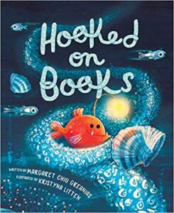
Hooked on Books dives deep into the heart of a bookworm named Pearl, an anglerfish who resides in the far reaches of the ocean’s twilight zone. With her glowing lure/reading light, Pearl embarks on a journey that many readers will find relatable–she wrestles with finding the oh-so-perfect reading spot undisturbed by her sea creature buddies.
Pearl’s story begins with her anticipation to dive into a long-awaited book about a kraken’s quest for happiness. However, her excitement is soon dampened by the constant interruptions from the underwater community (including eels, jellyfish, and mollusks), all eager to peek at her book. In her desperation for peace and quiet, Pearl explores the darkest corners of the sea, even braving the midnight zone where yeti crabs mistake her lure for a disco ball.
Finally, she finds solitude in the tranquil darkness of the abyss, a place untouched by the relentless interruptions. However, Pearl soon discovers that blissful silence can become a lonely place, leading to an unexpected realization: sharing her love for books might not be so bad after all.
In sum, Hooked on Books is a charming story that captures the frustration and the eventual compromise that comes with the territory of being an avid reader. Litten’s charming, whimsical illustrations breathe life into the narrative, illuminating the deep-sea setting with captivating contrasts of light and dark–I’ll let Abi explain that a bit more. At the same time, Greanias’ adept storytelling provides a gentle reminder about the importance of setting healthy, appropriate boundaries while also appreciating the company of others.
This eye-catching 32-page picture book is likely to resonate with young readers, whether they live on land or fancy a life far under the sea.
4.25 out of 5 pencils
–Abi’s Review of the Illustrations–
In Hooked on Books, Kristyna Litten has created not only engaging and expressive characters, but also visually stunning scenes. This is quite a feat for a story that takes place deep down in the dark ocean with a main character that, in real life, let’s just say does not look very approachable.
But Litten accomplishes this by using a limited color palette of varying shades of blue for most of the sea creatures and scenery, and reserving a bright orange hue for the main character, an anglerfish named Pearl, paired with a burst of bright yellow to depict her lure/reading light. In doing so, Litten skillfully evokes a deep sea atmosphere, but is still able to show details of other sea creatures, plant life, and scenery. The eye naturally follows the brightly-colored Pearl on each spread, with her funny pouty face as she tries to get a moment alone to read her book.
One thing that I thought would be imperative in this book was the effective use of light and shadow because a lot of the magic of deep sea anglerfish is just how dark it is way deep down in the ocean, and just how bright the anglerfish’s lure is. Fortunately, Litten rose to this challenge, and depicts light and shadow beautifully. I especially enjoyed the spread where Pearl is swimming away from all the sea creatures leaving behind a trail of light. It is such a fun scene, and the light trail really boosts the humor of the situation.
Another challenge Litten had to solve was how to show what Pearl was reading. Litten chose to make the book look like a shell, and then the characters from the book emerge from it as simple outlined forms as opposed to fully-rendered characters. This was a really clever way to distinguish the characters and action in Pearl’s book from what was really happening around Pearl.
I also really appreciated how Litten used creative layouts to effectively show Pearl’s vertical travel. For example, as Pearl journeys deeper, one spread has the reader flip the book on its side to make use of the full vertical double page orientation. As Pearl journeys up, Litten employs vertical panels to emphasize her ascent.
My favorite spread zooms out and shows a myriad of sea creatures fanned out from Pearl in a semicircle as she tries to hide in a shipwreck to get a moment of peace. Of course she’s illuminated by her burst of light at the bottom of the page. Kids will enjoy looking at the different fish and other creatures surrounding her.
In conclusion, it’s clear that Litten and the design team at Peachtree were very thoughtful in their choices about color, light and shadow, and design. The result is a book that flows wonderfully and will capture readers’ attention with every spread all the way through to the end.
5 out of 5 crayons

Abi Cushman is the author-illustrator of funny picture books, including Animals Go Vroom! (Viking), Soaked! (Viking), and her nonfiction debut, Wombats Are Pretty Weird: A [Not So] Serious Guide (Greenwillow, 2023). She has also worked as a web designer for over 15 years, and runs two popular websites of her own: MyHouseRabbit.com and AnimalFactGuide.com, which was named a Great Website for Kids by the American Library Association. In her spare time, Abi enjoys running, playing tennis, and eating nachos. (Yes, at the same time.) She lives on the Connecticut shoreline with her husband and two kids.
For exclusive sneak peeks, wombats, and special giveaways, subscribe to Abi’s newsletter.


