Picture Book Reviews: Just Snow Already; Don’t Mean to 13: Molly’s Tuxedo; Remind Me; What Goes on Inside a Beaver Pond?

I ran into an issue with securing a professional illustrator to partner with me this month on a picture book review. This just means we’re going with the much-​ballyhooed 5‑word review format once again here at OPB. Enjoy!


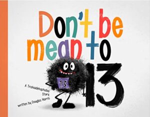
Don’t Be Mean to 13
Author: Douglas Harris
Illustrator: YipJar
Label Free Publishing
13 October 2023
24 pages

Five-​word review: Charming take on “unlucky” 13.

4 out of 5 Lucky Charms


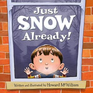
Just Snow Already!
Author: Howard McWilliam
Illustrator: Howard McWilliam
Flashlight Press
1 September 2023
32 pages

Five-​word review: Snow finally falls. Chaos missed.

4.25 out of 5 Snowballs


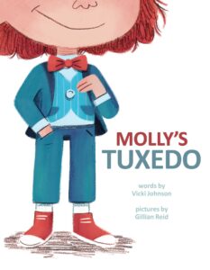
Molly’s Tuxedo
Author: Vicki Johnson
Illustrator: Gillian Reid
Little Bee Books
27 June 2023
40 pages

Five-​word review: Molly shines in true colors.

4.5 out of 5 Bow Ties


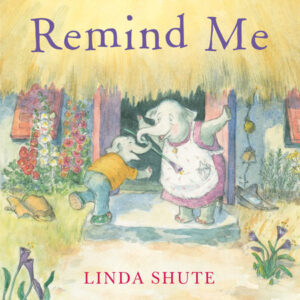
Remind Me
Author: Linda Shute
Illustrator: Linda Shute
Neal Porter Books
4 July 2023
32 pages

Five-​word review: Poignant look at memory loss.

4.5 out of 5 Elephants


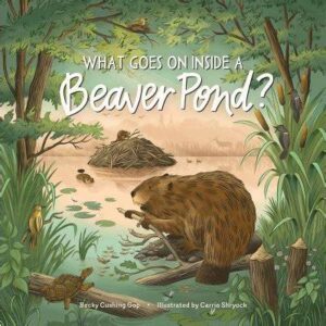
What Goes on Inside a Beaver Pond?
Author: Becky Cushing Gop
Illustrator: Carrie Shryock
Storey Publishing
5 September 2023
48 pages

Five-​word review: Beaver tale marries science, art.

4.25 out of 5 Beaver Dams

Picture Book Review: Way Past Mad by Hallee Adelman

Illustrator: Sandra de la Prada
Albert Whitman & Co.
1 March 2020
32 pages
This month’s PB review is by OPB superfan Ryan G. Van Cleave and Florida-​based author/​illustrator Linda Shute.

–Ryan’s Review of the Writing–

It’s incredibly challenging to create a picture book that primarily deals with emotions, but that’s the task Hallee Adelman sets for herself in Way Past Mad. Right from the start, our protagonist Keya is indeed wronged–her little brother Nate messes up her room. Then he inexplicably feeds Keya’s breakfast cereal to their dog. While those two things don’t seem especially malicious, the fact that he “ruined my favorite hat” puts Keya over the edge.

I get it. Little siblings can drive you bonkers. I know that truth from my own childhood, and I see it in the sometimes-​tumultuous lives of my two daughters.

Adelman presents Keya’s anger in this story as something that makes one lose control. That sense of being out of control is shown in how she kicks rocks and sticks on the way to school, and in how, for her, it’s “the kind of mad that starts and swells and spreads like a rash.” That’s a memorable way to describe being mad, though it feels a bit off in that anger flares to life and grows far faster than any rash does, both in real life and in this story. In contrast, Keya’s happiness at the end of the story that “starts and swells and spreads like a smile” feels like a much more apt comparison.

For me, the fuzzy part of Way Past Mad was coming to grips with what being mad is to Keya. If she’s “way past mad,” how can Keya blame it for her saying unkind things to her friend, Hooper (“But my mad made me say it”)? This might seem like I’m nitpicking, but is being mad a destination/​place/​situation/​state of being, or is it its own thing, like an entity one must deal with, as some books present via personification? Does anger have power over you? If so, how can that be the case if one is “way past mad” versus, say, being in the “clutches of anger” or something along those lines?

While Keya owns up to her anger-​infused behavior and apologizes to Hooper, there’s no parallel resolution with Keya’s little brother, despite him doing the three things that kick off this emotional story. Keya clearly values friendship, however, and she learns that things done in the heat of anger–though that’s my language again that doesn’t quite jibe with how this book presents it–aren’t usually that helpful, and those are solid takeaways. I just wish the level of emotional insight the book offered from start to finish was as rich and compelling as the terrific, bold cover that initially drew me to this book.

3.5 out of 5 pencils


–Linda’s Review of the Illustrations–

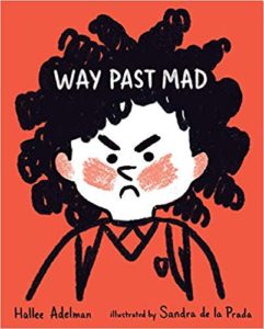
The jacket for Way Past Mad attracted me–a little girl’s furious face boldly drawn in white and black on a bright red background. But we are not introduced to this narrator on the opening page. Bright plaid endpapers and cheery repetitive colors dissipate the cover’s promise of drama. This is a story of building anger that explodes into regrettable action, leaving the protagonist in a dark, lonely place until she finds resolution. What I miss here is a visual story arc that supports the text’s arc.

Design strategies–varying the focus, or the size of the art (like in Where the Wild Things Are), expressive color temperature and dark/​light values, mood-​setting endpapers and front matter–can reinforce story and feelings. Instead, the frown on Keya’s face is our primary visual indicator of her emotional landscape.

During the story, Keya fantasizes she is a champion runner, but there are no compositional clues to indicate these three scenes are in her imagination. She shows up later, in “real time,” wearing the star she won during her fantasy, which furthers the confusion.

Sandra de la Prada created appealing characters and did a competent job illustrating Way Past Mad, but I cannot help regretting opportunities missed by her and the book’s art director/​designer.

3 out of 5 crayons


Linda Shute is an author/​illustrator who earned a degree in art and art history at Florida State University and taught children’s book illustration at Ringling College of Art and Design.
She loves peanuts and beach sunsets.

Picture Book Review: Bird Count by Susan Edwards Richmond

1 October 2019
32 pages
This month’s PB review is by Ryan G. Van Cleave (#1 Birder at Only Picture Books) and and Florida-​based author/​illustrator Linda Shute.

–Ryan’s Review of the Writing–

I’m always intrigued when a nonfiction book idea finds a quality story to match, which is what happens here. Instead of giving us “Bird counting happens throughout the world each year at Christmas thanks to the efforts of the National Audubon Society” etc., we get the story of Ava, a kid who loves birds and is excited to participate again this year with her family. Because she’s a kid, we’ve got people around her like Big Al to (believably) help remind her about the rules and best practices. Who knew that a citizen scientist’s most important tools are eyes and ears?

Ava knew, and now the reader does too.

We can tell how special this particular bird count is to Ava because she alerts us to that fact. “I look at Mom and smile. This is my first time,” she says about her being asked to record the names of all the birds they count. What’s especially fun is that the book layout has a spiral-​notebook part to the page where bird names appear as Ava writes them down.

One of the many lessons here is that rules matter. The rules say a bird can’t be counted unless two people see or hear it. So, when Ava sees a mockingbird that “flaps away in a flash of gray and white,” she can’t add it, despite really wanting to. “But Mom and Al missed it. So it doesn’t count.” Don’t worry–she finally sees one later and can add it to the list then.

Richmond’s use of language is compelling, too–especially when trying to capture the noises birds make, such as “Pssshh, pssshh, pssshh” and “mourning doves coo-​hooing.” (The name of that bird is bold as are the names of all 24 types of birds that get counted.)

Part of what give this story a bit of tension is Ava’s hope to see a raven, as she’d done a few years back. Will she see one again this time? She sure hopes so.

Generous but appropriate back matter completes this fine introduction to the world of birding.

4.5 out of 5 pencils


–Linda’s Review of the Illustrations–

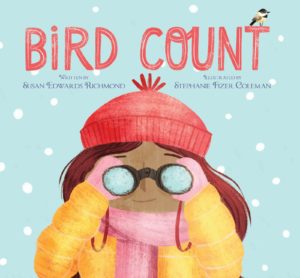
On the outside, Bird Count looks like a book for the preschool crowd–large squarish format, simplified head of a young girl on the front. Inside, there is text and information galore. I hope its exterior doesn’t signal second and third graders to pass it by.

The content is presented in wonderfully clear, consistent layouts. Except for the opening and closing, a wire-​bound notebook with the growing list of birds appears on the right edge of the double-​paged scenes of the day. The narrative text is generously line-​spaced, often on ample snowy areas of the compositions. Cheers to Peachtree designer Nicola Simmonds Carmack for the elegant and easily read fonts throughout, the heavy matte coated stock, and attention to details that make this a well dressed and durable book.

Stephanie Fizer Coleman was a natural choice for illustrator. See her “paint a bird a day” for 100 days project at http://stephaniefizercoleman.com/100-birds‑1 Coleman’s page designs are simple with strong elements leading left to right. Figures and faces are stylized, lending a detachment that keeps the focus on the birds and their environs. A palette of soft blue, lavender, and browns provides a subtle background to neutral colored birds. The art is rendered digitally with textures that appear to be brushy, sanded gouache and whites that recall frosty surfaces. The calming hues create a restful bedtime offering. And, for the “look again” reader, there is a rogue great horned owl!

5 out of 5 crayons


Linda Shute is an illustrator, writer, and teacher living near Sarasota, FL. There is never snow in her yard, and most of the birds have very long legs and croak!
See a few at www.lindashute.com.

Picture Book Review: Along the Tapajos by Fernando Vilela

See the source image

Author: Fernando Vilela
Illustrator: Fernando Vilela
Translated by Daniel Hahn
1 October 2019
40 pages
This month’s PB review is by Ryan G. Van Cleave (Top Riverboating Fan at Only Picture Books) and and Florida-​based author/​illustrator Linda Shute.

–Ryan’s Review of the Writing–

Author/​illustrator Fernando Vilela’s Along the Tapajós tells the story of Cauã and Inaê, a brother and sister who live in a small village along Brazil’s Tapajós River. (Here’s a map and more information about the river, in case you want a fuller geographical context for this story.) While all of their homes are up on stilts, the rainy season brings so much water that the entire community relocates to higher, drier ground. When they get to their new temporary home, the kids realize the problem straight away–they forgot their pet tortoise, Titi. A tortoise isn’t a turtle, so he can’t swim to safety on his own (turtles can swim whereas tortoises can’t). The pair hatch a daring plan to sneak back at night on a journey along the river to rescue him. Will they be able to save Titi in time before the waters get too high?

Foreign words won’t prove daunting here. Other than the names, there’s only one in the entire story, and it’s well-​glossed within the text. (Pa always finds a good spot, someplace sunny and close to an igarapé–that’s a kind of waterway.)

Readers will surely enjoy comparing the world of these kids to their own–the stilt houses, the school only reached by boat, the big critters (alligators and anacondas) lurking in the water, the idea of a two-​season year, a community-​wide annual migration, etc. All of that might lead to interesting discussions for sure.

The ending of this story, however, is potentially troublesome. Once the kids realize that Titi has been left behind, they disobey their parents who specifically tell them NOT to go back for the pet. And while on this unapproved rescue mission, they encounter an anaconda who’s about to gobble up the tortoise and both kids. But doesn’t. Why? It’s an unexplained deus ex machina moment. (“I don’t know how it happens, but when I jump back into the boat with Titi in my arms, the queen of the jungle gets all tangled up!”) Lucky for the kids and Titi, sure, but that’s the thing–they win via luck, not through their own efforts. Taken together, those two story moments might not sit well with readers.

Still, the book offers a lot of vivid details about this community that are interesting and extremely well-​depicted, visually speaking. And the backmatter, too, is quite fascinating and full of compelling facts, details, and images. The real selling point of this book, though, is the pictures. See what Linda has to rave about below!

3.75 out of 5 pencils


–Linda’s Review of the Illustrations–

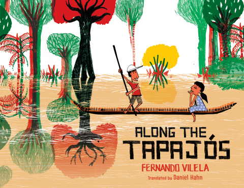
The art in Fernando Vilela’s Along the Tapajós snags the eye and enlarges the interpretive experience of American children. It is a textured panorama reflecting the energy of its creation and the urgency of the story it tells. The marks are slashed, carved, and incised, the palette basic–mostly flat tones of greens, browns, red and yellow on an armature of black. The effect is of layered, hand-​printed folk art. The river is a gouged wood block printed edge to edge across the pages, over and under other elements. Palm fronds, lily pads, oxen, fish, birds, the snake’s pattern, and the catwalk supports are stamped on freely. The pages are filled with details authentic to the cultural setting and invite reexamination and discovery.

The figures, however, are drawn, and the sister and mother wear flowered collaged dresses. Their black outlines are angular and sometimes crude. The faces are appropriately simple but expressive cartoons. The only stylistic distraction for me was a capybara pair that seemed Photoshopped additives.

Although the viewpoint voice is the boy’s, the book’s visual main character is the tan river which dominates virtually every page. The double spread riverside landscape might backdrop two or three sequential actions of the boat and children, an ingenious design maneuver to avoid fracturing the flowing scene. The river carries the action forward, the villagers to their winter refuge, and finally transforms the world we first entered. When the children return to rescue their tortoise from their now-​submerged home, they find the land structure and water creatures dreamily melded. The closing endpaper, a rainy season redux of the opening dry season endpaper, brings us to a satisfying and thought-​provoking full circle.

5 out of 5 crayons


In 1996, Linda Shute traveled in a small boat up an Amazon tributary similar to the Tapajós River and visited a school like the one in this book. The Escola Bosque had a poster of Elizabeth Taylor on the classroom wall!

Linda is an author/​illustrator in Nokomis, Florida. She has taught at Ringling College of Art and Design, is a member of The Children’s Book Guild of Washington, D.C., and was Illustrator Coördinator of Florida SCBWI the past nine years.

Visit her at https://lindashute.com

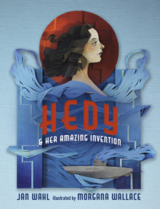
Picture Book Review: Hedy & Her Amazing Invention by Jan Wahl

Author: Jan Wahl
Illustrator: Morgana Wallace
5 February 2019
36 pages
This month’s PB review is by Ryan G. Van Cleave (#1 Invention User at Only Picture Books) and and Florida-​based author/​illustrator Linda Shute.

–Ryan’s Review of the Writing–

This grade school level picture book biography tells the story of Hollywood actress and inventor, Hedy Keisler, who later became Hedy Lamarr.

While this book is longer than most picture books I run across at OPB–not just the 36 vs. 32 pages, but also because it has chapters!–it never feels like it’s too much. Partially that’s due to the simple sentence structure and a straightforward style.

But almost everybody could go to the movies. A ticket only cost a few coins.

The story flows chronologically, beginning in Hedy’s childhood years of poverty in Austria, then moving ahead to her work as an actress, her initial attempts at creating inventions, and then her failed marriage to an older man that led to her decision to help the Allies in World War II. And all of this happened while growing her career as a Hollywood star.

Though most didn’t know that Hedy harbored a deep interest in inventions, she continued to research and create new things throughout her life. A new Kleenex box. A dog collar that lights up in the dark (so lost pets can be found more easily). A better traffic light.

But her most famous invention emerged after she learned how Nazi submarines were sinking British ships in World War II, and then jamming the radio signals so the British couldn’t return fire with their radio-​controlled torpedoes. In response, Hedy came up with the idea for frequency-​hopping (also called “spectrum spread”), a technique that’s still used widely today in a variety of items, including fax machines, cell phones, and wireless technologies. It’s no surprise that her birthday–November 9th–is now known as Inventor’s Day!

While there’s a sense that the challenges in Hedy’s personal and professional life stemmed from society’s now-​antiquated views on women, that avenue isn’t explored in as much depth as some of today’s readers might choose. Yet without a doubt, Hedy is an intriguing character with spunk, wit, and a profound commitment to helping others.

A brief Author’s Note in the back of the book shares the author’s three memorable personal anecdotes about Hedy.

4 out of 5 pencils

OPB Sidenote: Readers who want a picture book biography on Hedy that’s targeted at a younger audience might try Hedy Lamarr’s Double Life: Hollywood Legend and Brilliant Inventor, which is releasing on the same day as this Penny Candy Books title.


–Linda’s Review of the Illustrations–

When the reader cracks open the pages of Hedy, she will discover sophisticated, rich, secondary colors–notes that fall between the bright primary tones of books for younger audiences. The content is clearly defined, yet couched in the mystery of deep hues set against dark backdrops.

Illustrator Morgana Wallace’s medium is cut paper. She paints the pieces engagingly, modeling faces, costumes, and other details. The paper elements cast a soft drop shadow, giving a subtle 3‑D vibe.

An Art Deco san serif font is used for titles and chapter heads. Pages of text face single spread pictures. Occasionally, humorous vignettes break the type page.

Starting with Lamarr’s Viennese childhood, clothing reflects the times. Just so they grasp the glamour and glitter of her primary career, readers are given one full-​length image of Hedy in a lavish Hollywood costume. Her figure is reminiscent of 1940s and 50s fashion drawings–clean edged and dramatically posed with pensive expressions. Hedy’s profile is all 1940s starlet–pouty lips, arched brow, disengaged gaze.

The young reader should close the book with a feeling of having visited an exciting past era, yet one that is relatable and connects with ours.

5 out of 5 crayons


Linda Shute is an author/​illustrator who earned a degree in art and art history at Florida State University and taught children’s book illustration at Ringling College of Art and Design.
She loves peanuts and beach sunsets.

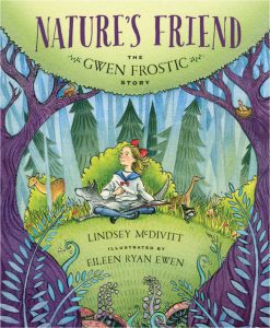
Picture Book Review: Nature’s Friend: The Gwen Frostic Story by Lindsey McDivitt

Nature’s Friend: The Gwen Frostic Story
Author: Lindsey McDivitt
Illustrator: Eileen Ryan Ewen
Sleeping Bear Press
4 August 2018
32 pages


This month’s PB review is by Ryan G. Van Cleave (#1 “Friend of the Trees” at Only Picture Books) and and Florida-​based author/​illustrator Linda Shute.

–Ryan’s Review of the Writing–

It’s always wonderful to read picture book texts where the author has a poetic sensibility about sound, as one can hear in “like a small fawn follows its herd,” which is how McDivitt describes Gwen’s relationship to her brothers and sisters. You hear it again with this line: “tiny town tucked into the thumb of Michigan.” While there are other instances of this type of attention to language, my favorite might well be “tiny ferns unfurled at her feet.” It’s clear early on that McDivitt is trying to create an image system from the natural world to prepare readers for Gwen’s later work as lover of nature.

Nature’s Friend shares Gwen’s entire life trajectory–all nine decades of it. She went from being a sickly child to a prominent businesswoman, successful artist, and environmental pioneer. She was so successful, in fact, that she left an estate of $13 million to Western Michigan University, which renamed its art school in her honor. While Gwen started off with clear physical challenges, she simply never saw herself as disabled. That’s an important message for young readers, to be sure.

Gwen’s life is so full of interesting things that trying to capture it all in a single book feels a bit like one of those Dagwood sandwiches–short of being a comic character with a jaw that can unhinge, there’s no way to quite get your mouth around all that deliciousness.

One of the nice touches in this book is how quotations by Gwen are occasionally included in soft blue letters at the bottom of the page. While some might include such quotations as back matter, these each seen specifically selected for the spread where they’re used. That’s a fine touch.

There’s even a craft project at the end of the book, along with additional back matter about Gwen’s life.

This is an empowering book about a truly noteworthy, admirable woman.

4.25 out of 5 pencils

–Linda’s Review of the Illustrations–

On the jacket of Nature’s Friend, dark tree trunks and limbs frame an alert turn-​of-​the century young Gwen sketching in a north woods glade. Artist Ewen draws us through the frame with a cast of half-​concealed wildlife friends in the greenery surrounding Gwen.

The watercolor color and line medium, warm colors, and intimate viewpoint lend a confident, cheerful mood to the mile marker scenes of Gwen’s life. A large page size, with widely line-​spaced blocks of text on generous white fields are inviting for the six to eight year old transitioning to independent reading. Many spreads feature Frostic quotes in a tall font that suggests hand lettering. Their sky blue tint prevents them from competing visually with the story text blocks, but beckons the reader to return and contemplate Gwen’s words. They soften and add interest to the generally airy page design.

We linger looking at Gwen’s early years long enough for the reader to identify with her, then sweep forward through her life watching her mature, her clothing and hair interestingly reflecting styles of the passing decades. The interior settings–her childhood classroom and home, Chicago trolley and print business, woodsy gift shop and sitting room–are well described, lending the story authenticity. For the outdoor scenes, the artist relies heavily on the less realistic and more decorative style used on the jacket.

Gwen’s physical handicaps are difficult to detect in the pictures. What is clearly shown is her spirit, determination, and resourcefulness, which leave an afterglow of optimism and peace.

4 out of 5 crayons


Linda Shute is an author/​illustrator who earned a degree in art and art history at Florida State University and taught children’s book illustration at Ringling College of Art and Design.
She loves peanuts and beach sunsets.