32 pages
This month’s PB review is by Ryan G. Van Cleave (chief rabbit aficionado at Only Picture Books) and OPB newcomer, freelance author/illustrator Kelly Light.
–Ryan’s Review of the Writing–
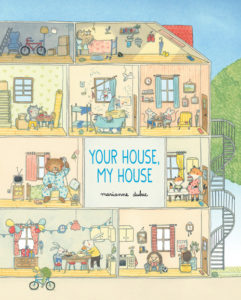
Marianne Dubuc’s new picture book, Your House, My House, almost seems like one of those seek-and-find books my kids loved so much in their k‑1 years. On every page of this book, a little block of text is tucked into the leaves of a tree at the top left while the rest of the page–the bulk of it–offers a look inside a multi-level house full of animals engaged in a variety of actions. Yes, it’s a very special day at 3 Maple Street since it’s Little Rabbit’s birthday. But there’s so much more going on at the same time.
I confess that I find it a bit challenging to connect the text to the characters being referenced since the art is disproportionately large on the page. I’m almost more inclined to just peruse the pictures and imagine my own stories to pair up with the interesting characters versus try to bring the existing text into some kind of connection with the art. Is that a good thing? I’m not sure what to think about it.
Since my responsibility in these reviews is to focus on the story, though, I’ll leave it to Kelly to dive deep into the compelling artwork. While I have lots of appreciation for this book as a whole, I’m giving this a slightly lower ranking than I’d give were I reviewing the entire book as a single thing. With it being such a clearly art-centric book, there’s almost no other option.
It’s worth checking out, though. Let’s not lose track of that fact.
4 out of 5 pencils
–Kelly’s Review of the Illustrations–
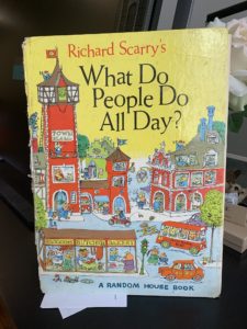
I’d like to ask Marianne Dubuc if she’s a fan of the book What Do People Do All Day? after pouring over her new book Your House, My House. Before I even received the book to review, the cover of her book struck a chord deep inside of me. I ripped tape off of  boxes from my recent move, to find my own tattered copy of Richard Scarry’s book.
Was it the cross-sectioned home revealing the inside of the building and goings-on of what appears to be an early twentieth century, very large old apartment building? The viewer never sees the house with its front wall. That invisible wall allows us to take in all that happens on a very, very busy day at 3 Maple Street.
The SUPREMELY detailed drawings in Marianne’s book appear to be done in great, old-fashioned pencil and watercolor. Simply–the best. Some touches of colored pencil, here and there. The palette emits a sunny day in soft washes with just the right amount of puddling. My inner art geek is dying to know. Did she work to size? (which means the size of the printed book.) I wonder if that’s the case because there is so much detail. I would imagine working larger to fit it all in, but if Marianne did that, perhaps all of this lovely graphite would close up and darken and lose its silvery tone.
These are the thoughts that fill my head when inspecting another illustrator’s work.
The details are ABUNDANT and the art tells most of the story. The writing here is mostly visual but WHOOO BOY, what kinds of lists Marianne must have made to keep this all straight as she drew! The day of the tiny Bunny’s birthday is filled with four floors of activity, one tree, two sides of the house, and the street out front. The inhabitants are all drawn with charm and deceptive simplicity. Marianne manages to convey all kinds of mood and emotion in her characters. An annoyed Owl, a sick Bear, Terrible Two Mice Triplets, Expectant Fox Family, Hedgehogs waiting for Dad, Cats moving in, Rabbits burning baked goods, Birds in the branches, a Post-Cat, a Goldilocks breaking and entering, a Wolf chasing down some pigs and a Little Red Riding Hood walking on by. The tiniest of the characters, the ghost, the ladybug, the bee, the mice children, and a very odd Gnome are the only ones that are hardest to read.
Some of their drawings got tight. It was the Gnome that made me put this book onto my Cintiq and blow it up. I stared. ”IS THAT A…GNOME? A GNOME, TOO??” I started to question my own eyes and rubbed them and wondered if Marianne had eye strain, too, after creating the art. It is quite a feat to draw what is the visual equivalent to a silent movie. I had to go back through all of the pages and see where and when this crazy Gnome came into 3 Maple Street! By making me do that, I knew, Marianne had hooked me into this book experience.
I imagine a child POURING over this book, over and over and over to see all of the details, just as I did with my own Scarry book. This feels very classic, looks very classic, and is illustrated with a lot of class. It feels very real in these times that we stay so close to home and perhaps feel so much more together than we have for a long time.
My ONLY wish? That the book was BIG. 11x15 BIG , like my old Richard Scarry book.
Pure pencil, pure watercolors, pure picture book perfection.
4 out of 5 colored pencils
 Kelly Light lives in Amherst, MA but grew up down the shore in New Jersey surrounded by giant pink dinosaurs, cotton candy colors, and Skee-Ball sounds. She was schooled on Saturday-morning cartoons and Sunday funny pages. She picked up a pencil, started drawing, and never stopped.
Kelly is the author/Illustrator of the Louise series. Louise Loves Art and Louise and Andie, The Art of Friendship are the first two picture books in the series. Louise Loves Bake Sales and Louise and The Class Pet are the first readers in HarperCollins’ I Can Read program.
Kelly has also illustrated Elvis and the Underdogs and Elvis and the Underdogs: Secrets, Secret Service, and Room Service by Jenny Lee, and The Quirks series by Erin Soderberg.
Website: www.kellylight.com


