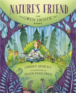
Picture Book Review: Nature’s Friend: The Gwen Frostic Story by Lindsey McDivitt

Nature’s Friend: The Gwen Frostic Story
Author: Lindsey McDivitt
Illustrator: Eileen Ryan Ewen
Sleeping Bear Press
4 August 2018
32 pages


This month’s PB review is by Ryan G. Van Cleave (#1 “Friend of the Trees” at Only Picture Books) and and Florida-​based author/​illustrator Linda Shute.

–Ryan’s Review of the Writing–

It’s always wonderful to read picture book texts where the author has a poetic sensibility about sound, as one can hear in “like a small fawn follows its herd,” which is how McDivitt describes Gwen’s relationship to her brothers and sisters. You hear it again with this line: “tiny town tucked into the thumb of Michigan.” While there are other instances of this type of attention to language, my favorite might well be “tiny ferns unfurled at her feet.” It’s clear early on that McDivitt is trying to create an image system from the natural world to prepare readers for Gwen’s later work as lover of nature.

Nature’s Friend shares Gwen’s entire life trajectory–all nine decades of it. She went from being a sickly child to a prominent businesswoman, successful artist, and environmental pioneer. She was so successful, in fact, that she left an estate of $13 million to Western Michigan University, which renamed its art school in her honor. While Gwen started off with clear physical challenges, she simply never saw herself as disabled. That’s an important message for young readers, to be sure.

Gwen’s life is so full of interesting things that trying to capture it all in a single book feels a bit like one of those Dagwood sandwiches–short of being a comic character with a jaw that can unhinge, there’s no way to quite get your mouth around all that deliciousness.

One of the nice touches in this book is how quotations by Gwen are occasionally included in soft blue letters at the bottom of the page. While some might include such quotations as back matter, these each seen specifically selected for the spread where they’re used. That’s a fine touch.

There’s even a craft project at the end of the book, along with additional back matter about Gwen’s life.

This is an empowering book about a truly noteworthy, admirable woman.

4.25 out of 5 pencils

–Linda’s Review of the Illustrations–

On the jacket of Nature’s Friend, dark tree trunks and limbs frame an alert turn-​of-​the century young Gwen sketching in a north woods glade. Artist Ewen draws us through the frame with a cast of half-​concealed wildlife friends in the greenery surrounding Gwen.

The watercolor color and line medium, warm colors, and intimate viewpoint lend a confident, cheerful mood to the mile marker scenes of Gwen’s life. A large page size, with widely line-​spaced blocks of text on generous white fields are inviting for the six to eight year old transitioning to independent reading. Many spreads feature Frostic quotes in a tall font that suggests hand lettering. Their sky blue tint prevents them from competing visually with the story text blocks, but beckons the reader to return and contemplate Gwen’s words. They soften and add interest to the generally airy page design.

We linger looking at Gwen’s early years long enough for the reader to identify with her, then sweep forward through her life watching her mature, her clothing and hair interestingly reflecting styles of the passing decades. The interior settings–her childhood classroom and home, Chicago trolley and print business, woodsy gift shop and sitting room–are well described, lending the story authenticity. For the outdoor scenes, the artist relies heavily on the less realistic and more decorative style used on the jacket.

Gwen’s physical handicaps are difficult to detect in the pictures. What is clearly shown is her spirit, determination, and resourcefulness, which leave an afterglow of optimism and peace.

4 out of 5 crayons


Linda Shute is an author/​illustrator who earned a degree in art and art history at Florida State University and taught children’s book illustration at Ringling College of Art and Design.
She loves peanuts and beach sunsets.

Picture Book Review: The Rabbit Listened by Cori Doerrfeld


The Rabbit Listened
Author: Cori Doerrfeld
Illustrator: Cori Doerrfeld
Bloomsbury Children’s Books
20 February 2018
40 pages


This month’s PB review is by Ryan G. Van Cleave (Top Rabbit at Only Picture Books) and Ringling College of Art and Design Illustration Professor (and OPB champion) John Herzog.

–Ryan’s Review of the Writing–

While this is a quiet book in many ways, the story starts with a disaster–birds knock down Taylor’s super-​tall, super-​cool block tower. In response, animal after animal arrives, with each acting in ways that match their animal nature. The chicken? It clucks away endlessly. The bear? It wants to roar and be mad. The snake? Revenge! But none of these interactions prove useful to Taylor, so each animal eventually wanders off. They all are more or less well-​intentioned, but they are more concerned with their solutions than thinking about what–if anything–Taylor needs.

It’s only the rabbit that doesn’t try to impose its natural response to the situation. It simply listens and is present, moving closer until “Taylor could feel its warm body.” This allows the child–half of the reviewers claim it’s a he, and half say Taylor is 100% gender neutral–to have their own range of reactions. Given the chance to respond as Taylor chooses, Taylor’s able to move past the many emotions (laughing, shouting, etc.) and can finally build once again.

Some readers will surely want to play up the animal voices to good effect when reading The Rabbit Listened to a child. The pacing of this story, too, lends itself well to reading aloud.

Will some readers find the message too straightforward or didactic? Perhaps. But it’s a sweet, simple story that teaches empathy, and that’s a lesson parents like myself wish were included in more picture books.

4 out of 5 pencils

–John’s Review of the Illustrations–

I’m really torn when it comes to The Rabbit Listened. No doubt Cori Doerrfeld has crafted an interesting take on what is essentially the five stages of grief. From an illustration standpoint, however, I feel there were a few missed opportunities.

For example, Taylor–our protagonist–is visited by all kinds of animals. We see them with Taylor in various spot illustrations that are organized just so on the page. On the far side of one spread, we see the animals walking away from Taylor, who’s on the opposite side. It’s adequate, I suppose, but we never truly get a sense of the crowd. We never get an image of all the animals overshadowing Taylor, enhancing and illustrating that overwhelming feeling of isolation. We get a great image of the bear doing that, but it would’ve felt much more powerful if all of the animals were there looking down at us.

Honestly, a little disorganization would’ve tremendously helped the first half of this book. Animals! Animals everywhere! Spouting advice and nonsense! It would’ve made the quieter scenes with the rabbit during the second half all the more endearing, providing some much-​needed contrast from the animal madness. Instead, the illustrations just feel a bit flat and somewhat sparse.

The strongest aspect of this book is the design of the main character. It’s very clear that Taylor is who we should be rooting for with their fun, messy hair and rounded features. The rabbit is fluffy and cute, of course, but feels a bit stock. The rest of the animals are designed somewhat grotesquely to emphasize Taylor’s ambivalence and aversion to their advice, I imagine. Yet from my perspective, these animals were only trying to help. Yes, they went about it in a bombastic way, but that doesn’t make them monsters. I wish they were softened up a bit, if anything to reinforce the idea that loved ones who suggest action in times of turmoil are only trying to help.

Perhaps I’m reading a bit too much into it.

I definitely like that we don’t have much of a sense of place and time, and I absolutely love the final image where we see Taylor’s vision of their next big building venture. And please don’t get me wrong–it’s important to listen in a situation like this. And Taylor eventually accepts what happened and moves on, which is nice and quite appropriate. For me, however, The Rabbit Listened perhaps aspires to be greater and deeper than it actually is.

3 out of 5 crayons


John Herzog is an illustrator and educator. His clients include Hasbro, James Patterson, Houghton Mifflin Harcourt, and Highlights for Children. He also teaches illustration classes at Ringling College of Art and Design. He lives in Florida with his wife, two kids, a pair of tarantulas, a bearded dragon, and a fish.
 

Picture Book Review: A Dog Named Doug by Karma Wilson and Matt Myers


A Dog Named Doug
Author: Karma Wilson
Illustrator: Matt Myers
Margaret K. McElderry Books
26 June 2018
40 pages


This month’s PB review is by Ryan G. Van Cleave (“Best of Show” winner at Only Picture Books) and Ringling College of Art and Design Illustration Professor David C. Gardner.

–Ryan’s Review of the Writing–

Choosing what to run with for this month’s review proved easier than usual–I’m a Karma Wilson fan (Bear Snores On got worn out in the Van Cleave household), and I’m a dog lover (rumor has it that I’ve twice chased a mailman). So when A Dog Named Doug arrived, it barked dug its way to the top of the list where it stayed. Like a good dog book should.

So here’s the story: A dog (named Doug) digs. He digs more. And more. And more. And then he goes to bed where he (1% spoiler here) dreams of digging in a (decidedly strange, and possibly too weird for some kids) dreamworld.

To be fair, a dog who digs because dogs like to dig isn’t much of a plot. But the book has three things really going for it that quite likely overcome any real or perceived weakness in the basic premise.

  1. The art is both compelling AND clever. See David’s review about that aspect of the book below.
  2. I have to mention the art again. Sorry to step on your toes so much, David. But the terrific art by illustrator Matt Myers frequently works as typography, such as a dirt mound becoming an A in “I can dig better than you!” or many dirt mounds becoming Ms in “Many miles of dirt Doug dug, leaving heaps and piles and mounds of mud.”
  3. The refrain of “Oh boy, did Doug dig!” is sure to encourage readers to shout it out during storytime. Plus the loose, easy rhymes that Karma’s known for are present here as well.

Part of the fun here is that Doug’s digging takes him to a whimsical range of destinations. The Old West. The White House (note the female POC/​President of Color). The ocean floor. Stonehenge. Some kind of Egyptian tomb. And even a bowling alley. He even digs to the other side of the earth where the perspective is, quite reasonably, upside down.

It’s a fun, rollicking book, to be sure. But some readers could get tripped up with the tongue-​twister start, and others might find the entire tail (yep–a pun!) a bit one note (Doug/​dog/​dug).

In sum, this is a playful book that could be–for the right child and adult reader–an enjoyable bedtime story with serious read-​aloud potential.

4 out of 5 pencils paws

–David’s Review of the Illustrations–

The cover starts us off on just the right note, with a vignette placing Doug digging in the text against a stark white background–a lovely, graphic design–and painted with such vigor that you can feel the dog digging furiously, happy, if a bit manic, capturing perfectly in one image what the book is about.

The palette is bright, saturated, and lighthearted without ever tipping into garishness. The whole book has the feel of an animated Looney Tunes short–madcap and raucous. The layouts are cinematic, utilizing a variety of close-​ups and long shots, and the brushwork is loose and energetic, with dabs of acrylic and oil paint so juicy and playful that you can almost feel them popping off the page.

What I appreciate most about Matt Myers’ illustrations are that they veer alongside and, at times, away from, the minimal text, often taking the lead and keeping us guessing: Where will Doug pop up next? The pictures, not the text, make this book a page turner.

This is exactly what Maurice Sendak suggested the pictures should do in a picture book–depict not just what the words are telling us, but take the story even further.

When Doug decides to head home, the text only tells us Doug is digging. But Mr. Myers turns the vignettes depicting Doug’s journey into a cartoony delight, with no rhyme or reason except to entertain a young reader (and their adult companion).

Near the end, the text tells us only that Doug was in his bed. But the illustration shows Doug in his owners’ bed, dreaming away. It’s an inspired choice–another gentle gag as the book is winding down.

A final example–and my favorite moment in the entire book–is when Doug digs all the way to China. The text only reads “Oh boy, did Doug dig, and dig, and dig.” In this fantastic spread, and with the help of some inspired handling of text, Mr. Myers shows that he can still see the world through a kid’s eyes.

Sharing the storytelling duties with the author to this extent is an illustrator’s dream. Matt Myers rises to the occasion splendidly.

4 out of 5 crayons dirt mounds


David C. Gardner is an award-​winning illustrator and visual development artist. A former artist for Walt Disney Animation Studios, he has illustrated numerous picture books, including his latest from Sleeping Bear Press, Write On, Irving Berlin! by Leslie Kimmelman (which appeared on OPB not so long ago). It tells the true story of little Izzy Baline, who immigrated to New York City in 1893 and grew up to become Irving Berlin, one of the most well-​known composers of popular music in America. David teaches illustration at Ringling College of Art and Design.
To learn more about his work, please visit FlyingDogStudio.com.

(Ryan’s note: With a website name like that, you can see why I asked him to pitch in for this month’s review!)

Picture Book Review: Perfectly Norman by Tom Percival


Perfectly Norman
Author: Tom Percival
Illustrator: Tom Percival
Bloomsbury Children’s Books
1 May 2018
32 pages


This month’s PB review is by Ryan G. Van Cleave (Employee of the Month at Only Picture Books) and Florida-​based author/​illustrator Linda Shute.

–Ryan’s Review of the Writing–

Maybe it’s because I’ve been binge-​watching Glee or because I have a teen and a tween living under my roof, but I’m smitten these days by books that encourage young people to be who they are versus who others want them to be. And that’s the story here with poor Norman who plays with his dog and seems just like every other little boy until one day, he sprouts a set of beautiful wings. He flies and zooms and soars, as happy as can be. But then he gets worried what everyone else will think. No one else has wings, do they? What will they all think?

So he hides those wings under a big coat and kind of huddles into himself.

As one would expect, wearing a big yellow jacket all the time is no fun and creates its own set of problems. Bath time? Bed time? Birthday parties? Yikes. “The coat was hot and uncomfortable, but Norman had decided that no one should see his wings–ever.” Norman remains in misery on the sidelines while the other kids go about their lives and do kid stuff.

Finally, thanks to the encouragement of his parents, Norman sheds his coat and reveals his glorious, colorful wings. And in doing so, a few of his peers are empowered to do the same and show their own wings. The sky is filled with flying kids who are having the time of their lives.

So while Norman might not be “perfectly normal,” he is “perfectly Norman,” and that’s far more important, he realizes at last.

Of course, the wings symbolize freedom and the story is fairly on-​the-​nose regarding its message that it’s better to accept your true identity than to live any type of lie. That’s a message every parent can support.

Many readers will feel uplifted by this tale of finding one’s place in the world. An enjoyable and satisfying read.

4 out of 5 pencils

–Linda’s Review of the Illustrations–

Right from the git-​go, it is hard to miss Perfectly Norman. The book stands a foot tall and gleams life-​jacket red. Even the brush script title glows in the semi-​dark. Strongly designed by Bloomsbury’s Goldy Bond, it is the ideal format to be read and shown to a young group because the target audience is not just the “Normans” out there, but their friends and classmates. Percival’s characters are drawn simply and lightheartedly with emotional appeal, inviting reader identification.

Norman lives in a sepia suburb. The townhomes, his diverse friends, and even his parents (one noticeable darker than the other) occupy bland tonality, but NOT NORMAN! He is the colorful character in their midst starting on page one. The only creatures, besides Norman, who live in the domain of color are the birds, in their bit of blue sky—a spoiler clue revealed on page two that can be enjoyed upon rereading. The spotlight is on Norman in his yellow clothing, and on the birds and (Let’s not forget!), the multi-​hued wings, focusing young listener/​viewers on Norman’s journey right through to its chromatically joyous conclusion.

And once Norman’s story is revealed…well, there’s time to go back and wander the interesting, humorous, warm details of his sepia world. This is a picture book that works on many levels.

4 out of 5 crayons


Linda Shute is an author/​illustrator who earned a degree in art and art history at Florida State University and taught children’s book illustration at Ringling College of Art and Design.
She loves peanuts and beach sunsets.

Picture Book Review: If You Had a Jetpack by Lisl Detlefsen and Linzie Hunter


If You Had a Jetpack
Author: Lisl Detlefsen
Illustrator: Linzie Hunter
Knopf Books for Young Readers
24 April 2018
32 pages


This month’s PB review is by Ryan G. Van Cleave (The Man Behind the Curtain at Only Picture Books) and Ringling College of Art and Design Illustration Professor John Herzog.

–Ryan’s Review of the Writing–

If You Had a Jetpack is predicated on one of those ideas that only the right type of imagination will recognize as potentially terrific (kid + jetpack = ?). Clearly Lisl Detlefsen is just such a writer.

In this story, a rabbit is bored, so it invents  …  a jetpack. His little brother gets jealous—as little brothers so often do when siblings have cool things—so older brother invents a second one, allowing them to embark together on adventures that only jetpack-​power can provide. The A‑then-​B-​then‑C linked progression of  the increasingly fantastical situations pleasantly echoes the structure of NumeroffIf You Give a Mouse a Cookie.

One of the real treats in this story is how so many of the adults need a hand from these smart bunnies. For example, when little brother is left with Nana so big brother can visit the astronauts in space who ask for “help with a slight spaceship repair.” Enter the clever, industrious, jetpack-​creating bunny! For this effort, the President offers him a special medal at a ceremony with autographs, photos, and interviews. How does the inventor bunny handle it? “Modestly.”

Throughout this story, there are various adverbs (-ly words) like “patiently,” “bravely,” and “persistently.” These are always set off on the page to highlight their importance and to encourage readers to consider their meaning. Many of these words will be known by kid readers, but a few might provide a chance for a vocabulary increase (in a fun way!).

One final observation: this STEM-​friendly book is written in second person, so the empowering message is about these clever little bunnies, for sure, but equally about the profound creative capability within us all (“Putting it together might be tricky, but since youre clever, youd figure it out eventually.”).

Highly recommended and loads of fun for parents and youngsters alike.

4.25 out of 5 pencils

–John’s Review of the Illustrations–

In 2018, most people are unable to tell if a movie was shot on film or shot digitally. Over the last ten years, digital technology has arguably caught up to where analog technology has been for almost a century. So how does this relate to the picture book in question? Well, as I looked at the wonderful illustrations in If You Had a Jetpack, I was convinced that they were created using traditional means—paint, pencil, pastels, screenprinting, etc.

I was, to my delight, completely wrong. More on that in a moment.

As an illustrator, I know how incredibly difficult it is to maintain a style when you’re dealing with a variety of characters and locations. Linzie Hunter makes it look so easy here. Her characters inhabit this universe with an incredible appeal that’s not only fun but also appropriate to the story.

This book reads like a young child wrote it, and while the illustrations are done in a somewhat juvenile vein, they never feel pandering or desperate. The colors remind me of those prominently used by NASA designers in the late 60s/​early 70s, which adds even more appeal as it deals with classic “space age” technology. A few pages feel a bit too busy, which hinders the flow of the text a little. But it’s a minor complaint against an otherwise delightful picture book.

Back to technology—at the end of the book, it’s noted that the illustrations were created using Procreate on the iPad Pro. While I would’ve enjoyed this book no matter how the illustrations were created, this delighted me because these are my tools of choice as a professional illustrator. But the reality is that, with digital technology catching up to traditional media, the tools don’t matter as long as you have an understanding of the fundamentals and how to use the tools. Linzie Hunter has a great understanding of both, and I’m excited to see more from her.

4 out of 5 crayons


John Herzog is an illustrator and character designer. He also teaches illustration classes at Ringling College of Art and Design. He lives in Florida with his wife, two kids, a pair of tarantulas, and a fish.
 

Picture Book Review: Mixed: A World of Colour


Mixed: A World of Colour
Author: Arree Chung
Illustrator: Arree Chung
Henry Holt and Co.
3 July 2018
40 pages


This month’s PB review is by Ryan G. Van Cleave (Top Tamale at Only Picture Books) and Florida-​based author/​illustrator Fred Koehler.

–Ryan’s Review of the Writing–

Arree Chung’s new picture book, Mixed, feels tailor-​made for the discordant world of today. Three colors–Blues, Reds, and Yellows–all live together in relative peace and harmony, until one day, Reds quite suddenly declare that they’re the best. The Yellows respond: “No! We’re the BEST because we’re the brightest!” (The Blues? They’re “too cool” to even point out what is obvious to them–Blues are best!)

As a result, the colors segregate themselves to color-​specific parts of the city. Then one day, a Yellow befriends a Blue. Before long, a new color emerges (Spoiler: Yellow + Blue = Green) and the world is full of new, exciting possibilities that create a sense of togetherness and belonging.

This sweet tale teaches readers about basic colors and how they mix to create new colors. But it also shares a non-​didactic message of  tolerance, understanding, and valuing differences that young people–and adults–can’t hear enough.

The simple, declarative sentences are potent and appropriate. Equally valuable, they’re of a level that most kids will be able to say aloud as the story is read and re-​read. That participatory element is an important part of internalizing this powerful message.

This book is so charming and spot on that I’ll even overlook the bonus “u” in the title word “colors,” which I acknowledge is the standard spelling in pretty much every English-​speaking country EXCEPT America. (If you have an issue with that, blame Noah Webster! I do!)

4.75 out of 5 pencils

–Fred’s Review of the Illustration–

Picture book artists often feel like we need to fill our pages with loads of detail to successfully tell a story. Just look at any book I’ve illustrated! 😂

The real magic happens when an artist becomes so good at their craft that they can tell MORE story with LESS detail. Some contemporary geniuses at this include folks like Greg Pizzoli, Debbie Ohi, Hervé Tullet, Oliver Jeffers, and, may I submit, Arree Chung.

Mixed isn’t just a hope-​filled parable about the beauty of inter-​chroma coupling. It’s an absolute masterclass in visual storytelling. I mean, how many variations can you have on a simple, colored dot anthropomorphized to have human(ish) qualities? Apparently dozens and dozens. The beauty of Chung’s work is in the consistent, fun, unexpected details that give life and personality to each of his characters.

As the story builds, so do the visual details, matching pace with the tension in the words. Then, unexpected things happen. And as you reach the penultimate scenes, you’ll be crying multicolored prisms of joy.

Aside from the visuals, my other favorite part is that by using colored dots as stand-​ins for people, Chung has given us room to discuss important issues of race without the need to get defensive or point fingers. I recommend this book for all collections.

5 out of 5 crayons


Fred Koehler is an artist and storyteller whose real-​life misadventures include sunken boats, covert border crossings, and fighting off robbers in the dead of night. Whether free diving in the Gulf of Mexico or backpacking across Africa, Fred’s sense of adventure and awe of nature overflow into his characters’ stories.

Between book projects, Fred also runs a highly-​sought after design studio, helping brands across the US learn to tell their own stories.

Fred is passionate about encouraging young artists, promoting social justice, and conserving our environment. He lives in Florida with his wife, kids, and a rescue dog named Cheerio Mutt-​Face McChubbybutt.