Picture Book Review: If You Had a Jetpack by Lisl Detlefsen and Linzie Hunter


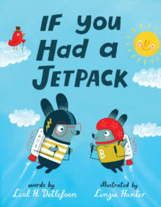
If You Had a Jetpack
Author: Lisl Detlefsen
Illustrator: Linzie Hunter
Knopf Books for Young Readers
24 April 2018
32 pages


This month’s PB review is by Ryan G. Van Cleave (The Man Behind the Curtain at Only Picture Books) and Ringling College of Art and Design Illustration Professor John Herzog.

–Ryan’s Review of the Writing–

If You Had a Jetpack is predicated on one of those ideas that only the right type of imagination will recognize as potentially terrific (kid + jetpack = ?). Clearly Lisl Detlefsen is just such a writer.

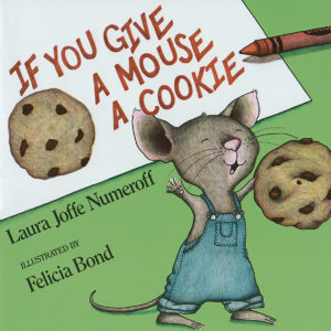
In this story, a rabbit is bored, so it invents  …  a jetpack. His little brother gets jealous—as little brothers so often do when siblings have cool things—so older brother invents a second one, allowing them to embark together on adventures that only jetpack-​power can provide. The A‑then-​B-​then‑C linked progression of  the increasingly fantastical situations pleasantly echoes the structure of NumeroffIf You Give a Mouse a Cookie.

One of the real treats in this story is how so many of the adults need a hand from these smart bunnies. For example, when little brother is left with Nana so big brother can visit the astronauts in space who ask for “help with a slight spaceship repair.” Enter the clever, industrious, jetpack-​creating bunny! For this effort, the President offers him a special medal at a ceremony with autographs, photos, and interviews. How does the inventor bunny handle it? “Modestly.”

Throughout this story, there are various adverbs (-ly words) like “patiently,” “bravely,” and “persistently.” These are always set off on the page to highlight their importance and to encourage readers to consider their meaning. Many of these words will be known by kid readers, but a few might provide a chance for a vocabulary increase (in a fun way!).

One final observation: this STEM-​friendly book is written in second person, so the empowering message is about these clever little bunnies, for sure, but equally about the profound creative capability within us all (“Putting it together might be tricky, but since youre clever, youd figure it out eventually.”).

Highly recommended and loads of fun for parents and youngsters alike.

4.25 out of 5 pencils

–John’s Review of the Illustrations–

In 2018, most people are unable to tell if a movie was shot on film or shot digitally. Over the last ten years, digital technology has arguably caught up to where analog technology has been for almost a century. So how does this relate to the picture book in question? Well, as I looked at the wonderful illustrations in If You Had a Jetpack, I was convinced that they were created using traditional means—paint, pencil, pastels, screenprinting, etc.

I was, to my delight, completely wrong. More on that in a moment.

As an illustrator, I know how incredibly difficult it is to maintain a style when you’re dealing with a variety of characters and locations. Linzie Hunter makes it look so easy here. Her characters inhabit this universe with an incredible appeal that’s not only fun but also appropriate to the story.

This book reads like a young child wrote it, and while the illustrations are done in a somewhat juvenile vein, they never feel pandering or desperate. The colors remind me of those prominently used by NASA designers in the late 60s/​early 70s, which adds even more appeal as it deals with classic “space age” technology. A few pages feel a bit too busy, which hinders the flow of the text a little. But it’s a minor complaint against an otherwise delightful picture book.

Back to technology—at the end of the book, it’s noted that the illustrations were created using Procreate on the iPad Pro. While I would’ve enjoyed this book no matter how the illustrations were created, this delighted me because these are my tools of choice as a professional illustrator. But the reality is that, with digital technology catching up to traditional media, the tools don’t matter as long as you have an understanding of the fundamentals and how to use the tools. Linzie Hunter has a great understanding of both, and I’m excited to see more from her.

4 out of 5 crayons


John Herzog is an illustrator and character designer. He also teaches illustration classes at Ringling College of Art and Design. He lives in Florida with his wife, two kids, a pair of tarantulas, and a fish.
 

Picture Book Review: Mixed: A World of Colour


Mixed: A World of Colour
Author: Arree Chung
Illustrator: Arree Chung
Henry Holt and Co.
3 July 2018
40 pages


This month’s PB review is by Ryan G. Van Cleave (Top Tamale at Only Picture Books) and Florida-​based author/​illustrator Fred Koehler.

–Ryan’s Review of the Writing–

Arree Chung’s new picture book, Mixed, feels tailor-​made for the discordant world of today. Three colors–Blues, Reds, and Yellows–all live together in relative peace and harmony, until one day, Reds quite suddenly declare that they’re the best. The Yellows respond: “No! We’re the BEST because we’re the brightest!” (The Blues? They’re “too cool” to even point out what is obvious to them–Blues are best!)

As a result, the colors segregate themselves to color-​specific parts of the city. Then one day, a Yellow befriends a Blue. Before long, a new color emerges (Spoiler: Yellow + Blue = Green) and the world is full of new, exciting possibilities that create a sense of togetherness and belonging.

This sweet tale teaches readers about basic colors and how they mix to create new colors. But it also shares a non-​didactic message of  tolerance, understanding, and valuing differences that young people–and adults–can’t hear enough.

The simple, declarative sentences are potent and appropriate. Equally valuable, they’re of a level that most kids will be able to say aloud as the story is read and re-​read. That participatory element is an important part of internalizing this powerful message.

This book is so charming and spot on that I’ll even overlook the bonus “u” in the title word “colors,” which I acknowledge is the standard spelling in pretty much every English-​speaking country EXCEPT America. (If you have an issue with that, blame Noah Webster! I do!)

4.75 out of 5 pencils

–Fred’s Review of the Illustration–

Picture book artists often feel like we need to fill our pages with loads of detail to successfully tell a story. Just look at any book I’ve illustrated! 😂

The real magic happens when an artist becomes so good at their craft that they can tell MORE story with LESS detail. Some contemporary geniuses at this include folks like Greg Pizzoli, Debbie Ohi, Hervé Tullet, Oliver Jeffers, and, may I submit, Arree Chung.

Mixed isn’t just a hope-​filled parable about the beauty of inter-​chroma coupling. It’s an absolute masterclass in visual storytelling. I mean, how many variations can you have on a simple, colored dot anthropomorphized to have human(ish) qualities? Apparently dozens and dozens. The beauty of Chung’s work is in the consistent, fun, unexpected details that give life and personality to each of his characters.

As the story builds, so do the visual details, matching pace with the tension in the words. Then, unexpected things happen. And as you reach the penultimate scenes, you’ll be crying multicolored prisms of joy.

Aside from the visuals, my other favorite part is that by using colored dots as stand-​ins for people, Chung has given us room to discuss important issues of race without the need to get defensive or point fingers. I recommend this book for all collections.

5 out of 5 crayons


Fred Koehler is an artist and storyteller whose real-​life misadventures include sunken boats, covert border crossings, and fighting off robbers in the dead of night. Whether free diving in the Gulf of Mexico or backpacking across Africa, Fred’s sense of adventure and awe of nature overflow into his characters’ stories.

Between book projects, Fred also runs a highly-​sought after design studio, helping brands across the US learn to tell their own stories.

Fred is passionate about encouraging young artists, promoting social justice, and conserving our environment. He lives in Florida with his wife, kids, and a rescue dog named Cheerio Mutt-​Face McChubbybutt.

Picture Book Review: They Say Blue by Jillian Tamaki


They Say Blue
Author: Jillian Tamaki
Illustrator: Jillian Tamaki
Abrams Books for Young Readers
13 March 2018
52 Pages


This month’s PB review is by Ryan G. Van Cleave (Big Cheese at Only Picture Books) and Ringling College of Art and Design Illustration Professor Katy Betz.

–Ryan’s Review of the Writing–

Caldecott and Printz Honor-​winning illustrator Jillian Tamaki’s They Say Blue clocks in at a beefy 52 pages versus the far leaner (and more traditional) 32-​page format. That’s not to say that this is a text-​heavy book, however. In fact, most pages with text only have 10 words or so, which makes sense since the strength of this quiet book resides in Tamaki’s compelling illustrations.

The main character is an inquisitive young girl who undergoes an almost philosophical exploration on the idea of color starting with the blue of the sky and the sea and ending with black crows flying: “Tiny inkblots on a sea of sky.” In many ways, the somewhat lyrical, nonlinear story is about curiosity–it has a kind of imaginative carpe diem feel throughout, or at least a “stop and smell the roses” lesson. But some readers might find the text a bit meandering and the ending too abrupt to be as richly satisfying as the wonderful artwork.

To be clear–there is no plot. It’s far more of a series of vignettes or musings.

Those who prefer picture books that generate discussion might find the girl’s color- and season-​based ponderings to be quite fruitful. For example, what reader won’t react when she cups water in her hands and says, “I toss it in the air to make diamonds”? Or when she stretches her arms to the sky and somehow transforms into a tree?

In sum, They Say Blue is a memorable book with more than a few picture-​perfect spreads, though it’s clearly the expressive artwork that carries the day.

3.75 out of 5 pencils

–Katy’s Review of the Illustration–

Jillian Tamaki’s illustrations in They Say Blue burst with energy and soulful contemplation. Readers will discover hidden truths about life on each page, thanks to the imaginative narrative and clever compositions.

Using traditional media of acrylic on watercolor paper, Tamaki invites readers to wonder through use of bold colors and sweeping textures. Her imagery plays off the text beautifully–sometimes visually supporting what the main character is thinking, while other times purposefully contradicting to evoke curiosity and surprise. The power of color association is often used to enhance conceptual facts, making us feel something instead of just think. And a few sequential drawings throughout the book illuminate concepts of time and transformation, integrating both literal and metaphorical imagery seamlessly.

They Say Blue is a pictorial delight that will inspire readers to never lose their sense of wonder.

5 out of 5 crayons


A Professor of Illustration at Ringling College of Art and Design, Katy Betz works with both traditional and digital media and is active in the fields of children’s literature, gallery, and editorial illustration. When not working in the studio or classroom, she says that you can find her “playing outdoors in the Florida swamps or hiking the California Sierras with a sketchbook in hand.”

Katy is represented by Christy Ewers of CATugeau Agency.

Picture Book Review: The Big Bed by Bunmi Laditan and Tom Knight


The Big Bed
Author: Bunmi Laditan
Illustrator: Tom Knight
Farrar, Straus and Giroux Books for Young Readers
6 February 2018
32 pages


This month’s PB review is by Ryan G. Van Cleave (Top Banana at Only Picture Books) and Ringling College of Art and Design Illustration Professor John Herzog.

–Ryan’s Review of the Writing–

Mommy. We have to talk,” says the protagonist of The Big Bed, a little cutie who’s All Business when it comes to getting what she wants: Daddy ousted from the bed that she and Mommy will share. It’s a fun twist on the age-​old issue of kids climbing into their parents’ bed at night.

This girl’s part carnival barker, part late-​night infomercial salesman, and part too-​cute-​to-​resist little kid. Who can blame her, though? Moms ARE “full of cozies” and plenty DO smell just like fresh bread. Few parents will be able to resist when the kid quite reasonably asks: “Who wouldn’t want to cuddle with her?”

What makes the language sing is the unexpected combination of formal, argumentative prose coupled with kidspeak. And Laditan does a fine job of keeping this self-​assertive girl’s attitude in check–it could quite easily get annoying if less skillfully managed. This is a clever, fun book.

Ladaitan’s third book is well worth reading and will deliver giggles and guffaws for both parents and kids alike.

4.25 out of 5 pencils

–John’s Review of the Illustrations–

I think everyone can relate to the central conflict of The Big Bed, which involves a little girl formally presenting reasons why her father should slumber elsewhere at bedtime. And the stylish illustrations by Tom Knight make it even more relatable and, more importantly, fun.

The treatment of the characters and the way they interact with each other are key throughout. As the little girl makes her case to dad, for example, she comes off as both a motivational speaker and a mob boss. And, of course, dad is seated on a small, plastic child’s chair that’s buckling a bit. Even minor characters like the cat and Grandma (specifically the pictures on Grandma’s wall) provide Easter eggs for repeated readings, which is always something I appreciate.

Bold colors, smart framing, and a fun style make The Big Bed a joy to both look at and read. Highly recommended.

4 out of 5 crayons


John Herzog is an illustrator and character designer. He also teaches illustration classes at Ringling College of Art and Design. He lives in Florida with his wife, two kids, a pair of tarantulas, and a fish.