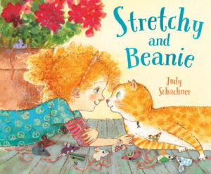
Picture Book Review: Stretchy and Beanie by Judy Schachner

Author: Judy Schachner
Illustrator: Judy Schachner
Dial Books for Young Readers
2 November 2021
40 pages

This month’s PB review is by Ryan G. Van Cleave (Owner/​Operator of Only Picture Books) and longtime OPB friend (and Ringling College of Art and Design Illustration Professor) John Herzog.

–Ryan’s Review of the Writing–

We all know Judy Schachner as the author/​illustrator of the terrific Skippyjon Jones series, so the expectations for her work are quite reasonably pretty high. Does this sequel to the picture book Stretchy McHandsome hit that mark? Let’s see!

At the beginning of Stretchy and Beanie, the McHandsome cat clan met the McBright human clan, so every McBright kid suddenly had the opportunity to become a pet owner. Beanie felt a deep connection with Stretchy the cat, and not just because they shared the same eye color (one green and one blue). In rhyming quatrains, readers learn how the new pair explored ways of getting along with each other. Things were “glorious.” At first.

Then Beanie “got the bright idea /​ to raise a perfect pet. /​ Even read a big best seller /​ on how she could, and yet…” Anyone who’s ever had a cat knows what’s coming next.  You can’t make a cat do things that the cat doesn’t want to do. And Stretchy isn’t into Beanie’s silly math, music, and dance lessons. Wearing a harness? No, thank you! So, Stretchy fought back by climbing the drapes and peeing on the carpet.

Still, Beanie kept over-​snuggling and kissing him! Ugh! Stretchy did his best to avoid her, but he finally had had enough. The door was left ajar, so off he fled. The point-​of-​view then shifts to a feline perspective, with Stretchy worrying about who’d bring him dinner, brush his fur, or listen to him purr. Those concerns are what finally get the runaway cat to come down from his hiding spot up in a tree. That, plus a fire truck and two bags of snacks.

The introduction of a first-​person narrator in the final few pages was quite a surprise. Another thing in the surprising category is some of the word choices, such as “caused our lad to hiss,” where the “our lad” feels at odds with the kid-​appropriate language found in much of the rest of the story (“squeezy squishes” and how Stretchy thought of birds as “little flying snacks”).  The “’twas” and “Ol’ Binney” also seems overly poetic and a bit old-fashioned.

The lesson for Beanie–and readers–is to have “patience, love, and kindness” for others, feline or not. And no one likes bossy people, period. Yet Beanie doesn’t learn this lesson because when Stretchy finally comes down, she gives him a “smushy hug and kiss” which is exactly what the cat hates most. The text alleviates this concern a little by saying that she hasn’t yet learned to be gentle with pets, so one might assume she will learn it eventually, but do parents and teachers want characters to change for the better by the end of a story? Do they need clearer evidence of the positive change that so many picture books promise? One might argue that Beanie remains the same, which explains the final spread, where Stretchy is once again tearing up the curtains.

The McBrights are as diverse as the cats they embrace, and one of the children even uses a wheelchair. Those are definite positives. And the art is quite interesting throughout. It really matches the text quite well. There’s much to like in this new book.

In sum, Stretchy and Beanie is lighthearted enough to undercut much of the serious material here, and Shachner’s incredibly bendy cat images are loads of fun. Cat lovers and fans of Shachner’s other titles will likely find this book to be adorable.

4.25 out of 5 pencils


–John’s Review of the Illustrations–

There’s an interesting trend that I’ve noticed in the kidlit world over the last few years that I have very strong feelings about. For obvious reasons, I will not name names here, but I’ve noticed that there is a group of illustrators out there who try to draw the way that kids draw–or at least the way they think kids draw.

These illustrators purposefully get anatomy wrong, simplifying in a way that feels kid-​like on the surface, but really isn’t because it lacks any kind of heart or soul. As a result, there is a cynical, condescending feeling to the work. Oftentimes, these illustrators are drawing well below their ability. But because they’re illustrating for kids, they feel that they have to extract any kind of sophistication and “dumb it down” for the audience. And sometimes, an illustrator lacking in observational and drawing skills hides behind this “style” to cover for the fact that they can’t draw very well.

I won’t lie to you: I hate this trend. It diminishes the entire medium. It underestimates the audience. And, more egregiously, it talks down to and belittles them. Kids are often smarter than we give them credit for.

Now, you may be asking, what does this have to do with Judy Schachner’s lovely Stretchy and Beanie? Well, after reading this book with my little boy and seeing his delighted reaction to both the rhythmic words and engaging pictures, I found myself genuinely contemplating why the illustrations in this book work so well for both a five-​year-​old and a forty-year-old.

I eventually came to this conclusion: Schachner’s love for the medium and the audience shines through in a way that is both accessible and enjoyable. While the illustrations don’t exactly look like a kid drew them, they embody the spirit of how a kid would illustrate a book like this. The little details coupled with swathes of bright, vibrant color reminded me of how I would draw as a kid, and the little things I would pick up on and include.

And speaking of color, this book? This book is an absolute masterclass when it comes to color. Bright oranges mixed with teals, reds, and purples… This is a book I will be referring to for years just so I can soak in the color palette.

Regarding the story, it’s interesting how Stretchy serves as a kind of mirror reflection of Beanie. With Beanie’s insistence on Stretchy being the perfect pet, it made me wonder if Beanie had someone in her life who was insisting on her being the perfect kid. It felt like a bit of a missed opportunity to explore that aspect more, but that is a minor criticism.

Reflected beautifully here is the way that kids tend to draw, without all of the pandering and cynicism. There is heart and soul aplenty here, and with Stretchy and Beanie, Schachner continues to prove that she is one of the best illustrators working today.

4.75 out of 5 crayons


John Herzog is an award-​winning illustrator and educator. 

His clients include Hasbro, Dreamworks TV, Houghton Mifflin Harcourt, Scholastic, and Highlights for Children. He also teaches illustration classes at Ringling College of Art and Design.

John is a member of the National Cartoonists Society and Society of Children’s Book Writers and Illustrators, where he received the 2018 SCBWI Magazine Merit Award for his Highlights High Five cover illustration. He lives in Florida with his wife, two kids, a pair of geckos, a bearded dragon, and a tarantula.

Picture Book Review: Song for Jimi by Charles R. Smith Jr.

Neal Porter Books
16 November 2021
56 pages

This month’s PB review is by Ryan G. Van Cleave (Owner/​Operator of Only Picture Books) and Connecticut-​based author/​illustrator Abi Cushman.

–Ryan’s Review of the Writing–

Author Charles R. Smith Jr. makes a clever choice with this biography of guitar legend Jimi Hendrix’s life (1942–1970) by structuring the book as an album, with five verses (full of poems that mirror song lyrics), and both an interlude and outro. Pretty cool! And it’s quite a fitting choice for a book about the man that the Rock and Roll Hall of Fame called “arguably the greatest instrumentalist in the history of rock music.”

Like so many gifted creatives, Jimi came from a home life that wasn’t ideal. Witness the powerful black-​and blue art in verse 1 which mirrors the language: “So Jimmy would hide, /​ hide in the closet, /​ scared and alone, /​ trying to keep quiet.” Yeah, his childhood gave him firsthand experience with living the blues.

Some readers will be surprised to learn that Jimi had “roots made strong /​ by the blood of Cherokee” or that he taught himself to draw as a way to deal with his sadness and pain. I can easily see and believe, though, that he played air guitar on a broom as he imagined his musical heroes, like Elvis, BB King, and John Lee Hooker, well before he turned sixteen and finally got his first real instrument–a white Supro Ozark electric guitar.

We even learn that while Jimi was born a lefty–we all recall him playing that way as an adult in the 60s–he faked playing righty as a kid because his dad said “the left hand was of the devil.” But along the way,  Jimi learned to actually play both ways. That’s how gifted he was in taking the hurt and pain inside him and letting it flow out “like rain” to explode into the air.

Yet in ninth grade, Jimi got an F in music because “school wasn’t his thing.” Worse, the music teacher said he should give up any dream of playing music. He responded by learning a new song every single day, and creating a raw (“VRENNNNNNNN”) and wild (“RENN ROWNNN RREEEE”) sound because he wanted his own style.

Song for Jimi is a big book (56 pages vs. the normal 32), so it covers a lot of ground. We see Jimi through all of his schooling, then his brief time in the military, and his tumultuous times in big cities like Nashville, New York, and London before he became the iconic Jimi Hendrix we all know and admire.

I’m always interested in how picture book authors push language in fresh ways, and we see that here where the author tries to mimic the bizarre sounds Jimi urged from his guitar, such as in Verse 1 where we encounter: “WRRRRRIIIINNNNN.” Or how we get poetry-​fun moments like “Tangerine SCREAMS /​ screeched through loud, /​ yellow sunBURSTS, /​ electrifying the crowd.” Lovely. And perfectly appropriate for a book comprised of poems.

I’m less enthusiastic at how readers repeatedly encounter the phrase “git-​tar” throughout the book. Is it ever a good idea to have incorrectly spelled words when the intended audience is those who are learning to read, write, and spell themselves? I fully understand that the voice in these poems/​verses is very conversational, as we see in these playful lines that depict a far less playful scene: “But Jimmy could hear, /​ oh yeah, that’s right, /​ he could hear Mama and Daddy /​ drink and fight.” Ultimately, some of the creative language choices might give readers pause.

The art by former TIME art director Edel Rodriguez is on-​point throughout, however, with an appropriate psychedelic feel and mood that reminds me of rock band posters of the 60s and 70s. I’ll let Abi explain that all more clearly because that’s more her thing than mine. But I can sure admire it. Well done, Edel!

The outro section of this book offers a nice take on an iconic moment in Jimi’s life–the Monterey Pop Festival where Jimi delivered his “groovy git-​tar voo-​doo.” The author also provides a detailed Author’s Note, as well as an extensive timeline, a personal playlist, discography, and references.

Ultimately, this is a rhymey, fast-​paced storybook that covers a ton of biographical ground and offers insight into the man who became a legend despite dying at 27. It might be a bit much in terms of sheer size for some readers, but it’s family friendly and more of a celebration of a life than a lament over a genius being lost far too soon (as we see so often with many geniuses). But as the author said, “Jimi, /​ no one /​ before you /​ could play the style /​ that you do.” And this visually appealing book has some of those same aspirations that make it different than other picture book biographies.

4.25 out of 5 pencils


–Abi’s Review of the Illustrations–

The cover for Song for Jimi immediately caught my eye. And how could it not? Featuring a portrait of Jimi Hendrix, made up of bright swaths of color and dynamic black linework, the cover is truly mesmerizing. Kids will get a sense of Jimi’s groundbreaking and otherworldly sound immediately through Edel Rodriguez’s artwork.

Rodriguez’s illustrations, created with woodblock prints and digital media, are reminiscent of the iconic psychedelic art of the late 1960s. This bold illustration style is surely a tip of the hat to psychedelic rock poster artists like David Byrd, as well as to Karl Ferris, the psychedelic photographer and designer who created many of Jimi’s album covers.

Psychedelic art often features bright, contrasting colors, distorted or surreal imagery, and kaleidoscopic patterns. We see examples of this throughout the book, starting with a very impactful image on the first spread, where bursts of colors and circles emanate out from Jimi’s guitar.

The use of flat, textured color and geometric shapes in the backgrounds of all the spreads succeed in eliciting various moods in the story, rather than depicting specific locations. This focuses the reader in on the emotion of Jimi’s music, personal triumphs, and heartbreaks.

One particularly emotional spread showcases the devastation Jimi feels when his mother leaves him. On the left side, we see Jimi as a boy crouching by himself, his face buried in his hands. The slope of Jimi’s back along with the diagonals in the background draw your eye from him to the image of his mother, who is shown with her back to us and suitcases in hand. Her figure is contrasted against a cream-​colored rectangle. Though the background isn’t drawn out in detail,
the reader can make the connection that his mother is walking out the door. The stark, limited palette of blues and blacks in the image evokes a mood of loneliness and sadness.

Similarly, the colors used by Rodriguez help amplify the happy moments of Jimi’s life, as well. For example, when Jimi finally catches a break and captures the attention of a big music producer, Rodriguez uses bright bursts of pinks, blues, and yellows overlaid with circles and flowers to showcase his triumph.

Overall, I found the illustrations in Song for Jimi to be breathtaking and powerful–a perfect testament to the book’s legendary subject matter. I also really enjoyed how all parts of the book work together to resemble an album. Not only is the author’s verse structured like parts of a song, the art and layout of the text work in tandem to echo the design of a record album.

5 out of 5 crayons


Abi Cushman is the author-​illustrator of Animals Go Vroom! and Soaked!, which was a Kids’ Indie Next To Ten Pick. She has also worked as a web designer for over 15 years, and runs two popular websites of her own: MyHouseRabbit.com and AnimalFactGuide.com, which was named a Great Website for Kids by the American Library Association. In her spare time, Abi enjoys running, playing tennis, and eating nachos. (Yes, at the same time.) She lives on the Connecticut shoreline with her husband and two kids.

For exclusive sneak peeks, wombats, and special giveaways, subscribe to Abi’s newsletter.

Picture Book Review: A Song of Frutas by Margarita Engle

Author: Margarita Engle
Illustrator: Sara Palacios
Atheneum Books for Young Readers
3 August 2021
40 pages

This month’s PB review is by Ryan G. Van Cleave (Owner/​Operator of Only Picture Books) and freelance illustrator Edna Cabcabin Moran.


–Ryan’s Review of the Writing–

Pura Belpré Award-​winning author Margarita Engle’s A Song of Frutas tells the story of a young child who visits “mi abuelo” (Spanish for “my grandfather”) in Cuba and helps him sell fruit in the streets.

What’s wonderful is how the child watches Abuelo and the other sellers hawking their wares in song, full of “melodies and rhythms.” As Abuelo and the child walk together, “our footsteps are drumbeats,” and “our hands are maracas.” But there’s all manner of music in the air, so Abuelo must sing louder than the rest in order to be heard. This musical theme is embedded all throughout these pages literally, lyrically, and visually.

I’m a fan of how the physical layout of the text tries to mirror the musical rhythms, such as “mangos, lemons, limes, coconuts, melons, oranges, grapefruits, bananas, and pineapples.” Written in vivid colors and staggered down the page, this list of fruits is echoes the multi-​vocal song of the street vendors.

The most tender moment of the story is how the child explains that their favorite visits to Cuba are “on the eve of el año nuevo,” where everyone wants to buy 12 grapes so they can have luck in each month of the coming year.  At midnight on New Year’s Eve, the child gobbles 12 grapes to “make one wish per month for the whole coming year.”

The author has a clear message in this book, as the child illustrates by admitting that their last wish is for friendship between the two countries (the US and Cuba). This message re-​appears in greater clarity in the Back Matter, citing the “unfair” travel restrictions that keep people from seeing loved ones as often as they’d like.

Let’s go back to the story text itself. Many of the Spanish job titles included in the story are easily explained in the context. That’s wonderfully done. And, at times, we see Spanglish in action, such as how Engle uses “Sabroso” followed by “Tasty.” Giving readers the same meaning from two words in two languages is a very strong technique, and from the Back Matter, this is intentional.

As I read, I wondered if there’d be a Spanish-​to-​English glossary in the back, or perhaps a pronunciation guide. There isn’t. Maybe there’s no need? I wonder, though, how many readers will, in those early pages, be saying “nah-​ran-​jah” and “pee-​na” for naranja and piña. Hopefully none!

It’s a sweet book with bright, memorable illustrations that offer a glimpse into a very specific part of the world of Cuba. Very nice indeed!

4.25 out of 5 pencils


–Edna’s Review of the Illustrations–

Sara Palacios’ delightful artwork in A Song of Frutas brilliantly underscores Margarita Engle’s heartwarming Spanglish poem and her story of a girl and her beloved Abuelo el frutero. Palacios’ mid-​century inspired illustrations are very compelling, but I find them equally potent as a sequential work, enhancing and elevating Engle’s words with a warm, visual narrative imbued with musicality and meaning.

Throughout the book, Palacios’ paintings croon with jewel-​tone hues, textured shapes and lines, and an energetic cast of characters. From an artistic standpoint, this dense combination of equally bold colors, patterns, and personalities is hard to pull off. Palacios confidently blends and amplifies these elements in a symphony of movement and white space (a.k.a. composition). What might come across as light and loose stylistically is actually tightly composed.

Palacios’ overall treatment of spreads move with rhythm and musicality–highly-angled collage and expressive lines coming together under Palacios’ deft orchestration. She plays the elements in service of story and tenor. In the opening spread, contrasting colors and values establish that the girl and her abuelo are the main characters overseeing a street that sits under a cerulean blue sky hosting the opening stanza. In the second spread, Palacios directs the readers’ eyes from light pastel words floating in the sky, down the handle of Abuelo’s fruit cart, and across the gutter to the right page, landing onto main characters joyfully singing.

In the third spread, Palacios employs golden browns and bursts of yellow on a building that fills the entire left page. This is balanced at the right by detailed vignettes of people and objects dancing atop a background gradation of soft purple to gray and then to white space with a stanza, at the top.

Palacios switches to a completely different treatment on the next spread where she leaves the left page empty of illustration–a field of white space that holds one long stanza with playful type–and on the opposite side, installs a charming scene of the girl with her abuelo delivering fruit in a basket to a customer high up in a balcony. Palacios’ varied and generous use of white space continues into the middle of the book as other “los pregoneros,” or singing vendors, are mentioned.

Then come the final spreads, beginning with Palacios articulating the poignancy of grapes on New Year’s Eve. After a dramatic sweep of painterly scenes, one after another, Palacios changes from the jewel-​tones of Havana to an earth-​tone scene in San Francisco. A blue mailbox and a set of blue doors at the US Post Office foreshadow what’s next: A scene accompanying “hopeful poems flying like songbirds” followed by a scene of the girl and Abuelo embraced in a hug–all happening beneath cerulean blue skies.

Flat, collage-​style artwork has the potential for visual tangents which create ambiguity and confusion between objects. I found a few instances in Palacios’ artwork such as the open market scene where, at first glance, a basket of fruit appears to be on the same plane as a woman’s head, jutting out like a headdress. But such tangents are minor and do not detract from the story. I feel satiated after reading this picture book, thanks in great part to Palacios’ gorgeously detailed and stylized illustrations—each spread hanging together with all the rest and giving voice to what matters in the story like the soft glowing festival lights in Palacios’ nighttime scenes.

4.75 out of 5 crayons


Edna Cabcabin Moran is an author/​illustrator, multi-​disciplined artist, educator, and advocate for youth voices and diversity in publishing. She is also a dancer with acclaimed hālau hula and dance company, Nā Lei Hulu I Ka Wēkiu, and a teaching artist specializing in STEAM and integrative arts. She has served on several nonprofit committees including We Need Diverse Books and Alternative in Action’s Project Youthview: The Power of Youth in Film.
A Filipina-​American born to immigrants and raised in a military family, Edna grew up in the USA’s east and west coasts, Iceland, and Hawai’i. She resides in the SF Bay Area where she’s written and/​or illustrated for children’s literature and poetry anthologies. Her latest picture book title, Honu and Moa (BeachHouse Publishing), received an 2019 Aesop Accolade from the American Folklore Society.

https://kidlitedna.com

IG & Twitter: @kidlitedna

Picture Book Review: Toasty by Sarah Hwang

Author: Sarah Hwang
Illustrator: Sarah Hwang
Margaret Ferguson Books
4 May 2021
32 pages

This month’s PB review is by Ryan G. Van Cleave (Owner/​Operator of Only Picture Books) and Florida-​based freelance illustrator Gladys Jose.


–Ryan’s Review of the Writing–

There’s no doubt about it–the main character in Sarah Hwang’s Toasty is pretty darn cute. He’s a piece of toast, after all, with arms, legs, and a little face. I’ll resist sharing too much of my non-​expert opinion on the art because I have the terrific Gladys Jose to do that, but I must note this. Toasty’s problem–a wish, really–is to be a dog. Once we realize that, it’s just so easy to see his face as a doggy face in a way that wasn’t evident at the start. That’s a clever bit of art making there!

The story is all about Toasty trying to be a dog. He can bark and he has a collar, but he stinks at rolling and chasing cats. He keeps trying canine things with a determination that might be called “dogged.” In the park, Toasty goes from trying to play with dogs to being the thing they want to play with. He hides in a sandwich and just as the dogs seem ready to gobble him up…a girl rescues him. He woofs in response, and she more or less adopts him as a pet. Not just as any pet, but a dog!

I’m charmed by the art, the dilemma this anthropomorphic piece of toast faces, and the ending (finding a way to be a dog-​like companion for someone despite his non-​dog characteristics). Yet I have questions.

Question 1–The book is super-​lean on text. That’s fine, but it requires what’s there to have to really sing at the same level of goodness as the fun imagery. Given that level of attention, the first line doesn’t really hold up. In fact, most editors strongly recommend against beginning picture books with “Hi, I’m_​_​_​_​” or “This is _​_​_​_​.” The reason why is easy to see–readers want story. An introduction can happen in the course of story or action versus a static narrative beginning. Why not just start with “Toasty loved to watch the dogs outside this window play”?

Question 2–If Toasty is just discovering his desire to be a dog, why does he already have a collar and leash (and not just one but several collars because he has a “best collar”)?

Question 3–Isn’t the girl swooping in to save him stealing Toasty’s agency for solving his own problems?

Ultimately, I have mixed feelings about Toasty. Am I being too crusty? Maybe. But no matter what, that little toast character is terrific. I can’t help but feel that an industry gatekeeper was so charmed by the image and idea of Toasty–that spread where he hides atop a sandwich is darling!–that the story didn’t matter as much.

Some reviewers and readers will counter my questions by saying it’s just quirky or strange in the same way an imaginative child might tell a story. Maybe. If that’s the argument, I’m not persuaded. And yet I’m so taken by the character and his strange desire that I find myself liking a lot about this book. From the response of other readers and reviewers, I’m not along in that appreciation. I just wish the story would’ve given us one just-​believe-​it thing (this piece of toast operates like a person), because the rest could easily have worked with real-​world logic.

Regardless, I look forward to seeing more of Sarah Hwang’s work. She’s clearly a talented picture book creator.

3.75 out of 5 pencils


–Gladys’ Review of the Illustrations–

Toasty was a visually tasty treat. Not that I’d ever dare feast on Toasty!

I absolutely adored Sarah Hwang’s picture book. There’s an innocence and tenderness that just left me smiling and feeling satisfied at the end.

Art comes in so many styles, rendering techniques, and media. Sarah is very proficient in her art style. I absolutely love that this isn’t super rendered with layers and layers of color and details. Sarah added exactly what is needed in each illustration and nothing is unintentional. From things happening in the foreground to every minor detail in the background–like the silhouettes in the window of the last page that she uses to re-​enforce the difference between toasty and the others.

I love how you can see the layers of color underneath some of the paint strokes. It makes Sarah’s art seem more genuine and honest which works so perfectly with the story and the intended audience.

Her character designs are great and I’m especially in love with Toasty as a character. It’s a challenge to bring life to non-​living things–especially a square toast of bread!–without having it look lifeless and stiff. Or there’s the other problem of adding “too much life” and losing the original form of the character. But Sarah beautifully avoids that with just a few simple details and with the looseness of her paint strokes. Toasty seems very much like a piece of toast, but simultaneously it’s presented as toast that’s somehow alive! Plus, I mean, just look at him–he’s so darn cute!

In conclusion, I thoroughly enjoyed this picture book. Both the words and art were superb! It will definitely be a re-​read for my daughter and me.

5 out of 5 crayons


Gladys Jose is an illustrator and storyteller. She graduated from the University of Central Florida in 2012, where she earned a Bachelor of Fine Arts degree, specializing in graphic design. She’s the illustrator of the Fresh Princess series (HarperCollins), The Elephants’ Guide to Hide-​and-​Seek (Sourcebooks), and Clayton Parker Really Really REALLY Has to Pee (Abrams), as well as other upcoming books.
She lives in the sunny state of Florida with her supportive loving husband, energetic brilliant daughter, and a very sweet pup named Miles.

Picture Book Review: Hurricane by John Rocco

Author: John Rocco
Illustrator: John Rocco
Little, Brown Books for Young Readers
7 September 2021
48 pages

This month’s PB review is by Ryan G. Van Cleave (Owner/​Operator of Only Picture Books) and Ringling College of Art and Design Illustration Professor (and OPB pal) David C. Gardner.


–Ryan’s Review of the Writing–

I chose this book to review because John Rocco’s art is consistently luscious and delightful (I enlisted David Gardner to explain the hows and whys below!), and Rocco’s new picture book, Hurricane, is no exception. What grabbed me on the first page of text is how the boy walking to the end of a decrepit dock remarks “It’s very old and splintery.” Wow, that last word is spot-​on. It’s the sort of exactitude of language I don’t encounter often enough in picture books by author-illustrators.

The boy we’re following in the story returns home after a lovely day of fishing and swimming off that dock to find his dad boarding up the house in preparation for a hurricane. Does the father seem a bit too calm (both in his visual appearance and not using an exclamation point in telling the boy to go inside)? Maybe. Being in Florida for more than a decade now, I know all about hurricanes–intimately so. I’m not a fan of seeing the boy with his face pressed up against a top-​story window during the actual storm. That’s dangerous stuff, I’m afraid, since windows are very susceptible to blowing out in hurricanes. Plus, we just saw the dad boarding up the downstairs window for safety reasons. In a hurricane, EVERY window is a source of danger. Rocks and debris get kicked up and fly around like bullets–any one of them could shatter any window at any time.

But again, in this very same moment where the boy looks out at the storm from the upstairs window, the language is once more quite evocative: “The rain doesn’t fall in drops–it slashes sideways as if shot from a fire hose.”

I don’t want to harp on bad parenting in a picture book, BUT letting the boy outside in the post-​storm wreckage of the neighborhood the next morning (witness flooding, felled trees, and damaged houses!)? That’s hard to swallow in this age of helicopter parenting or just general common sense. I fully appreciate that it’s a story about a child, so getting adults out of the way is helpful in terms of keeping it the child’s story, but this stops me. There’s not a single adult anywhere when he first goes outside. Yes, he could’ve sneaked out before anyone noticed, though adults tend to go outside to assess damage the moment it’s safe to do so.

I often think about the obligations of authors and illustrators in picture books. While we don’t want to make our stories too didactic, can we err too much on the other side by having kids so completely in their own kid-​world bubble that they miss growth opportunities or seem to exist in a world that’s not quite our own? Maybe I’ve seen too many big Florida storms to easily buy into the casual response here in an otherwise real-​world setting with realistic characters. Maybe picture books should be more aspirational and inspirational than realistic? Or maybe we can do all three at once? It’s an interesting conundrum for sure for which there’s no easy answer.

The boy is quite concerned with how the “monster”–meaning the storm–gobbled up the dock he loved so much. Since no one else ever used that dock, it easily explains why everyone has more pressing things to do than deal with that ruined dock. So, the boy decides he’ll try to fix it. That’s a lovely moment since the dock is so special to him and him alone. It’s almost like a friend who needs help.

I won’t spoil the ending, but there’s a strong sense of community in play through both words and visuals–it’s quite compelling. I’m also charmed by the back matter, which includes an image of a note the author wrote at six years old.

To Mom and Dad–

I have gone fishing. I will come back with a fish. John

P.S. I hope I will come back with a fis!

In quality STEAM fashion, readers are also given double-​page spreads that reveal how both a dock and a hurricane work. Like the rest of the illustrations in this story, these schematic-​like images are impressive and memorable.

This is a gorgeous picture book that feels visually on par with Rocco’s other fine titles (including an OPB favorite, Blackout). The story feels somewhat less potent in comparison, however. Overall, this is a fine book that can spark useful discussions about dangerous weather, community, and fear, as well as kids who have “secret” places. And do I need to mention yet again how fine the images are? Rocco is a supremely talented visual storyteller.

4.25 out of 5 pencils


–David’s Review of the Illustrations–

John Rocco is perhaps best well-​known for his beloved, iconic illustrations for the Percy Jackson book series, so it’s no surprise that his cover for Hurricane is a knockout.

The cover promises a dramatic story: the low camera angle, the slash of lighting across the boy on the pier, the monochromatic background and characters in near silhouette in poses suggesting urgent anticipation of something terrible. The hurricane is referred to as a “monster” in the text, and the kids on the cover could easily be witnessing the arrival of Godzilla.

The story unfolds cinematically, shifting from wide shots to close-​ups. Small panels, like storyboards, show progression. The depiction of the river creeping up the street is clear and exciting––we see the boy’s point-​of-​view looking through his window. Like a fixed camera shot, the first picture shows a red car in the rain, the second shows the same car, flood water rising fast all around it.

Plenty of generous double spreads are put to good use. I found two layouts especially effective: The hurricane devastating the boy’s street, full-​bore, and the boy dreaming of the ocean creatures stirred up and sailing beneath his pier. It’s a moment filled with wonder.

Rocco is at the forefront of the visual storytellers who currently work in children’s books and in visual development for animation. His extensive work as a concept artist for studios like Dreamworks is evident. Mood and emotions are essential elements in concept art, and they are conveyed masterfully in Hurricane, from the sunny beginning to the turbulent storm to a sparkling, hopeful resolution.

Much of this is in his depiction of light––the changes from blue skies and French vanilla clouds to the shadowy, dimly lit, desaturated palette of the storm. For the aftermath, light sparkles on the calm water in a lovely, well-​observed play of light.

The painted effects, done in watercolor, line and digital painting, are delightful. Wind and rain, tumbling leaves, waves and splashes––there’s is dynamic movement on every page. Rocco’s loving and carefully studied rendering of water, clouds, the swirl of debris, and the details of the smallest props, such as the boys rod-​and-​reel, all ground the story in a realistic setting, which heightens the impact of the storm.

A recurring seagull character adds a funny (but believable) lighthearted touch. Technical illustrations describing hurricane formation and pier construction serve as bookends. They’re not essential to the story, but they round the book out into a perfect study guide for classrooms.

4.5 out of 5 crayons


David C. Gardner is an award-​winning illustrator and visual development artist. A former artist for Walt Disney Animation Studios, he has illustrated numerous picture books, including his latest from Sleeping Bear Press, Write On, Irving Berlin! by Leslie Kimmelman (which appeared on OPB in May 2018). It tells the true story of little Izzy Baline, who immigrated to New York City in 1893 and grew up to become Irving Berlin, one of the most well-​known composers of popular music in America. David teaches illustration at Ringling College of Art and Design.
To learn more about David’s own work, please visit FlyingDogStudio.com.

Picture Book Review: King of Ragtime by Stephen Costanza

Author: Stephen Costanza
Illustrator: Stephen Costanza
Atheneum Books for Young Readers
24 August 2021
56 pages

This month’s PB review is by Ryan G. Van Cleave (Owner/​Operator of Only Picture Books) and longtime OPB pal (and Ringling College of Art and Design Illustration Professor) John Herzog.

–Ryan’s Review of the Writing–

King of Ragtime, the new picture-​book biography by author/​illustrator Stephen Costanza, drives home the point that Joplin created his music by using his own creativity as well as the sounds and music of the world around him. From the start, Scott Joplin was a quiet boy who “hardly spoke above a whisper” because he preferred to listen instead. And listen he did, to the “Buzzz-​zuzzz!” of a wasp’s nest to the “Chhh-​chhhipp!” of a cicada or the “Rrrrrrummm-​bum-​bum!” of a thundercloud that could just as easily be an unseen train in the distance.

Because sound is so vital to this story, Costanza employs subtle rhymes and onomatopoeia to emphasize the rhythms and music of life that Joplin took as source material. It’s clear that the King of Ragtime heard things in a way no one else quite did.

It’s a little surprising that Joplin’s parents were so supportive of his musical interest despite facing profound poverty. Yet his father didn’t insist his son join him for the dependable work on the railroad, and his mother traded cleaning services for piano lessons. They even “scrimped and saved” enough to buy a dusty, old second-​hand piano so that Joplin could make his own music versus asking to use pianos in the homes of wealthy white families where his mother cleaned.

Who knew a piano could roar like a train or sing like a nightingale?”

Joplin did, of course. And he soon went from being a local sensation playing for church socials, dances, and Juneteenth celebrations, to living in St. Louis and working as a pianist in saloons and dance halls. He even played outside the 1893 World’s Fair–“Black pianists weren’t allowed to play at the fair, but in the nearby cafés a red-​hot piano sound filled the air”–and that seemed to help introduce the music known as ragtime to the world. Later, Joplin studied music in college and published “Maple Leaf Rag,” the first of his many popular songs.

The book’s Back Matter includes a Recommended Listening list of Joplin’s music and a short Bibliography, as well as 2+ pages of historical information that includes the story of how the author became interested in Joplin and his life. This material provides welcome context for how Joplin and his music was received in his own time, too.

Throughout King of Ragtime, Costanza doesn’t shy from issues concerning race. In both images and words, he shows many of the challenges that newly free Black people faced. Through it all, they returned to music “for solace and celebration,” which is something Joplin’s own beautiful music offered them, too.

This book is visually stunning from start to finish–so much so that I find myself imagining a wordless version, especially in those moments where the text and image line up perhaps a bit too linearly. I’ll let John say more about the art, but wow, it’s really evocative and memorable.

With King of Ragtime, Costanza has created a lively book that does justice to Joplin, the King of Ragtime, whose work inspired generations of jazz musicians. Libraries and teachers, in particular, should have a copy on their shelves. (I can also imagine amazing read-​alouds of this book with music introduction and accompaniment to help young readers appreciate just how different ragtime is from so many other types of music.)

4.25 out of 5 pencils


–John’s Review of the Illustrations–

Stephen Costanza’s King of Ragtime is an absolutely beautiful picture book and–dare I say it–an instant classic.

There. That’s my review.

What? You need more? All right…

From an illustration perspective, this book is an incredibly enjoyable combination of the surreal and the traditional. It’s a fever dream of bright colors, captivating perspective, and appealing characters. I suspect that Costanza’s mixing of popular art styles from the time of Joplin (Fauvism, Expressionism, and American Modernism) is not a coincidence. Instead of using a more classical illustrative approach for this reverential story–which, let’s be honest, would’ve been a bit hokey–Costanza’s illustrations reflect the style and methods of the time, trading in digital illustration for wax pastels, collage, and gouache. It not only feels true to the time, but also to Joplin and his music.

Each illustration is a feast–so much so that I often forgot there were words to read. The written story is perfectly fine, but the reality is that I was consumed by the art. And honestly, the illustrations do such a good job of telling the story that I feel this could’ve easily been a wordless picture book. There is so much story to mine from the visuals that the text almost feels a bit redundant.

Now, to acknowledge my bias: I am a massive fan of Mary Blair. Her use of color, design and composition–all of it is perfect in my opinion, and right up my alley. If you’re unfamiliar with Mary Blair, click here to learn more. While reading King of Ragtime, I couldn’t help but be reminded of Blair’s wonderful work. And while I don’t know if Costanza overtly referenced her art while making this book, he’s done an amazing job of capturing all of the qualities that makes Blair’s work so amazing and fun.

In conclusion, and I know I’m going to sound like a broken record here, but Stephen Costanza’s King of Ragtime is an absolutely beautiful picture book and–dare I say it–an instant classic.

5 out of 5 crayons


John Herzog is an award-​winning illustrator and educator. 

His clients include Hasbro, Dreamworks TV, Houghton Mifflin Harcourt, Scholastic, and Highlights for Children. He also teaches illustration classes at Ringling College of Art and Design.

John is a member of the National Cartoonists Society and Society of Children’s Book Writers and Illustrators, where he received the 2018 SCBWI Magazine Merit Award for his Highlights High Five cover illustration. He lives in Florida with his wife, two kids, a pair of geckos, a bearded dragon, and a tarantula.