Picture Book Review: A Little Called Pauline by Gertrude Stein

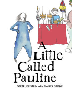
A Little Called Pauline
Author: Gertrude Stein
Illustrator: Bianca Stone
Penny Candy Books
14 April 2020
64 pages

This month’s PB review is by Ryan G. Van Cleave (Big-​time Gertrude Stein fan at Only Picture Books) and Florida-​based author/​illustrator Fred Koehler.

–Ryan’s Review of the Writing–

Let me preface this review by saying that dozens of picture book hardcovers, softcovers, e‑versions, ARCs, and F&Gs arrive at OPB each month, and it’s hard to deny that more than a few have a sense of sameness to them. That’s not to say quality stories don’t land on my desk each month–some are quite strong! A few are even great. But it’s accurate to note that much of what I see follows traditional paths in how they story creators convey story. I say all this by way of explaining that when a picture book comes along that avoids well-​trod paths, it stands out.

Enter A Little Called Pauline by the late-​great Gertrude Stein, who first published this as a poem in her amazing 1914 book Tender Buttons. The poem isn’t some candy-​coated version of poetry for kids with June-​moon-​spoon rhymes and surface-​only clarity. And this new book is a vibrant, fresh take on a poem that might seem a bit disjointed in both logic and language.

Witness: “Bidding a wedding, widening received treading, little leading mention nothing.”

Or the lines that immediately follow the above: “Cough out cough out in the leather and really feather it is not for.”

Yet there IS a story here, thanks to the work of illustrator Bianca Stone, whose ink and wash sketches pair with Stein’s words to create a story about a girl who dearly wants a fancy, expensive crown for her birthday that’s more than the family can afford. The girl throws a tantrum, and has a Where the Wild Things Are imaginative trip out to sea in a little boat where she then has strange experiences that end up not quite being all she hoped for. In both stories, it’s Mom who provides an apt, tender moment to bring these tumultuous excursions to a satisfying close.

I applaud the inclusion of the Illustrator’s Afterword which discusses the storyness of this poem, and the poemness of this story, as well as Stone’s personal connection to the original “A Little Called Pauline.” The Afterword also invites readers to join in the visual interpretative fun via what Stone calls “Poetry Comics.”

Leave it to Stone–a poet-artist–to trust the power of poetry for its ability to reach young readers. Stone explains: “Poetry is not a mysterious riddle you must figure out. It is a continuous adventure with your own mind, and there are no wrong answers in how you interact with it. All it asks is that you do.”

And that’s what this welcome adaptation of a century-​old poem does. It asks–insists, really–for interaction and response that few readers can deny.

4.5 out of 5 pencils

–Fred’s Review of the Illustration–

Anytime an artist successfully pushes boundaries within a genre, they’re creating new spaces for other artists to experiment and play. In A Little Called Pauline, two bodies of art are separated by over a hundred years and yet somehow they sing in a weird and satisfying harmony.

Yes, I credit this book with having two artists. Gertrude Stein wrote the words in her 1914 poetry collection Tender Buttons. At first blush, they’re so strange that you wonder if it’s a bad translation. But the more you look at lines and say them out loud, the more sense they make. The words make art all by themselves, almost as if they’re a magic spell and by reading them you’re falling under its influence.

Then along comes Bianca Stone, who addresses the text as if she understood exactly what Stein was meaning to say all along. Around the nonsense, she wraps a parent/​child narrative that’s equally intriguing. I love the ink and watercolor style that draws the eye to important details. It’s fun to go back through and see what you missed the first time.

If you skip the words all together, you’ll understand the story. But when you add in the poem, you end up with something oddly wonderful that seems perfectly appropriate, and potentially a healing force, for the strange world we live in today.

I can’t wait to see what Bianca Stone comes up with next.

4 out of 5 crayons


Fred Koehler is an artist and storyteller whose real-​life misadventures include sunken boats, covert border crossings, and fighting off robbers in the dead of night. Whether free diving in the Gulf of Mexico or backpacking across Africa, Fred’s sense of adventure and awe of nature overflow into his characters’ stories.

Fred is passionate about encouraging young artists, promoting social justice, and conserving our environment. He lives in Florida with his wife, kids, and a rescue dog named Cheerio Mutt-​Face McChubbybutt.

Picture Book Review: Fly, Firefly! by Shana Keller

Fly, Firefly!
Author: Shana Keller
Illustrator: Ramona Kaulitzki
Sleeping Bear Press
1 March 2020
32 pages

This month’s PB review is by Ryan G. Van Cleave (#1 Firefly Fan at Only Picture Books) and Florida-​based freelance artist Austin McKinley.

–Ryan’s Review of the Writing–

Fly, Firefly! tells the story of what happens to a single firefly when “a wind current carried him out to see the sea.” While out there, he sees winking lights beneath the water–other fireflies, perhaps? So he dives into the water and can’t get out. He’s rescued by “my niece and I” who explain that the underwater fireflies were in fact the glow of marine plankton–“bioluminescence swirling and twirling through the great sea!” The eponymous firefly is then released on land where he finds his fellow fireflies, and all is well again.

The smoothness and sense of most of the rhymes make lines such as “He dove and splashed through the wet glass, but under the surface, air did not last” stand out. Another line that gives this reviewer pause is “The sea pushed and tugged while I scooped up our bug.” While the second part of the Back Matter does an effective job of offering STEM-​style information on fireflies (a.k.a. lightning bugs)–including pointing out that they’re beetles, not flies–it doesn’t say that they aren’t bugs either (a fact, despite what this line claims). Considering that this book does have a science fact focus–and given the popularity of the term “lightning bugs”–this distinction seems useful to make at some point. Ultimately, the reason the word “bug” is there seems clear–to fit the rhyme, not the science.

Taken as a whole, the text works, though the overall story isn’t a story so much as an anecdote since it’s unclear whether the main character could/​should be the firefly (witness the title, and how it’s the first character we see on page one and in the last spread), the first-​person speaker (who’s an older character), or the niece, Marjie (who rescues the firefly and explains bioluminescence to it in Dr. Doolittle fashion that belies her very young age).

What gives away the real goal of the book is the first page of the Back Matter–the author read a letter that Silent Spring author and environmentalist Rachel Carson wrote to a friend about her own memorable encounter with a firefly half a century ago. An excerpt of that letter shows that Rachel herself considered writing a children’s book about the experience, though she clearly never did such a thing. Some readers might find it gratifying that Shana Keller helped fulfill Rachel’s impulse here with Fly, Firefly!.

The other selling points of this book are the really fine art (see what Austin says below!) and the second half of the Back Matter that gets into the science and biology of fireflies. It’s a plus that the author has so much information on Rachel , too, because kids need to know about her impactful life and work, without a doubt. If Shana Keller opts to write a nonfiction book about Rachel Carson (or the worldwide impact of Silent Spring) with the quality she used in her picture book biography, Ticktock Banneker’s Clock, OPB will be eager to see it.

If you’re a firefly fan or you just love good picture book art, Fly, Firefly! is likely to brighten up your nights.

3.5 out of 5 pencils

Austin’s Review of the Illustrations–

German Illustrator Ramona Kaulitzki’s sumptuous illustrations are so kinetic you can practically hear them, but nevertheless remain calming and peaceful. Here she explores the entire spectrum from the warm glow of the firefly’s body, through a masterful rendering of magic-​hour twilight, to the swirling blues and greens of glowing plankton churning in the waves, all in tints pure and moody without being brooding.

The forest at dusk comes alive. The panoply of sea life she depicts with exquisite sensitivity, whereas the human and titular firefly characters she handles with appealing whimsy.

Her choice of perspectives is also fascinating. We soar through the air, plunge into the waves, and plod along the beach as the sparkling stars hang over the day’s last glow. She skillfully captures mood and emotion—it’s a truly magical, evocative experience that perfectly portrays the parallels of life-​generated lights that created such an impression on biologist Rachel Carlson, and subsequently author Shana Keller.

A look through Ramona’s portfolio will reveal a flair for stylizing the natural world in a sophisticated but approachable way both dynamic and heartwarming without ever becoming saccharine. Her work is digital, but has a very organic, textural, handmade quality that reminds one of mid-​century children’s illustration, like a next-​generation Alain Grée or J.P. Miller. Her staging, however, is far more clever and interesting, her cartooning more fine-​tuned, her palette more refined.

It’s a fine line to walk, but she dances along it expertly in Fly, Firefly!

5 out of 5 crayons


Austin McKinley makes comic books, cartoons, movies, video games, screenplays, novels and novellas through his company, Flying Car. He shot and appeared in the award-​winning feature documentary The New 8‑Bit Heroes alongside director Joe Granato. His comic illustrations have also been published by Image Shadowline, Devil’s Due/​1st Comics, Alias/​Blue Water Press, Avatar, Boom!, Blue King Studios, and FC9. He wrote and illustrated Squareasota, a weekly cartoon in the Sarasota Herald-​Tribune for seven years.
He is currently illustrating Tales of Mr. Rhee vol. 5: Rockstar Paranoia, a graphic novel for Source Point Press.

Picture Book Review: Paper Planes by Jim Helmore

Author: Jim Helmore
Illustrator: Richard Jones
Simon & Schuster Children’s
1 March 2020
32 pages

This month’s PB review is by Ryan G. Van Cleave (Chief Paper Plane Designer at Only Picture Books) and Ringling College of Art and Design Illustration Professor (and OPB lizard-​loving wunderkind) John Herzog.


–Ryan’s Review of the Writing–

Anytime you’ve got a story about friends separating, it seems like we tend to follow the one who goes to the new place. It makes sense. Stories are fundamentally about challenges and changes, and, of course, the person moving away will have those things aplenty.

But in Paper Planes, author Jim Helmore wisely shows us that the ones left behind are encountering their own brand of challenge and change, as we see with Mia, the child left behind when her bestie, Ben, moves far, far away.

One of the things both children share is a love for making paper planes. In fact, they had a Big Plan to create a paper plane so large that it could fly across a “great, wide lake” where they live next to in side-​by-​side houses at the start of the story. What are they going to do now that Ben and his family have moved so, so far from Mia?

Helmore doesn’t pull emotional punches as you can see here: “Hot tears fell from her eyes.” And we see Mia’s loneliness darken into resentment, shown in action by her taking a plane Ben gave her and smashing it. That kind of direct access to a character’s feelings will surely spark discussions in parents and readers about acceptable behavior and the power of emotions.

I’m quite taken by the art here–there’s an interesting contrast in play between the relatively lean prose and the dreamy aspects to the illustrations. I’ll let John explain that better below, since that’s solidly in his domain.

In sum, Paper Planes is an emotionally textured book about friendship and belonging that’s especially welcome in these challenging times.

4.5 out of 5 pencils


–John’s Review of the Illustrations–

I’m prefacing my review of Paper Planes with some historical context:

Right now, it’s April 2020 and the planet is engulfed in the coronavirus pandemic. The majority of businesses are closed, grocery stores can’t keep toilet paper and hand sanitizer in stock, and everyone has been tasked with the responsibility of practicing self-​quarantine and social distancing. Little to no air travel is happening as airlines have suspended service, and hubs of humanity from Times Square to St. Peter’s Square are empty. Friends, family, educators, and entertainers now largely communicate via video conference from their homes.

It is a very, very strange time — and it makes me appreciate Paper Planes all the more.

A lovely story of the triumph of long-​distance friendship, Paper Planes is timeless yet relevant. Mia and Ben are two friends who enjoy spending time with each other, and they especially love making paper airplanes together. One day, Ben tells Mia that he and his family are moving far away, and we see how Mia copes with the situation. Jim Helmore’s story is incredibly sweet and sensitive, yet believable. Mia’s frustration, sadness, and longing for her friend endears us to her, and I kept hoping that she and Ben would somehow be brought back together. Can their friendship endure despite being far away from each other? I’ll avoid spoilers here, but I will say that the result is realistic yet satisfying.

Richard Jones’ illustrations elegantly combine both the simple and complex. Mia and Ben, as well as their cute little dogs, are simply designed yet they’re surrounded by geese, seaside towns, and grassy fields that are full of complexity. The world is nicely balanced, and everything here feels effortlessly deliberate–a quality most illustrators (myself included) struggle to achieve. With Paper Planes, Jones makes it look like a cakewalk.

There’s also a very tactile feel to the illustrations, which is of course inherent in their execution, but also helped quite a bit by the presentation offered by Peachtree Publishing. The dust jacket, for instance, uses a very textured substrate that adds a sophistication and warmth to the overall feeling of the book. Likewise, the interior pages use a matte finish that allows the reader to soak in all of the sumptuous earth tones and vibrant colors used by Jones. This is a high-​quality book — probably one of the best I’ve seen–that rightly deserves to be on everyone’s shelf.

Paper Planes provides a message of hope for all who are far away from friends and loved ones. Granted, given our current situation with the coronavirus pandemic, that message resonates even more. However, I can’t help but feel that I would love this book regardless of what’s happening right now. Its message of friendship transcending distance is timeless.

4.5 out of 5 crayons


John Herzog is an award-​winning illustrator and educator. His clients include Hasbro, Dreamworks TV, Houghton Mifflin Harcourt, Scholastic, and Highlights for Children. He also teaches illustration classes at Ringling College of Art and Design.

John is a member of the Society of Illustrators and SCBWI, and received the 2018 SCBWI Magazine Merit Award for his Highlights High Five cover illustration. He lives in Florida with his wife, two kids, a pair of geckos, a South American horned frog, a bearded dragon, and a fish.

He is represented by Shannon Associates.

Picture Book Review: The Society of Distinguished Lemmings by Julie Colombet

The Society of Distinguished Lemmings
Author: Julie Colombet
Illustrator: Julie Colombet
Peachtree
1 March 2020
40 pages

This month’s PB review is by Ryan G. Van Cleave (lead lemming researcher at Only Picture Books) and Ringling College of Art and Design Illustration Professor (and new OPB friend) Rebecca Zomchek.

–Ryan’s Review of the Writing–

Is there ever a happy ending for a story about lemmings? Thanks to Julie Colombet’s The Society of Distinguished Lemmings, the answer is now an emphatic “yes!”

This fancy society of lemmings have 10 rules to follow, with #1 being “Lemmings Only” and #10 insisting “No Questioning the Rules.” Not a problem for these rule-​following lemmings! But then lemming Bertie decides to leave the underground burrow because even distinguished lemmings can sometimes get TOO noisy. Once Bertie reaches the surface, though–gets the shock of his small life. He encounters a creature that he suspects is a bear! But Bear isn’t going to eat him–instead, it licks him, and just like that, they’re pals.

Bear doesn’t show interest in any of Bertie’s distinguished activities (painting and playing chess), but Bertie is quite taken by Bear’s most un-​distinguished activities (rolling in flowers, climbing tress, and jumping in mud puddles). When the other lemmings eventually learn of Bear, they are reluctant to let him join their society despite Bertie’s hope that they do so–Bear’s a bear after all, and he doesn’t appreciate the same things that the oh-​so-​fancy lemmings do. “The bear will never be distinguished,” they ultimately decide.

Bertie and Bear are then left behind when the others go on a sudden vacation (the dangerous migration we all worried would come when we heard the term “lemming” via the title). Some extremely fortuitous reading material (a book called A Short History of Lemmings) concerns Bertie and Bear enough such that they rush to the ocean to ensure their lemming buddies are safe. To no one’s surprise, the lemmings aren’t safe–they swam out too far into the deep water and are exhausted. But the distance is easily covered by Bear’s superior swimming ability, and he rescues them all, which earns him immediate entry into the new Society of Distinguished Lemmings…and Bears.

I’ll let Rebecca point out the visual jokes and discuss how the comic-​style multi-​vocal technique works to give voice to the many, many lemmings in this story. Instead, I’ll focus on three aspects on the story side of things.

  1. The wordplay here is fun, with such bear-​adjacent lines as “This is unbearable” and how Bear worries that things are “about to get grizzly.”
  2. The story offers a palatable take on kid topics such as following rules, supporting your friends, and accepting differences in others.
  3. Many of the funniest lines in the story appear in word balloons–kids will likely enjoy reading them, and will note different/​new things with subsequent reads, much like in a well-​done Search-​and-​Find where there’s always seemingly more to appreciate.

In sum, The Society of Distinguished Lemmings is a promising premise that ends up somewhat underdeveloped thanks to convenient moments (the right passage of the right book being read at the right time), a huh? moment (why does lemming Bertie need a book to teach him about a lemming’s penchant for a watery end via a migration?), and a relatively predictable conclusion (strong-​but-​shunned bear saves stodgy/​snobby lemmings). Yet make no mistake–the fundamental concept is fun, the lemming art entertaining, and the sense of play welcome. Taken together, it’s a mostly encouraging debut from French author/​illustrator Julie Colombet.

3.75 out of 5 pencils

Rebecca’s Review of the Illustrations–

From the expressive and character-​filled endpapers to the illustrated pages sprawling with dozens of ludicrous lemmings, The Society of Distinguished Lemmings is a fun and detail-​filled adventure from beginning to end.

Colombet’s soft style, with contrasting bright-​eyed characters and funny expressions, builds a wonderful bridge between comic and book form illustrations. Her detailed page layouts use speech bubbles to invite the viewer to explore her complex scenes that add to the larger story. Filled with tiny props and dozens of unique characters, these add amusing jokes and side narratives to serious situations and a larger moral.

Despite Colombet’s soft and friendly style, the images are actually quite nuanced.  When we’re first introduced to our lemming protagonist, Bertie, we are shown that he is unique among his compatriots, both because of his open-​minded attitude and his polka-​dotted coat, instead of a traditional striped pattern. This pattern mixing is a nice visual cue of individuality for a younger audience where the other lemmings can blend together, indicating their crowd-​like mentality. In each scene, as we see more of the lemmings and their new friend, Bear, the clear and exaggerated expressions really help communicate the attitudes and emotions of the characters and how they relate to each other as the story progresses. The bear’s expressions, in particular, show a great inner arc that transitions from fear to joy as his friends are rescued, resulting in a happy ending.

Some of my favorite pages are the underground scenes showing the lemmings’ home and the final scene where we see the lemmings and Bear finally relaxing together. I love the way we see dozens of characters on a page, but if we take the time, we can break down each area into unique instances and dramas so each page becomes dozens of moments the audience can come back to again and again. These scenes–filled with tiny chandeliers, dining tables with minuscule cutlery and goblets, concert halls, and portrait galleries–help contrast strongly with outdoor scenes in which we see Bertie and Bear bonding over simpler pleasures. It’s a nice visual resolution to see these two worlds merge at the end of the book in a large outdoor picnic

There are a lot of exciting details for readers young and old to discover on each page of this book. Colombet’s style brings the simple story to life and adds wonderful expression and humor to a profound narrative about learning to stand up to peer pressure, having fun, and being yourself.

4.5 out of 5 crayons


Rebecca Zomchek is a children’s book illustrator who has worked as a concept artist and cartoonist. She earned her BFA from Syracuse University and her MFA from The School of Visual Arts; she teaches Illustration at the Ringling College of Art and Design. Rebecca likes distinguished things like classical music and museums, but also loves being outside and getting paint everywhere.

Picture Book Review: Tiara’s Hat Parade by Kelly Starling Lyons

Tiara’s Hat Parade
Author: Kelly Starling Lyons
Illustrator: Nicole Tadgell
Albert Whitman & Co.
1 April 2020
32 pages

This month’s PB review is by Ryan G. Van Cleave (champion hat-​wearer at Only Picture Books) and Ringling College of Art and Design Illustration Professor (and OPB friend) David C. Gardner.

–Ryan’s Review of the Writing–

This new book by Kelly Starling Lyons tells a tale you don’t often see in picture books–capitalism. Tiara’s momma is terrific at making hats, but along comes a new store in town that sells them cheaper, so when Momma’s sales bottom out, she reluctantly shuts down her small business–the Tracy Rose Millinery. But Tiara isn’t fine with that because she loved Momma’s creations, and not just because Tiara was its top hat model.

Even though Momma eventually finds another outlet for her creativity–teaching art at Tiara’s school–it’s not the same. She’s clearly still sad about her defunct business and no longer being able to make her beloved hats for friends, family, and the community. Tiara can tell how much Momma misses it. So, when it’s time on Fun Friday to choose the next class art project, Tiara suggests, “Hats!” That’s what the class does, and Momma and the students have a blast.

But Tiara takes it a step further. She advertises a Hat Parade at Height Elementary, with the request that people come and wear their favorite Tracy Rose hat. They come out in droves with each taking a turn on stage to model their hats and share how empowering and individually meaningful they are. Momma is touched, and she starts to get orders for new hats once again. Maybe, too, Tiara has discovered her own future calling as well after finding great pleasure in helping her friend, Matti, improve on her art class creation.

I’ll leave it to David to speak about how these interesting visuals complement the story, but Tiara’s Hat Parade goes well beyond the tale of a small business that fails and finally comes around again thanks to community spirit. It’s also about a young girl’s indefatigable spirit and deep love for family. A thoughtful Author’s Note also shares the author’s own experience with hats and explains how they are a vital part of Black women’s–and men’s–style. A list of Famous Black Milliners is an added bonus to the back matter.

This emotional-​but-​triumphant story utilizes language at times that matches the beauty of Momma’s fine hats, which is a very nice touch.

4.25  out of 5 pencils

David’s Review of the Illustrations–

The illustrations by Nicole Tadgell are light, lively, and expressive. They highlight the characters’ relationships, never missing an opportunity to show characters interacting playfully with one another. The text relies on these relationships to tell the story, but the pictures show us these relationships–the closeness, the joy and the humor–in a way the text cannot, from Tiara’s closeness to her mom, to the joy in the big finale, the hat parade, the women’s outfits, colorful and varied.

The expressions of the characters are clear on every single page due to Ms. Tadgell’s thoughtful depiction of facial expressions, body language, and her attention to the emotions of color. For example, when Tiara’s mother and her family go through hard times, the colors take us down, cool and desaturated, without dipping too far down into mere drabness.

Even in a sad moment though, there is a fluidity and charm to Ms. Tadgell’s style, due in part to the sensitivity of the watercolor paintings and the light, loose holding line of the pencil which, at its best, recalls the charm of Trina Schart Hyman’s classic work. The mother, in particular, rings true. Using specific details, such as her distinctive hairstyle, glasses, and even the type of clothing Momma chooses to wear, she leaps from the realm of generic mother to being a warm, real person. There’s the visual contrast between Tiara, thin and angular, and Momma, round and soft, which sets up a pleasing–and essential–variety to the central relationship of the book.

The great success of these pictures is the emotion they convey on every page, and, by extension, the connections and relationships: Mother and daughter dancing in the hat shop to friends’ applause (a clever visual foreshadowing of the climactic parade), the family gathered around the dinner table in unspoken sadness, Momma dancing in front of her giddy students at school. The colorful hat parade of the title splashes across a series of pages, each wonderfully realized model/​friend alive in a spotlight of her own. A sense of community, togetherness, and fun is conveyed through the characters’ constantly moving–dancing, strutting, reaching–and through the colors, bright but never garish.

Ms. Tadgell skimps a bit on the background details now and then, such as a window frame that feels sketched in as an afterthought and could have used the same loving attention as the observed detail on Momma’s dress or a nearby jade plant. Proportions and perspective in the drawings feels a bit off at times. But those details seem minor considering the overall fun in the spot-​on hat designs and colors, full of rich, observed detail.

It’s clear to see why Tracy Rose’s hats bring so much joy to others, and clearly these pictures will delight any child.

4.5 out of 5 crayons


David C. Gardner is an award-​winning illustrator and visual development artist. A former artist for Walt Disney Animation Studios, he has illustrated numerous picture books, including his latest from Sleeping Bear Press, Write On, Irving Berlin! by Leslie Kimmelman (which appeared on OPB in May 2018). It tells the true story of little Izzy Baline, who immigrated to New York City in 1893 and grew up to become Irving Berlin, one of the most well-​known composers of popular music in America. David teaches illustration at Ringling College of Art and Design.
To learn more about David’s own work, please visit FlyingDogStudio.com.

Picture Book Review: Way Past Mad by Hallee Adelman

Illustrator: Sandra de la Prada
Albert Whitman & Co.
1 March 2020
32 pages
This month’s PB review is by OPB superfan Ryan G. Van Cleave and Florida-​based author/​illustrator Linda Shute.

–Ryan’s Review of the Writing–

It’s incredibly challenging to create a picture book that primarily deals with emotions, but that’s the task Hallee Adelman sets for herself in Way Past Mad. Right from the start, our protagonist Keya is indeed wronged–her little brother Nate messes up her room. Then he inexplicably feeds Keya’s breakfast cereal to their dog. While those two things don’t seem especially malicious, the fact that he “ruined my favorite hat” puts Keya over the edge.

I get it. Little siblings can drive you bonkers. I know that truth from my own childhood, and I see it in the sometimes-​tumultuous lives of my two daughters.

Adelman presents Keya’s anger in this story as something that makes one lose control. That sense of being out of control is shown in how she kicks rocks and sticks on the way to school, and in how, for her, it’s “the kind of mad that starts and swells and spreads like a rash.” That’s a memorable way to describe being mad, though it feels a bit off in that anger flares to life and grows far faster than any rash does, both in real life and in this story. In contrast, Keya’s happiness at the end of the story that “starts and swells and spreads like a smile” feels like a much more apt comparison.

For me, the fuzzy part of Way Past Mad was coming to grips with what being mad is to Keya. If she’s “way past mad,” how can Keya blame it for her saying unkind things to her friend, Hooper (“But my mad made me say it”)? This might seem like I’m nitpicking, but is being mad a destination/​place/​situation/​state of being, or is it its own thing, like an entity one must deal with, as some books present via personification? Does anger have power over you? If so, how can that be the case if one is “way past mad” versus, say, being in the “clutches of anger” or something along those lines?

While Keya owns up to her anger-​infused behavior and apologizes to Hooper, there’s no parallel resolution with Keya’s little brother, despite him doing the three things that kick off this emotional story. Keya clearly values friendship, however, and she learns that things done in the heat of anger–though that’s my language again that doesn’t quite jibe with how this book presents it–aren’t usually that helpful, and those are solid takeaways. I just wish the level of emotional insight the book offered from start to finish was as rich and compelling as the terrific, bold cover that initially drew me to this book.

3.5 out of 5 pencils


–Linda’s Review of the Illustrations–

The jacket for Way Past Mad attracted me–a little girl’s furious face boldly drawn in white and black on a bright red background. But we are not introduced to this narrator on the opening page. Bright plaid endpapers and cheery repetitive colors dissipate the cover’s promise of drama. This is a story of building anger that explodes into regrettable action, leaving the protagonist in a dark, lonely place until she finds resolution. What I miss here is a visual story arc that supports the text’s arc.

Design strategies–varying the focus, or the size of the art (like in Where the Wild Things Are), expressive color temperature and dark/​light values, mood-​setting endpapers and front matter–can reinforce story and feelings. Instead, the frown on Keya’s face is our primary visual indicator of her emotional landscape.

During the story, Keya fantasizes she is a champion runner, but there are no compositional clues to indicate these three scenes are in her imagination. She shows up later, in “real time,” wearing the star she won during her fantasy, which furthers the confusion.

Sandra de la Prada created appealing characters and did a competent job illustrating Way Past Mad, but I cannot help regretting opportunities missed by her and the book’s art director/​designer.

3 out of 5 crayons


Linda Shute is an author/​illustrator who earned a degree in art and art history at Florida State University and taught children’s book illustration at Ringling College of Art and Design.
She loves peanuts and beach sunsets.