This month’s PB review is by Ryan G. Van Cleave (Owner/Operator of Only Picture Books) and Florida-based freelance illustrator Gladys Jose.
–Ryan’s Review of the Writing–
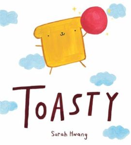
There’s no doubt about it–the main character in Sarah Hwang’s Toasty is pretty darn cute. He’s a piece of toast, after all, with arms, legs, and a little face. I’ll resist sharing too much of my non-expert opinion on the art because I have the terrific Gladys Jose to do that, but I must note this. Toasty’s problem–a wish, really–is to be a dog. Once we realize that, it’s just so easy to see his face as a doggy face in a way that wasn’t evident at the start. That’s a clever bit of art making there!
The story is all about Toasty trying to be a dog. He can bark and he has a collar, but he stinks at rolling and chasing cats. He keeps trying canine things with a determination that might be called “dogged.” In the park, Toasty goes from trying to play with dogs to being the thing they want to play with. He hides in a sandwich and just as the dogs seem ready to gobble him up…a girl rescues him. He woofs in response, and she more or less adopts him as a pet. Not just as any pet, but a dog!
I’m charmed by the art, the dilemma this anthropomorphic piece of toast faces, and the ending (finding a way to be a dog-like companion for someone despite his non-dog characteristics). Yet I have questions.
Question 1–The book is super-lean on text. That’s fine, but it requires what’s there to have to really sing at the same level of goodness as the fun imagery. Given that level of attention, the first line doesn’t really hold up. In fact, most editors strongly recommend against beginning picture books with “Hi, I’m____” or “This is ____.” The reason why is easy to see–readers want story. An introduction can happen in the course of story or action versus a static narrative beginning. Why not just start with “Toasty loved to watch the dogs outside this window play”?
Question 2–If Toasty is just discovering his desire to be a dog, why does he already have a collar and leash (and not just one but several collars because he has a “best collar”)?
Question 3–Isn’t the girl swooping in to save him stealing Toasty’s agency for solving his own problems?
Ultimately, I have mixed feelings about Toasty. Am I being too crusty? Maybe. But no matter what, that little toast character is terrific. I can’t help but feel that an industry gatekeeper was so charmed by the image and idea of Toasty–that spread where he hides atop a sandwich is darling!–that the story didn’t matter as much.
Some reviewers and readers will counter my questions by saying it’s just quirky or strange in the same way an imaginative child might tell a story. Maybe. If that’s the argument, I’m not persuaded. And yet I’m so taken by the character and his strange desire that I find myself liking a lot about this book. From the response of other readers and reviewers, I’m not along in that appreciation. I just wish the story would’ve given us one just-believe-it thing (this piece of toast operates like a person), because the rest could easily have worked with real-world logic.
Regardless, I look forward to seeing more of Sarah Hwang’s work. She’s clearly a talented picture book creator.
3.75 out of 5 pencils
–Gladys’ Review of the Illustrations–
Toasty was a visually tasty treat. Not that I’d ever dare feast on Toasty!
I absolutely adored Sarah Hwang’s picture book. There’s an innocence and tenderness that just left me smiling and feeling satisfied at the end.
Art comes in so many styles, rendering techniques, and media. Sarah is very proficient in her art style. I absolutely love that this isn’t super rendered with layers and layers of color and details. Sarah added exactly what is needed in each illustration and nothing is unintentional. From things happening in the foreground to every minor detail in the background–like the silhouettes in the window of the last page that she uses to re-enforce the difference between toasty and the others.
I love how you can see the layers of color underneath some of the paint strokes. It makes Sarah’s art seem more genuine and honest which works so perfectly with the story and the intended audience.
Her character designs are great and I’m especially in love with Toasty as a character. It’s a challenge to bring life to non-living things–especially a square toast of bread!–without having it look lifeless and stiff. Or there’s the other problem of adding “too much life” and losing the original form of the character. But Sarah beautifully avoids that with just a few simple details and with the looseness of her paint strokes. Toasty seems very much like a piece of toast, but simultaneously it’s presented as toast that’s somehow alive! Plus, I mean, just look at him–he’s so darn cute!
In conclusion, I thoroughly enjoyed this picture book. Both the words and art were superb! It will definitely be a re-read for my daughter and me.
5 out of 5 crayons
 Gladys Jose is an illustrator and storyteller. She graduated from the University of Central Florida in 2012, where she earned a Bachelor of Fine Arts degree, specializing in graphic design. She’s the illustrator of the Fresh Princess series (HarperCollins), The Elephants’ Guide to Hide-and-Seek (Sourcebooks), and Clayton Parker Really Really REALLY Has to Pee (Abrams), as well as other upcoming books.

